Test your designs on iPhone 12 device widths
Now you can test your designs on the new iPhone 12 product line in the Mobile portrait breakpoint.
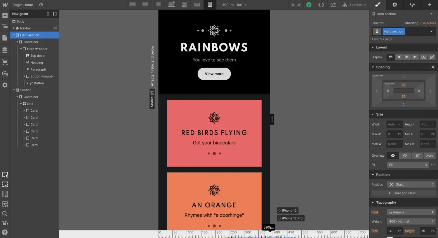
<p>Today, Apple released the iPhone 12 product line with four new viewport sizes that vary from the existing iPhone 11 product line.</p><figure class="w-richtext-figure-type-video w-richtext-align-fullwidth" style="padding-bottom:56.206088992974244%" data-rt-type="video" data-rt-align="fullwidth" data-rt-max-width="" data-rt-max-height="56.206088992974244%" data-rt-dimensions="854:480" data-page-url="<https://www.youtube.com/watch?v=26TA0OIrHGY>"><div><iframe allowfullscreen="true" frameborder="0" scrolling="no" src="<https://www.youtube.com/embed/26TA0OIrHGY>"></iframe></div></figure><p>We’ve added four new device widths to bring the newest iPhones to the Webflow Designer: iPhone 12 and iPhone 12 Pro (390px), iPhone 12 Pro Max (428px), and a smaller width for the iPhone 12 mini (360px).<br></p><figure class="w-richtext-figure-type-image w-richtext-align-fullwidth" style="max-width:3056px" data-rt-type="image" data-rt-align="fullwidth" data-rt-max-width="3056px"><div><img src="<https://cdn.prod.website-files.com/64f9399ca7d13575ff21a675/64f9399ca7d13575ff21d36d_iPhone-12-mobile-portrait.png>" loading="lazy" width="auto" height="auto"></div><figcaption>To test your new and existing designs, go to the Mobile portrait breakpoint and adjust the canvas width to preview your design on each device.<br></figcaption></figure><p><br></p>