Customize form checkboxes and radio buttons
Now you can go fully custom with the design of your form checkboxes and radio buttons (with the option to switch back to the default styling at any point).
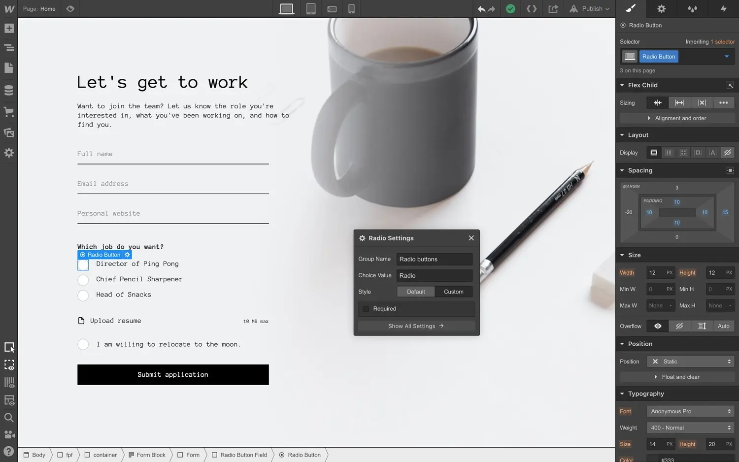
<p>Now your form checkboxes and radio buttons can be completely customized, thanks to a new option to override the default styling and customize their design however you’d like.</p><figure class="w-richtext-figure-type-image w-richtext-align-center" style="max-width:80%" data-rt-type="image" data-rt-align="center" data-rt-max-width="80%"><div><img src="<https://cdn.prod.website-files.com/64f9399ca7d13575ff21a675/64f9399ca7d13575ff21cab3XX80VxkQDXiBf5UetUJlq3CRY-SaQAbq5UoqnKRlDEKzFULcuSubyZKc0-g5CIhn8VJeB-qXDHsYoljphB8KN4paScCEjawgwZtpgeMy1esFkE7amNxYpBgs7VJk2mF14HCv.gif>" alt="Switch to custom mode to completely customize the style of checkboxes and radio buttons."></div><figcaption>Switch to custom mode to completely customize the style of checkboxes and radio buttons.</figcaption></figure><p>To enable custom styling, enable the new “custom” option in the checkbox and radio button form element mini-settings. (Note that you can always switch checkboxes and radio buttons back to their “default” styling if you want to keep things simple.)</p><figure class="w-richtext-figure-type-image w-richtext-align-fullwidth" style="max-width:800px" data-rt-type="image" data-rt-align="fullwidth" data-rt-max-width="800px"><div><img src="<https://cdn.prod.website-files.com/64f9399ca7d13575ff21a675/64f9399ca7d13575ff21cab2zMIauCdudQs2QG0WZRKs7mQwFQhj-q19MQRcd9pdZI2nY9dQDeng-7QPdSqAke2tIGxzGHo5fpuko938ugCh3qiE7wFsnRzlH3DzmUZDJg4sYiMgYcE7Wq8QAJ6geDMG-Lqwb2.gif>" alt="Radio buttons and checkboxes: now more fun (if you’re into that)."></div><figcaption>Radio buttons and checkboxes: now more fun (if you’re into that).</figcaption></figure><p>When you switch to the custom styling option, these elements are yours to style as you’d like. (For example, maybe you want to change radio buttons to look like arrows when selected, or checkboxes to look like little moons — it’s your life.) </p><figure class="w-richtext-figure-type-image w-richtext-align-fullwidth" style="max-width:749px" data-rt-type="image" data-rt-align="fullwidth" data-rt-max-width="749px"><div><img src="<https://cdn.prod.website-files.com/64f9399ca7d13575ff21a675/64f9399ca7d13575ff21cad3_gZTRaOiQegC1m3kKaqDK5UAVwwEEjb8BY43qHkGXrGVikMviwYMQaqrpUrAj0zXgYYLTcyF6PhggFCXot9WIVZ3d9tm9q66AuZND8LgENQ4piJ-Z4nm93DSmyIw2BTtWsuuvcS08.png>" alt="Set a “checked” state to control how checkboxes and radio buttons look when selected."></div><figcaption>Set a “checked” state to control how checkboxes and radio buttons look when selected.</figcaption></figure><p>You’ll also notice that these elements come with a new “checked” state, that you can use to control how these elements look when they’ve been selected. We also added a default blue shadow to the focused state to keep radio buttons and checkboxes accessible for people using arrow keys to navigate through forms.<br></p>