Task

Find and fix empty links

Category:

Controls

Where:

Audit panel

When:

Review
Check as complete

Empty links are links with no meaningful text or image alt text, like a social media icon inside a link block. This causes a confusing experience for people using assistive technology.


Fix links without descriptive content

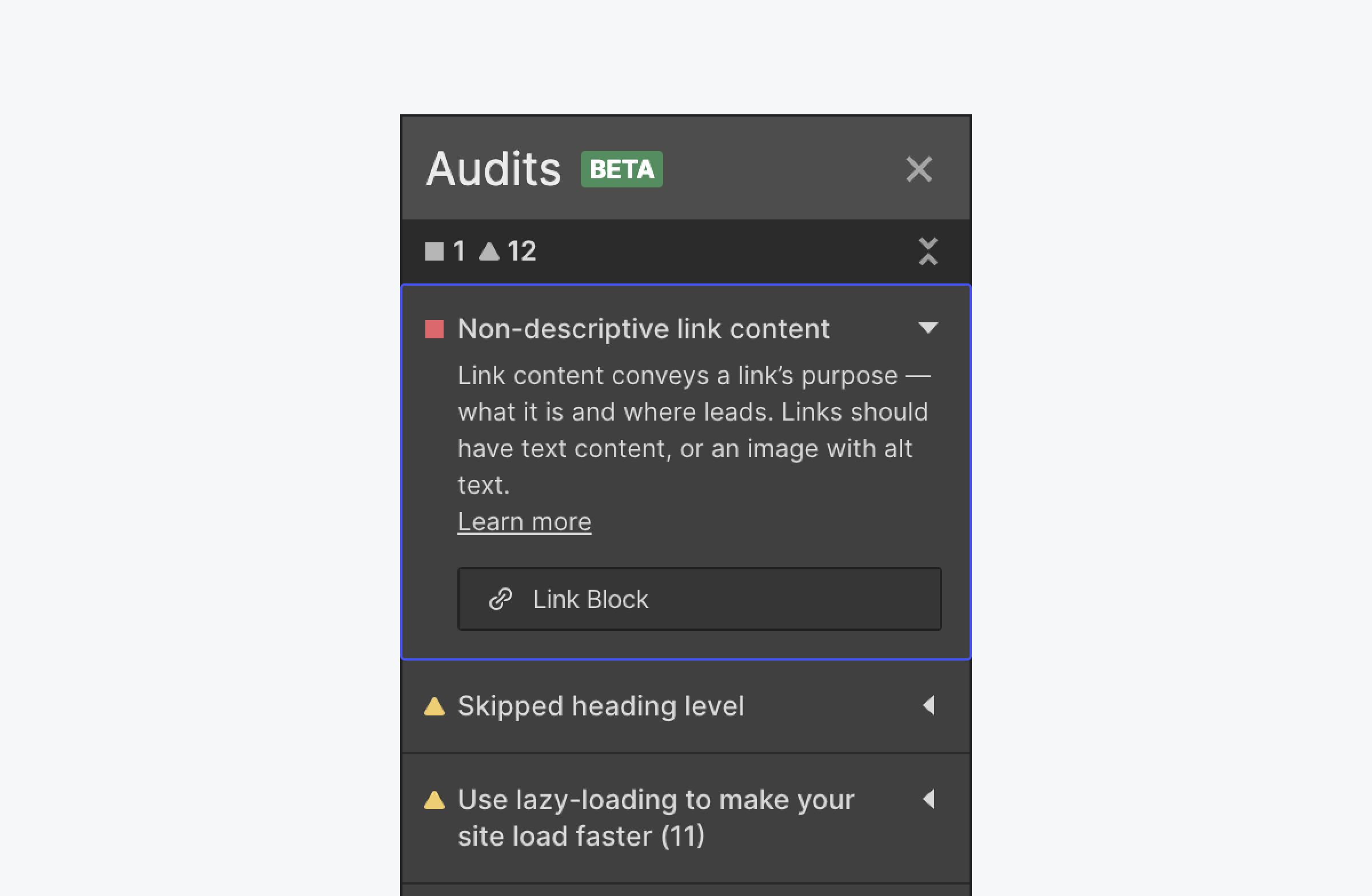
The Audit panel panel flags your empty links.

The Audit panel tells you common accessibility errors like links with non-descriptive content, skipped heading levels, or missing alt text.

To fix links without descriptive content, see our guide on Webflow University.

WCAG reference:

2.4.4 Link Purpose (In Context)

0 / 0

Congratulations on making the web a more accessible place!

Where:

Style panel

When:

Design
​​Instructions for understanding content and accomplishing tasks shouldn’t rely solely on characteristics like shape, color, size, visual location, orientation, or sound.
Full details

Where:

Style panel

When:

Development
People with low vision use zoom to scale content, sometimes up to 400%. As they zoom, content should reflow vertically (as a column) and remain fully legible and logical without a need for horizontal scrolling.
Full details

Where:

Custom code

When:

Development
Videos, animations, and audio that automatically play can be confusing and stressful for people with cognitive impairments. Autoplaying media also makes it hard for people using screen readers to hear a page’s content.
Full details

Where:

Canvas

When:

Design
Using motion behind static text creates a depth mismatch that can be triggering. Even subtle animations can be harmful when placed directly behind the text. What constitutes excessive motion can be subjective, but a good rule is to avoid motion that takes up more than 10% of the central visual field.
Full details

Where:

Interactions panel

When:

Design
Certain animations can be distracting and cause dizziness, nausea, headaches, and seizures in people with vestibular and photosensitivity disorders.
Full details

Where:

Interactions panel

When:

Design
A parallax effect is a design trend where background elements move at different speeds than foreground elements while scrolling. This type of motion is harmful to people with vestibular disorders and should be avoided or used with extreme caution and restraint.
Full details

Where:

Custom code

When:

Development
Scrolljacking is when a website overrides expected up/down scrolling patterns on a page. Scrolljacking can make it difficult to navigate a website, especially for people using assistive technologies.
Full details

Where:

Element Settings panel

When:

Development
Autofocus can create confusion, especially for screenreader users, by moving them to a form field without permission or context. When the page <input> includes other content, or when the input field isn’t the primary purpose of the page, it's best practice to let visitors choose to fill out a form.
Full details

Where:

Canvas

When:

Design
Images of text can’t be read by screen readers, don’t scale well for people with low vision, and can’t reflow on zoom.
Full details

Where:

Style panel

When:

Review
Some users mount devices in a fixed orientation (e.g., on the arm of a wheelchair). Make sure your content doesn’t restrict its view and operation to a single display orientation, such as portrait or landscape, unless a specific display orientation is essential.
Full details

Where:

Style panel

When:

Review
All borders need a contrast ratio of at least 3.0:1 against their backgrounds. This includes borders on actionable elements like text inputs, radio buttons, and checkboxes.
Full details

Where:

Style panel

When:

Review
Icons need a contrast ratio of at least 3.0:1 against background colors.
Full details

Where:

Style panel

When:

Review
Text should have sufficient contrast against its background to be readable.
Full details

Where:

Style panel

When:

Review
Text that overlaps images or videos needs sufficient contrast against the background to be fully legible. Images and videos with busy backgrounds make text difficult to read.
Full details

Where:

Style panel

When:

Development
Keyboard users navigate a site by tabbing through actionable items on a page, and focus states indicate which item is being focused.
Full details

Where:

Custom code

When:

Development
People with partial vision and low vision enlarge text to make it more readable. Using user-scalable=”no” in the <meta name=”viewport” element blocks people from resizing text, and ultimately from using your site.
Full details

Where:

Custom code

When:

Development
Accordion elements should use an ARIA attribute to communicate an open or closed status to screen readers and other assistive technology.
Full details

Where:

Navigator panel

When:

Development
Sighted people perceive page structure and relationships through visual cues like headings, spacing, color, etc. Having these structures and relationships set or available in text make your site easier to understand for everyone.
Full details

Where:

Navigator panel

When:

Development
Many people use only the keyboard to navigate a website. Tabbing order should be logical so that keyboard users can sequentially navigate and use every interactive element on a page.
Full details

Where:

Canvas

When:

Design
If you host websites that collect personal data from EU residents — e.g., via form submissions or third-party scripts — you have responsibilities as a "data controller." Take the time to understand your responsibilities as a data controller, and take steps to abide by the GDPR. This data protection self-assessment checklist can be helpful.
Full details

Where:

Element Settings panel

When:

Review
To display content in a table, table elements need to be properly labeled to be understood by people who use assistive technologies. While there’s currently no way in Webflow to natively create an HTML <table> element, you can create an equivalent structure using a series of <div> elements and proper aria attributes.
Full details

Where:

Style panel

When:

Design
Make sure touch controls like hamburger menus, social icons, gallery viewers, etc. are usable by a wide range of hand and stylus sizes. This doesn’t include footnotes or icons in or at the end of a sentence.
Full details

Where:

Style panel

When:

Review
People with low vision sometimes resize text larger than the 16px default. When we set font sizes in absolute units, like px, the page doesn’t always respect the user’s preference and instead shows the text at the font-size authored.
Full details

Where:

Element Settings panel

When:

Development
Decorative elements (that aren’t images) should be hidden with an aria attribute so assistive technology can ignore them.
Full details

Where:

Custom code

When:

Development
Keyboard users use the “Tab” key to navigate from link to link on a web page. Without a “Skip to main” link (sometimes referred to as a “skip navigation link”), users are forced to tab through every link in a navigation bar before getting to the main content.
Full details

Where:

Element Settings panel

When:

Development
Alt text describes images to visitors who are unable to see them. This includes screen readers and browsers that block images, but it also includes users who are sight-impaired or otherwise unable to visually identify an image.
Full details

Where:

Canvas

When:

Development
Audio descriptions describe visual information presented in video or other media. This benefits people who are blind, have low vision, or have cognitive limitations that make it hard to interpret visual cues.
Full details

Where:

Custom code

When:

Development
Captions allow Deaf or hard of hearing people to access audio content. Some video services like YouTube use an algorithm to automatically generate captions. This is a fast but often ineffective method, as the captions are often incorrect.
Full details

Where:

Canvas

When:

Design
Excessive motion can trigger vestibular disorders and seizures. To reduce harm, it’s important to include a motion warning if your site uses excessive motion, or if you’re linking to a page that uses excessive motion.
Full details

Where:

Navigator panel

When:

Design
Website content should be easy to scan and understand. Your page layout should make it easy for visitors to find what they’re looking for and do what they need to do. It’s also important to build your content programmatically, so assistive technologies can access content in the same order it is visually displayed.
Full details

Where:

Style panel

When:

Design
We shouldn’t rely solely on color to convey information, indicate an action, or distinguish a visual element. This makes it impossible for people who are blind, visually impaired, or who don’t easily distinguish colors to access this information.
Full details

Where:

Style panel

When:

Design
Designing text for readability and legibility are essential to a successful user experience. Appropriate text sizing and spacing ensure that visually-impaired people can read important text, and help those with cognitive disabilities to better focus on text blocks.
Full details

Where:

Page settings

When:

Development
The title element, contained in the document's head element, is often the first piece of information announced by assistive technology. This helps tell people what page or view they are going to start navigating.
Full details

Where:

Custom code

When:

Development
Provide a global pause function on media elements. If the device has a keyboard, make sure the space key can pause playback. Make sure your site doesn’t interfere with the space key's ability to scroll the page/view when not focusing on a form control.
Full details

Where:

Style panel

When:

Development
Most of the time, content that’s not visible on the screen should also be hidden from keyboard and screen readers. This means that hidden content should not be focusable. For example, an inactive modal shouldn’t be focusable.
Full details

Where:

Element Settings panel

When:

Development
A common web pattern is to animate the transition to an anchor link within a page. This animation can be harmful to people who are sensitive to motion.
Full details

Where:

Project settings

When:

Development
Setting the language on a webpage allows more people to access your content. This benefits people who use assistive technologies like text-to-speech, people who rely on captions, and people who have a hard time reading written material.
Full details

Where:

Canvas

When:

Design
Unstructured web content is overwhelming and unusable for everyone, but especially for people with cognitive disabilities and those who use screen readers. Headings organize content and guide readers through your site.
Full details

Where:

Canvas

When:

Design
Words carry meaning, and can cause harm — even if unintentional. And creating more inclusive spaces is defined by our actions, not our beliefs.
Full details

Where:

Element Settings panel

When:

Development
Landmark regions help communicate the layout and important areas of a page or view to assistive technologies and can allow quick access to these regions.
Full details

Where:

Audit panel

When:

Development
Headings give people a sense of a page’s organization and structure, like a table of contents. They break up content to be easily scanned with screen readers or visually. Absent or poor heading structure forces visitors to work hard to find what they’re looking for.
Full details

Where:

Canvas

When:

Design
Plain language benefits everyone on your site, including people with cognitive disabilities and non-native language speakers. Plain language speeds up comprehension, helps people find what they’re looking for and do what they came to do.
Full details

Where:

Navigator panel

When:

Development
When you have a list of several similar elements like cards or bullets, make sure they’re always contained in a list, either a semantic unordered list <ul> or an ordered list <ol>. When screen readers come to a semantic list, they’ll notify the user that there’s a list and how many items it has.
Full details

Where:

Interactions panel

When:

Design
Significant on-screen flashing can trigger seizures. Animations and background videos can also be distracting and disruptive for people with cognitive disabilities like ADHD.
Full details

Where:

Canvas

When:

Design
Terms like “click here” and “read more” don’t provide any context. Screen readers can give visitors an overview of all the links on a page.
Full details