Object-fit support
Now you can use the object-fit property to control how images resize within parent elements, giving you a more accessible alternative to background images.
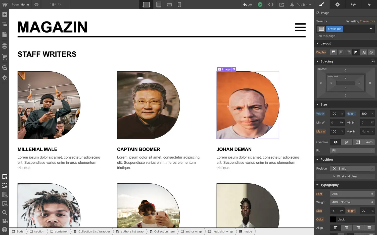
<p>Thanks to <a href="<https://wishlist.webflow.com/ideas/WEBFLOW-I-1019>">popular demand</a>, we’ve added the <a href="<https://developer.mozilla.org/en-US/docs/Web/CSS/object-fit>">object-fit</a> property to Webflow (shortened to “fit” on the style panel), giving you control over how images resize within their parent elements — and a more accessible and faster-loading alternative to <a href="<https://university.webflow.com/article/background-image>">background images</a> (see why at the bottom of this update).</p><figure class="w-richtext-figure-type-image w-richtext-align-fullwidth" style="max-width:720px" data-rt-type="image" data-rt-align="fullwidth" data-rt-max-width="720px"><div><img src="<https://cdn.prod.website-files.com/64f9399ca7d13575ff21a675/64f9399ca7d13575ff21cc76GT3XsKQiGht2CvRLf7AS1PgYGMXnIQ7gjvnFX7VLfFlDPCcuqtBjodpeBxYIPDKZ75ZLcPlI0Wh5lK66mc78JgpetQ90vTcXbwjcIoXZdYaDyqWxCLv7nAJHtrhb2IlnmMnhz.gif>" alt="Control how images resize within their parent elements using the fit property."></div><figcaption>Control how images resize within their parent elements using the fit property.</figcaption></figure><h2>Object-fit in action</h2><p>As shown in the first GIF in this update, you can use the fit property to control how a grid of author headshots display within their containing parent.</p><p>In the example below, the headshot image elements are set to 100% width and height of their parents — but without the fit property, they’re awkwardly squeezed to fit those dimensions.</p><figure class="w-richtext-figure-type-image w-richtext-align-fullwidth" style="max-width:800px" data-rt-type="image" data-rt-align="fullwidth" data-rt-max-width="800px"><div><img src="<https://cdn.prod.website-files.com/64f9399ca7d13575ff21a675/64f9399ca7d13575ff21cc94hOfQBxNbEYFxNyBv47CzRW2Z05rObmpMCvxWRhO-3Gb9e1RAWtnAtl8l0mSeOJGwAAU9cFC8ROvpDJdZx4gcB0fGJQVnwALs5cf5qsGnSZhhSXO6lZH4hNv2jhn6KStr9FdvuuU.jpeg>" alt="Images set to 100% width and height are “squeezed” without the fit property."></div><figcaption>Images set to 100% width and height are “squeezed” without the fit property.</figcaption></figure><p>To make all the headshots fill the space of their parent elements without distortion, we’ll apply the “cover” attribute, which ensures that the image — you guessed it — <em>covers</em> the space available, without distorting its proportions.</p><figure class="w-richtext-figure-type-image w-richtext-align-fullwidth" style="max-width:1200px" data-rt-type="image" data-rt-align="fullwidth" data-rt-max-width="1200px"><div><img src="<https://cdn.prod.website-files.com/64f9399ca7d13575ff21a675/64f9399ca7d13575ff21cc78F1p0PuMOgSlp4gIQlOGoyg1FCP-X-luiaZQb6Pgtg1sWaGg9DloTNspOkNS4hbKcajn5V5GtpnVSbQw5p6Sgw4fqzQIS4hMI5NLq9MSfynNZgf31JYsvX5T54gz0okQdsOLqM.gif>"></div><figcaption>Apply the fit option “cover” to have images fill the space without distortion.</figcaption></figure><h2>Advantages of using the fit property over background images</h2><p>As many of you pointed out in the wishlist item for this feature, the fit property provides a different way of achieving many of the designs that are currently only possible with <a href="<https://university.webflow.com/article/background-image>">background images</a>. </p><p>Here’s a couple of the key advantages of using the fit property:</p><ul><li><strong>Improved accessibility.</strong> If you use image elements in place of background images, you can provide alt text to let people who use screen readers better understand what your page is showing — an option that simply doesn’t exist when using a background image.</li><li><strong>Responsive images support.</strong> Webflow <a href="<https://webflow.com/blog/new-feature-responsive-images>">automatically scales, compresses, and optimizes inline images</a> for every device — but not background images. With the fit property, you can use inline images instead, so your images will be appropriately scaled for the viewer’s device, and hence, load faster.</li></ul><p>For a full look at all the options object-fit allows, check out <a href="<https://developer.mozilla.org/en-US/docs/Web/CSS/object-fit>">Mozilla’s documentation</a>.<br></p>