

Menus affect both how visitors use a website and whether they have a quality experience.
Navigation comes in all shapes and sizes, from subtle sidebars to full-screen mega menus. You can carefully hone your website’s menu style and user experience to improve how visitors explore your content.
If you’re not sure what type of navigation is the best fit for your latest project, check out these 10 website menu ideas and learn how each guides the target audience.
An overview of website navigation menus
A navigation menu serves as the map or table of contents for a website, showing visitors what’s available and where to find it. Most menus are placed at the top of the screen or tucked away in an expandable window. And they typically showcase the most important, top-level pages to keep the experience simple and curated.
Here are some of the most common menu designs:
- Horizontal menu: A list of categories or direct links, arranged horizontally in the top section of every page on the site.
- Sidebar menu: A left- or right-hand window that arranges navigation options vertically.
- Hamburger menu: A hidden navigation menu that opens when visitors click on or tap a hamburger icon, which usually looks like two or three horizontal lines.
- Dropdown menu: A partial menu that keeps some options tucked away until visitors click on or tap an icon to expand the full navigation.
- Sticky menu: Any menu design (including all the above styles) that stays in place while visitors scroll down the page.
10 navigation examples to inspire your next project
Let's look at 10 examples of well-designed navigation menus you may want to emulate.
- 1820 Productions
- The History of Jailhouse Lawyers
- Hofft
- Raca Design Studio
- Holland Design
- Allies Studio
- Sui
- Airtree
- OutThere
- Coinsetters
1. 1820 Productions
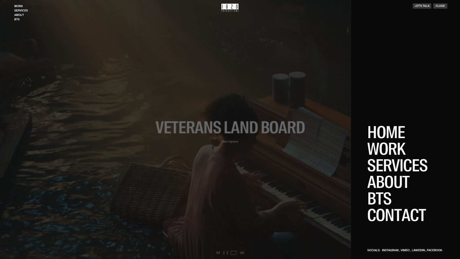
The 1820 Productions website, designed by Carter Ogunsola, features an above-the-fold section devoted largely to a looping video. Other elements are kept minimal, so the primary navigation menu is included twice. On the left are a few concise options in small white text, and on the right, a simple “Menu” button expands a panel with the same choices in a much larger font size. As a result, visitors aren’t likely to overlook the navigation, even while it stays out of the video's way.
2. The History of Jailhouse Lawyers
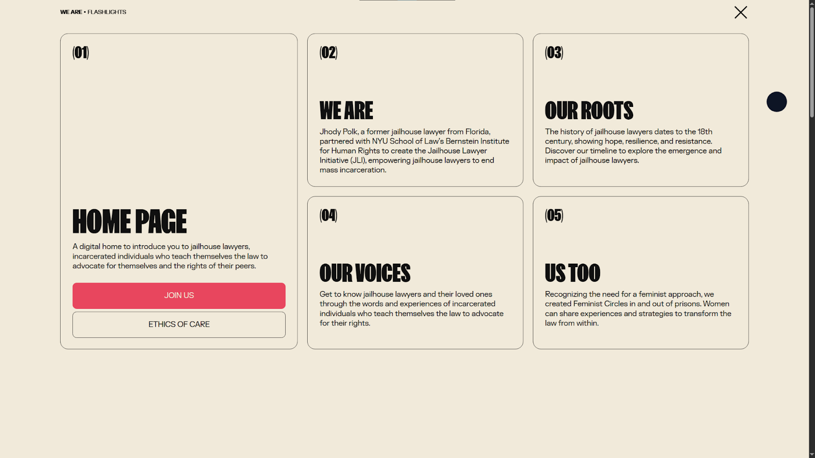
The History of Jailhouse Lawyers educates visitors about events that have contributed to mass incarcerations in the United States. There aren’t many pages on this site, but designer Tubik still opted for a mega menu, giving each topic plenty of room for a bold, attention grabbing font and a brief overview. This example shows how a navigation menu can go beyond function to present content in a way that encourages informed click-throughs.
3. Hofft
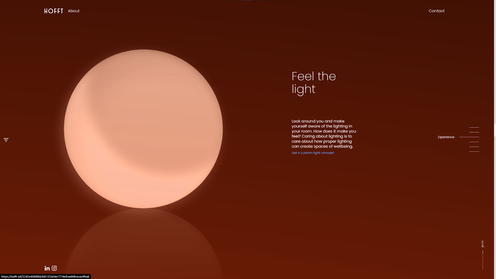
Hofft’s website, designed by Emil Villumsen, features three sticky navigation menus. On the left, a hamburger icon opens a side panel menu, while the navigation bar at the top offers the same options. Plus, there's an interactive sidebar on the right that helps visitors navigate the homepage's various sections. Keeping all these options sticky lets visitors move smoothly around this creative, non-traditional web design with minimal scrolling.
4. Raca Design Studio
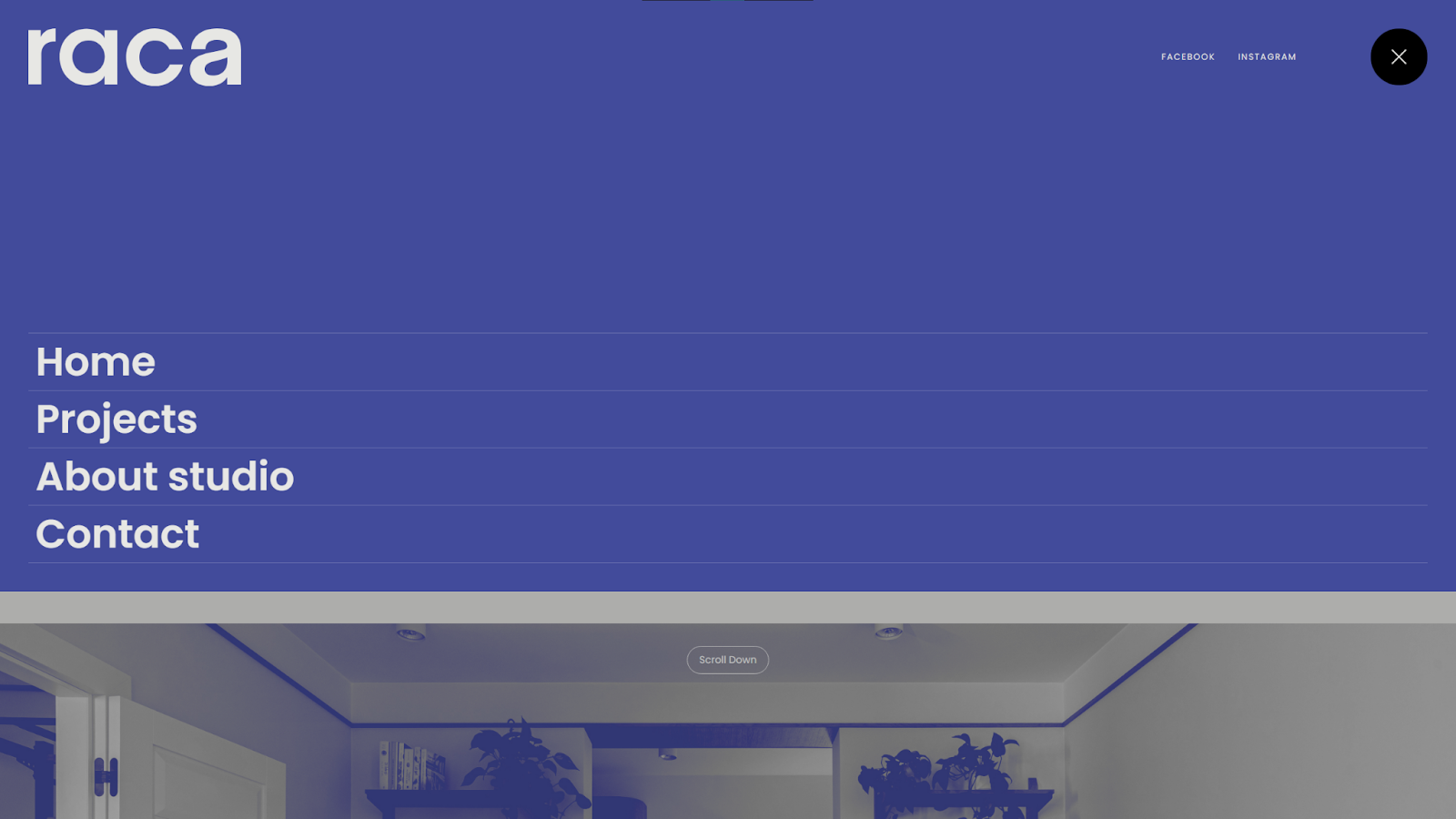
Raca Design Studio’s site, designed by Marcin Mikołajczyk, puts minimalism on full display with its two-tone color scheme and ample whitespace. The navigation follows that design style with a clean, modern font and more space than words. Hover animations add a touch of interactivity, but otherwise this is a simple, clear menu that gets out of the way so visitors find their intended destinations as fast as possible.
5. Holland Design
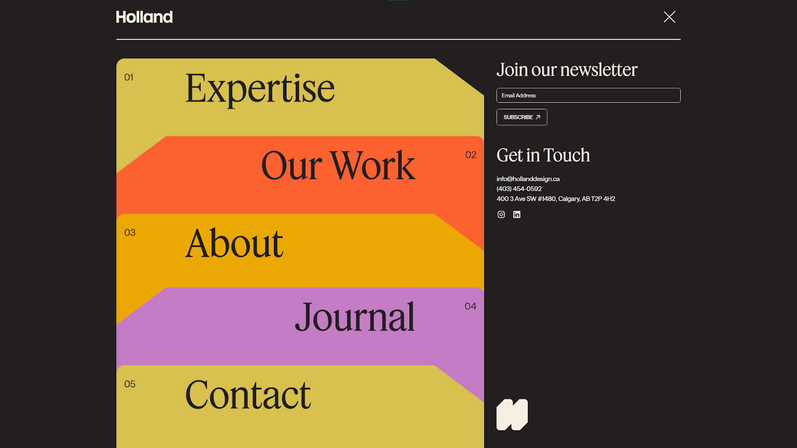
Holland Design uses a mobile-friendly single-column layout throughout the website, and its mega menu is no exception. The expandable navigation arranges all the site’s top-level categories into color-coded cards, embellished with subtle hover animations. Since the menu takes up the full screen, the designer also used the extra space to add a sign-up form and contact information, while keeping plenty of whitespace on either side to match the overall site design.

Startup website
This Webflow startup kit has everything you need including homepage variations, about pages, feature pages, and more.
6. Allies Studio
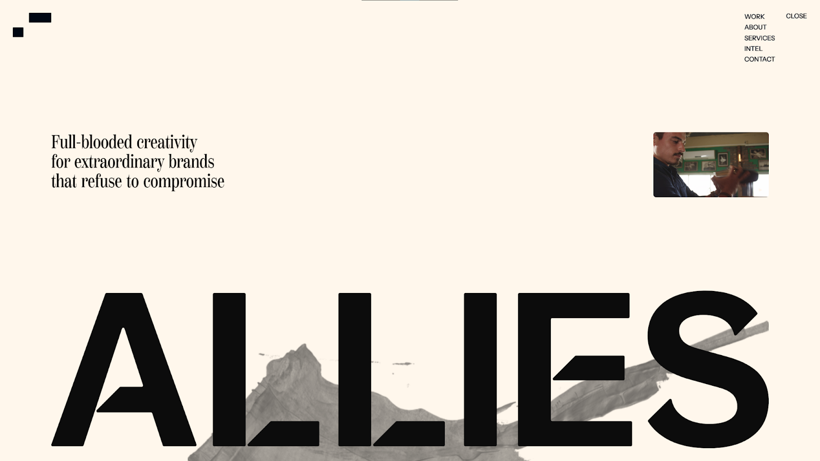
Allies Studio's site, created by Jomor Design, keeps visitors engaged with videos, parallax scrolling effects, and immersive animations. The one thing that remains predictable throughout this busy website is the sticky sidebar menu, which stays in the top-right corner and expands on hover. In such an avant-garde website design, this bit of predictability helps keep user experience accessible and encourages exploration.
7. Sui
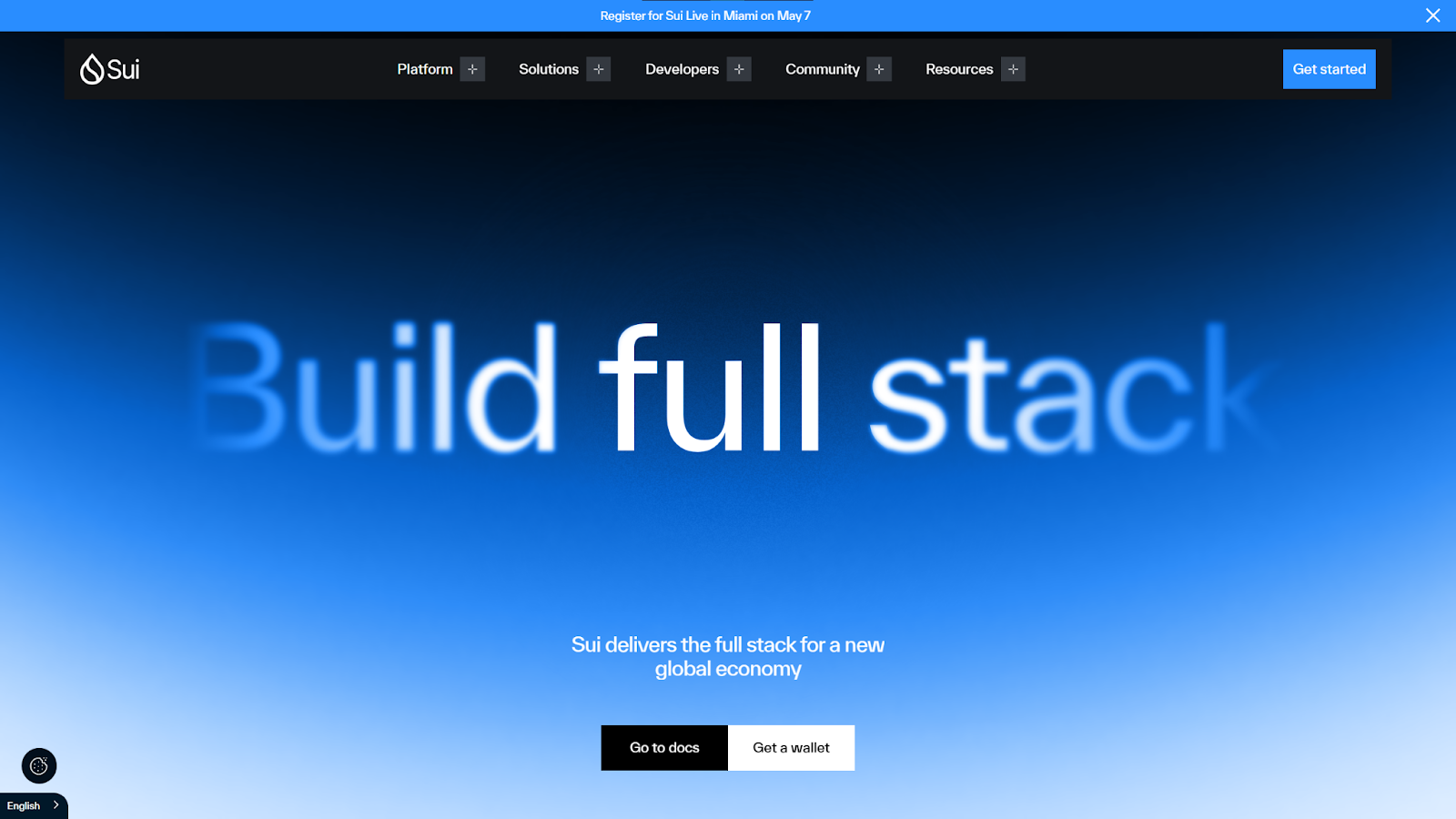
Sui is a blockchain developer with a lot of information to cover, so designer AKKA Studio opted for a top navigation bar with dropdown menus that group the many topics into clear categories. The menu is also sticky, so visitors are never far from the option to switch between subjects. This type of guided freedom helps when you have a highly complex product or service to promote or a design that relies on visitors moving frequently between pages.
8. Airtree
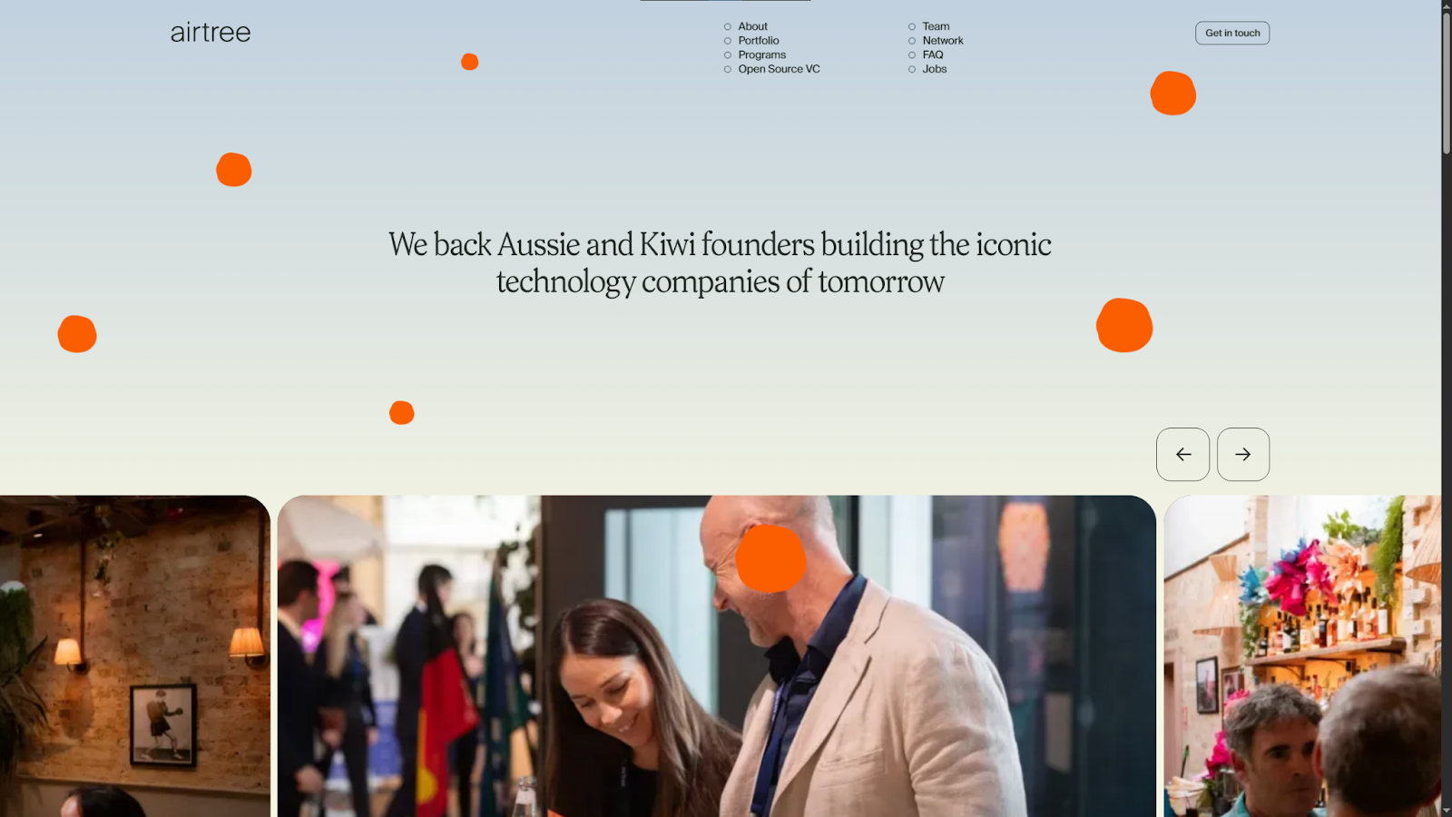
Airtree's site, designed by Sam Charpentier, mixes varied layouts while keeping the overall user experience straightforward. The navigation menu at the top of the page contributes to that effect, with pages arranged into two vertical columns — an unusual style that's still very clear and readable at a glance. This is a good example of how to get creative with something as basic as a navigation bar while maintaining strong usability.
9. OutThere
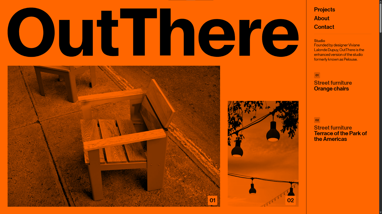
OutThere's website, designed by Xavier Cédric, lives up to its name with a distinct, eye-catching design. The red monochrome color palette washes everything out until you hover over an image to see it in full color. When you do that, the sticky sidebar menu on the right also highlights the relevant section. This keeps visitors oriented in an unexpected visual landscape, showing them where they're at on the page and how they can jump to more information about a specific image.
10. Coinsetters
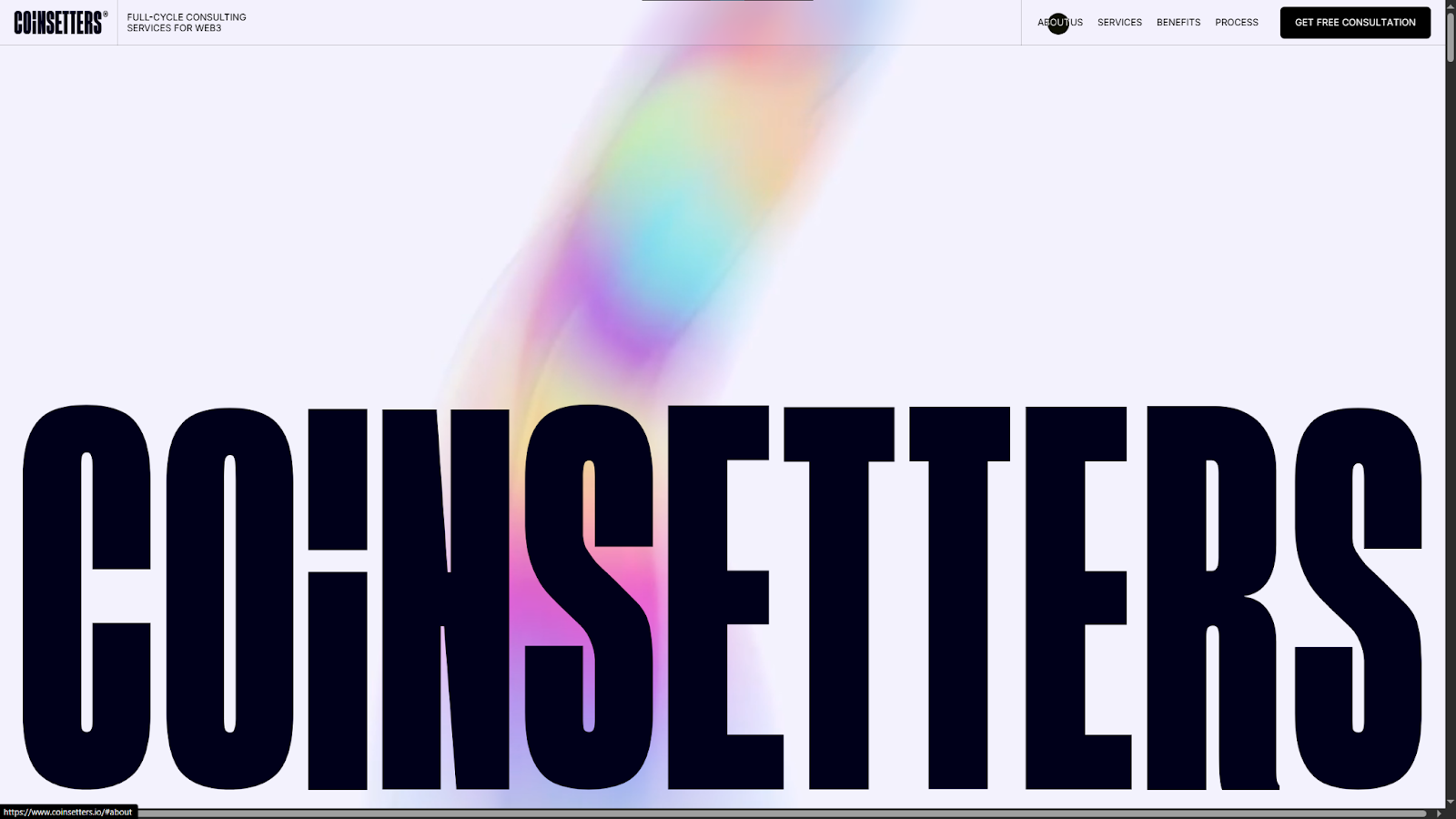
Coinsetters' site, designed by Qream, uses a bold, fullscreen layout and makes big promises about the business right from the start. The navigation menu is a sticky bar at the top of the page that organizes high-level categories such as About Us, Services, and Benefits. While other elements play with color, size, and motion, the menu stays approachable thanks to short words and basic fonts — although the hover animations add a creative touch that blends well with the rest of the site's design.
Best practices for an effective website menu
Website navigation menus vary wildly based on design style and client needs. However, the best designs consistently follow these practices:
- Keep navigation straightforward. Don't overdo it with animations and graphics; the text is the most important part, so avoid elements that might overshadow it or otherwise hinder usability.
- Prioritize mobile responsiveness. Start with your mobile design first, making sure the menu's layout is clear and readable on small screens.
- Incorporate visual cues. Use icons and subtle hover animations to draw visitors' attention to the interactable elements in your navigation.
- Keep the menu visible as users scroll. Sticky menus ensure that users are never more than a click or tap away from the next step in the user journey.
Design standout navigation menus with Webflow
As the examples above demonstrate, designing a navigation menu is a visual process. You need to see a menu on the page in order to fine-tune its hierarchy and interactions, and gauge how well it draws attention while meshing with the rest of the website's design.
To create highly effective navigation, use a website platform like Webflow — it shows your designs in real time, exactly as visitors will see them. Fully customizable page structures and reusable components give you lots of design flexibility, while interactions and animations let you build navigation that stands out and responds to user inputs.
Create unique, highly navigable pages with Webflow.
Build websites that get results.
Build visually, publish instantly, and scale safely and quickly. All with Webflow's agentic web marketing platform.