







A great menu welcomes visitors to your website and helps them understand everything it has to offer.
Standard navigation bars have their place, but they’re not always the best way to guide people through your site. When compared with basic drop-down choices, a mega menu gives visitors more context that guides them where they want to go.
For example, ecommerce websites often use mega menus to clearly organize dozens of product categories and hundreds of listings. SaaS companies rely on them to group product features and documentation. And on educational sites, mega menus help visitors find specific topics quickly, without forcing them to dig through multiple layers of navigation.
Read on to explore eight effective mega menu examples, and learn how various industries use this element to improve the user experience.
What’s a mega menu, and when should you use one?
A mega menu is an expanded navigation section that displays multiple links, categories, and/or page groupings in a large panel. This type of menu typically looks like a regular navigation bar at first. But when you click on or hover over that bar, a larger window opens to present a wide range of options.
Drop-down menus often work best for short lists of related pages. Hamburger menus (which are hidden until the user interacts with an icon) are great for minimalist and mobile-first designs. A mega menu gives you more room to organize navigation using columns, subcategories, images, and even short descriptions.
You may want to use a mega menu when you:
- Have many product or service categories
- Speak to multiple target audiences
- Want to highlight a lot of important pages
- Have a large content library
8 effective mega menu examples
The best way to understand the benefits of mega menus is to see them in action. With that in mind, let’s check out eight examples of this web design element.
- Webflow
- Giga Energy
- CLEAR
- tinyEmail
- BlogSync
- Onebrief
- Strive Pharmacy
- Turn.io
1. Webflow
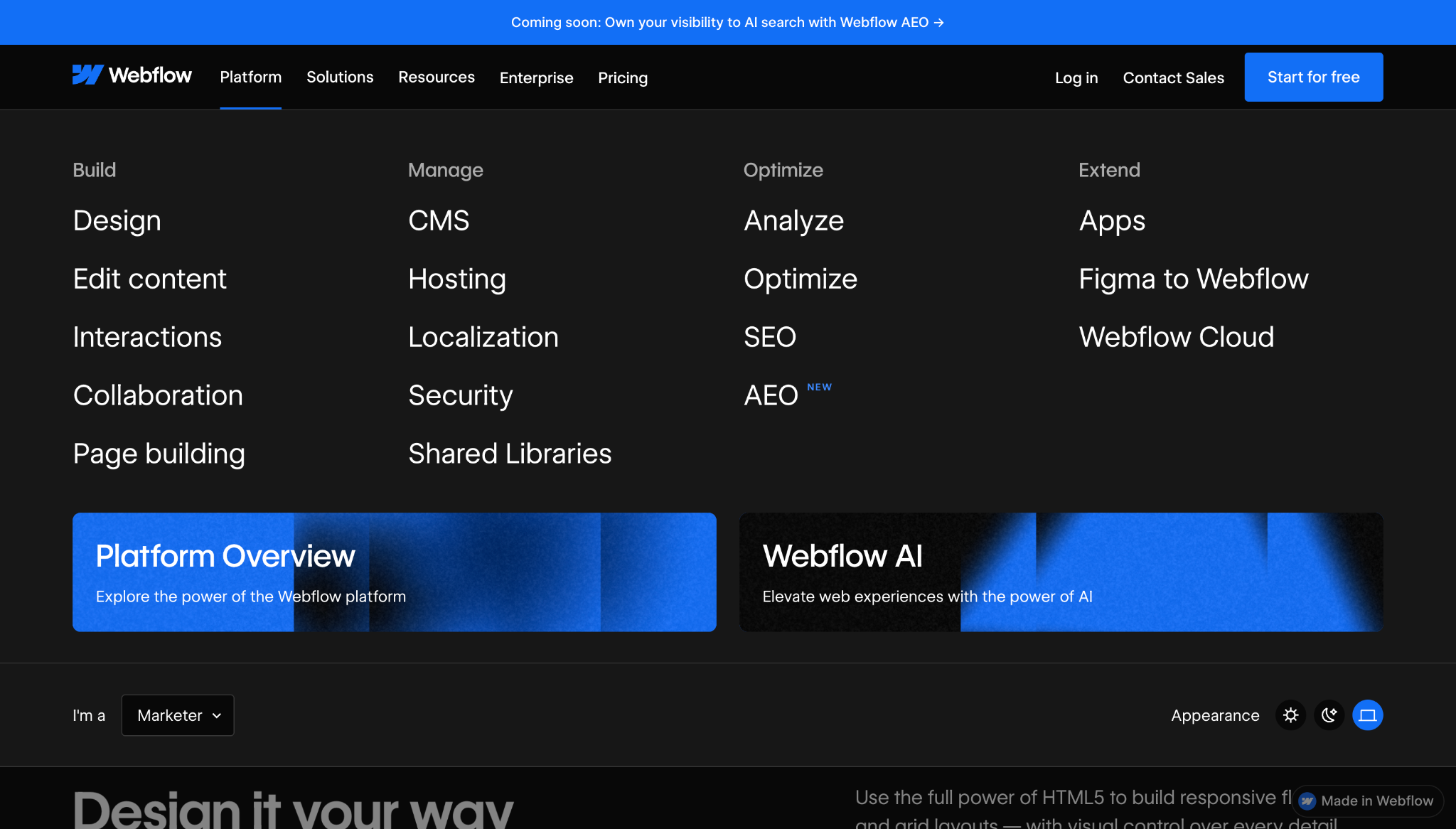
Webflow’s mega menu works like a miniature site map, organizing a large platform that offers multiple products and services. The “Platform” panel lists features and groups them by lifecycle, helping visitors understand how key product areas fit together so they can choose the right pages. Then the “Solutions” section reframes features in terms of audience needs, such as “Marketing” and “Engineering.”
To give people more agency over their experiences, this mega menu also includes a role selector and appearance widgets. This brings better accessibility to the navigation while helping different people find the right product fit. When a site serves many audiences, a mega menu helps visitors reframe the user experience around their roles and browsing needs.
2. Giga Energy
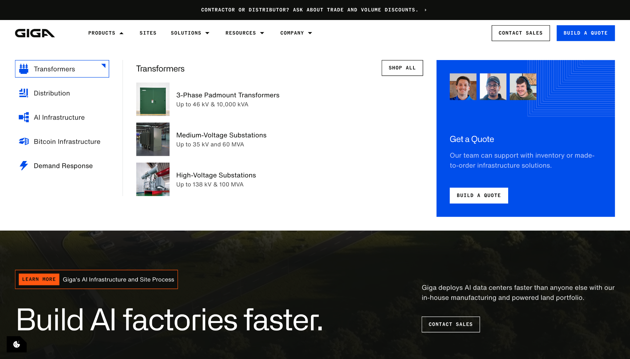
Giga Energy’s mega menu gives each navigation submenu a layout that matches its user intent:
- “Products” has a left-hand category list with icons, which reveal product links with thumbnail images and specifications.
- “Solutions” features industry cards and a large customer story module, helping visitors browse by use case instead of product type.
- “Resources” uses visuals to showcase recent blog posts, along with a “View all” path for those who want to read more.
This categorization offers a big-picture view, so users can understand the site’s structure. In addition, the sharp blue accents and angular card shapes reinforce the brand’s identity without compromising scannability.
3. CLEAR
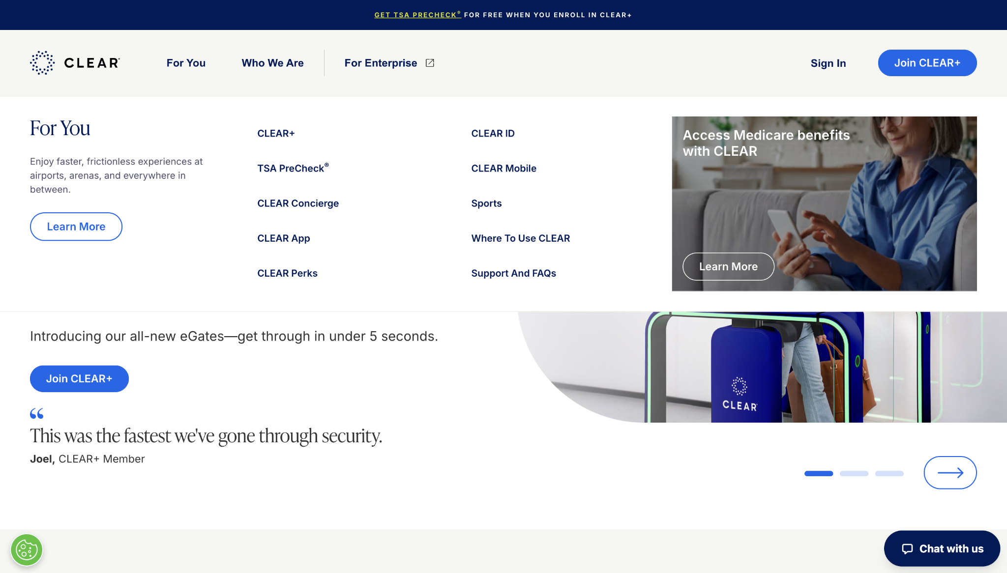
CLEAR’s mega menu separates the website into three decision paths:
- “For You”
- “Who We Are”
- “For Enterprise”
By breaking down the site’s structure, the menu lets visitors self-sort and explore what matters to them right away. These options take a narrative approach to explaining the company’s platform, which is useful for people who arrive without knowing the difference between CLEAR+, TSA PreCheck, CLEAR ID, and the CLEAR app.
The menu’s large panel also gives each option room to breathe. This whitespace keeps the navigation readable and approachable, avoiding the overwhelm that a long, tight list of links can create.
4. tinyEmail
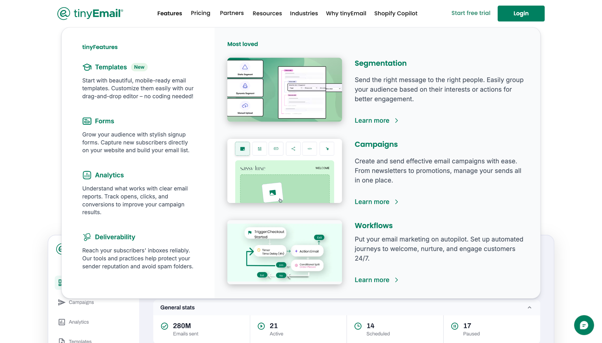
tinyEmail’s mega menu is a useful product primer for visitors who don’t know which email marketing feature they need. Instead of giving every page equal weight, the menu groups content around recognizable tasks like:
- Building emails
- Capturing subscribers
- Tracking performance
- Improving deliverability
- Automating campaigns
- Migrating from another platform
This approach turns the central navigation into a comparison tool, letting users quickly scan for capabilities and outcomes in one place. Then, the smaller “Resources” and “Industries” submenus shift focus from product education to task-based support and audience fit, guiding each visitor closer to the right tool for their needs.

Get started for free
Create custom, scalable websites — without writing code. Start building in Webflow.
5. BlogSync
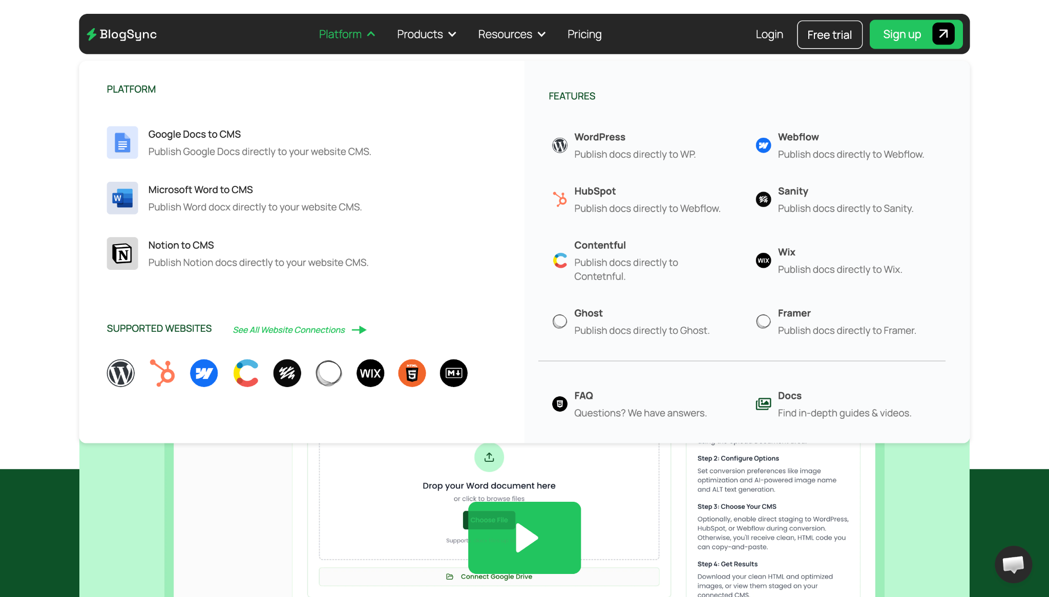
BlogSync’s navigation breaks an integration-heavy workflow product down into more digestible pieces. The “Platform” panel quickly answers two practical questions visitors might have: “What can I publish from, and where can I publish to?”
Source tools, such as Google Docs, Microsoft Word, and Notion, sit beside CMS destinations like Webflow and HubSpot, so users can quickly confirm compatibility with their favorite platforms. And the “Products” submenu uses larger cards to preview the company’s tools, helping people visualize how each one fits into the overall product workflow.
6. Onebrief
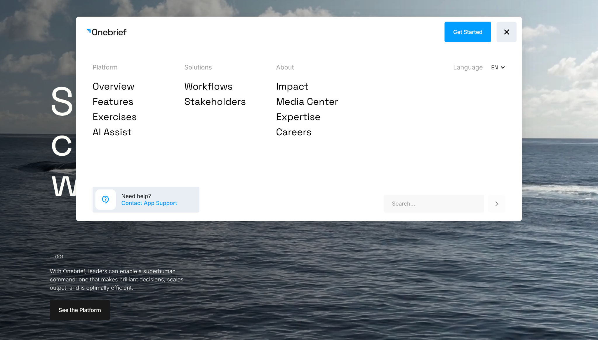
Onebrief’s mega menu provides a high-level overview of a specialized product, without bringing in military or enterprise tech jargon too early. The main navigation groups — “Platforms,” “Solutions,” and “About” — keep the first decision point broad. After that, organized links to subpages like “Features” and “Workflows” transition visitors to more specific information.
This mega menu also includes a “Get Started” call-to-action button and a link to app support, so current customers and leads further along the sales funnel can find what they want fast. In B2B ecommerce, prospects often arrive with many different needs, and Onebrief’s menu structure provides for its large audience well.
7. Strive Pharmacy
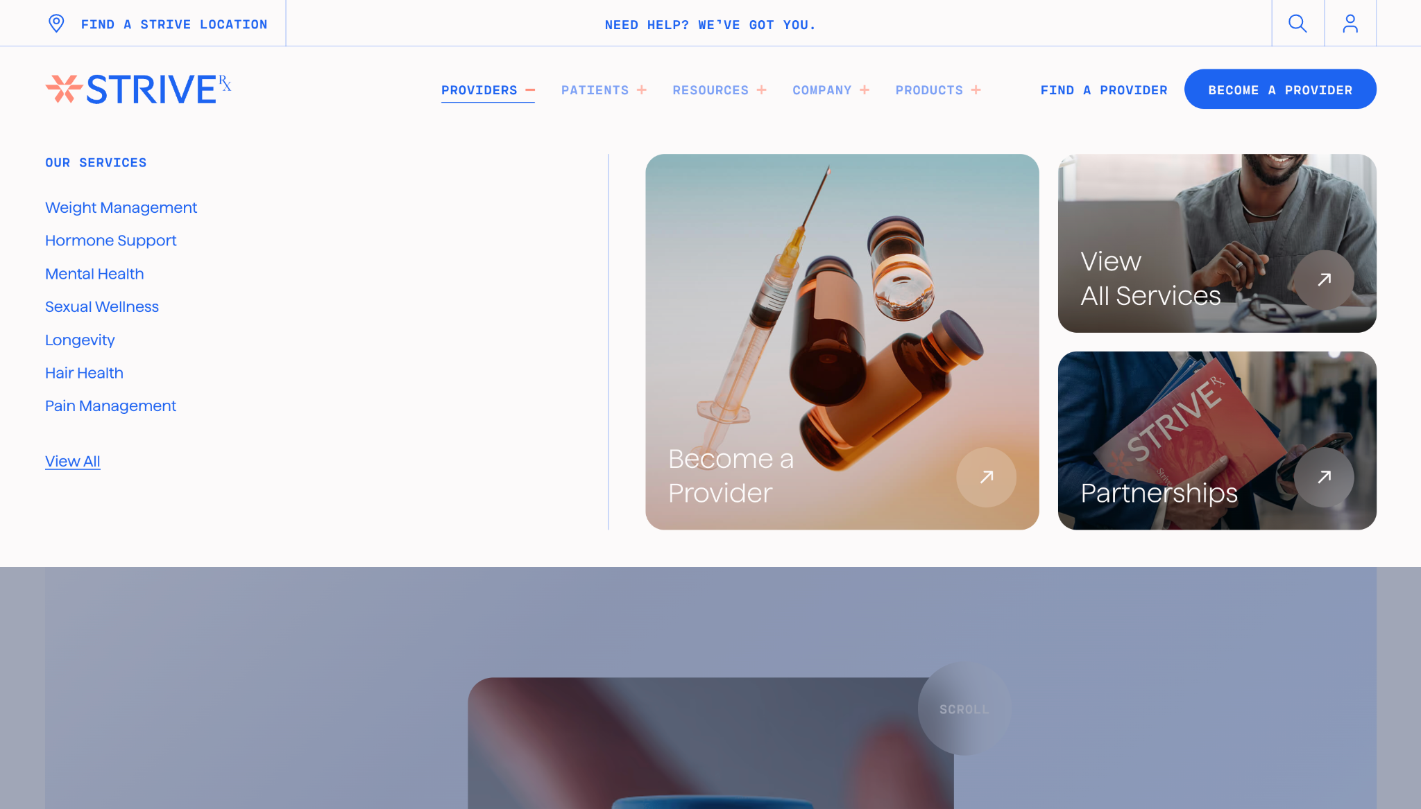
Strive Pharmacy’s navigation is built around the different reasons someone might visit a pharmacy website, such as:
- Finding a provider
- Refilling a prescription
- Exploring services
- Reading health-related guides
- Buying products
Some visitors know what service they want, while others need a provider’s help or an educational resource to find the best fit. So Strive Pharmacy's navigation doesn’t rely on a one-size-fits-all services page. Instead, large thumbnails separate ‘information’ paths from ‘action’ paths, so everyone can find their natural next step.
8. Turn.io
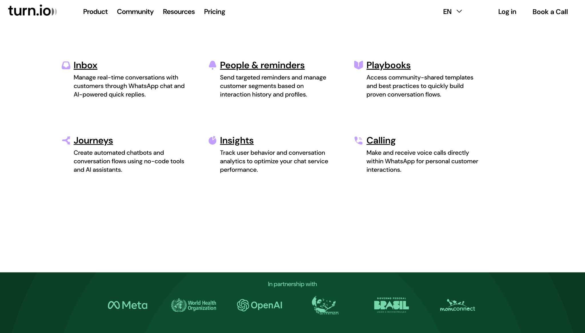
Turn.io’s mega menu has navigation labels that don't lead with abstract language or technicalities. Instead, the labels name what people can manage with this tool, such as inboxes, reminders, insights, and calls. These familiar terms help visitors connect the product’s features to practical workflows, such as appointment follow-ups and patient conversations.
Visually, the mega menu’s nearly full-page white overlay temporarily obscures the dark green header design. This creates a focused browsing experience and directs attention to content rather than style.
Best practices for great mega menu design
Now that you’ve seen what you can accomplish, follow these tips to get the most from your mega menu.
Make navigation clear
When a menu is straightforward to scan and use, people are less likely to get lost or abandon the site. Focus on making important paths highly visible, rather than highlighting your entire sitemap at once.
To do that, group page links based on how visitors might think, using high-level categories like:
- Products
- Services
- Industries
- Roles
- Resources
Labels should be in plain language, with consistent category names. If two links sound similar, explain the difference using a short description or remove one option from the menu.
Keep the menu mobile-friendly
A mega menu that works well on desktop won’t automatically function the same way on a smaller screen. To avoid clutter, you may need to reconsider large panels, hover states, multi-column layouts, and image cards.
For the mobile version of your site, consider turning the menu into a tap-friendly accordion or layered navigation system. Group related links under labels, and use large touch targets so people don’t have to zoom or scroll sideways to read content. If the desktop version has hover interactions, make sure that functionality works smoothly through taps.
Optimize for accessibility
Like any website element, your mega menus should work for people who navigate with a mouse and keyboard or assistive technology. That means you need logical tab orders and predictable open-and-close behavior.
For example, don’t make hover interactions the only way to access navigation. People should be able to open the menu with a click or keyboard command, move through links in a logical order, and close the menu without losing their place on the site. Descriptive labels are also key, because they help screen readers understand link destinations.
Guide visitors smoothly through your site with Webflow
An effective mega menu makes even a large site feel navigable within seconds. Clear categorization and straightforward labels put visitors at ease, so they can enjoy exploration and avoid frustration. To achieve that effect, make sure to design navigation from the user’s perspective, organizing options around common questions and pain points.
Once you have your menu planned out, you can use Webflow’s interactions to design hover states, click reveals, drop-down behaviors, and animated transitions that make your mega menu feel responsive. You can also structure your menu with visual layout controls, and explore Webflow’s templates for a quick start.
See how Webflow helps you build interactive navigation that drives on-site engagement.

Bridging the design to development gap
Learn best practices for integrating the workflows between design and development in this free webinar.