

Enhancement
Layout & design
Drop shadow filters
Add depth and dimension to designs using the drop-shadow() CSS function, now available as an effect in the Style panel.
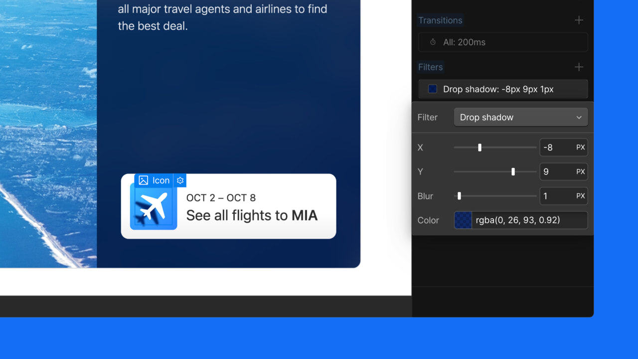
We’re excited to announce the addition of drop shadows to the Style panel, giving you more control over the depth and dimension of your designs without the need for custom CSS.
Add drop shadows with ease
You can now apply and customize drop shadows directly from the Style panel > Effects > Filters. This CSS function allows you to create shadows that conform to the shape of your elements, perfect for images, complex shapes, and more.
Why drop shadows?
Unlike box shadows, drop shadows follow the exact contours of your elements. This means:
- Perfect shadows for transparent images and logos
- Realistic depth effects for irregularly shaped elements
- More natural-looking emphasis for your design components
Customize drop shadows
The new drop shadow filter includes a few properties you can control to get your effect looking just right:
- X and Y offsets: control the position of your shadow
- Blur: adjust the softness of the shadow's edges
- Color: choose your shadow color and opacity with the color picker
Adjust across breakpoints
You can adjust your drop shadow settings at different breakpoints to ensure your design looks great on all devices.
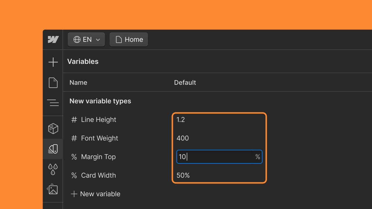
Animate with variables
To animate a drop shadow:
- In the Style panel, bind variables to the filter’s properties: x and y offsets, blur, and color.
- In the Interactions panel, create a new animation that includes a “Set variable value” action, and update your drop shadow variables accordingly. This creates a smooth, dynamic drop shadow animation!
Try out drop shadows today
We're thrilled to bring this highly requested feature to the Webflow Designer. Whether you're highlighting a product image, adding depth to a button, or creating a subtle lift effect for text, drop shadows offer a new level of polish to your designs.
Ready to add some depth to your project? Head to the Webflow Designer and start experimenting with drop shadows today!
Related updates


Get started for free
Try Webflow for as long as you like with our free Starter plan. Purchase a paid Site plan to publish, host, and unlock additional features.
Try Webflow for as long as you like with our free Starter plan. Purchase a paid Site plan to publish, host, and unlock additional features.