
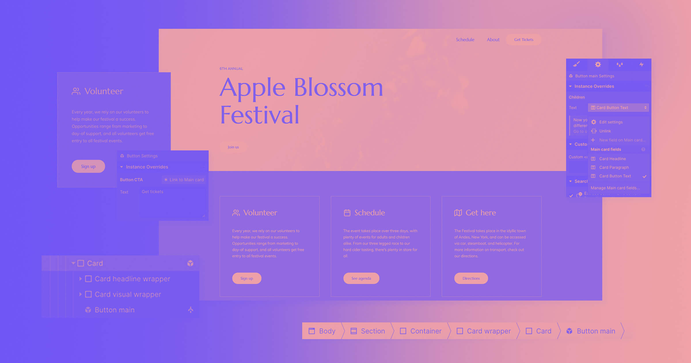
As laptops and external monitors keep getting bigger, Webflow’s keeping up with the times by adding not one, not two, but three new large breakpoints at 1280px, 1440px, and 1920px.
Last Updated
September 5, 2025
Category

Now you can customize your designs for larger screens with new device breakpoints at 1280px, 1440px, and 1920px.
Subscribe now for best practices, research reports, and more.
You are now subscribed.
As laptops and external monitors keep getting bigger, Webflow’s keeping up with the times by adding not one, not two, but three new large breakpoints at 1280px, 1440px, and 1920px.

What we've been shipping: April - June 2020
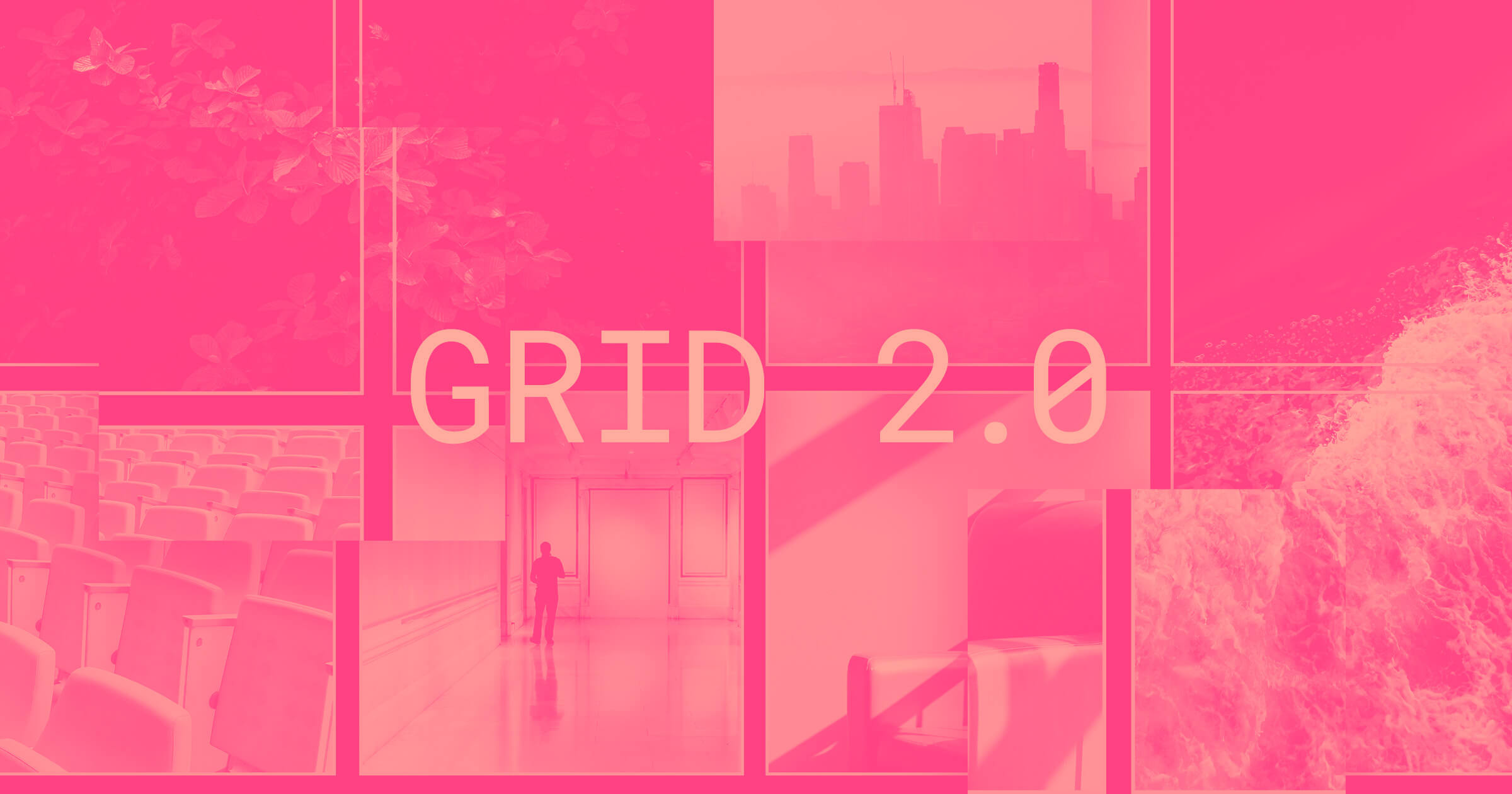
CSS grid: release 2.0

Reuse grid layouts more easily with grid template areas
Responsive web design best practices and examples [2025 guide]
7 websites with inspiring typography
Nested symbols: Evolving reusability and maintainability in Webflow
Try Webflow for as long as you like with our free Starter plan. Purchase a paid Site plan to publish, host, and unlock additional features.
Try Webflow for as long as you like with our free Starter plan. Purchase a paid Site plan to publish, host, and unlock additional features.


