

Great healthcare websites do more than tell you your lab results and what insurance they accept.
When it comes to effective healthcare web design, an empathetic atmosphere invites deeper exploration. Every detail counts: Clear design elements and well-organized content can establish your client as an authority in their field.
Web designers with healthcare clients will need an informed approach that considers visitors as patients. Read on to explore 10 healthcare web design examples that help visitors feel confident enough to reach out.
10 thoughtful health and wellness website design examples
User experience (UX) essentials (such as intuitive navigation, built-in functionality like patient portals, and clear calls to action [CTAs]) make a big difference between strong medical websites and ones that don’t win over new clients.
The following 10 healthcare websites nail site-design fundamentals while also expressing unique brand identities.
1. Goodall-Witcher Healthcare
2. The Children’s Practice
3. Zealthy
4. Function Health
5. TheraHive
6. Deia Health
7. Hospitalia
8. Heva Health
9. MyHealthPrac
10. Tend Health
1. Goodall-Witcher Healthcare
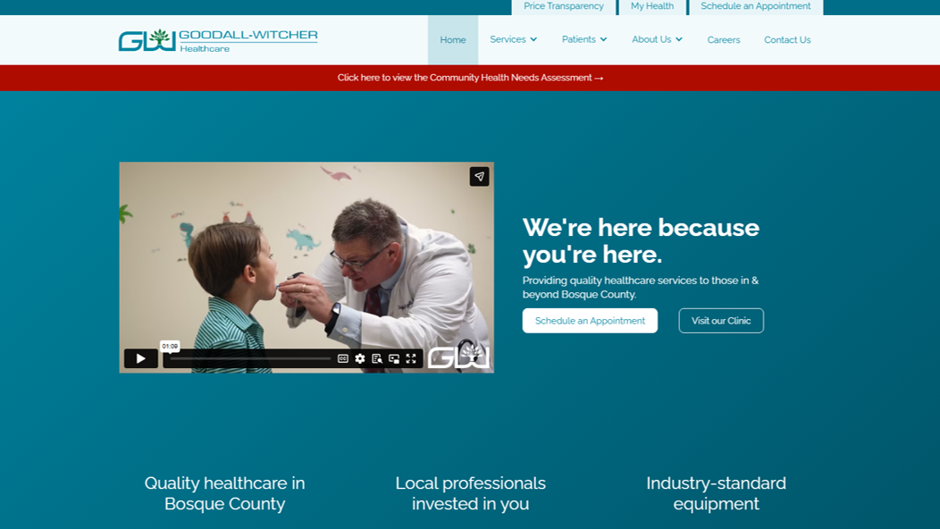
Goodall-Witcher Healthcare provides everything from emergency and surgical care to outpatient services for its rural Texas community. Its website delivers a patient-centric visitor journey: Pages load quickly, and efficient content organization without complex page structures or distracting animations enable visitors to find what they need within a click or two, regardless of their technical know-how.
The patient portal and appointment scheduling options are clearly labelled above the drop-down menu in the header, giving patients immediate access to the tools they’ll use most. Goodall-Witcher Healthcare’s overall patient-centric perspective is backed up with a link to a community health needs assessment the organization performed in 2024, so prospective patients know their actual care needs are front and center.
2. The Children’s Practice
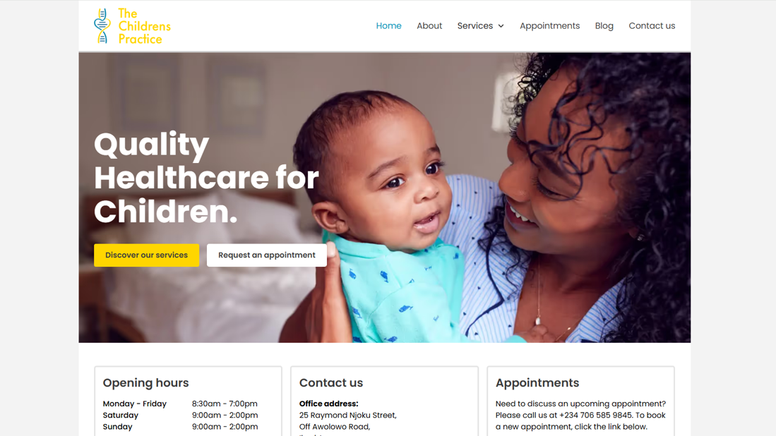
Warm yellow accent colors, pictures of smiling adults and babies, and clear booking information nestled in boxes around those images tell parents exactly who The Children’s Practice serves. This website delivers clear CTAs and a layout that immediately gives busy parents the information they need most, so parents don’t have to waste time searching for instructions on making an appointment.
The “About” page especially stands out. Simple animations, like five stars dropping in to top a glowing review as you scroll, bring the content to life. The page connects key statistics, testimonials, and photos of the clinic itself for a dynamic experience that builds the trust necessary for a parent to reach out.
3. Zealthy
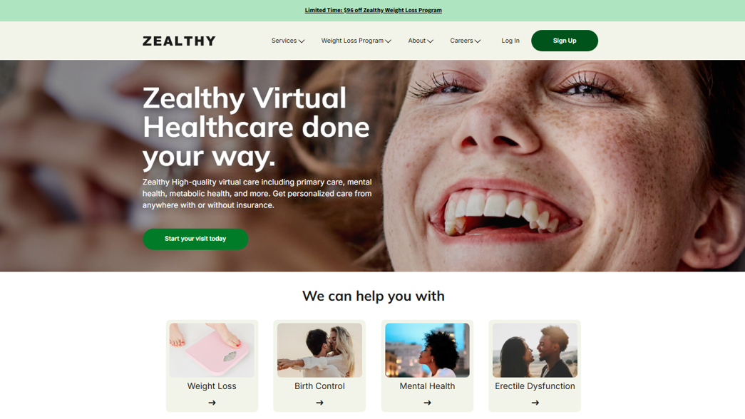
Zealthy is an online healthcare system that offers virtual visits, prescriptions, and ongoing treatment for a short list of concerns (e.g., male pattern baldness and insomnia). Since virtual-only on-demand practices are a relatively new model, Zealthy’s homepage quickly makes its value proposition very clear. Above the fold, it explains what the service is and who it's for (patients who may not have insurance but have a common problem they need help with as soon as possible). CTAs prompt visitors to sign up and start their visit.
Zealthy’s website breaks down its major offerings into two horizontal rows of easy-to-scan image and brief text pairs, and follows them with a four-step “How it works” explanation. With a clean, patient-centric, and easy-to-navigate design, Zealthy sets the bar for telehealth sites.
4. Function Health
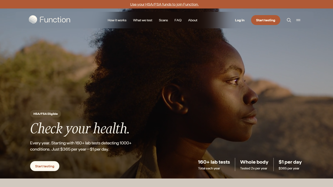
Function Health specializes in functional medicine and comprehensive testing, and its website design uses that scientific background to its advantage. Animated graphs and charts are heavily simplified to make complex information dynamic and digestible while establishing authority, and a consistent color palette subconsciously links all the data.
UX and human-centered design play a big role on the “What we test” page. Here, visitors can filter by body part or condition to read through all of Function Health’s 160+ testing options, including how to pronounce complex terminology and how it could be impacting their daily health. The overall aesthetic creates a modern, professional experience that helps potential customers understand Function Health’s evidence-based brand.
5. TheraHive
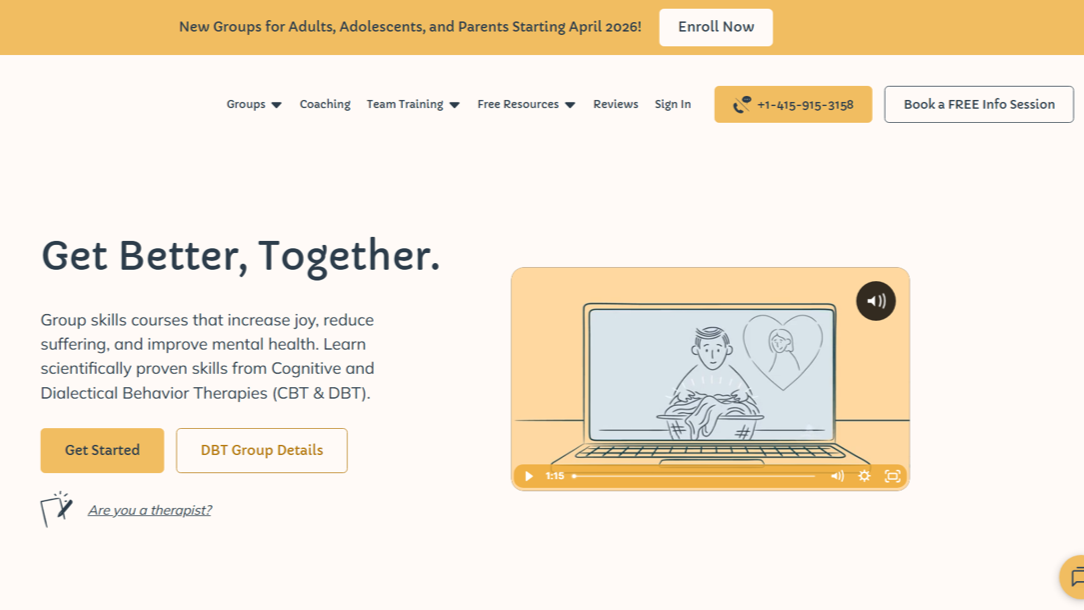
TheraHive uses a gentle honey yellow color palette and rounded sans serif font family to make its mental health care feel approachable. Simple, charming line drawings scattered throughout add an additional layer of warmth, making the UX personal rather than clinical. Putting all the information a prospective patient needs on the homepage alongside the friendly visual design keeps a very direct connection to prospective patients when they need empathetic human connection most.
While having that much information on one page can get overwhelming, a sticky nav bar helps visitors find their way from anywhere on the site. And TheraHive’s extensive mental health information educates visitors, establishing its authority and building trust.
6. Deia Health
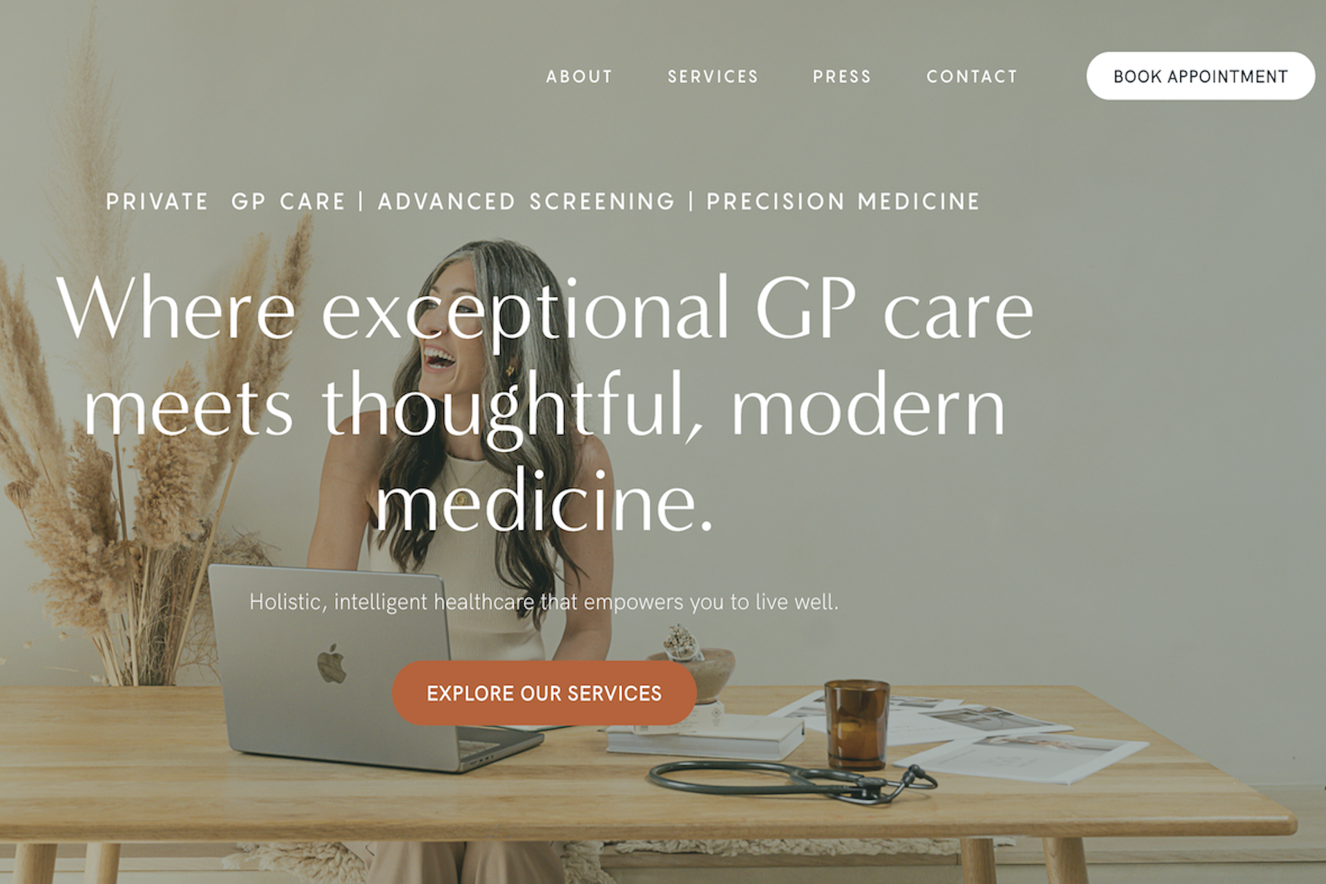
Source: Deia Health
Deia Health’s website fits actionable CTAs into almost every visually differentiated section of the homepage, but it never feels heavy-handed. Rather, the section-ending CTA bubbles are a natural continuation of the content, guiding visitors to book sessions with ease.
Outside of all the useful information on the homepage, a highly personal “About” page acquaints readers with Deia Health’s staff. It features artistic staff photos and detailed bios to create a sense of familiarity before potential clients reach out. For visitors who want to build a strong relationship with their provider, this section’s personality and transparency can tip the scales in Deia Health’s favor.

Get started for free
Create custom, scalable websites — without writing code. Start building in Webflow.
7. Hospitalia
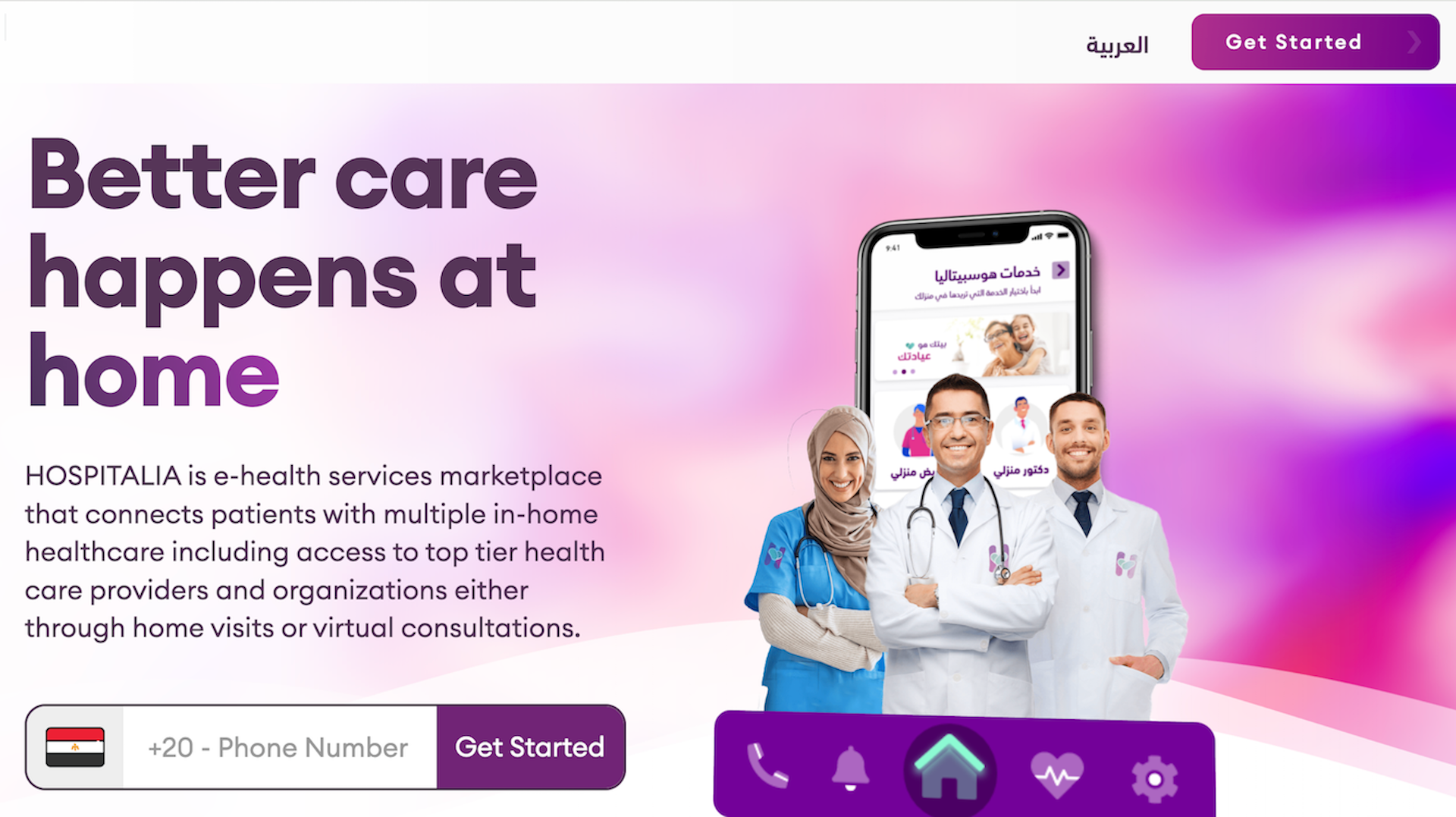
Hospitalia's homepage immediately offers helpful guidance for patients in need. It leads with a step-by-step how-to guide on their unique virtual-forward process, from booking and matching with providers to in-home visits and follow-up care.
Hospitalia is based in Egypt and readily addresses site visitors who speak English and Arabic. There's a toggle in the upper right-hand corner to flip the page's main language between the two, and customer testimonials are available in both languages. This shows potential patients that this center is ready to listen to and understand their needs.
8. Heva Health
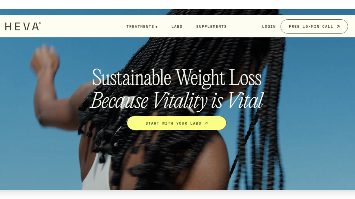
Like Zealthy, Heva Health offers virtual appointments that cover simple health concerns, with an exclusive membership-based approach. Its website reflects the brand's upscale perspective on personal health.
The site design feels polished, with refined serif fonts, crisp images, and subtle animations that shift text or fill bubbles with colors as you scroll. Meanwhile, clear top-level navigation ensures visitors can find the services and resources they need. It's a strong example of healthcare web design that feels sophisticated while keeping usability and UX top of mind.
9. MyHealthPrac
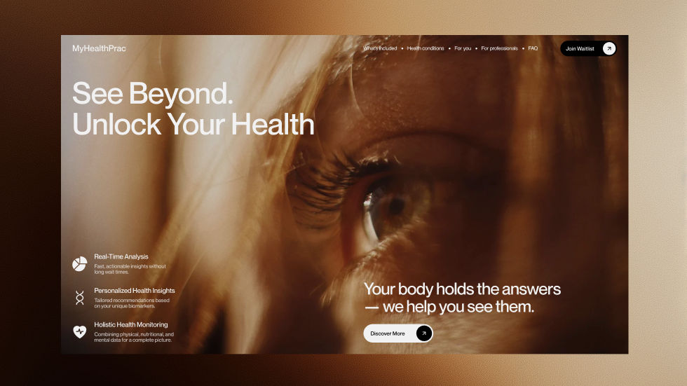
Open MyHealthPrac's homepage and you're met with a striking looped close-up of a blinking eye. It's unexpected and memorable, and ties in neatly with the company's "See beyond." tagline. The site's design, addresses both patients and practitioners who could be interested in joining the team. But thanks to its well-organized information architecture and clear hierarchy, visitors can drill into specific services or explore broad topics without losing their bearings.
10. Tend Health
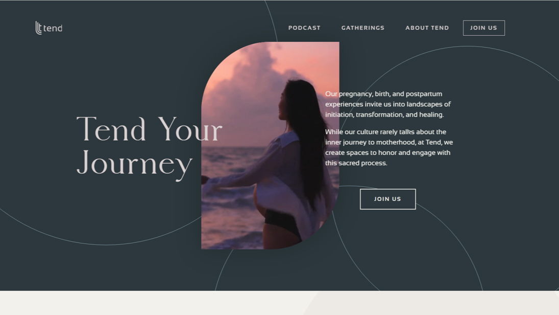
Tend Health centers on the "sacred process" of pregnancy, birth, and postpartum experiences — and the site's imagery and typography immediately reflect that intimate focus. The business's community-first approach also stands out behind every design choice.
The site highlights gatherings for expecting parents, shared experiences, and group support in a way that feels more like a personal invitation to connect than a clinical interaction. With glossy photography and warm, gentle language, this site offers the authoritative trust that nervous new and expecting parents are looking for.
Building a healthcare website: The essentials
The 10 examples above show stellar healthcare web design in practice, but behind every standout site is a shared set of principles that make it work. Here are the fundamentals behind effective medical websites.
Intuitive navigation and information architecture
The site should be easy to navigate so visitors don't have to click through multiple pages to locate a provider or access a patient portal. A clear hierarchy and logical page groups based on topic or function keep visitors well-oriented. For inspiration, check out sites from major medical organizations like the Mayo Clinic, which uses intuitive navigation broken down by audience and purpose to house a large cache of content.
Performance and load times
A slow site eats away at the UX. When pages don't load in a few seconds, visitors are very likely to bounce. Compress images, minimize asset size bloat, and regularly test performance to ensure pages load quickly across all kinds of devices and connection speeds.
HIPAA-compliant security
If the site handles any patient data, including patient-provider instant messages, HIPAA compliance is mandatory. You'll need encrypted data transmission, proper asset controls, and a secure hosting platform to start. Building it on a platform like Webflow, which offers enterprise-grade security and compliance with HIPAA and other major regulators baked in, can save you and your clients significant headaches down the road.
Visible and actionable CTAs
CTAs make the visitor's next step obvious, so keep them clearly worded and easy to tap or click on any device. Sprinkle them throughout the site when it's time to take the next step, like moving from learning about the providers to booking an initial appointment. Incorporate them into a few consistent locations, like a sticky header or footer, to help visitors find them when they come back to the site.
Accessibility and inclusivity
Designing for accessibility means staying compliant with Web Content Accessibility Guidelines (WCAG). Aside from helping your SEO strategy, inclusive design tells visitors the practice isn't just for people who are fully able-bodied (which is especially important in the healthcare industry).
Responsive, mobile-first design
Since mobile devices account for over 60% of total web traffic, many patients are likely accessing healthcare sites from their smartphones or tablets. A responsive, mobile-first approach ensures the site is easy to access on any device, so content stays readable and every part of your design shows up exactly where you want it.
Functionality
Today's patients expect medical websites to act as self-service hubs, where they can view test results, schedule appointments, and communicate with their doctor from home. Organizations like Northwestern Medicine deliver with an abundance of homepage links to relevant, actionable content and a robust patient portal.
Build a robust healthcare website with Webflow
Visitors rely on healthcare providers' sites to make informed decisions that affect the rest of their lives, whether they're learning more about a new diagnosis or making a change for their mental well-being. The key is to design with clarity and empathy so they feel empowered to move forward with your client with confidence.
To make everything on the site as polished and professional as possible, you need a platform that helps you get it right consistently. Webflow can help you create fully customizable page structures with advanced styling for every healthcare need. Plus, our enterprise-grade security and HIPAA compliance give everyone peace of mind.
Ready to build a better healthcare site? Get started with Webflow today.
Get our 100 video course on web design — for free
From the fundamentals to advanced topics — learn how to build sites in Webflow and become the designer you always wanted to be.