








Great ecommerce store designs help visitors and search engines alike understand products quickly.
The best way to build a conversion-generating online store is to learn what strong ecommerce website design looks like in practice. Once you see how successful brands personalize and optimize shopping experiences, you can take the same principles and apply them to your site.
For instance, effective ecommerce stores help potential buyers find what they need quickly via clear navigation that speaks directly to common pain points. And on the technical side, websites can optimize for AI search to get in front of more relevant consumers.
In this guide, we’ll look at 10 ecommerce website examples from different industries. We’ll explore how layouts, visuals, and copy work together to create sales-centric experiences that build trust with customers and encourage them to buy.
- TileHaus: Organize products according to how customers shop
- VALR: Highlight and explain your USP
- Clicks: Show how your product improves everyday experiences
- 221 Cafe: Leverage your brand story for persuasion
- L’intendance: Simplify complex processes with visuals
- Darkroom: Highlight practical details to instill trust
- Solid X: Use hard numbers to support your solutions
- Mike’s Camera: Organize your site for each buyer path
- Sandbar: Mention the problem you solve before the tech
- Infinite Machine: Go in-depth for premium products
1. TileHaus: Organize products according to how customers shop
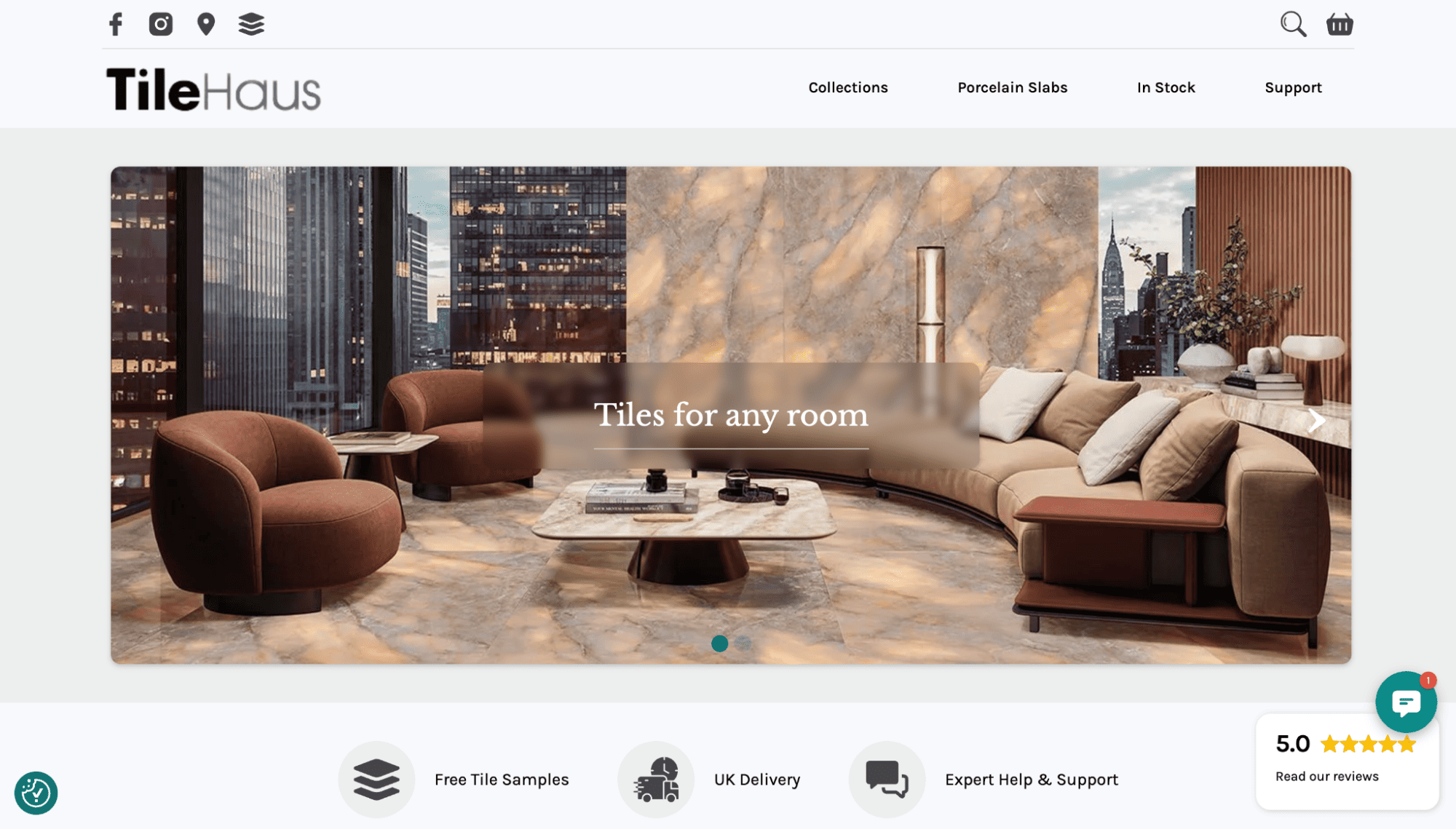
What the brand sells. TileHaus sells luxury porcelain and ceramic wall and floor tiles.
Why the website works. Instead of focusing on product names, TileHaus’ site lets you explore tiles based on immediately understandable criteria like color, finish, size, and slip rating. This helps human visitors find the products they want fast, and enables AI tools to pull key details so they can show items to the right searchers.
While browsing, you can also choose between marble, wood, and concrete. These filters narrow down the options through an almost sensory experience, helping you visualize the tiles. TileHaus also reduces online shopping hesitation by prominently offering sample orders, letting you compare tiles at home before committing to a purchase.
Key takeaway. Organize your products around the way customers shop and the features that matter most to them.
2. VALR: Highlight and explain your USP
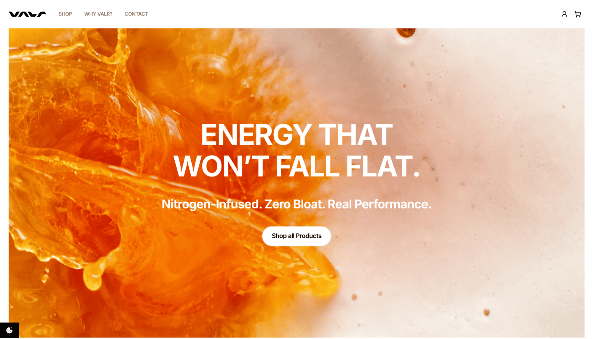
What it sells. VALR sells nitrogen-infused energy drinks and variety packs.
Why the website works. ‘Nitrogen-infused’ could sound like a marketing gimmick to the average consumer. So VALR’s website connects the concept to a relatable effect, explaining how these energy drinks avoid the bloated sensation you might feel after having a carbonated beverage. This explanation quickly shows why the product exists and how it separates itself from other options on the market.
The site backs its claims up with science, sharing details about ingredients and research studies. But it also pulls in emotion through benefit-led sections and customer testimonials, building confidence in the product.
Key takeaway. If your product has a unique feature, explain what makes it different, tell visitors how that impacts them, and share social proof from real buyers.
3. Clicks: Show how your product improves everyday experiences
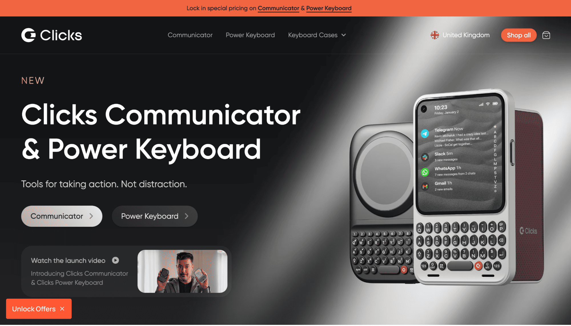
What it sells. Clicks sells physical keyboard cases for smartphones.
Why the website works. Clicks takes a throwback concept and makes it feel modern, without relying too heavily on nostalgia. Text and visuals illustrate how a physical keyboard isn’t just a gimmick, but can improve phone usability through more screen space and fewer distractions, plus tactical buttons for quick shortcuts.
The site’s shopping experience keeps device compatibility front and center. You can immediately browse by brand to find a Clicks case that works with your phone, offering a clear path to conversion
Key takeaway. If your product is niche or unfamiliar, show how it fits into and improves your customers’ everyday experiences.
4. 211 Cafe: Leverage your brand story for persuasion
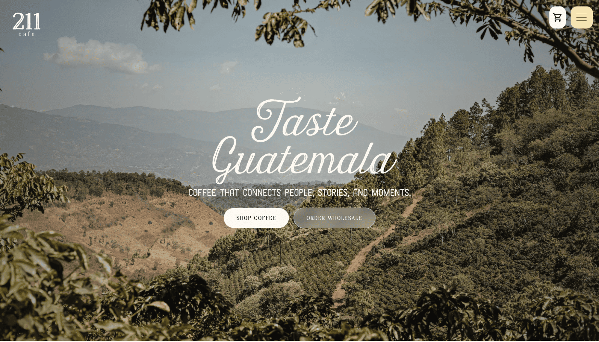
What it sells. 211 Cafe sells freshly roasted Guatemalan coffee.
Why the website works. 211 Cafe’s “Taste Guatemala” messaging gives its products a sense of place. Its storefront is versatile, serving both everyday shoppers and B2B customers looking for wholesale orders or event catering. There’s a personal touch too, as the site chronicles the founder’s journey from Guatemala to Arkansas and his family’s mission to share their country’s love through coffee.
In addition to the story, this ecommerce site is a good example of effective UI, since it offers practical navigation that stops you from having to dig through pages to find what you want. Instead, you can select action-focused options like “Shop for coffee,” “Find a cafe location,” and “Order wholesale.” Clear structure also helps AI programs navigate your site smoothly and return relevant results to searchers.
Key takeaway. Use your brand’s story to give simple, everyday products a personal touch and create a more persuasive sales pitch.
5. L’intendance: Simplify complex processes with visuals
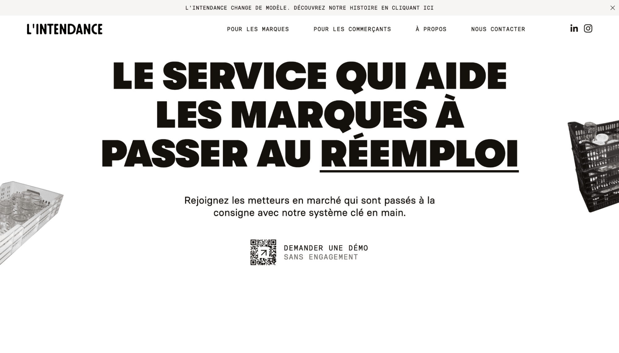
What it sells. L’intendance offers a reusable container service that helps brands switch to returnable packaging.
Why the website works. L’intendance takes a service that seems operationally complicated, and makes it straightforward through step-by-step visuals. Images and supporting text walk you through the behind-the-scenes process:
- Containers get an identifier
- Customers return them at partner retailers
- L’intendance collects and cleans the containers, then sends them back into circulation
This clearly demonstrates how L’intendance’s business model would work for your business. For example, if you have a food brand, you can picture your jars being tagged and returned through a retailer network before L’intendance steps in.
Key takeaway. If your offer or service feels complex to understand, explain the process using high-quality visuals and simple, step-by-step messaging.

Get started for free
Create custom, scalable websites — without writing code. Start building in Webflow.
6. Darkroom: Highlight practical details to instill trust
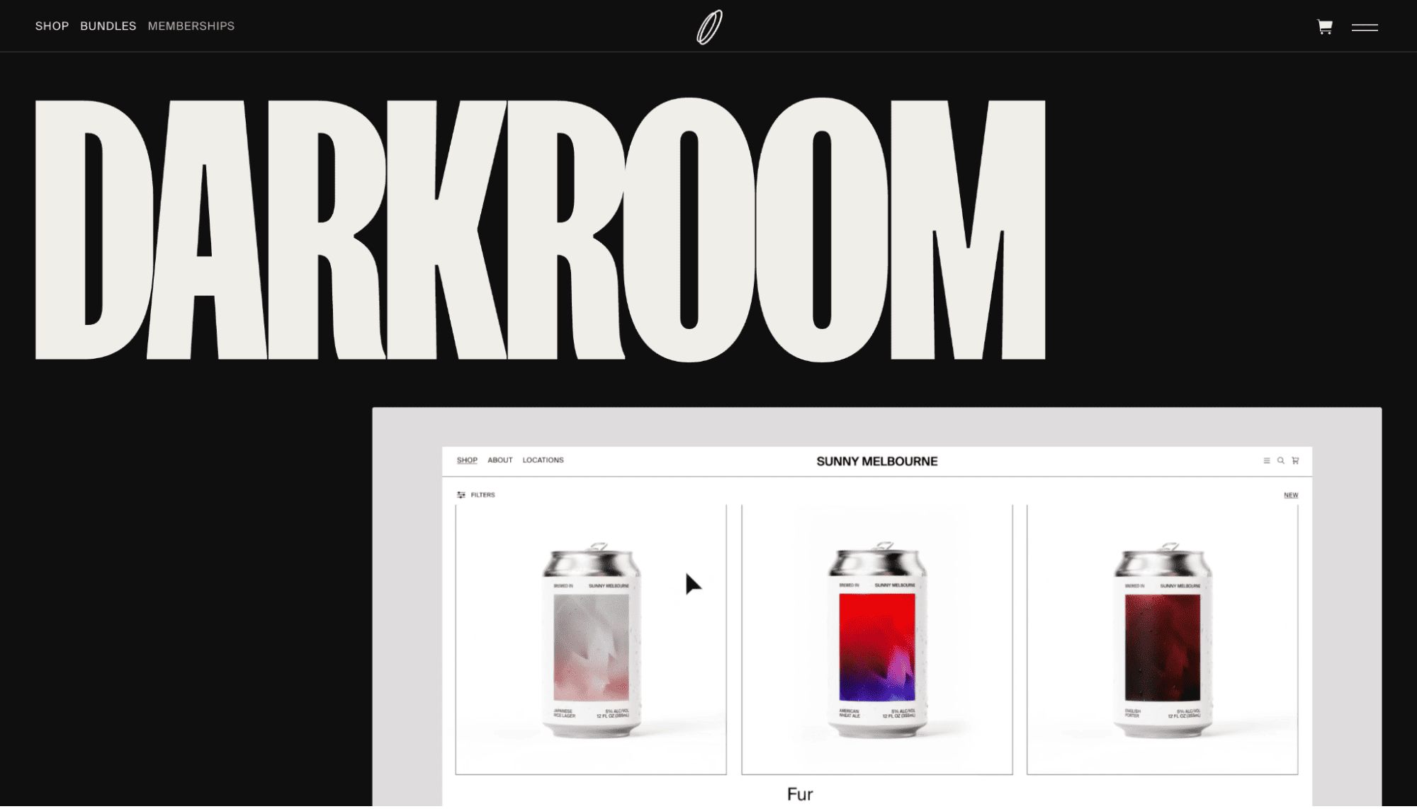
What it sells. Darkroom sells premium Photoshop mockups, bundles, and memberships for web designers.
Why the website works. The team behind Darkroom understands that before designers will buy digital assets, they need proof the mockups will look good and be highly customizable. This website uses product photography and animated visuals as proof, along with detailed descriptions that elaborate on file types, resolutions, lighting control, and color grading.
This depth of information helps you understand whether a mockup fits your workflow. Despite a large catalog, Darkroom also feels well-curated, with numbered products and straightforward categories that help you quickly browse through the options.
Key takeaway. When selling digital products, highlight the final result and practical details people need to trust the files.
7. Solid X: Use hard numbers to support your solutions
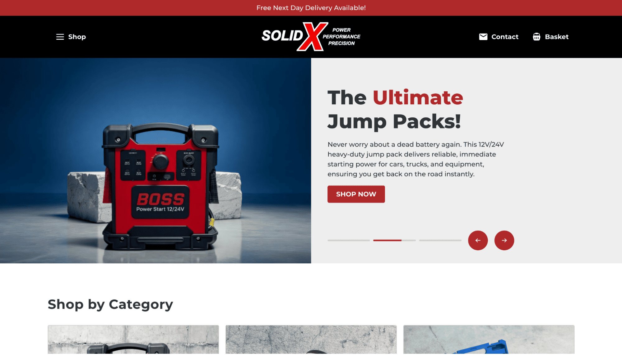
What it sells. Solid X sells heavy-duty jump packs, welding equipment, impact socket sets, and forged alloy race wheels.
Why the website works. Solid X’s target audience is buying for performance, so the site leads with practical, high-stakes use cases like dead battery scenarios and racing-grade wheels. This immediately connects the products to real professions, and communicates who they’re useful for.
The website also highlights specs to help with decision making. For example, details like “12V/24V power” and “15,000A peak current” tell you concretely whether a tool can handle your needs, which is important when you’re comparing technical products.
Key takeaway. Lead with the problem your product solves, and back up your solution with hard numbers.
8. Mike’s Camera: Organize your site for each buyer path
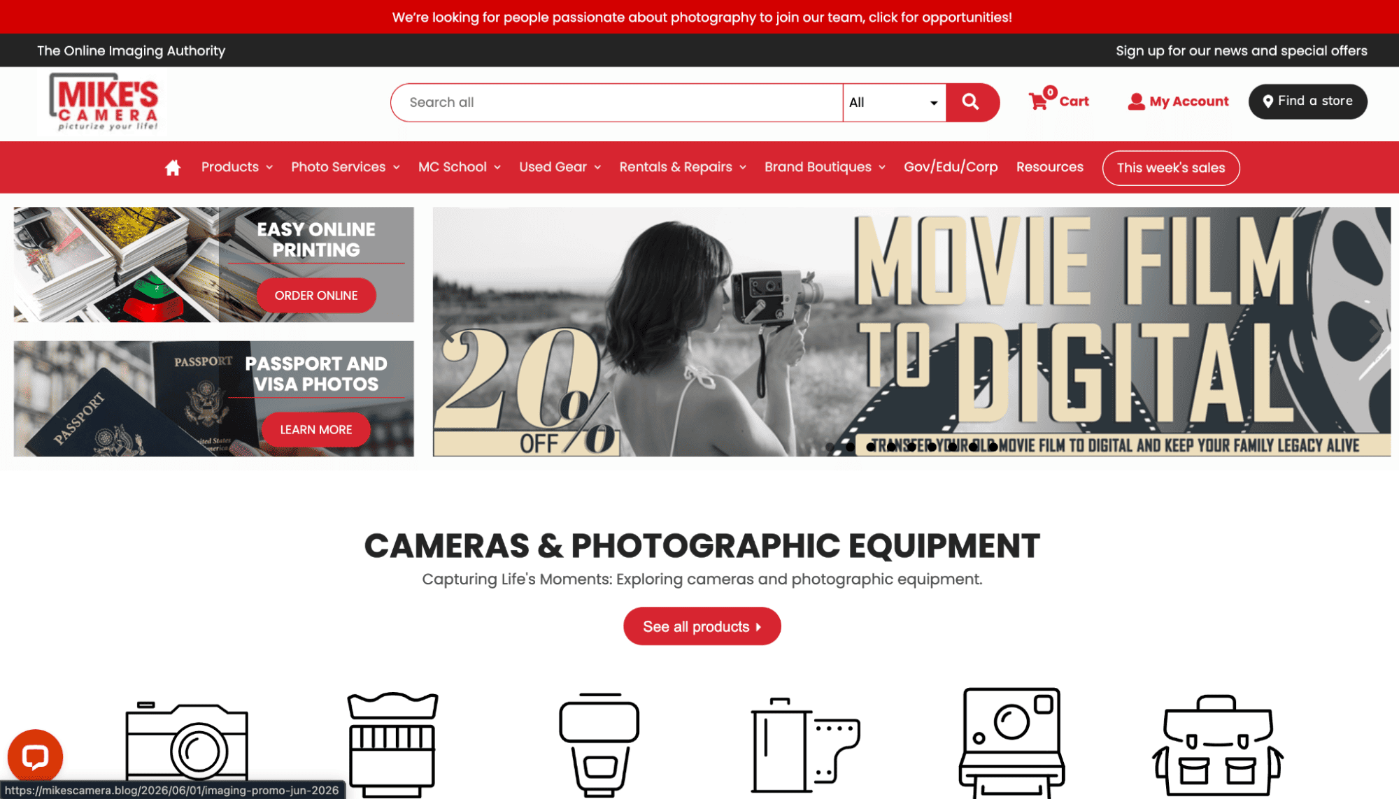
What it sells. Mike’s Camera sells photography equipment, prints, and in-store imaging services. It also offers repairs and photography classes.
Why the website works. Mike’s Camera treats photography as an art, not just a product, building a more complete user journey in the process. You can shop for cameras and lenses, but you can also rent gear, explore classes, and find services like film processing.
This approach supports a broad audience. For example, a beginner might arrive looking for a camera and intro classes, while an experienced hobbyist may need a lens rental or a complex repair. Mark’s Camera gives both personas clear product categories and paths to solutions, through structured pages that present specific use cases for products and services.
Key takeaway. If your store serves different customer types, organize your site around those journeys instead of funneling everyone onto a single, generic path.
9. Sandbar: Mention the problem you solve before the tech
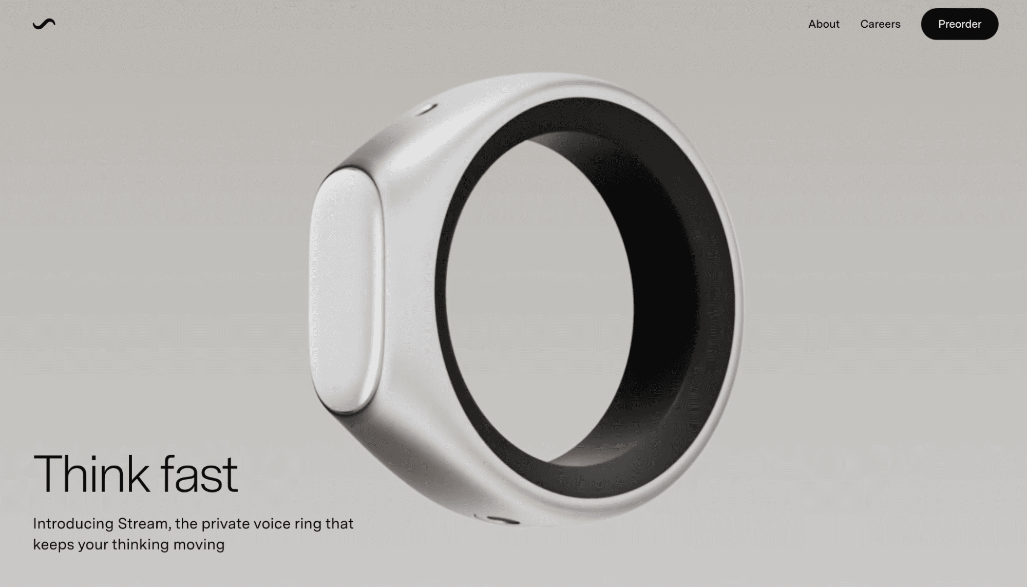
What it sells. Sandbar sells Stream, a private voice ring and conversational notes app.
Why the website works. Sandbar’s ecommerce site offers design inspiration on how to take an unconventional product and make it feel more familiar. Instead of starting with tech specs, this site establishes the pain point: your mind moves too fast, and ideas disappear before you can unlock your phone.
From there, the product images and descriptions show how Stream might fit into your lifestyle:
- Hold, tap, or swipe the glass surface on the ring to speak or trigger a command
- Release the button to send information to the app
- Feel a haptic confirmation
The preorder page then handles any questions you might have regarding sizing, privacy, and shipping or returns, reducing common barriers to conversion.
Key takeaway. If you sell a tech-based product, mention the problem it solves before explaining the technology behind it.
10. Infinite Machine: Go in-depth for premium products
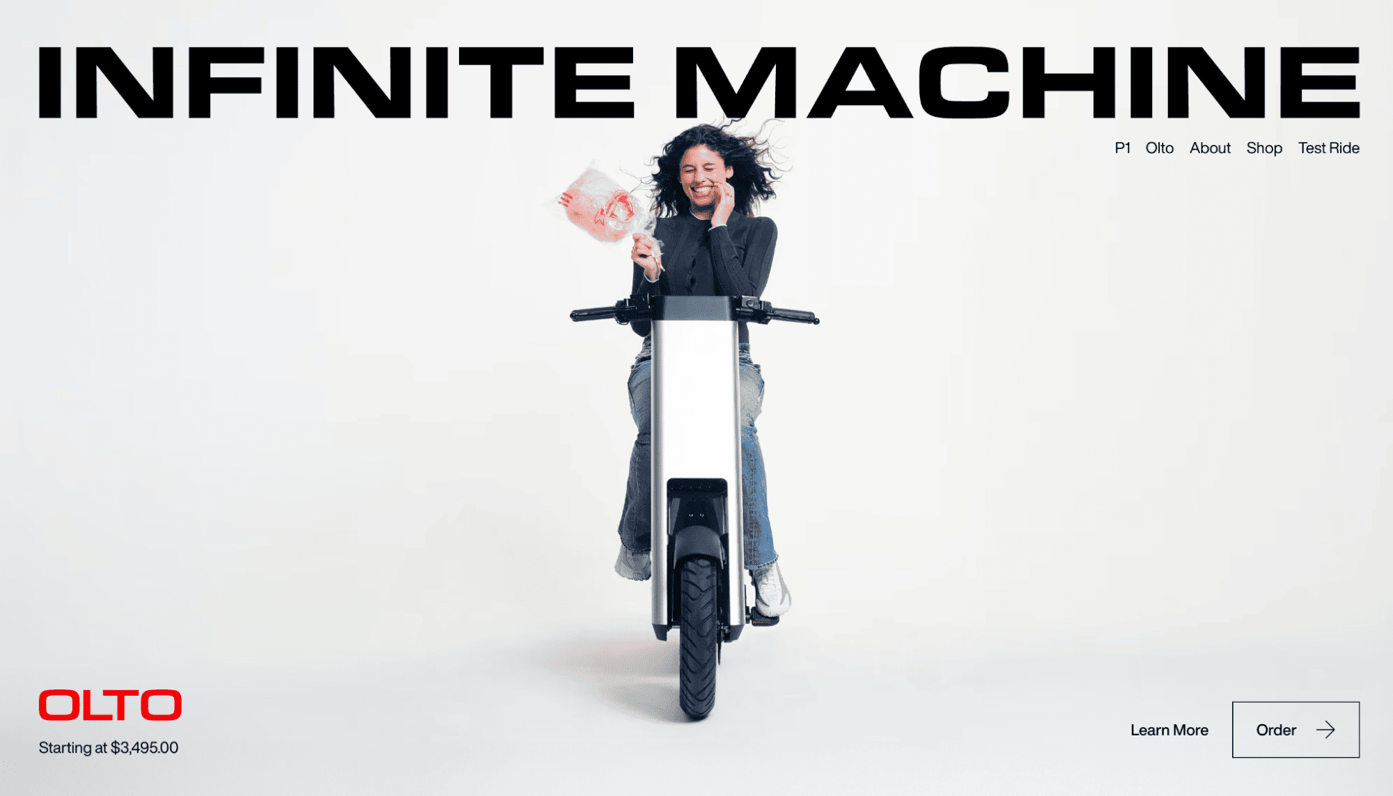
What it sells. Infinite Machine sells electric vehicles for urban transportation.
Why the website works. Infinite Machine sells its products by pitching the lifestyle angle and the commerce logistics at the same time. Branding statements like “The Best Non-Cars on Earth” make the vehicles feel futuristic, but the page quickly grounds that idea in everyday city problems like traffic, parking, and charging.
This site also clearly differentiates between its key products. You don’t have to compare unfamiliar items and decode the technical differences. Instead, you get clear use cases: the Olto is for the bike lane, while the P1 is for the car lane.
Key takeaway. When selling a premium product, offer practical details so visitors can imagine owning it and being satisfied with their purchase.
Build a great ecommerce store with Webflow
The best ecommerce website examples show how thoughtful design and careful messaging impact the shopping experience. Visuals grab attention, while helpful navigation and a smooth path to checkout turn that interest into conversions.
Webflow’s agentic web marketing platform gives you the tools to create that type of experience. You can build and manage your custom store from scratch, or explore hundreds of ecommerce templates that already follow best practices for ecommerce UX.
Start your ecommerce journey with Webflow.
Build websites that get results.
Build visually, publish instantly, and scale safely and quickly. All with Webflow's agentic web marketing platform.