








A carousel can dynamically package highlights in limited spaces and encourage visitors to explore your content.
In web design, a carousel is a rotating set of images or messages that share the same space. Horizontal cards represent individual pages or pieces of content, and visitors can click to the left or right to move the carousel along and see new options.
Carousels look visually interesting, and they save page space, letting you show multiple articles or features in a relatively small area. But if this element is poorly designed or implemented, it can frustrate users and obscure important information.
Read on to see where carousels improve the user experience, when they get in the way, and how to use them effectively on your website.
Are website carousels outdated?
Website carousels have been around for a long time, but they’re still a useful web design tool. Plenty of modern sites use carousels, especially on ecommerce homepages to showcase multiple products or highlight key features.
At the same time, carousels can have performance issues or be distracting, so you can’t treat this element as a simple replacement for static hero sections and content blocks. Carousels create usability problems when they:
- Rotate too quickly
- Hide other important content on the page
- Compete with the main call to action
So, it’s important to be intentional with carousels — they have to genuinely help visitors browse information or compare content. W3C’s guidance explains that carousels are most accessible when people have control over the movement and each slide is easy to read and navigate. For example, if your carousel includes text-based cards, users should be able to pause the motion so they can read a particular entry.
Dos and don’ts of carousels in web design
Let’s look at when creating carousels enhances the user experience, and when it causes problems.
Do:
- Place carousels where people naturally expect to browse. Carousels make more sense when people already expect interactive elements. For example, carousels are logical additions to galleries, slideshows, presentations, and timelines, because those sections use multiple images or cards to deliver a complex message.
- Use carousels to save time and clicks. A carousel lets users preview multiple related items without opening new pages or bouncing back and forth between sections, so it’s a great way to reduce effort.
- Prioritize simple visual content. Carousels are more effective when they’re primarily visual and easy to understand at a glance. Once slides require excessive reading, the motion competes with the content and usability suffers.
Don’t:
- Place carousels in hero sections. The top part of your homepage design should help visitors understand your website’s purpose immediately. When a carousel takes over that space, it replaces one clear statement with several competing messages. Placing a carousel in this spot can weaken your site’s first impression and confuse visitors.
- Use carousels in articles. When reading an article, most people want a linear, uninterrupted experience. Breaking long content into slides or click-through cards slows the reading process down and can make it frustrating.
- Let a carousel become a content dumping ground. A carousel can turn into a holding area for content that didn’t make the site's main layout. If too much unrelated information sits in one rotating space, the carousel becomes too busy and will likely just confuse visitors.
How to design effective carousels
A well-designed carousel should stay out of the way until visitors engage with it, then it must be easy to use. Keep these best practices in mind when designing website carousels.
Avoid autoplay
Autoplay usually makes a carousel harder to use because it moves content along before people are ready to interact. When slides transition on their own, visitors can miss important information or feel rushed.
When you turn autoplay off, the carousel becomes more scannable and less distracting. For example, a testimonial slider is more impactful when each quote stays onscreen until the user clicks or swipes to the next one.
Let visitors control the carousel
People should be able to control your carousel with clear ‘next’ and ‘previous’ arrows, slide indicators, swipe gestures, and keyboard navigation. These elements make the interaction feel predictable by helping visitors understand how the carousel works at a glance. For instance, a case study carousel with arrows and dots lets visitors jump to the exact projects they want to view.
Keep text short and clear
Carousel slides only get a small window of attention, and dense copy slows the interaction down. Brief copy lands better because it’s faster to understand and keeps the carousel's layout from feeling cluttered.
Only use one H1 tag per webpage
Carousel slides shouldn’t compete with the page’s main heading. A single H1 establishes a clear visual structure on the page, while slide titles should have lower-level H2 and H3 headings to show that they’re supplementary. If your hero section already has an H1 like “Build a faster marketing website,” the headlines in the carousel beneath it should be smaller so as not to distract from that message.
Keep carousels touch-friendly
A carousel should feel natural on mobile devices, where many users will instinctively try to swipe through it. Mobile-friendly touch controls should be large and well spaced to reduce accidental taps and make the carousel more usable on smaller screens.

UX design websites from the Webflow community
Find inspiration from the Webflow community for your UX design website.
3 examples of great website carousel designs
Now, let’s see what effective carousel designs look like in action.
1. ThreeSixtyEight’s scroll-style carousel
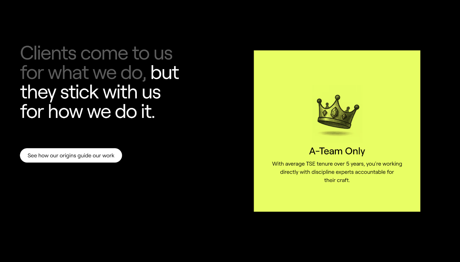
ThreeSixtyEight’s website has a scroll-triggered image carousel midway through the page, introduced with the line: “Clients come to us for what we do, but they stick with us for how we do it.” The first part of that statement is highlighted in white, grabbing attention by contrasting with the black background. The card block to the right shows a looping video montage with a button labeled “Play Agency Reel.”
As you scroll, the video block expands, which makes the viewing experience more immersive and helps this element function as a visual portfolio. Then the carousel transitions into static illustrated cards that explain how TSE operates.
Once you reach the last card, the text “but they stick with us for how we do it” is highlighted, neatly splitting the opening sentence into two parts. The video shows why clients come to TSE, while the cards explain why they stay. And the carousel doesn’t autoplay, so users are in control of its speed and overall experience.
2. August Health’s card-style carousel
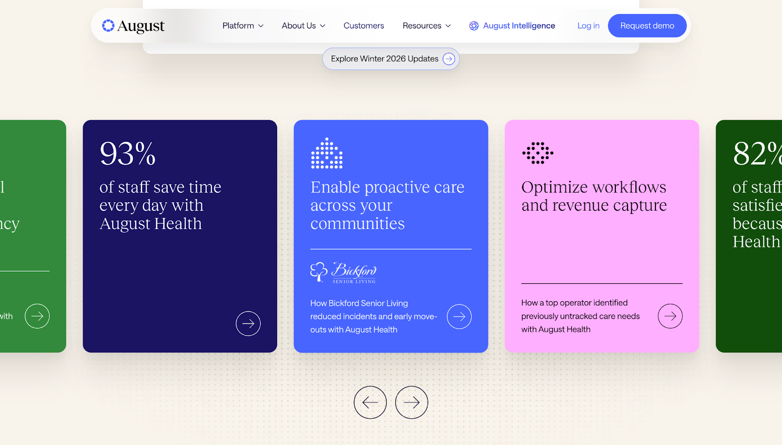
August Health’s carousel is a browsable row of case study highlights. The prominent left and right arrows at the bottom offer clear carousel navigation, so visitors can move between case studies at their own pace. Partially-cropped cards on the edge of the screen reveal more content in waiting, encouraging users to interact further.
The panels are easy to scan thanks to an effective hierarchy: The main idea for each is an H2 with supporting text and, in some cases, a logo or stat to add credibility. Plus, each card is a different color with contrasting text, making them distinct while maintaining high readability.
3. East Partnership’s testimonial slider

East Partnership’s site uses a carousel for its testimonial section, with highly visible control circles on the left and right. To boost usability further, the card on the left is sharp and clear while the others stay translucent. This lets visitors focus on the card they’re reading, while still seeing the rest of the content that’s available.
Each card also has a clear and consistent hierarchy. A quote takes up the bulk of the space, while details about the speaker and the relevant business logo sit below for added credibility. The cards don’t autoplay, and since they use muted visuals, they help users browse East Partnership’s social proof without taking too much focus away from the rest of the page.
Build carousels that enhance your pages with Webflow
Carousels perform well in web designs when they support the page’s main content and give people a streamlined way to interact. This element is useful for highlighting important information like case studies and testimonials, where you want to show breadth in a tightly organized format.
With Webflow, you can use slider tools to build responsive carousels and style them to match your brand. GSAP-powered interactions let you add and customize motion, so your carousels look appealing and feel intuitive to use.
Design a website with click-worthy carousels in Webflow.
Get started for free
Create custom, scalable websites — without writing code. Start building in Webflow.