

Feature
Design for even larger screens with 3 new breakpoints
Now you can customize your designs for larger screens with 3 new device breakpoints at 1280px, 1440px, and 1920px.
As laptops and external monitors keep getting bigger, Webflow’s keeping up with the times by adding not 1, not 2, but 3 new large breakpoints at 1280px, 1440px, and 1920px.
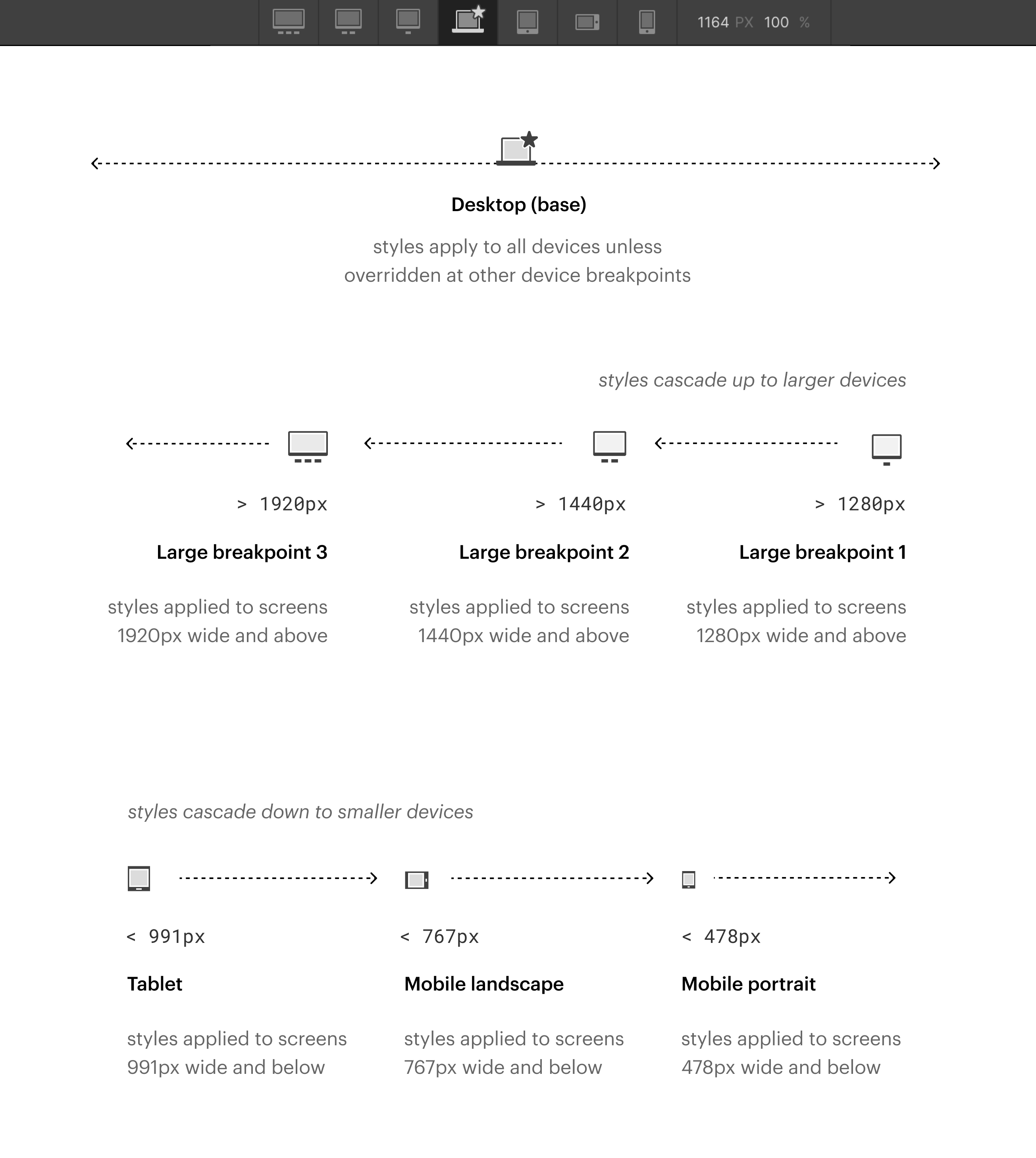
This means that Webflow projects now have 7 breakpoints, with the largest 3 being the new ones:
- 1920px: styles applied to screens 1920px wide and above
- 1440px: styles applied to screens 1440px wide and above
- 1280px: styles applied to screens 1280px wide and above
- Desktop (base): styles apply to all devices unless overridden at other device breakpoints
- Tablet: styles applied to screens 991px wide and below
- Mobile landscape: styles applied to screens 767px wide and below
- Mobile portrait: styles applied to screens 478px wide and below
For a closer look at these changes and a walkthrough of updating a site to use these new breakpoints, check out our announcement blog post.
Related updates


Get started for free
Try Webflow for as long as you like with our free Starter plan. Purchase a paid Site plan to publish, host, and unlock additional features.
Try Webflow for as long as you like with our free Starter plan. Purchase a paid Site plan to publish, host, and unlock additional features.