


People tend to remember how a website made them feel, even if they forget how it looks.
Websites with quality user experiences (UXs) help visitors navigate smoothly through layouts and pages so that they can quickly find what they need and take action. When visitors enjoy the overall feeling they get while using a site, they should be more likely to remember it, return, and build a positive association with the company or brand
Read on to learn about core UX design principles and see examples of websites with great UX design.
What makes a website’s UX design great
Great UX is when people can move smoothly through a website, understand what they see, get the intended message, and complete actions without issues. User interface (UI) design contributes to those successes by focusing on visual elements like buttons and colors, but UX is the broader experience that all the site’s elements combine to create.
UX designers follow several core principles:
- User first. A user-first website organizes content and actions in a way that makes sense from the visitor’s point of view, by considering their goals, questions, expectations, and likely next steps.
- Usability. Visitors should be able to find information, move between pages through clear menus and links, understand what actions are available, and follow through on their goals.
- Consistency. Similar elements must behave in standard ways across the site, so visitors only have to grasp the layouts and navigation once and then explore confidently.
- Accessibility. Great UX shouldn’t depend on perfect vision, hearing, or dexterity — the website should be usable for everyone.
- Hierarchy. Pages guide attention through visual hierarchy, using design to show visitors what matters most on each page and where to look next.
- Context. Effective sites give people the right information at the right moments, in a format that’s suited to their needs and personalized where possible.
Why UX can make or break a website
Great UX helps a website do its job faster and more effectively. When each next step feels obvious and natural, people are more likely to stay longer and complete desired actions (e.g., fill a contact form, complete a purchase, read a blog post).
For example, a strong UX on a renovation company’s site might lay out services and service areas in a highly readable format, provide social proof through testimonials and case studies, share clear pricing details, and use a prominent ‘Request a quote’ call to action (CTA) to encourage conversions.
These elements help visitors go from awareness to action with minimal interruptions and effort. That’s why websites with good user experiences tend to attract more customers and increase brand awareness, giving each client a solid foundation for long-term growth.
7 websites with great UX designs
Here are seven examples that show what websites with great user experiences can look and feel like.
- Modash
- Outseta
- January AI
- MarqVision
- Anrok
- MA Quilts
- Eleken
1. Modash
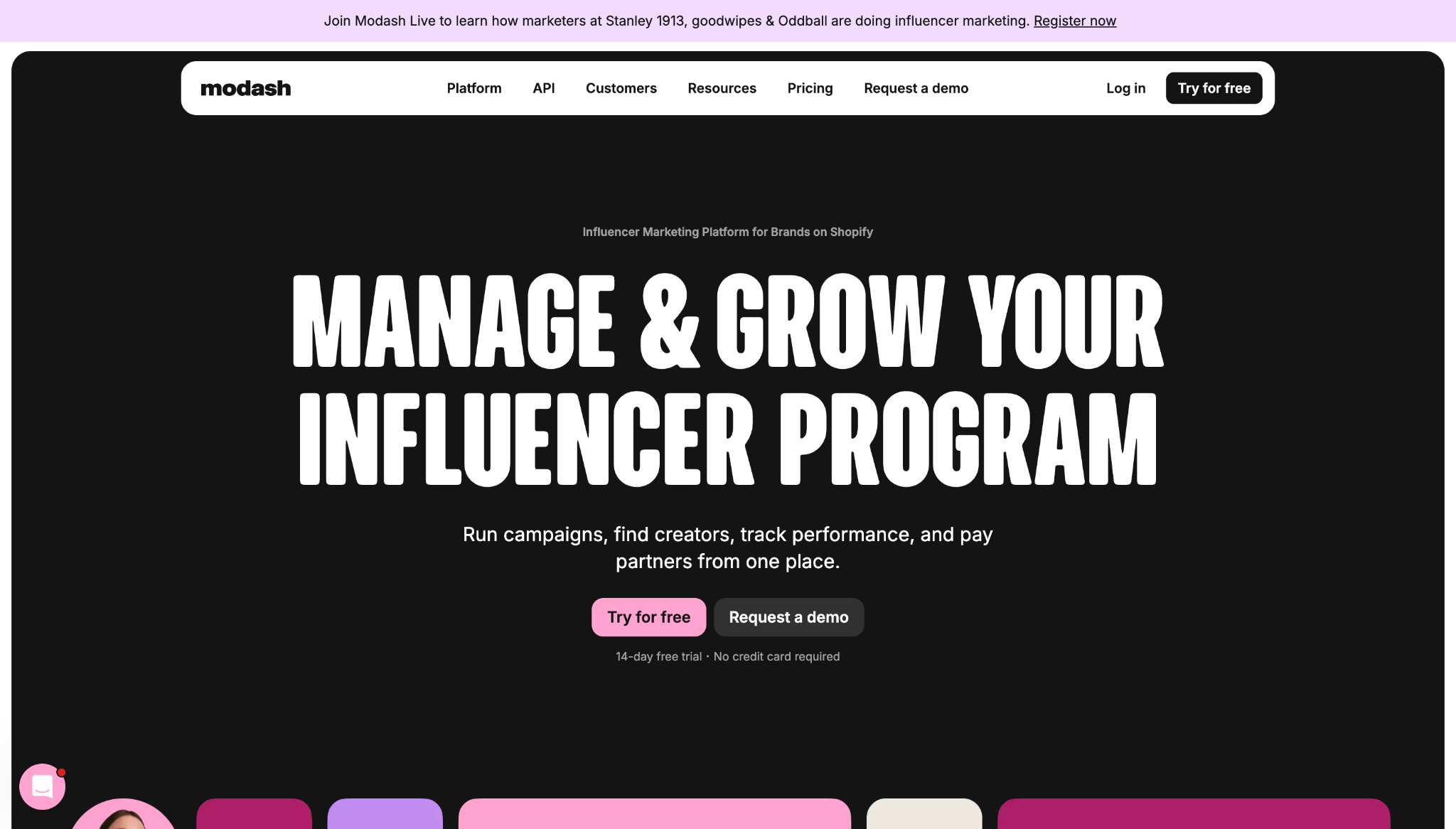
Modash’s website shows how great UX turns a complex, feature-heavy pitch into a more digestible and guided browsing journey. Instead of making visitors decode how the product functions, this site does much of that work for them.
Key UX choices:
- Clear workflow labels. Titles like “Manage,” “Discover,” “Track,” and “Pay” break the product’s features into simple categories so visitors can understand the basics faster.
- Multiple next steps. Information about free trials, demos, pricing, and product tours appears early, giving each user a path that matches their intent instead of using one CTA for everyone.
- Immediate social proof. Trial details and client logos appear near the top of the homepage, building trust and product confidence.
2. Outseta
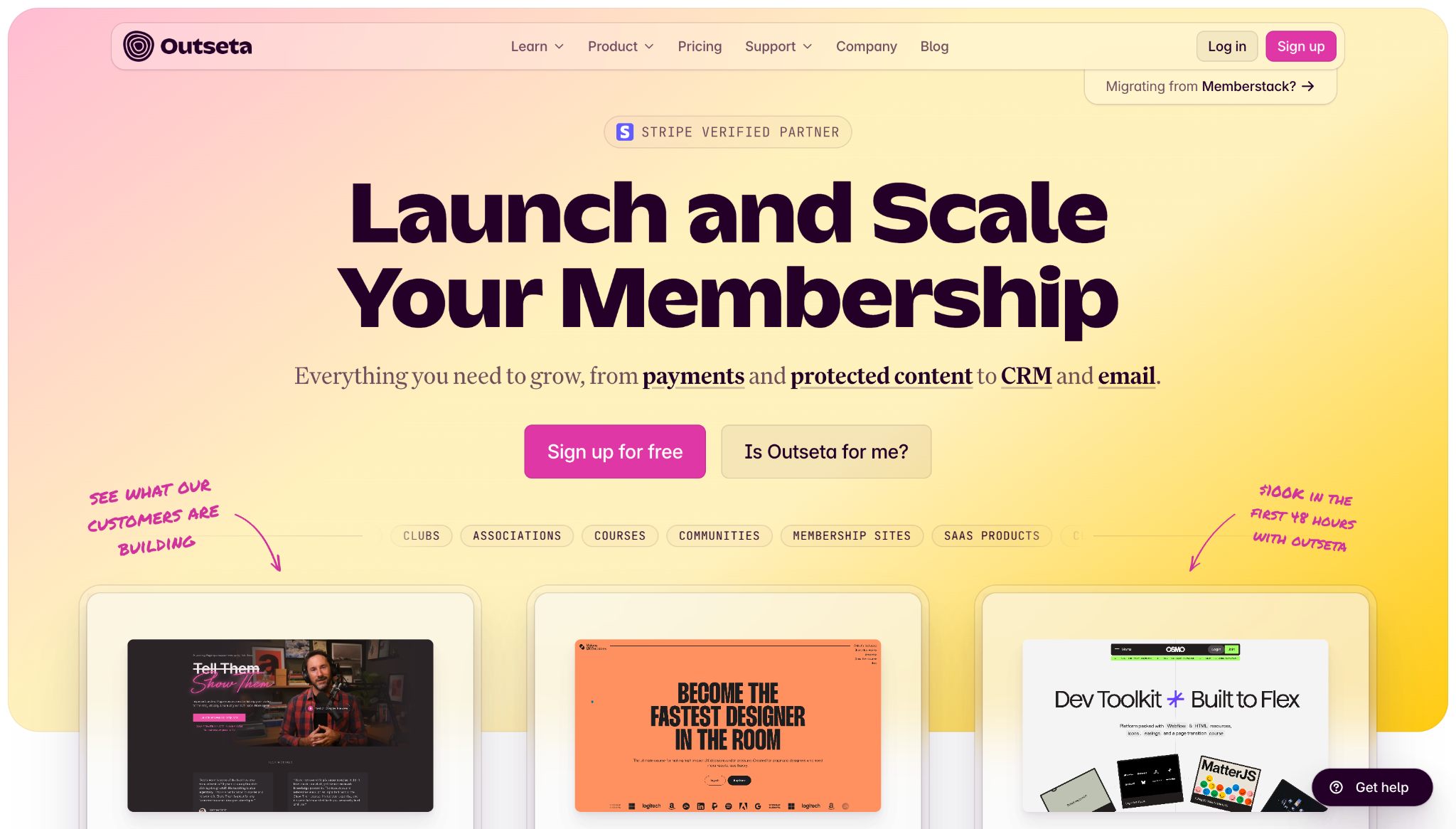
Outseta’s website demonstrates how SaaS and other membership-focused businesses can simplify a multi-tool product to make its value proposition clear.
Key UX choices:
- Workflow-based navigation. Clear workflow labels with corresponding links to relevant tools help people understand the product quickly and map features to their pain points.
- Outcome-focused elements. Customer testimonials sit between course offerings and contact forms, mixing sales copy with more plain-language examples of how real users benefit from the product.
- Self-qualification paths. The phrase “Is Outseta for me?” doubles as a button that takes users to a dedicated page outlining who the platform is best for to help with decision making.
3. January AI
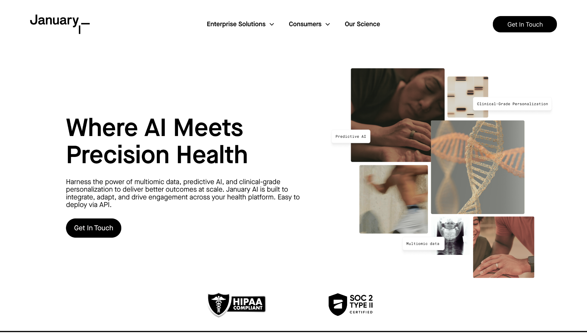
January AI’s website presents technical, medical-heavy content via a minimalist design that avoids overwhelming visitors with too much information too quickly.
Key UX choices:
- Audience segmentation. “Enterprise Solutions” and “Consumers” tabs split the target audience into distinct categories, helping each visitor understand where they belong before they explore further.
- Clear product ladder. A dedicated section highlights “January Mirror,” “Lifestyle Intelligence,” and the January app as core features. It also breaks the complex health platform’s functionality into smaller steps for non-technical visitors and anyone who’s simply in a hurry.
- Consistent CTAs. Each CTA button has the same simple black-and-white design and similar concise labels, so users see them immediately whenever and wherever they‘re ready to take action.

UX design websites from the Webflow community
Find inspiration from the Webflow community for your UX design website.
4. MarqVision
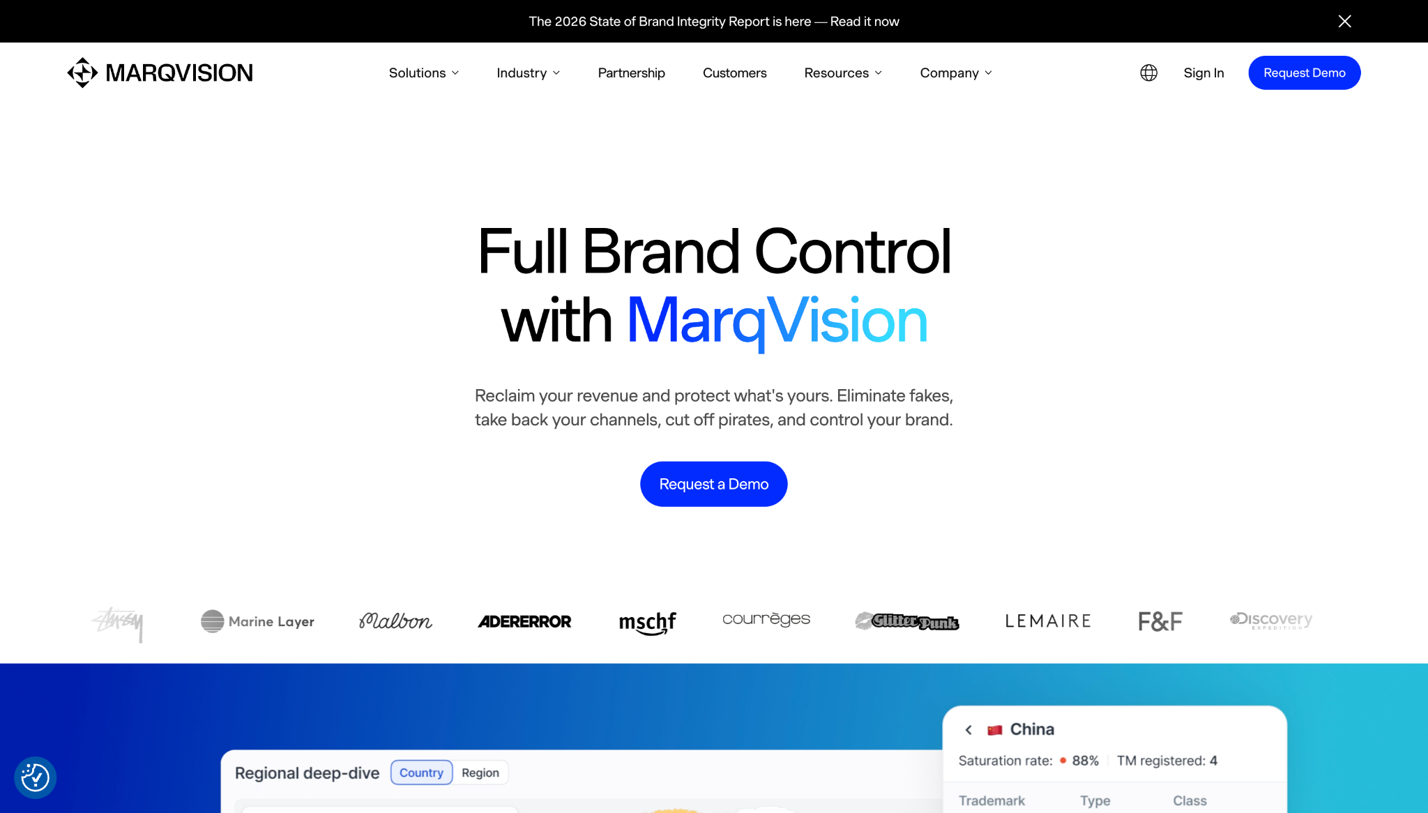
MarqVision’s website offers solutions to high-stakes problems like brand protection and unauthorized sales through fake products. Its UX focuses on reassuring visitors that the brand is trustworthy and can help with these sensitive needs.
Key UX choices:
- Problem-based navigation. Pain points like unauthorized sales, impersonation, content protection, and trademark management have separate links in the navigation menu, along with descriptions that provide context, so people can jump straight to the most relevant messaging.
- Industry pathways. The navigation bar also leads to landing pages for specific industries, such as fashion and pharmaceuticals, giving visitors an alternative way to narrow down their searches.
- Stats and badges. The homepage features case studies, customer logos, a 4.9-star rating badge, and key statistics like “24/7 monitoring” and “99% accuracy” — all of these elements help build credibility.
5. Anrok
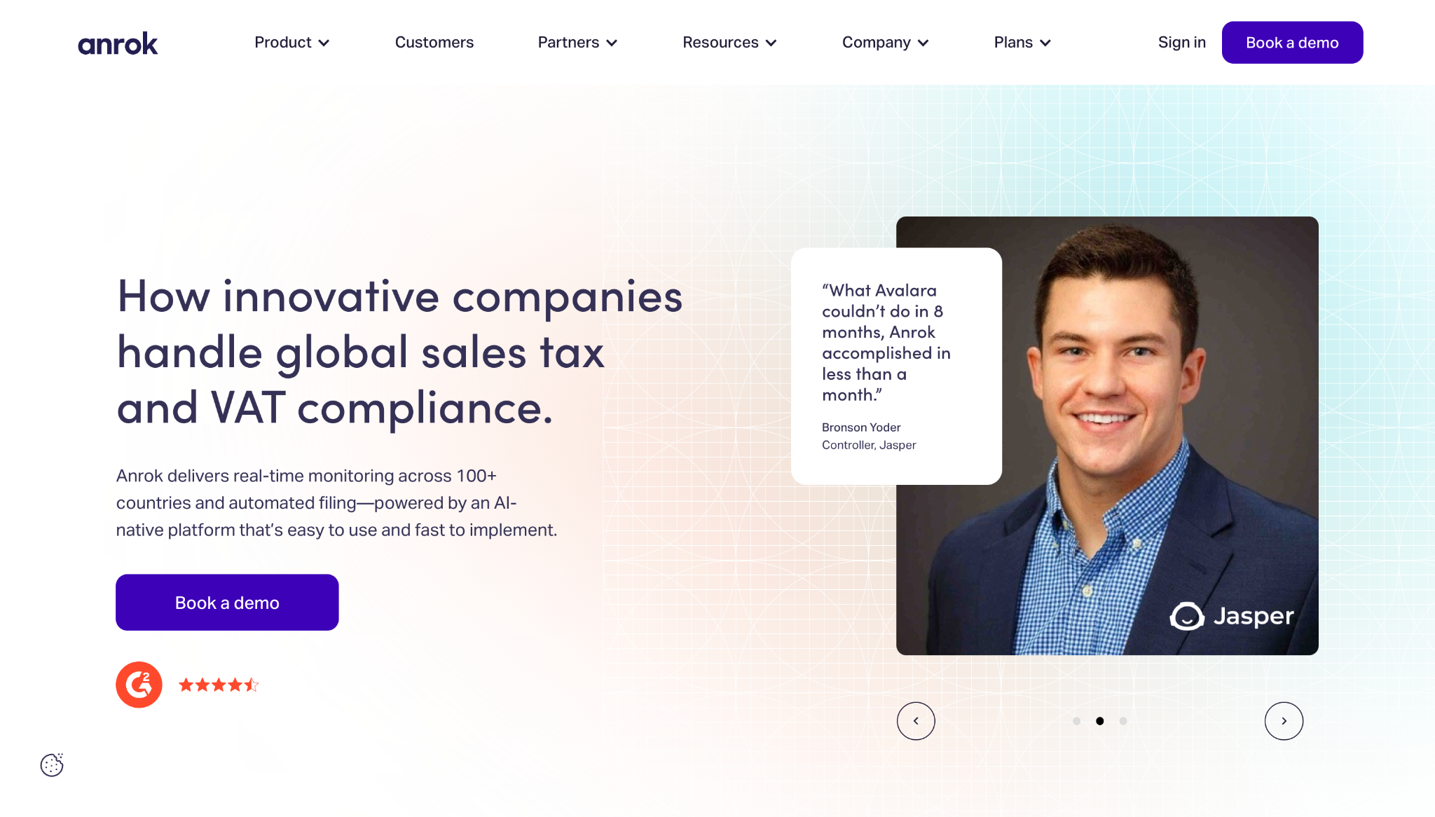
Anrok’s website shows how you can turn a stressful, compliance-related topic like sales taxation into an enjoyable user experience.
Key UX choices:
- Utility-first navigation. The site has an animated coverage map showing tax and VAT rates in the United States and Europe, helping visitors understand these key numbers at a glance.
- Clear workflow. Features like financial stack integration, tax calculation, and automated file reporting appear sequentially to demonstrate how customers can turn messy tax problems into manageable processes.
- Proof in the header. The hero section includes customer quotes with photographs of recognizable company executives, which adds social proof to Anrok’s core promise.
6. MA Quilts
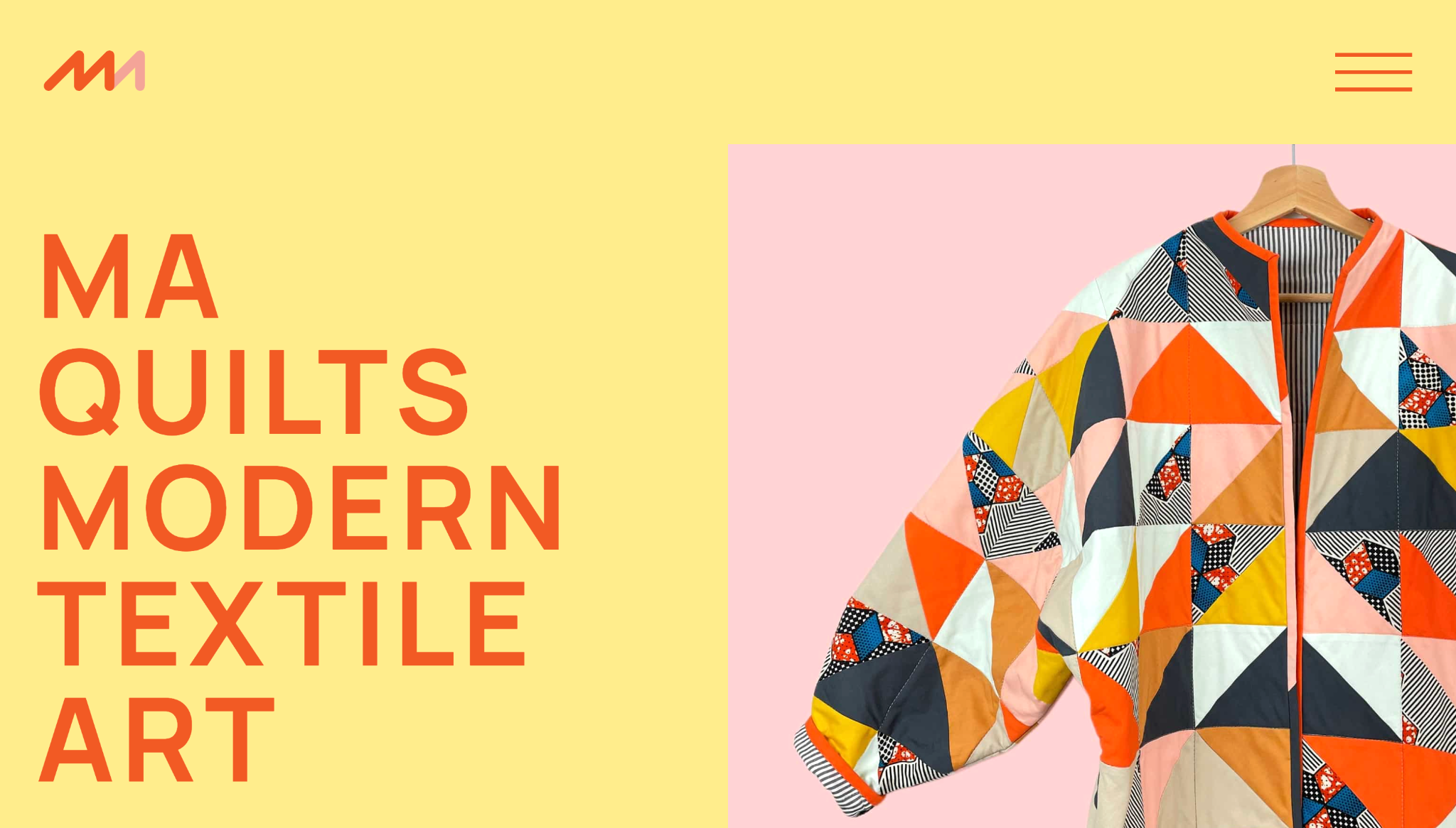
MA Quilts’ website offers inspiration to anyone building portfolio sites for creative clients. Exploring this website illustrates how a simple structure can guide attention and convey a client’s visual identity.
Key UX choices:
- Clear navigation. There are only a few paths in the expandable hamburger menu, and they have straightforward labels like “Quilts,” “About,” “Process,” “Blog,” and “Contact.”
- Prominent product placement. The homepage quickly transitions from the brand statement to the company’s best pieces, along with a “See all quilts” button that leads to more featured products.
- Design that reflects the core offering. The minimal layout and short copy leave room for imagery to lead the experience, which is well-suited to such a visual-forward product.
7. Eleken
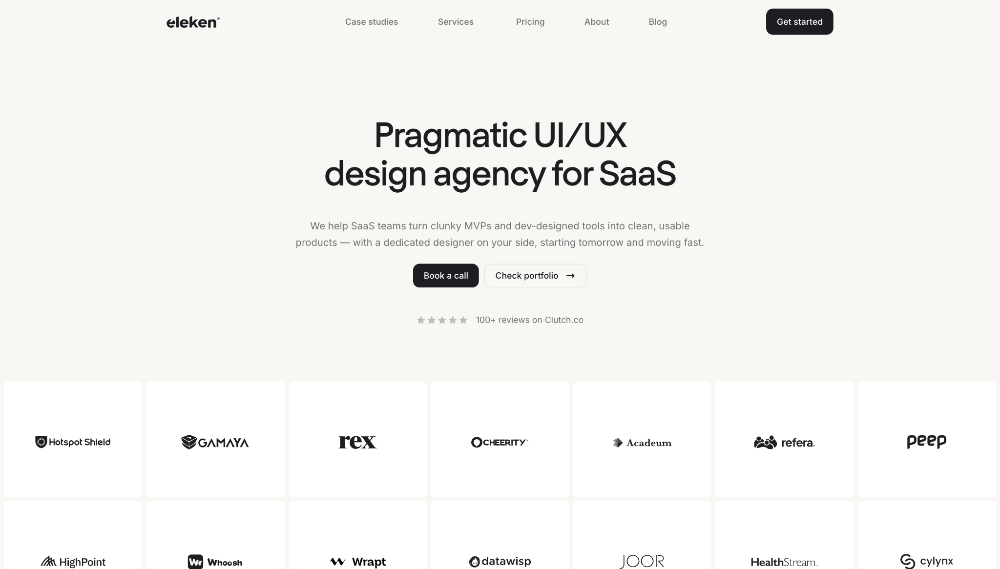
Eleken’s website speaks directly to visitors’ pain points by matching messaging, content structure, and conversion paths to user intent.
Key UX choices:
- Context-based client logos. Hovering over each client logo shows the company’s industry and project, such as “EdTech and Product Redesign” or “Recruiting and Team Extension,” so visitors can find relevant social proof fast.
- Outcome spotlights. Case studies highlight measurable results, such as lower dropoff rates and higher customer satisfaction, which builds on the client logo section’s messaging and encourages visitors to convert.
- Scroll-based interactions. An orange ball responds to scrolling behavior, showing a delivery timeline and step-by-step trial process while making the experience more engaging.
Build engaging user experiences with Webflow
A website with a good user experience design often looks impressive, but what really matters is that it helps people move forward without hesitation. When you take the time to create a clear content structure, helpful navigation, a brand-relevant design, and fluid interactions, you deliver user experiences that elevate your clients’ websites and get results.
Webflow gives you the tools to build effective UI/UX systems for all your projects. You can design visually and update quickly thanks to Webflow’s composable CMS. Built-in performance tools help pages load quickly and feel smooth to use, while workflow features support seamless collaboration and publishing.
Use Webflow to create a great user experience every time.

The modern web design process
Discover the processes and tools behind high-performing websites in this free ebook.


