

What your visitors see when they land on your site determines if they’ll stay long enough to discover your value.
A well-designed hero section sets the tone for a smooth user experience (UX) and establishes your brand identity from moment one. If visitors like what they see, they’re less likely to bounce and more likely to receive your brand’s messaging.
This guide on hero image best practices will help you create visual interest above the fold to make a lasting first impression. We’ll provide five great hero image examples, as well as best practices and tips for maximum impact.
What’s a hero image?
A hero image is a large visual that appears at the top of a web page. It typically spans the full width of the screen under the menu and includes a headline, along with supporting text and a call to action (CTA). The hero image can be any type of visual, including animations or short looping videos.
While most people associate hero images with homepage design, you can also place them on landing pages, product pages, and blogs. Regardless of their format or where you put them, effective hero images tell visitors what you offer and guide them to the next step of the user journey.
Why hero images matter
The hero section shapes your visitor’s first impression of your website (and potentially your brand as well). An effective hero image makes the most of it, intensifying the following:
- Branding impact. Your hero image guides visitors’ perceptions of your brand. Every detail, from typography and color choices to overall design, signals who you are and what you stand for.
- Emotional connection and storytelling. The right visuals use emotional cues to compel visitors and prompt them to explore your brand’s story and its offerings.
- Value communication. Instead of forcing visitors to dig through paragraphs of text, the right visual instantly shows what you do and why it matters. Pair it with a sharp headline and a clear CTA, and you've communicated a value proposition before the first scroll.
7 best practices for effective hero images
Here are seven hero image design tips that can help you create a stunning top-of-the-fold that drives conversions.
1. Set the right mood for your brand
2. Design for clarity
3. Use motion and video intentionally
4. Avoid stock imagery
5. Optimize file size without sacrificing quality
6. Design for responsiveness across devices
7. Ensure accessibility and effectiveness
1. Set the right mood for your brand
Your hero image needs to accurately represent your brand identity, including aesthetic and emotional angles.
If you run a telehealth therapy service, for example, the rest of your site may look calm, warm, and have a lot of whitespace. To match, your hero image might include a simple illustration or photograph with a few words of text rather than a high-energy video montage.
2. Design for clarity
The layout, contrast, and spacing in your hero image directs visitors’ focus to the headline and CTA. Negative space in particular serves as an effective arrow.
Consider setting up a hero image that positions your headline across an open area of the hero image rather than above or below details (like Insider Madeira on our list). This way, the whitespace helps the message stand out and land faster.
3. Use motion and video intentionally
A short background video in your hero section can quickly demo a product and add emotional depth that static images can’t match. It’s more likely to catch and hold a visitor’s attention for the first critical few seconds, and keeps the section’s CTA in front of them for longer.
However, animated hero images come with trade-offs for your site’s overall performance. Large video files can slow load times, frustrating visitors before they even see your content. Some users are sensitive to motion or flashing lights, so adding accessible reduced-motion options (like fallback images) will make your website more approachable for everyone.
5. Optimize file size without sacrificing quality
A hero image can’t influence visitors if it doesn’t load with the rest of your page. Large, uncompressed files can also drag down overall site performance, hurting both UX and search visibility. So, use modern formats like WebP or AVIF and compression tools to optimize your hero image and keep load times fast without degrading visual quality.
4. Avoid stock imagery
Visitors can spot staged or stock images instantly, and for businesses selling a product, it’s unlikely that your exact offering is on display in a stock photo. That disconnect between the visual and your brand can slow decision-making or push users away altogether. For service providers and those with portfolio websites, obvious stock photos can make your site feel unprofessional.
Instead, use custom photography or brand-specific illustrations that reflect real experiences. A real team photo or unique art style can make your hero section feel grounded, establishing that what visitors see is what they’ll get.
6. Design for responsiveness across devices
You might find that a hero image that works well on a desktop monitor has a cropped focal point, skewed composition, and unreadable text on phone screens. Since over half of all web traffic comes from mobile devices, responsive hero images are critical. Try designing your hero image for mobile and adding it to that screen size initially as part of a mobile-first design process to make sure everything looks right.
7. Ensure accessibility and effectiveness
To support visual accessibility, every hero section should include sufficient color contrast between text and the background. If it uses video, add the option for captions or a link to a transcript, so that visitors who are hard of hearing can follow along.
Effectiveness testing is equally important. Check your hero image across multiple devices, browsers, and assistive technologies to catch issues that aren’t revealed in mockups. And don’t forget to run A/B tests to see which hero section variations resonate best with your audience.
5 websites with eye-catching hero images
Effective website hero images, paired with clear headlines and intentional CTAs, set a tone visitors remember long after they’ve scrolled past them. Here are five examples that provide unique takes on effective hero image designs.
1. Insider Madeira
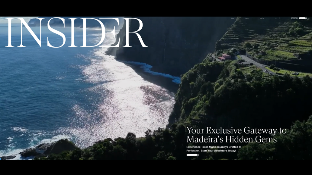
Insider Madeira’s website opens with a short video highlighting the Portuguese island of Madeira’s sailing, dining, and hiking opportunities. This hero visual shows visitors what the location actually feels like, not just how it looks. Movement captures the island’s beauty and accentuates the lush imagery in ways static images can’t. Soft waves and aerial shots of forests and fields invoke a sense of relaxation and wanderlust to convince visitors the island is worth exploring, while the associated text quickly and simply identifies what they’re looking at and how to learn more.

Get started for free
Create custom, scalable websites — without writing code. Start building in Webflow.
2. WanderPins
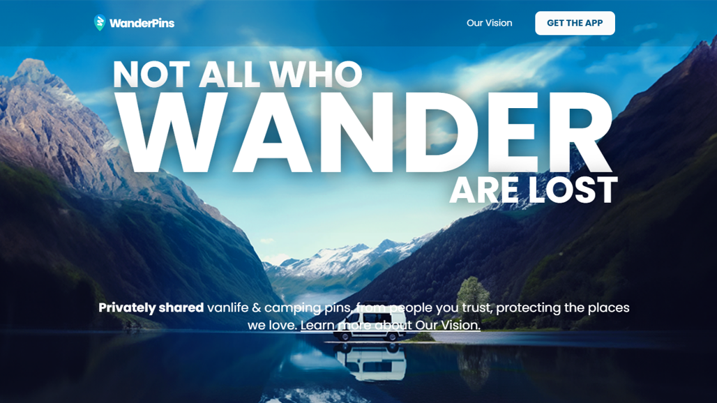
WanderPins used a clean design composition to feature a camping van in this hero image. It showcases a remote location, modeled after WanderPins’ ethos of protecting secluded camping sites from being disrespected and overrun.
The emphasis on text in this hero image, such as the large “WANDER” that takes up most of the image’s top third, keeps the focus on moving toward action rather than taking in the view. Further down the section, a concise headline and subtle CTA sit along the edge of the water to fit into the idyllic scene, so the tagline can stand tall.
3. Andrew Barrell
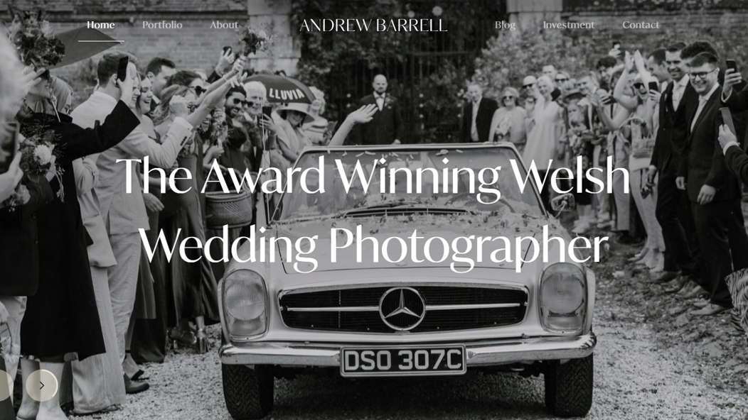
Welsh wedding photographer Andrew Barrell’s website opens on two emotionally rich hero images: one of a black and white wedding getaway, the other of a couple in a field at golden hour. These are two samples of Andrew’s style as a wedding photographer, so visitors can immediately see the quality of his work — in other words, his value proposition.
White text overlays the images without competing with the moments, as the images are dark enough to provide visual contrast and any distracting background details stay away from the centered text. While the hero image flips between two photos, each image stays on screen for several seconds, so visitors can get the full emotional experience from both.
4. TED Conferences
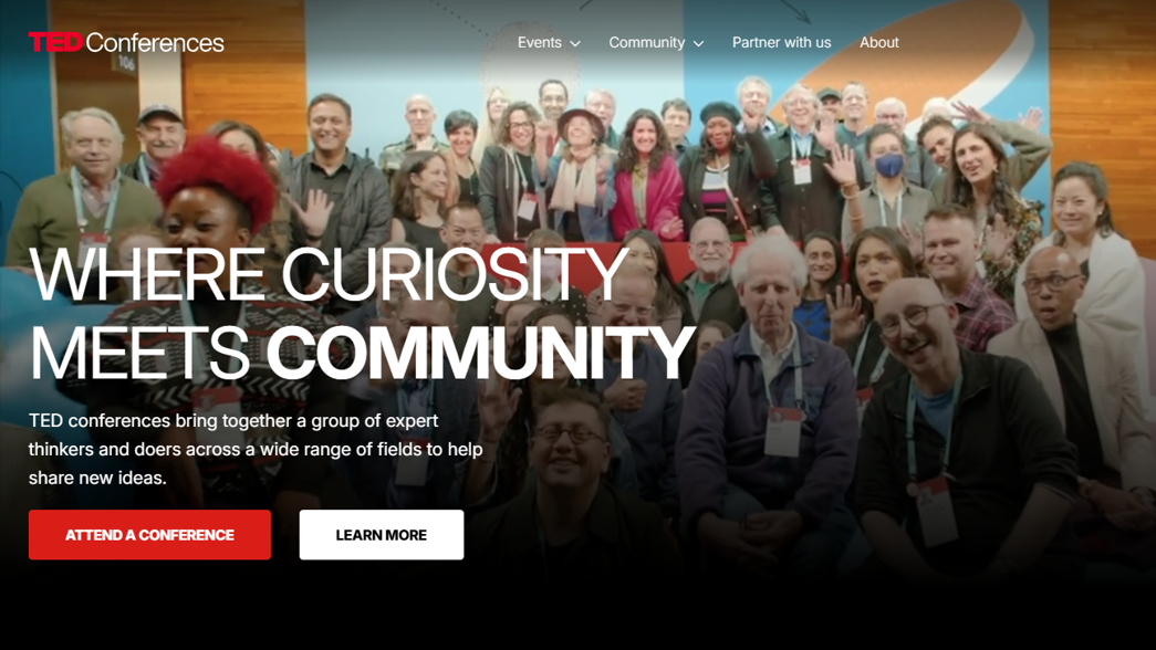
The hero section for TED Conferences skips the logistical clutter of dates and venues to focus on its brand-defining human energy. By using short video clips of actual audiences, engaged speakers, and vibrant group interactions, the hero image shows visitors TED’s community and idea-sharing ethos in practice. These clips portray enthusiasm to convince readers that learning can be fun, which builds an emotional connection and creates a sense of urgency for viewers who don’t want to miss out.
5. Sakura Motors
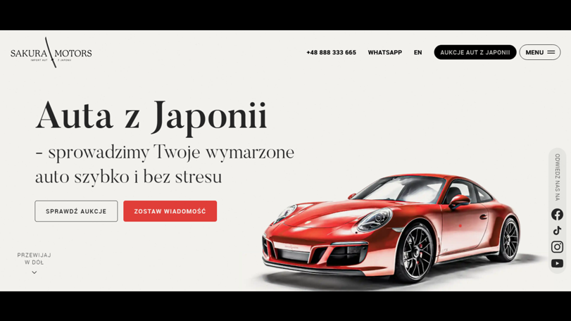
Polish car importer Sakura Motors’ website includes a very focused hero section featuring one of the company’s vehicle options and a promise: “We will import your dream car quickly and without stress.” Small hover animations move the car, adding a sense of tangibility to visitors’ interactions. This high-quality graphic and value-driven text lays out exactly what Sakura Motors offers so viewers can immediately understand their value.
Capture your brand’s essence with Webflow
A strong hero image introduces your site and shows visitors what’s most important about your brand. And when they’re optimized and designed according to best UX practices, hero images can convince visitors to convert before they scroll down the page.
Webflow’s agentic web marketing platform helps you fully customize your page structure to create the best first impression possible. You can use one of our templates for sites led by hero images, or choose from thousands of other Webflow templates if you need to put your site together quickly.
Ready to refine your site’s first impression? Start designing with Webflow.
Freelance web design boot camp
Explore what a successful, fulfilling web design career can look like with this free, comprehensive course.