

Scrolling can be so much more than a simple navigation method.
When your website controls the pace of the user experience, your message tends to come across stronger. That’s why scrollytelling is such a great web design technique: It creates momentum as visitors scroll down the page and delivers important information in a more engaging format.
Read on to learn what scrollytelling looks like and how it can add value to your website. Plus, see examples of scrollytelling in action, then get tips for applying this design element effectively.
What’s scrollytelling?
Scrollytelling is a web design technique that uses scrolling to reveal a story or complex message in a specific sequence. As visitors move down the page, elements like text and multimedia work together to guide them from one idea to the next.
In contrast, a standard web page contains content organized into static sections, which works well enough but doesn’t actively pull readers into engagement. And if there’s a lot on the page, visitors might not know what to focus on first and get overwhelmed. Scrollytelling turns those static pages into more immersive experiences, using motion and pacing to shape how visitors understand the story.
Key characteristics of scrollytelling
Scrollytelling relies on visual patterns and interactive elements to help reveal ideas in clear sequence. Let’s look at the most common scrollytelling design features.
Data or concept visualization
Data or concept visualization turns detailed information into visuals, such as:
- Charts
- Maps
- Diagrams
- Timelines
- Illustrations
These visuals often change as users scroll, so each new section adds context or highlights a key idea. Visuals make the story easier to follow, because they can add meaning words alone may not communicate as clearly — especially when the topic is complex.
Parallax scrolling
Parallax scrolling is when foreground and background elements move at different speeds or in different directions while users scroll. This creates a depth effect that makes pages feel more immersive, like the visuals are popping off the page.
Parallax scrolling works best as a subtle addition, since too much movement is distracting and reduces accessibility through higher cognitive load.
Visual transitions and animations
Transitions and animations attract attention with movement, and they connect sections so the scrolling experience feels continuous. Scrollytelling relies heavily on visual transitions and animations like:
- Fades: Elements gradually appear or disappear to soften the shift between sections
- Reveals: Content is introduced in small chunks
- Slides: Text or visuals move into view at specific points
- Zooms: Elements scale up or down to add emphasis or shift focus
- Morphs: Objects dynamically transform to show change or comparison
- State changes: Buttons and images change in response to scrolling
- Layered movement: Multiple elements and images move on scroll at the same time to create depth and rhythm
Sticky or pinned elements
Sticky and pinned elements stay in place for all or part of the scrolling experience, while other content moves around them. You can use sticky design for charts, product mockups, and other focal visuals you want to remain in frame as the surrounding text updates. This helps visitors grasp how various points or steps connect.
Benefits of scrollytelling
Using scrollytelling on your website can:
- Boost engagement. Scrollytelling gives readers a reason to keep moving through the page by revealing content in stages and creating momentum.
- Strengthen brand storytelling. A scrollytelling page shapes how visitors experience your brand, because it lets you control pacing and emphasis.
- Simplify complex information. Scrollytelling breaks dense topics into smaller steps and only shows what’s needed at each moment. Instead of feeling repetitive or overwhelming, scrollytelling makes a long page seem like a guided journey with a clear sense of progression.
5 examples of scrollytelling in web design
Here are five website examples that use various scroll-based design techniques to create engaging experiences.
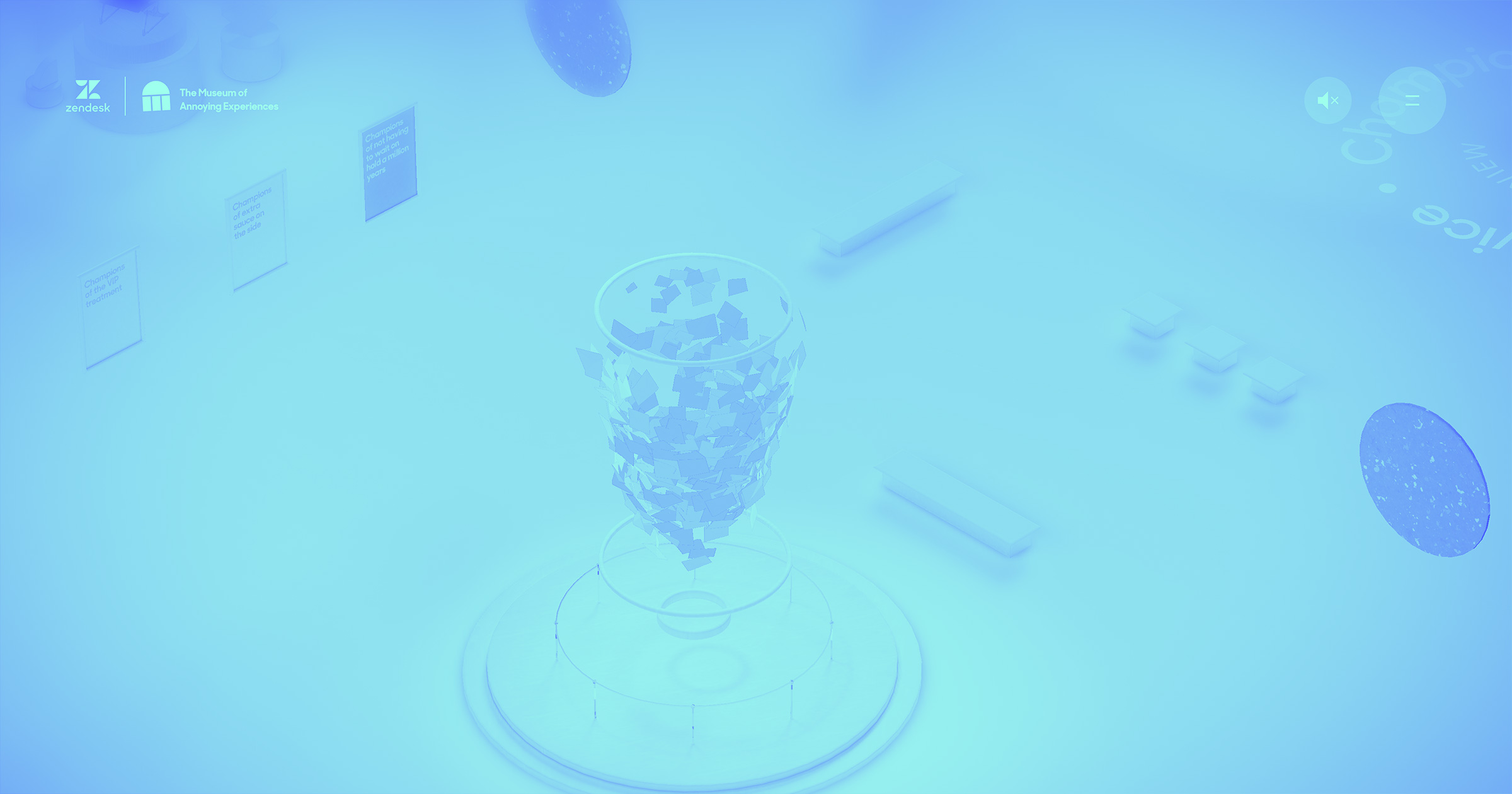
1. Cula
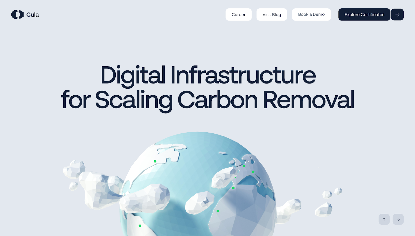
As you scroll through Cula’s homepage, designed by Refokus, a story unfolds in sections. This page begins by introducing the company’s larger mission, then gradually moves visitors into a stylized 3D environment that explains how Cula’s carbon removal process works in stages.
Sticky text and controlled scene shifts keep the pace slow, and layered motion controls pacing. These techniques help readers understand a complex technical process in a clear order without overwhelming them. Meanwhile, polished but slightly cartoonish visuals keep the tone light and ground the explanations in real-world imagery.
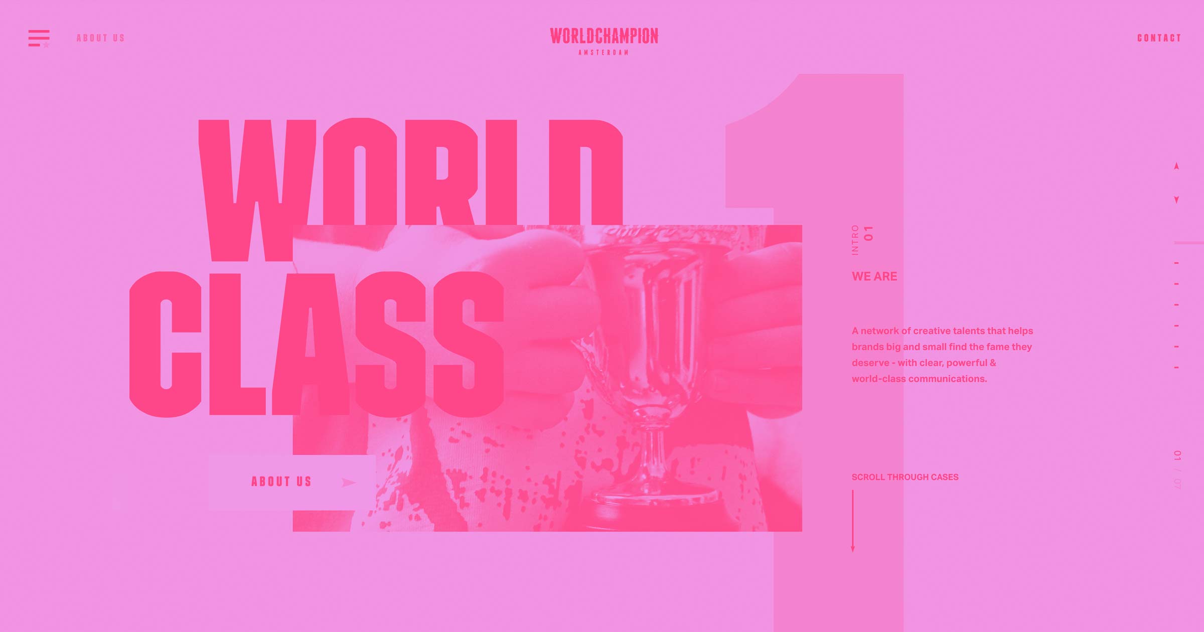
2. Agile by Design
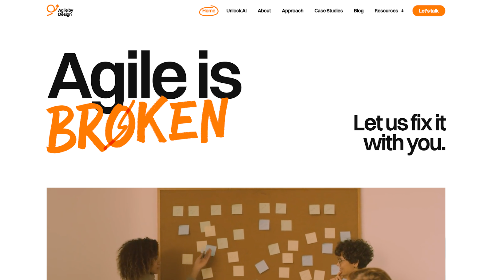
Agile by Design’s homepage, designed by Diego Toda de Oliveira, starts with a challenge to conventional agile thinking: “Agile is broken.” This grabs attention, and the rest of the page builds a strong argument through:
- Video footage to add visual variety
- Hand-drawn arrows to emphasise important text
- Parallax scrolling to add depth against a plain background
- Animated textual elements to hold reader interest
Instead of presenting claims as isolated blocks, each section builds on the last, moving from critique to explanation to pitch. By the end, the intended message is clear — that Agile by Design will help you optimize your agile workflows.

Why your design team should use Webflow
Discover how design teams are streamlining their workflows — and building better experiences — with Webflow.
3. Sage East
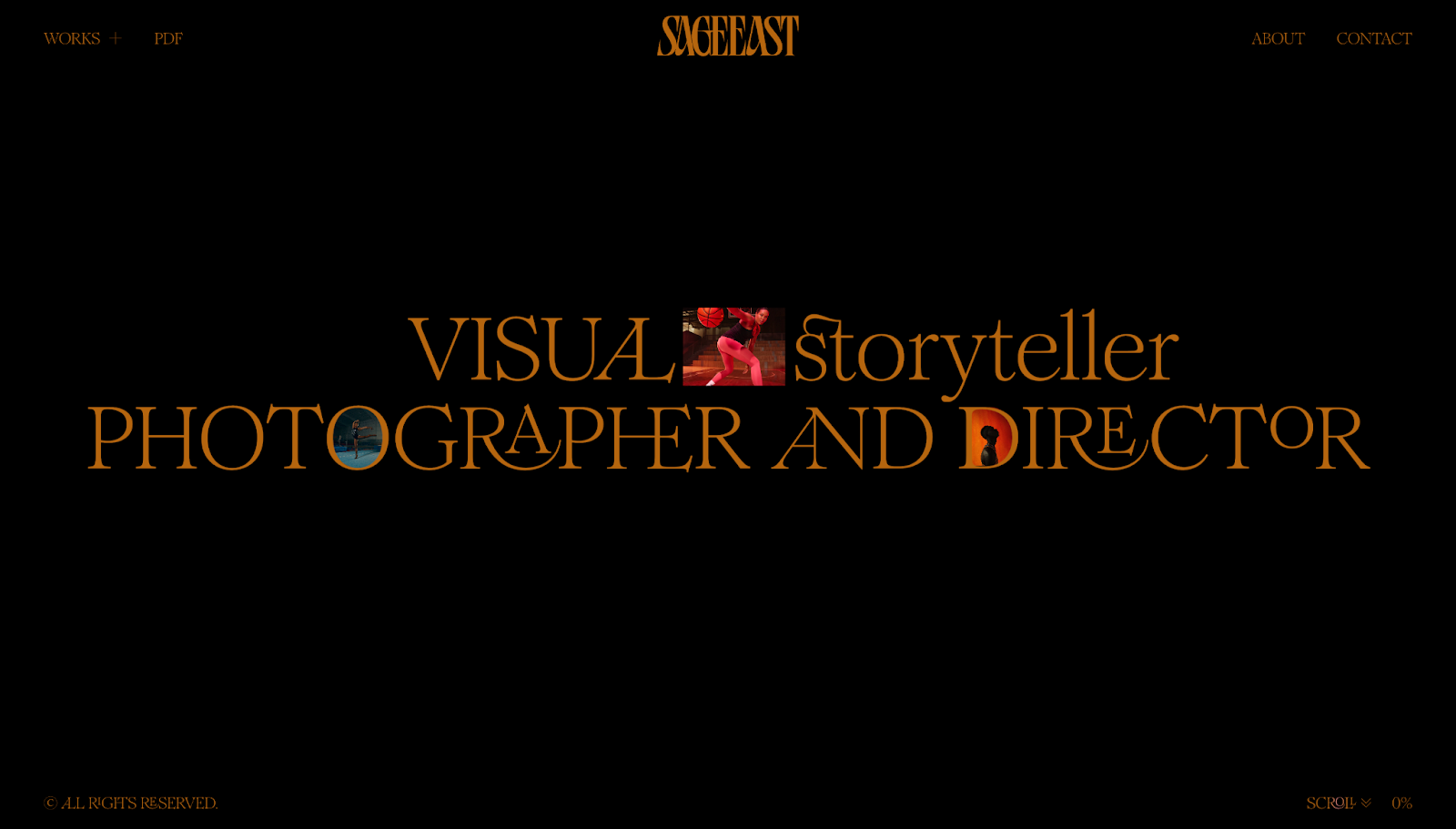
Sage East's portfolio, designed by The Blackpepper Studio, starts with an opening statement that defines what makes Sage's work distinct. She "doesn't just shoot what it looks like, but what it feels like."
Throughout the portfolio, scrolling pulls individual projects forward through zooming thumbnails, soft parallax effects, and transitions that briefly centralize each case study. These elements make every project noticeable and worthy of attention. Plus, visitors can choose between two paths (an immersive grid view or a more editorial list view), which gives them some agency while the scrollytelling directs the experience.
4. Diego

In Diego Toda de Oliveira's portfolio, projects come into view with more movement than in a standard, static case study page. Each project flips in with a dramatic transition, offering a clear sense of progression while separating one example from the next.
Further down the page, there's a testimonial section with sticky text behind cards showing concise user reviews moving across the screen. This keeps social proof prominent without breaking the page's flow. The final call to action (CTA) uses parallax in a similar way, making the invitation to get in touch harder to ignore.
5. ComPsych

On ComPsych's design guidelines site, designed by Konpo, readers move sideways through a timeline instead of scrolling from top to bottom. That timeline carries visitors from the brand story into details about:
- Tone of voice
- Logos
- Typography
- Photography
- Colors
This scrollytelling uses an infinite loop, so the journey feels less like a document with a fixed end and more like a dynamic system users can keep exploring as long as they like.
How to build a scrollytelling website
Follow these tips to build an engaging scrollytelling experience that moves visitors smoothly through your site.
Use a modern website builder
Choose a platform that lets you design layouts and add scrolling interactions visually, so you can see how they'll appear to visitors. For example, Webflow supports scroll-based triggers and timelines, which helps you create prototype reveals, pinned sections, and animated transitions. You can also test how sections flow together in a staging environment before going live.
Start with a strong narrative structure
Plan the page as a story before adding any complex elements. Decide what visitors need to understand first, where tension or interest should build, and how you can present ideas in a clear order.
Prioritize performance and accessibility
Keep animations smooth and media lightweight, so pages load quickly and make their intended impact. Design for people who may be sensitive to motion — W3C accessibility guidelines recommend including reduced-motion preferences to accommodate all audiences.
Use scroll triggers thoughtfully
Excessive motion and effects can make an experience cluttered and harder to understand, whereas thoughtful, limited interactions create a rhythm that helps people focus on one task at a time. So add scrollytelling techniques where they help you explain key concepts or pace the story, not just because they look impressive.
Bring your website to life with Webflow
A scrollytelling website doesn't rely on motion alone; it works when each section arrives at the right moment and the whole page leads visitors through a story. Aim to make scrolling part of the experience by pairing it with layouts, visuals, text, and other design elements that complement the motion and reinforce your message.
Webflow gives you a strong foundation to build engaging experiences quickly. You can create custom layouts in a visual design environment, then add GSAP-powered interactions that provide scroll-based motion and allow for structured, engaging narratives.
See how Webflow helps you turn your brand's story into an experience people want to keep exploring.
Get started for free
Create custom, scalable websites — without writing code. Start building in Webflow.