







Modern scroll animations let you decide when and where to reveal page elements for precise control over the user experience.
What used to be a simple navigation technique has now become a staple of premium website design. Scroll animations move visuals and page elements in response to the visitor scrolling down the page. This technique adds visual interest to your web design, and gives you added control over the look and feel of your layouts.
That said, it’s easy to overdo scroll animations. Too many can make a website load slowly and feel unintuitive, ultimately hurting your site’s perceived quality. In this article, you’ll learn which types of website scroll animations help you create an intentional user experience (UX) and how to use them to guide your visitors’ attention without overwhelming them. Then, we’ll share five scrolling animation examples that put these principles into action.
Types of scroll animations and their use cases
There are many kinds of scroll animations you can use for various effects. Here are some of the most common ones and their typical use cases:
- Scroll-triggered animations start when they come into view, much like lazy-loading images. They’re great for catching readers’ attention so they don’t scroll past important parts of the site, like a call to action (CTA).
- Scroll-linked animations play as readers scroll through a specific section. The animation begins as a visitor starts to move down that part of the page, but unlike scroll-triggered animations, it only advances as the visitor continues scrolling.
- Parallax scrolling describes any type of website animation in which foreground elements move faster than background elements. This gives the impression of depth, and you can use it to create a surprisingly convincing 3D effect.
- Horizontal scrolling animations shift the scrolling view from side to side instead of up and down. They’re great for timelines and galleries, and anywhere else that a long, flat space makes more sense than a vertical one. Use them sparingly, though — one or two make for an immersive surprise, but any more and your page can feel unpredictable.
- Reveal animations change the visibility of a page element as a user scrolls. You can use them to bring something into view, or to change the opacity of something like a sticky menu or navigation bar.
Why scroll animations matter for UX
Adding a scroll animation adds some visual flair and interactivity to your site, so they make a big impact on the overall user experience. Here are a few ways to use them effectively.
Engagement and attention
People naturally turn their attention to something that’s moving, so controlling movement means controlling their gaze. You can then direct it toward a CTA, for instance, or a product visual you want to highlight.
Visual hierarchy
The order in which your animations trigger provides subtle clues about the page's information hierarchy. For example, you could fade in a hero image with a short heading to set the stage, then follow up with related content. A scroll animation helps you time these effects so readers always get the context they need.
Storytelling and narrative progression
Scroll animations help you control how quickly readers move through your page. That’s key in scrollytelling, a web design technique that uses scrolling to influence narrative progression. For example, parallax scrolling and horizontal animations are great for timelines and interactive visuals, since they change the scroll behavior to catch readers at specific points.
How to use scroll animation to improve UX
Since scroll animations are such powerful tools for visual attention, including too many on your site can be counterproductive. An overload of animations can hurt your UX by slowing page load times, obscuring important information, and making the page more difficult to navigate.
Here are a few ways to carefully place them for a stronger UX:
- Use animation to guide, not distract. Only add animations to visuals or text that you want to draw immediate attention to, like a hero image, brand logo, or product visual — and only add one at a time. Too much animation makes for a busy, overwhelming UX as readers try to guess where they’re supposed to start.
- Keep motion subtle and purposeful. Slow and steady is best when inserting animations, since you can’t predict exactly how quickly visitors are scrolling. An infinite scroll wheel can blow past a fast animation, but slowing it down means most users will get a fairly similar experience.
- Limit animation density. Spread your animations out, and put static sections between them to break up the motion on the screen. That way, visitors can easily tell when one animation ends and another begins.
- Prioritize performance. Test your designs as you go to ensure each new animation doesn’t slow your page load time. Visitors won’t see any of your animations if they bounce because the page took too long to load.
- Design for mobile interactions. If your site follows average internet use patterns, more of your traffic will come from phones rather than a desktop browser that has plenty of screen space for animations. Follow a mobile-first design process to get your animations looking right on a smaller screen, then scale it up for larger ones.
5 scroll animation examples (and when to use them)
The key to using scroll animations effectively is being deliberate about where you use them, and that takes some experimentation to get just right. Here are five examples of website designs with scroll animations that don’t go overboard.
1. Landing pages: Diamond Rose Sanctuary

- What it does: Diamond Rose Sanctuary’s website uses scroll-loading animations to establish a visual hierarchy. As readers scroll, visuals fly or fade in to reveal text.
- Why it works: The first thing to appear always has enough time and space to establish itself as the primary focus of a section. Then, after a few more scrolls, the other elements add to it, emphasizing the text or image’s main point.
- When to use it: This animation style adds friction to the user experience, so it’s best to use it sparingly. Add it only to places where you want to keep a reader’s attention on a major tagline or product visual. If you use it too much, you’ll slow down the user experience, and you might even frustrate readers who get stuck while trying to scroll to a particular section further down the page.
2. Product storytelling pages: Agile by Design

- What it does: Agile by Design’s about page uses a horizontal scrolling timeline to explore its history, giving the page more than enough space to cover each milestone in detail.
- Why it works: Only two or three milestones fit onto the screen at a time, keeping the layout clean with enough whitespace that it never looks cluttered.
- When to use it: Inserting a horizontal scrolling section gives you another dimension to work with, which helps your page stay organized if you have a lot of content to show. It’s usually best to put horizontal scrolling sections toward the bottom of a page, where you can add content without blocking anything below. If you use it near the top, keep it short so viewers don’t have to scroll for too long without moving toward the content they want to see.

Interactions & animations
Learn how to animate multiple elements and bring your designs to life with rich, sequenced interactions and animations.
3. Agency portfolios: Paper Tiger
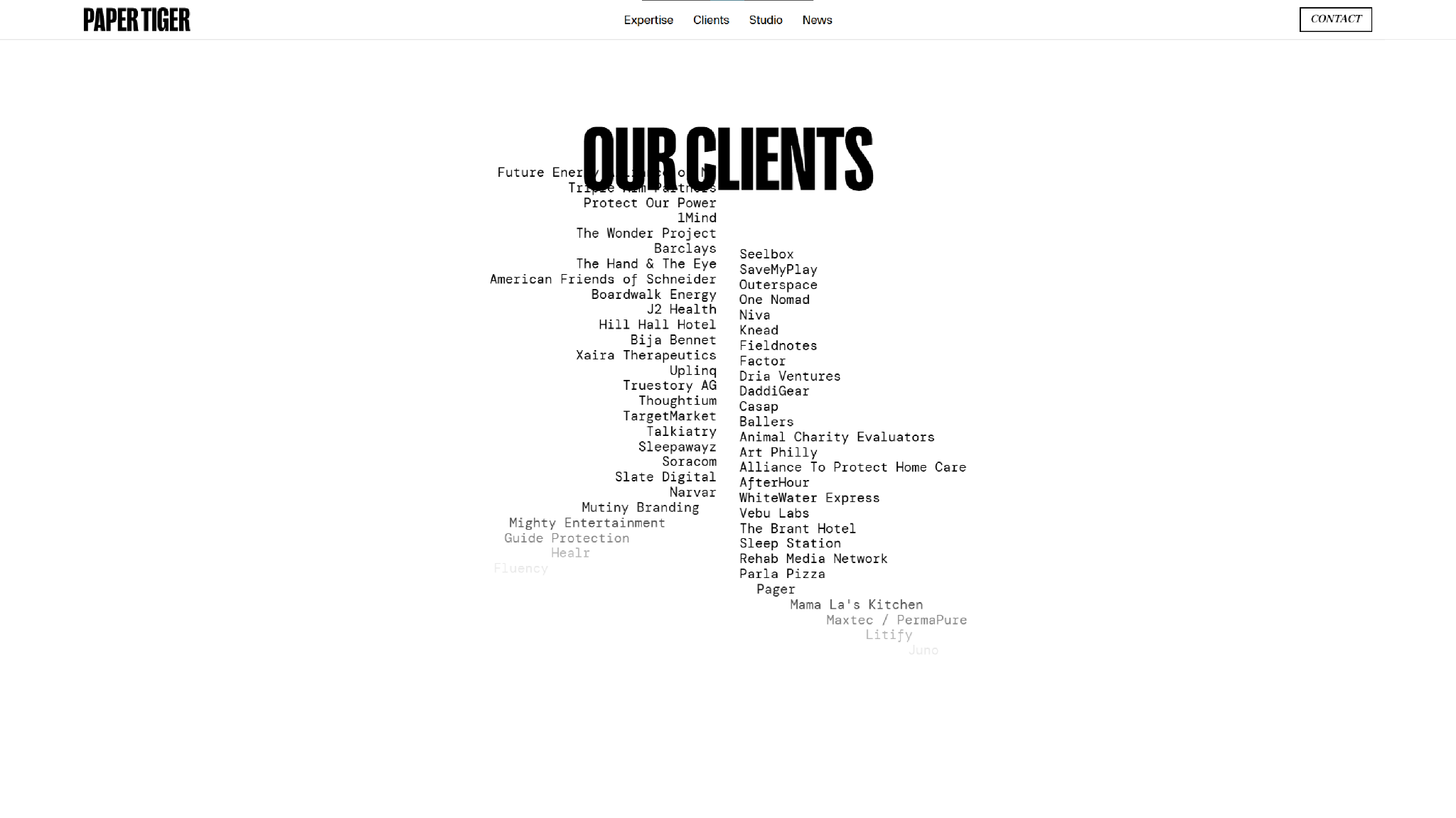
- What it does: Paper Tiger uses scroll-loading and scroll-triggered animations to guide visitors through the user experience. Its “Expertise” page, for example, moves two columns of the team’s skills in opposite directions to encourage visitors to keep scrolling, before “DESIGN,” “ENGINEERING,” and “STRATEGY” (the section headers for the rest of the page) appear.
- Why it works: The animations indicate the direction and interactivity of each section, making it intuitive to read and understand at a glance.
- When to use it: This scroll animation style is great for grabbing the reader’s attention and keeping it. If you have a story to tell, several case studies to show, or a lot of explaining to do before you can get to the CTA, then this is an excellent template to follow.
4. Ecommerce product reveals: Hungry Tiger

- What it does: Hungry Tiger uses parallax scrolling to animate a rotating bottle of their product, a jarred tikka masala sauce, which stays on center screen until the “What’s inside” section, where it spills out.
- Why it works: It’s a clever way to familiarize a visitor with a product and show off its packaging, then introduce a section about its contents.
- When to use it: Parallax scrolling is best for creating memorable visual interactions that put a product or service front and center. It’s a versatile effect, so you can find a way to use it on most websites (even if it’s just a brand logo that moves around the page).
5. Data storytelling pages: Builders Power Rankings
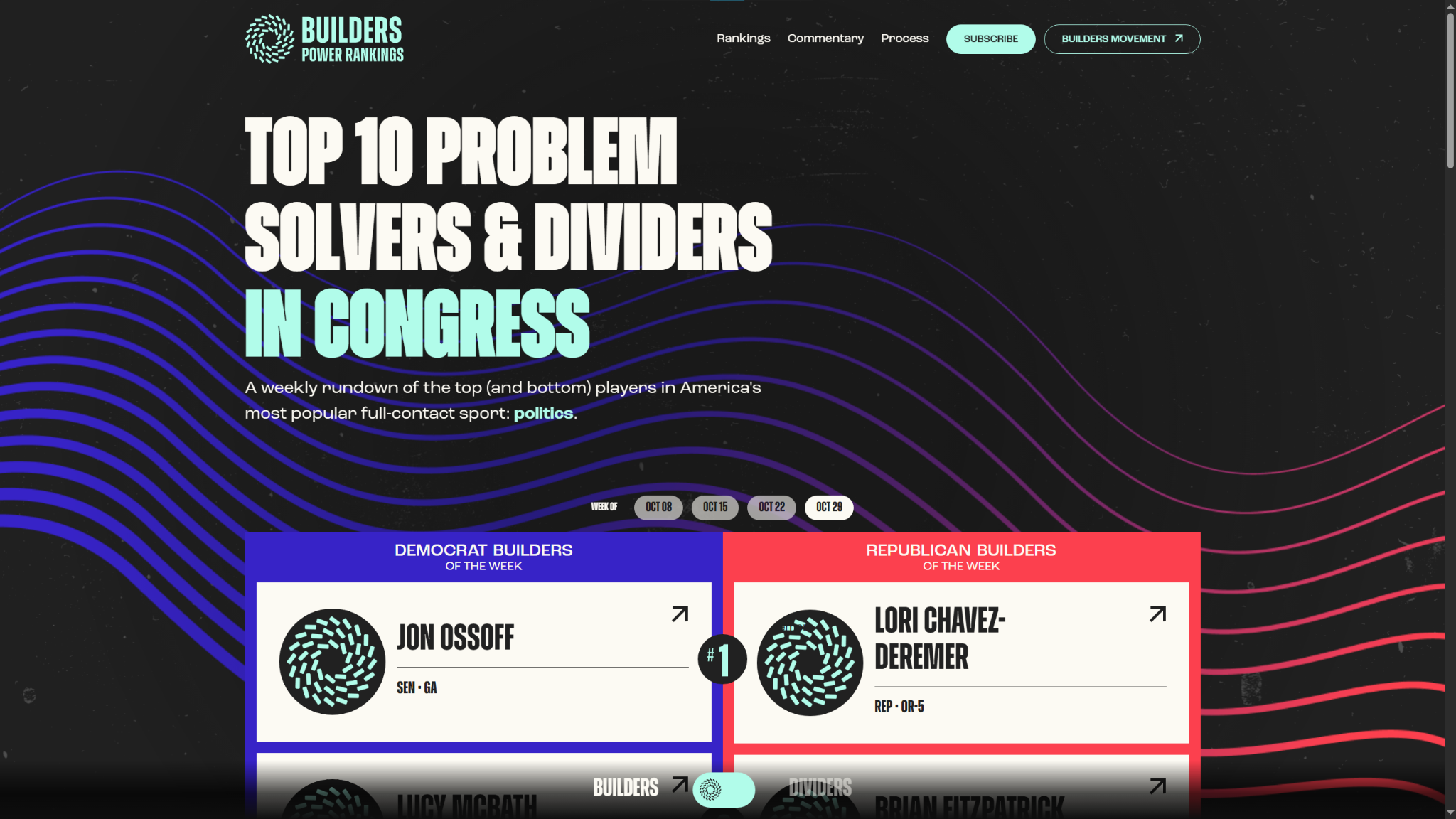
- What it does: Builders Power Rankings uses animations to fade in the page and its interactive elements. Every card in the grid opens a pop-up window when clicked, and as you scroll down the page, reveal animations slowly uncover new sections.
- Why it works: The intricate political data this website captures can appear intimidating and get overwhelming without a knowledgeable guide, which is the persona Builders Power Rankings is creating. These animations gradually reveal all the data, establishing an intuitive visual hierarchy that shows (rather than tells) people where to start.
- When to use it: If you have a lot of data to organize and display to readers, a gradual approach to the layout can make it more inviting and easier to navigate. Capturing detailed views in pop-up windows so visitors can focus on one thing at a time is a helpful touch, too.
Apply scroll animations purposefully with Webflow
Scroll animations aren’t the end-all and be-all for a compelling website design, but they can make all the difference between an okay UX and a conversion — if done right. That means being deliberate about where and when to use them, and striking a balance between visual flair and practical usefulness.
Webflow’s visual canvas helps you quickly design expressive animations that impress your clients and visitors alike. The interactions menu is filled with prepared options for behaviors, triggers, and directions, so you can quickly assemble a dynamic scroll animation that grabs attention.
Design your next site with Webflow and discover all the other ways our agentic web marketing platform can work for you.

The modern web design process
Discover the processes and tools behind high-performing websites in this free ebook.