


Pasting a Cloudinary URL into Webflow's native image element works, but it skips responsive delivery entirely. The srcset and sizes attributes, which tell the browser which image size to request, aren't exposed for external sources in Webflow. Here's how to add them using a Custom code embed.
Oversized images are one of the most common performance drag on Webflow sites. The problem? Webflow's native image element doesn't expose srcset controls for externally hosted images, so there's no obvious place to plug in Cloudinary's responsive delivery.
The result is that people either upload full-resolution images directly to Webflow and let the browser scale them down, or they use Cloudinary URLs as a direct src attribute and miss the entire responsive delivery stack.
In this guide, we cover two methods for serving Cloudinary images responsively in Webflow: a hand-coded srcset embed for static pages, and Cloudinary's JavaScript library for automatic per-element sizing. Each method has a different trade-off profile. I'll tell you which to reach for based on what you're building.
What do you need to serve responsive Cloudinary images in Webflow?
You need a Cloudinary account (free tier works for all three methods), at least one image uploaded to your Cloudinary Media Library, and a Webflow site on a paid plan. The paid plan requirement is for the Code Embed element, which is unavailable on the free Webflow plan.
A Cloudinary account and an uploaded image
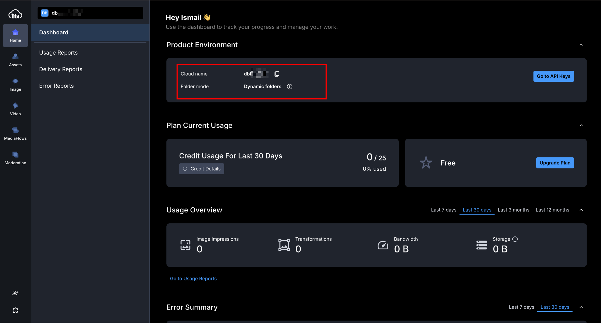
Sign up at cloudinary.com. After logging in, your cloud name appears in the top-left corner of the dashboard. It's a short identifier like mycompany that appears in every delivery URL you'll build.
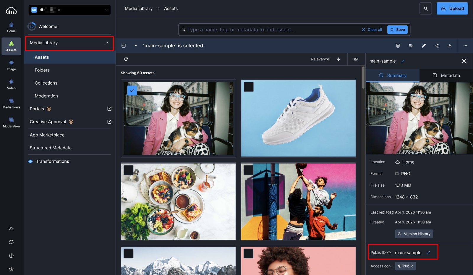
Upload your first image through the Media Library tab.
After uploading, Cloudinary shows you the image's public ID — the path and filename used to reference it in URLs. For an image uploaded to the root of your Media Library named hero.jpg, the public ID is simply hero.jpg.
For a folder like /site-images/hero.jpg, the public ID is site-images/hero.jpg.
The free Cloudinary plan includes 25 monthly transformation credits and 25GB of storage. For a small site, that's generally sufficient. If you're running many srcset variants across dozens of images, monitor your usage in the Cloudinary dashboard and consider the free plan limits before deploying to production.
A Webflow site on an active Site plan
The Code Embed element requires either a Core, Growth, Agency, or Freelancer Workspace plan or an active Site plan on the project you're working on. Free Webflow sites without one of these plans can't use Code Embed elements.
If you're on the free Webflow plan and want to test, publish to your .webflow.io staging subdomain after upgrading.
Once these are in place, building out responsive image delivery takes about 15–20 minutes for Method 1, longer for Methods 2 and 3 if you're setting up CMS fields from scratch.
What are the methods to serve responsive Cloudinary images in Webflow?
Webflow has no native UI control for srcset on external images, so all methods rely on either the Custom code embed element or custom code in Project Settings. The choice between them comes down to one question: are you hand-coding a handful of images, or do you want automatic sizing across an entire page?
| Method | How it works | Best for | Trade-offs |
|---|---|---|---|
| Static srcset embed | |
Static pages, hero images, marketing sections | Manual URL construction; update the embed if you swap images |
| Cloudinary JS library | cloudinary-core script + cld-responsive class auto-sizes every tagged image |
Pages with many images, consistent breakpoint patterns | Requires JavaScript; browser preloading sacrificed |
I use Method 1 for hero images and feature sections where I know the image won't change often. Method 2 when I have a gallery or portfolio page with a dozen images that I don't want to hand-code.
Method 1: Add a responsive Cloudinary image with a static srcset embed
This method builds a standard srcset attribute containing multiple Cloudinary URLs (one per breakpoint), and drops it into a Webflow Code Embed element. The browser then picks the closest-sized image based on the current viewport. No JavaScript or external library. Just HTML that works.
For the Cloudinary URL structure, every transformation goes between /upload/ and the public ID. Width is set with w_[N], format with f_auto and quality with q_auto.
So a 768px-wide, auto-format, auto-quality version of hero.jpg looks like:
https://res.cloudinary.com/[cloud-name]/image/upload/f_auto,q_auto,w_768/hero.jpg1. Build your base Cloudinary URL
Open your Cloudinary Media Library, click your image, select “Copy URL”, then choose “Copy Original URL with options”.
The delivery URL will look like:
https://res.cloudinary.com/mycompany/image/upload/hero.jpg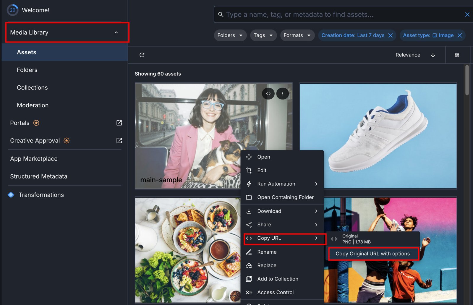
You'll build all your srcset variants from this base by inserting transformation parameters after /upload/.
2. Generate your srcset URLs
For a typical responsive image, generate five width variants. These cover the range from a small mobile screen to a large desktop retina display:
https://res.cloudinary.com/mycompany/image/upload/f_auto,q_auto,w_640/hero.jpg   640w
https://res.cloudinary.com/mycompany/image/upload/f_auto,q_auto,w_768/hero.jpg   768w
https://res.cloudinary.com/mycompany/image/upload/f_auto,q_auto,w_1024/hero.jpg  1024w
https://res.cloudinary.com/mycompany/image/upload/f_auto,q_auto,w_1280/hero.jpg  1280w
https://res.cloudinary.com/mycompany/image/upload/f_auto,q_auto,w_1920/hero.jpg  1920w
Breaking down what each parameter does:
f_autotells Cloudinary to deliver the most efficient format the browser supports (typically WebP, AVIF, or JPEG XL) without requiring you to maintain separate URLs for each format. Which formats are eligible depends on your Cloudinary plan. Withoutf_auto, Cloudinary delivers the original format regardless of browser capabilities.q_autoapplies intelligent compression. Both are free transformation operations included on every Cloudinary plan and should be on every image URL you build.
Why these breakpoints? They cover the range from small mobile to large desktop retina, aligning well with Webflow's built-in responsive breakpoints, where the base desktop view starts at 992px, and the tablet breakpoint applies at 991px and below.
The 1280px and 1440px points in the srcset map to Webflow's optional larger breakpoints for widescreen designs. You can trim or extend this list based on your actual layout: a 2-column grid image only needs to go up to ~800w.
Retina/HiDPI displays: A MacBook with a 2x display at 1280px logical width requests a ~2560px image. The 1920w entry is the closest match in this srcset, which means retina users get a slightly lower-density image.
For hero images where sharpness matters, add a 2560w entry. For secondary images, 1920w is adequate. The improvement at 2560w is marginal at typical compression settings.
3. Write the full![]()
Combine the srcset URLs with the sizes attribute. The sizes attribute tells the browser how wide the image will actually be rendered at each viewport width. This is what lets the browser pick the right srcset entry.
For a full-width hero image:
<img
  src="https://res.cloudinary.com/mycompany/image/upload/f_auto,q_auto,w_1024/hero.jpg"
  srcset="
    https://res.cloudinary.com/mycompany/image/upload/f_auto,q_auto,w_640/hero.jpg 640w,
    https://res.cloudinary.com/mycompany/image/upload/f_auto,q_auto,w_768/hero.jpg 768w,
    https://res.cloudinary.com/mycompany/image/upload/f_auto,q_auto,w_1024/hero.jpg 1024w,
    https://res.cloudinary.com/mycompany/image/upload/f_auto,q_auto,w_1280/hero.jpg 1280w,
    https://res.cloudinary.com/mycompany/image/upload/f_auto,q_auto,w_1920/hero.jpg 1920w
  "
  sizes="100vw"
  alt="Descriptive alt text"
  loading="lazy"
  style="width: 100%; height: auto; display: block;"
/>
For an image that's 50% of the viewport on desktop but full-width on mobile:
sizes="(min-width: 768px) 50vw, 100vw"The src attribute is the fallback. Use the mid-range width (1024w). The loading="lazy" attribute defers loading until the image is near the viewport. Remove it for above-the-fold hero images to avoid LCP impact.
For above-the-fold hero images, omit loading="lazy" entirely, or set loading="eager". Also, add fetchpriority="high" to signal to the browser that this is your LCP element:
<img srcset="..." sizes="100vw" src="..." fetchpriority="high" alt="...">fetchpriority="high" is supported in all modern browsers and can meaningfully improve LCP scores by deprioritizing other resources in favor of the hero image.
4. Add a Custom Code Embed element in Webflow
In the Webflow Designer, open the Add panel (the + icon in the left toolbar). Search for 'Embed' using the search field, or scroll to the Components section and drag the Embed element onto the canvas.

The Embed element appears as a grey placeholder box on the canvas. This is expected. It won't preview the image in the Designer. Click on it to open the Code Embed editor.
5. Paste your![]()
With the Embed element selected, the Code Embed Editor pops open.
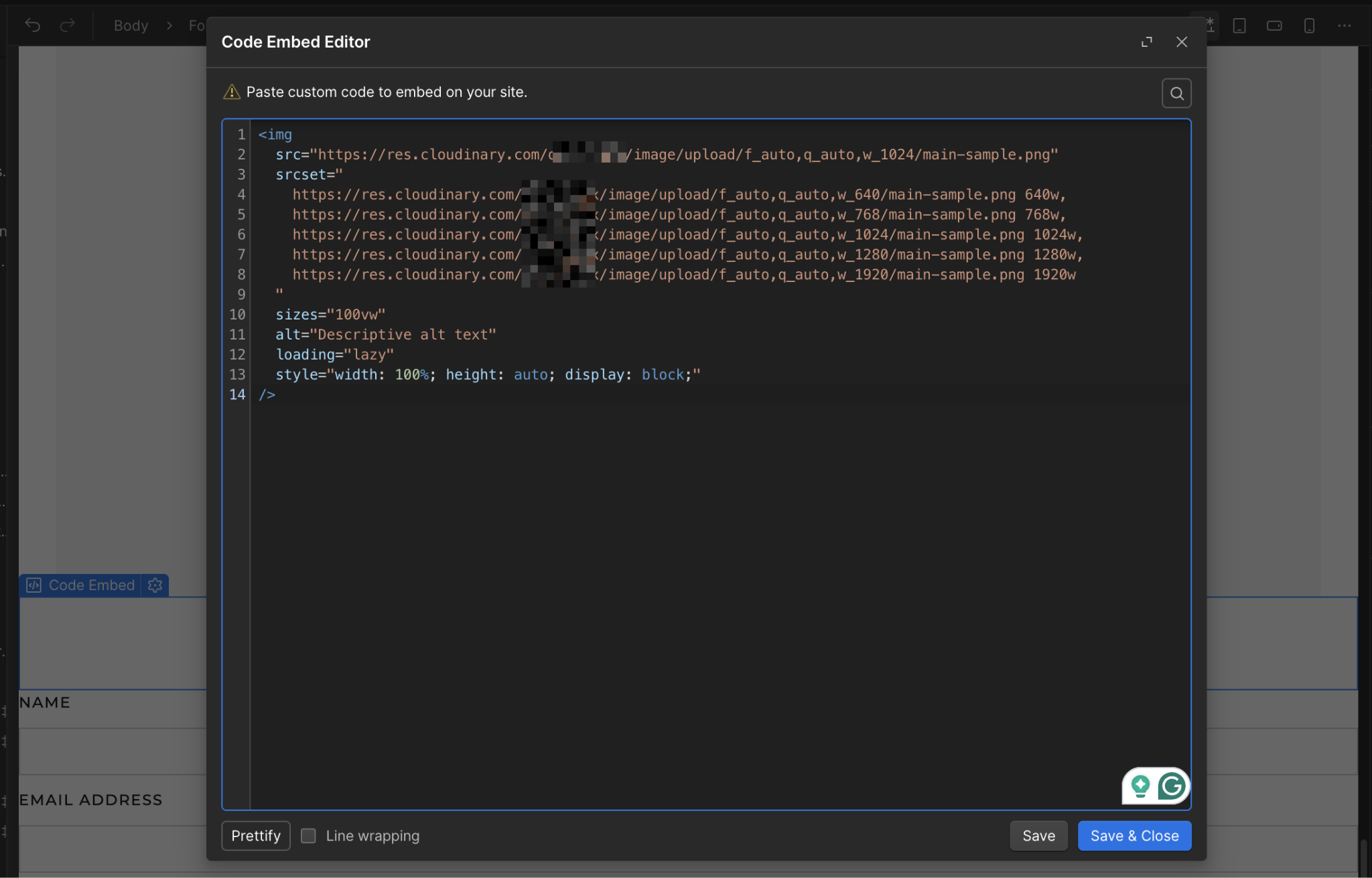
Paste the full
6. Publish and verify with browser dev tools
Publish your site. On the published page, open your browser's developer tools (F12 or right-click → Inspect), find the
- The
srcsetattribute is present with all five URLs - The
sizesattribute matches what you set - The
srcattribute shows the correct fallback URL
To verify which image the browser actually loaded, switch to the Network tab, filter by Img, reload the page, and look for the Cloudinary domain (res.cloudinary.com). The file loaded should roughly match your current viewport width.
On a 1280px desktop, the browser should request the 1280w or 1024w image, not the 1920w.
Expected outcome: The browser loads a viewport-appropriate image, and f_auto delivers WebP or AVIF to browsers that support them. On a 375px mobile device, the browser should serve the 640w image rather than the 1920w original.
Method 2: Use Cloudinary's JS library for automatic sizing
Cloudinary's cloudinary-core JavaScript library watches every image tagged with the class cld-responsive. It replaces the data-src placeholder with a URL sized to the exact pixel width available for that element in the layout. This is hands-off; once configured, you don't write srcset at all.
For new projects, Cloudinary recommends @cloudinary/url-gen, but for a Webflow embed context with no build step, cloudinary-core remains the practical choice — the newer SDK assumes a module bundler. If your setup supports ES modules, check Cloudinary's JS SDK docs for the current approach.The trade-off is that the browser can't preload these images before the script runs, which can affect Largest Contentful Paint for hero images. I don't use this method for above-the-fold images, but it's fine for grids, galleries, and below-the-fold sections.
1. Add the Cloudinary library to your site's Head code
In the Webflow Designer, go to the Webflow logo → Site settings → Custom Code → Head code.
Paste the library script tag there:
<script src="https://unpkg.com/cloudinary-core@latest/cloudinary-core-shrinkwrap.js" type="text/javascript"></script>Placing it in Head Code ensures the cloudinary global is defined before any body-level embed scripts execute.
For live sites, pin to a specific version rather than @latest to protect against breaking changes. Check unpkg.com/cloudinary-core for the current version number, then replace @latest with it (e.g., cloudinary-core@2.14.1).
Click “Save changes” to save the header.
2. Add a Custom code embed element with the initialization script and image tag
In the Webflow Designer, add an Embed element (from the Add panel) to the page where you want the responsive image to appear.
Open the code editor and paste:
<img
  data-src="https://res.cloudinary.com/mycompany/image/upload/f_auto,q_auto,w_auto,c_scale/hero.jpg"
  class="cld-responsive"
  alt="Descriptive alt text"
  style="width: 100%; height: auto; display: block;"
/>

<script type="text/javascript">
  var cl = cloudinary.Cloudinary.new({ cloud_name: "mycompany" });
  cl.responsive();
</script>
Replace mycompany with your actual Cloudinary cloud name in both the data-src URL and the cloud_name value.
The w_auto,c_scale transformation tells Cloudinary to deliver an image scaled to the element's available width. The cloudinary-core library reads that width from the DOM after the page loads and updates the data-src to a real URL with the correct pixel value, e.g., w_800 on a section that's 800px wide.
On the live site, each image loads at the width Cloudinary determines matches the container. In dev tools, you'll see data-src on initial load become a proper src attribute with a width value after the script fires.
3. Test on multiple viewport sizes
The JS library updates image widths in 100px increments by default to avoid generating too many unique transformed images. A container that's 847px wide gets a 900px image, not an 847px image. This is a good trade-off between precision and your Cloudinary transformation count.
Resize your browser window and hard-reload. You should see different w_[N] values in the Cloudinary URLs for different viewport sizes.
If you're seeing the same width value regardless of viewport size, the initialization script isn't firing before the image loads. Check that the cloudinary-core script is in Head Code (not Footer Code) and that the cl.responsive() call appears after the image tag in the same Embed element.
Order matters. The image must exist in the DOM before cl.responsive() scans for cld-responsive elements.
4. Exclude hero images from this method
Above-the-fold images shouldn't use the JS-dependent method because the browser can't preload them before the script runs. For any image that's likely to be your Largest Contentful Paint element, use Method 1's static srcset instead, or combine both: use Method 1 for the hero and Method 2 for everything below the fold on the same page.
A practical pattern: add the cloudinary-core initialization script once in your site's Head Code, then use Method 1's cld-responsive class and data-src attributes in Embed elements.
The two methods coexist cleanly on the same page because they use entirely different mechanisms: one is static HTML, the other is JavaScript-driven.
What causes Cloudinary images to break in Webflow?
Images that render fine in Cloudinary's dashboard but break on the Webflow site usually fall into one of four categories: code that only runs on published sites, a missing or malformed sizes attribute, a URL construction error, or an initialization order problem with the JS library.
The symptom usually points directly to the cause.
The image appears in Designer but not on the published site
Cause: Custom code embed elements containing <script> tags show a placeholder block in the Designer, not a live preview. Scripts only execute on the published site.
Fix: Publish to your .webflow.io staging subdomain to test without going live on a custom domain. If the image appears on the staging URL but not the Designer, the code is working correctly.
Image loads at full resolution despite srcset
Cause: A missing or incorrect sizes attribute. The browser defaults to 100vw when sizes is absent, but this interacts with your srcset differently than an explicit declaration. More commonly, the image is loading from the src fallback rather than the srcset, which means the browser found the srcset malformed.
Fix: In the browser dev tools, inspect the currentSrc property in the console: document.querySelector('img').currentSrc. If it matches your src fallback exactly (not a srcset entry), your srcset syntax has an error. Look for missing commas between srcset entries, or spaces inside the width descriptor (it should be 640w, not 640 w).
Cloudinary URL returns a 400 or 404 error
Cause: Incorrect transformation syntax or a public ID that doesn't match the uploaded file.
Fix: Test the URL directly in a browser tab first. Common mistakes: spaces in the public ID (Cloudinary encodes these, but they can cause issues when hand-typed), wrong cloud name, or a version segment mismatch. Remove all transformation parameters and test the bare URL first:
https://res.cloudinary.com/mycompany/image/upload/hero.jpgIf this loads, add transformations back one at a time until you find the one causing the error.
CMS dynamic embed shows raw binding syntax instead of the image URL
Cause: The field binding syntax ({{wf ...}}) wasn't inserted using Webflow's Add Field button; it was typed manually, which almost always results in malformed binding code.
Fix:Open the embed code editor, delete the manual binding syntax, reposition the cursor inside the attribute value, and use the Add Field button to insert the binding correctly. Webflow generates the correct JSON syntax and automatically escapes quotes.
JS library images don't resize on viewport change
Cause: The Cloudinary cloudinary-core JS library only fires responsive sizing on initial load and window resize events with a debounce delay. If you resize the window and immediately inspect, the image may not have updated yet.
Fix: Resize the window, wait about 500ms, then hard-reload. The library also requires that the Cloudinary script in Project Settings Footer Code be loaded before the cloudinary.Cloudinary.new() call in the Embed element.
If the initialization order is reversed (library tag in Footer Code, initialization script in a body embed), the cloudinary global won't exist when the embed script runs. This is why the library should go in Head Code, not Footer Code.
Head Code executes before the page body, so the global is always available to any embedded elements that follow.
Go further with Cloudinary and Webflow
Responsive delivery is the performance layer. The next layer is workflow: keeping Cloudinary and Webflow in sync when images change, without manually updating URLs across CMS entries.
Explore Webflow + Cloudinary to go deeper into how Cloudinary and Webflow connect, what each handles, and common architecture patterns.
See Webflow's developer docs for server-side workflows where an external pipeline uploads to Cloudinary and pushes URLs to Webflow CMS programmatically.
Frequently asked questions
Can I use Cloudinary URLs directly in Webflow's native Image element?
Yes. You can paste a Cloudinary URL as the image source in the Webflow Image element, but you lose responsive delivery. Webflow's native Image element doesn't expose srcset or sizes controls for external URLs. Those attributes only appear for images uploaded to Webflow's own asset hosting. For responsive delivery, use a Custom code embed element with a hand-coded
Will Cloudinary serve WebP automatically without any additional setup?
Yes, if you include f_auto in the transformation parameters. f_auto checks the browser's Accept header and serves WebP, AVIF, or JPEG XL when supported, with JPEG as the fallback. Without f_auto, Cloudinary serves the original format regardless of browser capabilities. Note that AVIF and JPEG XL are not enabled for f_auto on all Cloudinary plans. Bandwidth-metric accounts need to contact Cloudinary support to have them enabled.


