

Luxury websites give visitors a curated, polished experience that’s just as high-end as the products.
It takes a keen eye for detail to create a premium website experience that luxury shoppers enjoy. Whether it’s for a fashion house or high-end brand agency, a site selling luxury products and experiences needs to be immediately recognizable as premium. Balancing stylish aesthetics with sophisticated interactions and fast loading times make the difference between a luxury website and a standard e-commerce page.
There are some basic elements that most sites offering luxury experiences share. In this article, you’ll find a list of those high-end website design elements, along with seven luxury website examples that demonstrate how to put those features to use.
Design elements to include in a luxury brand website
Here are some of the most common luxury website elements to consider when designing your own.
High-end visual direction
Luxury e-commerce website design starts with a deliberate visual style because it guides every choice you’ll make. An elegant color palette is a good place to start, accompanied by high-quality photography and modern font choices.
It’s also helpful to capture everything in a detailed design system that provides a source of truth for your overall luxury brand aesthetic goals. Reference it often throughout development so every design decision fits in.
Premium UX and subtle microinteractions
Effortlessness is part of a luxury experience, and that means removing friction at every step of the user experience (UX). Many luxury websites opt for a carefully curated one-page layout that leads visitors directly to conversion at the bottom of the page.
Seamless interactions remove friction from the UX, adding the polished feel that luxury websites need. Augmented reality (AR) product visualizations, intuitive navigation menus, and smooth animations are all great examples of interactions that make a page feel like a glossy magazine.
Storytelling that reinforces heritage and craftsmanship
If you’re selling a luxury product, consider how exclusivity or quality sets it apart. Think deeply about your product, where it came from, and how much expertise was required to make it. Then, find opportunities to tell that story throughout the purchasing process.
For example, each piece of dinnerware on the Palmer site (below) has a name that harkens to the origin of its patterns, shape, or materials. This kind of storytelling improves luxury site designs because it makes visitors feel connected to your offering.
Trust and authenticity
You’ll need to capture visitors’ attention in the first few seconds to convince them to stick around long enough to understand your value. Pick a great hero image for the top of your homepage, and optimize your site for a fast load speed.
Take every opportunity to build credibility by associating your brand with reliable outside parties who exude luxury. Social proof, like reviews and testimonials, can reassure visitors that your brand is trustworthy (which is especially important for sites offering products and experiences that require an investment).
7 luxury website examples
Before you start creating your own luxury website, look through these seven examples. Notice what stands out to you and consider how you might apply those techniques to your own designs.
1. WHITE PLAN
2. Palmer
3. Stewart & Partners
4. Studio Few
5. Ascension Luxury Catamaran
6. RAMONA BIZBAC
7. Cue
1. WHITE PLAN
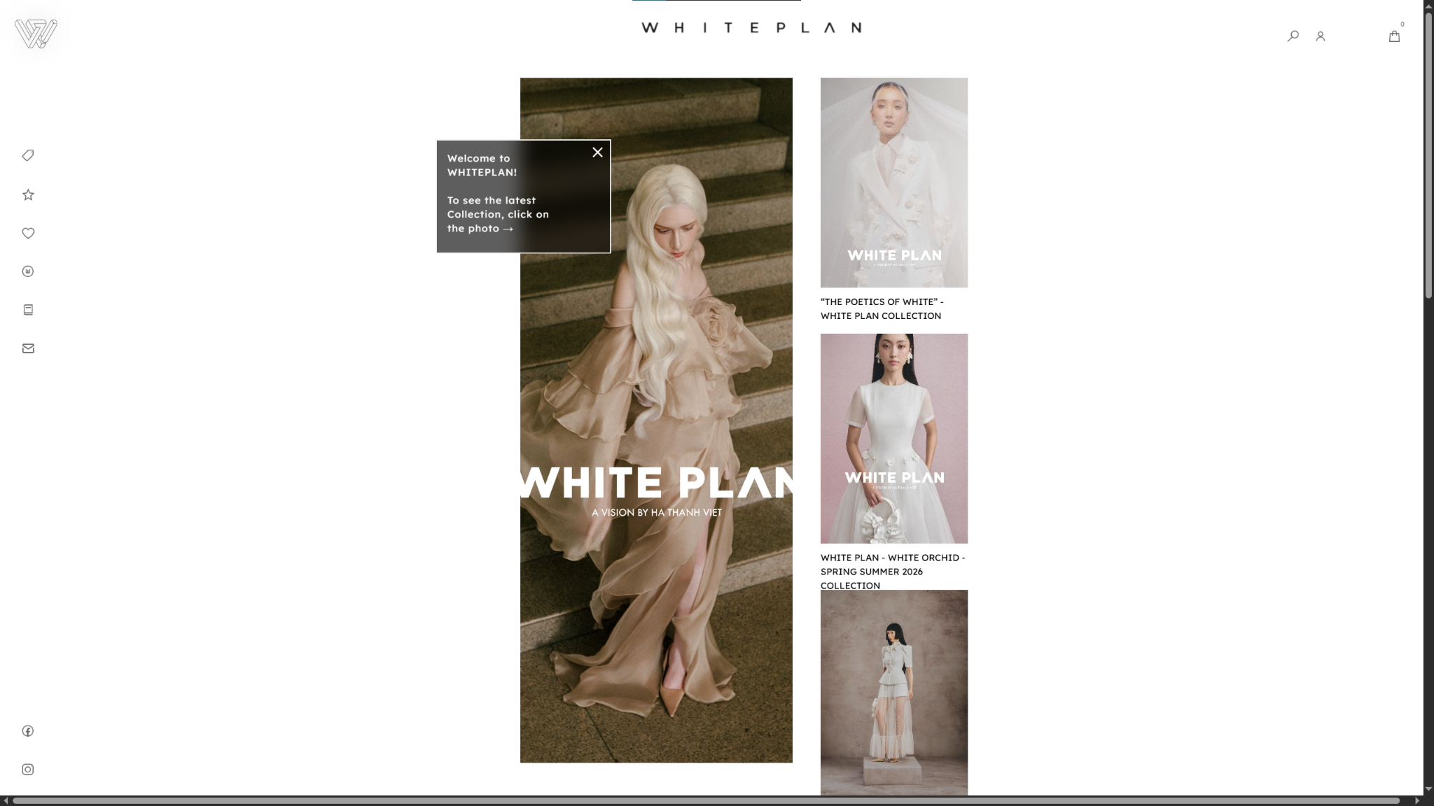
WHITE PLAN is a designer clothing studio based in Vietnam that features the work of fashion designer Hà Thanh Việt. The website showcases Việt’s preference for clean, sophisticated aesthetics. Its minimalist layout includes plenty of whitespace and very little embellishment, reflecting the most notable qualities of his fashion design to give the site an editorial feel. The few decorations include animations, hover states, and a glassmorphic effect that add a touch of interactivity. These decorations catch visitors’ attention, and the whitespace keeps their attention focused on Việt’s products.
2. Palmer
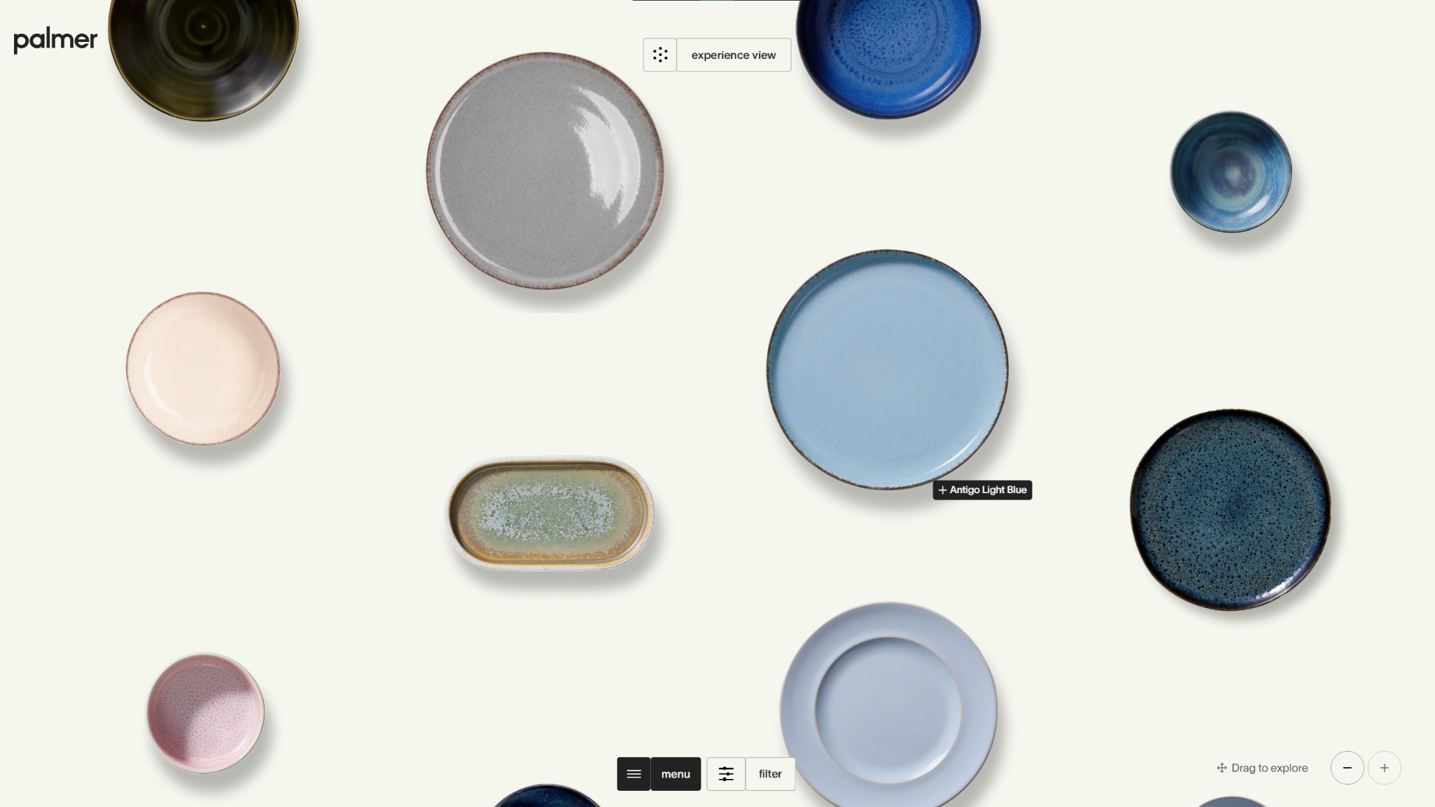
The Palmer website puts the products front, center, and everywhere else on the site. A button at the top of the homepage lets shoppers switch between a more traditional grid view and an “experience view,” which is exactly the kind of language that resonates with luxury consumers. In this “experience view,” hovering over each piece of dinnerware enlarges it with a subtle animation that transforms the shopping experience into something more immersive. The lighting in each product picture aligns precisely with the drop shadow applied to them in the website design, and the focus on products rather than copy lets Palmer’s quality speak for itself.
3. Stewart & Partners
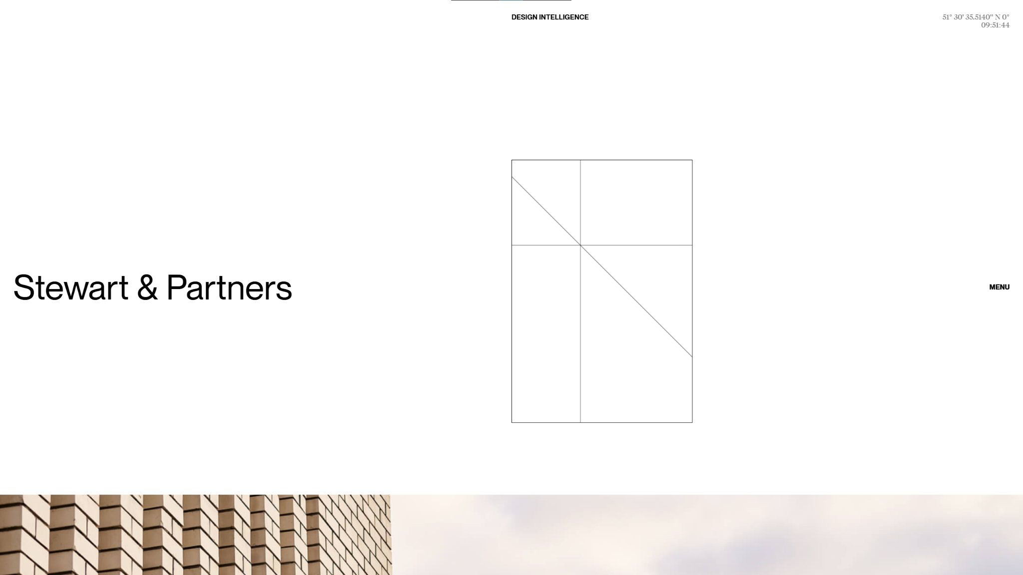
Stewart & Partners’ website leans heavily into the architectural firm's luxury branding with geometric patterns and thin, clean lines. There are rarely more than a few visuals on the screen at once, and interactions like the navigation menu stay tucked away until they’re hovered over.
What really sets this example apart is the striking imagery in Stewart & Partners’ work samples. Rather than traditional, static mockups, these pictures zoom in to capture unique angles and small details that emphasize each project’s luxury aesthetic.

Ultimate web design
From 101 to advanced, learn how to build sites in Webflow with over 100 lessons — including the basics of HTML and CSS.
4. Studio Few
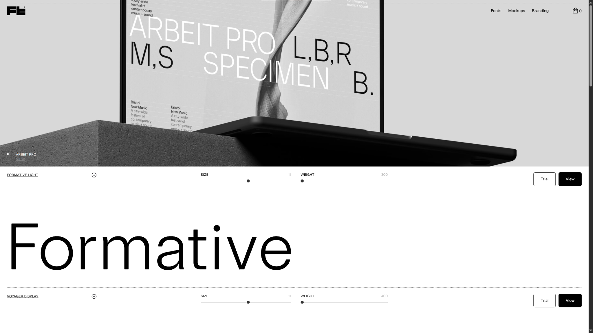
Studio Few is a luxury brand design agency specializing in fonts and logo design. They created their own site, which serves as a proof of concept for their work, and took every opportunity to showcase their offerings. Every element fits into a single consistent design style built around Studio Few’s own fonts and logo styles. Each page has small text with minimal copy, as well as a minimalist, mostly black-and-white color palette, that keeps attention on the visuals.
For brand and design agencies, achieving this level of consistency across your site builds credibility with clients that you can deliver that same curated feel for them.
5. Ascension Luxury Catamaran
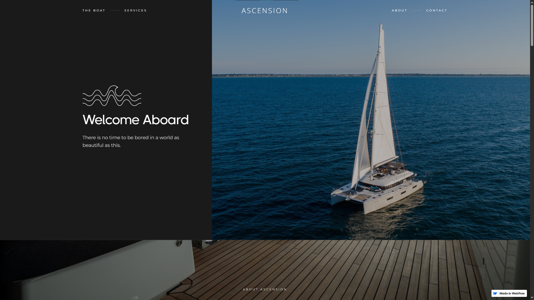
The Ascension Luxury Catamaran website uses a dark mode design that makes the striking hero image pop with plenty of contrast. The high-quality photography and cohesive color palette carry down the page. These visual elements all fit together to create the feeling of flipping through a well-curated glossy photo book, making for an unmistakably high-class website.
In your design, pay special attention to the first few moments of your site’s user experience. Carefully coordinate your colors, layouts, and font choices to portray sophistication and luxury before visitors start scrolling.
6. RAMONA BIZBAC
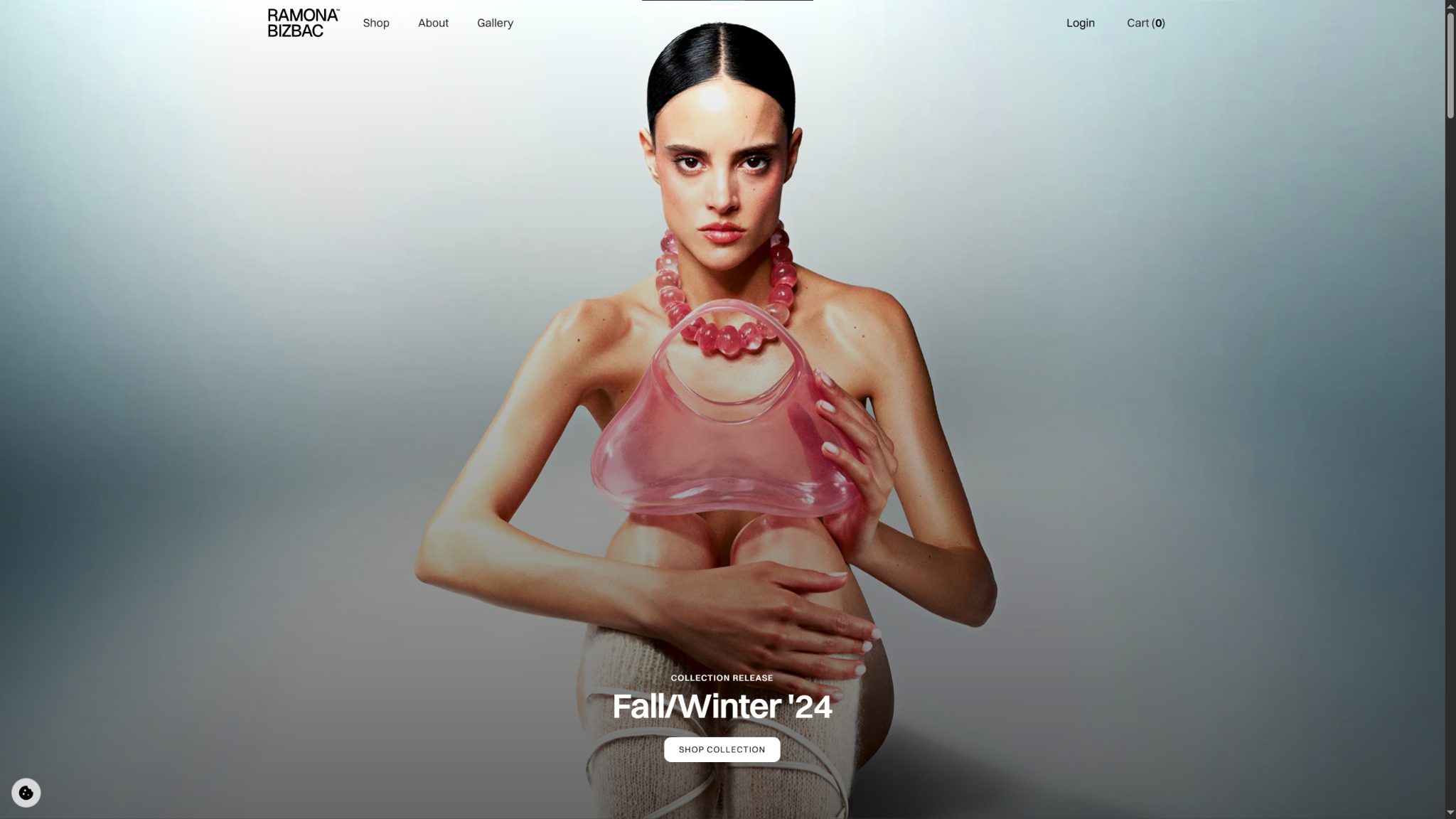
RAMONA BIZBAC’s avant-garde style is immediately obvious in this example of a luxury website. The striking hero photo that reveals itself underneath Ramona Bizbac’s name is only the beginning. Every product image puts her uniquely modern feminine style front and center with a bold style and parallax scrolling that suits the fashion designer’s overall vision.
This site is an excellent reminder that the story behind your offering is just as important to cover when you’re building a thorough, trustworthy luxury site. Showing customers how these products are so high-quality, and focusing on the designers or inspirations behind each luxury item, is a great way to do that.
7. Cue
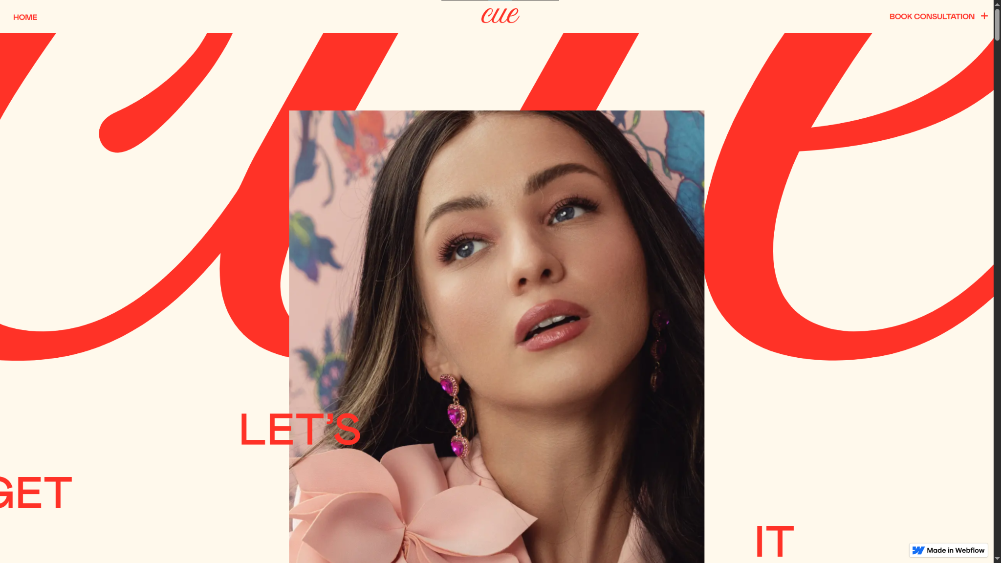
Cue creates wigs that “disappear from your thoughts the second they’re on your head.” However, the website was designed to stick with their target audience (younger women who want realistic wigs made with human hair) by balancing sophistication and an approachable brand image.
Throughout the website, Widelab leaned into the unique combination of contemporary aesthetics (like a cream and bright red color palette) and a modest perspective to cover the gap. The page leads with a scrolling set of editorial images of people with long hair, followed by phrases like “We’re not changing the world, we sell wigs.” Focusing on the quality of their products and visuals that represent them directly translates to Cue’s visual-first product.
Build elevated websites with Webflow
Building a luxurious website that stands out means knowing how to keep your site design tight. By deliberately picking a few embellishments and interactions that direct the user journey and optimizing your UX, you’ll create a site that captures the attention of potential customers who have greatness in mind.
You can find all the tools you need to create a precise luxury site with Webflow’s virtual experience platform. In the visual canvas, you have complete control of every detail from your layout to font pack spacing, so you can hone a sharp, striking look that customers will remember.
Refine your luxury site design with Webflow.
Get started for free
Create custom, scalable websites — without writing code. Start building in Webflow.