

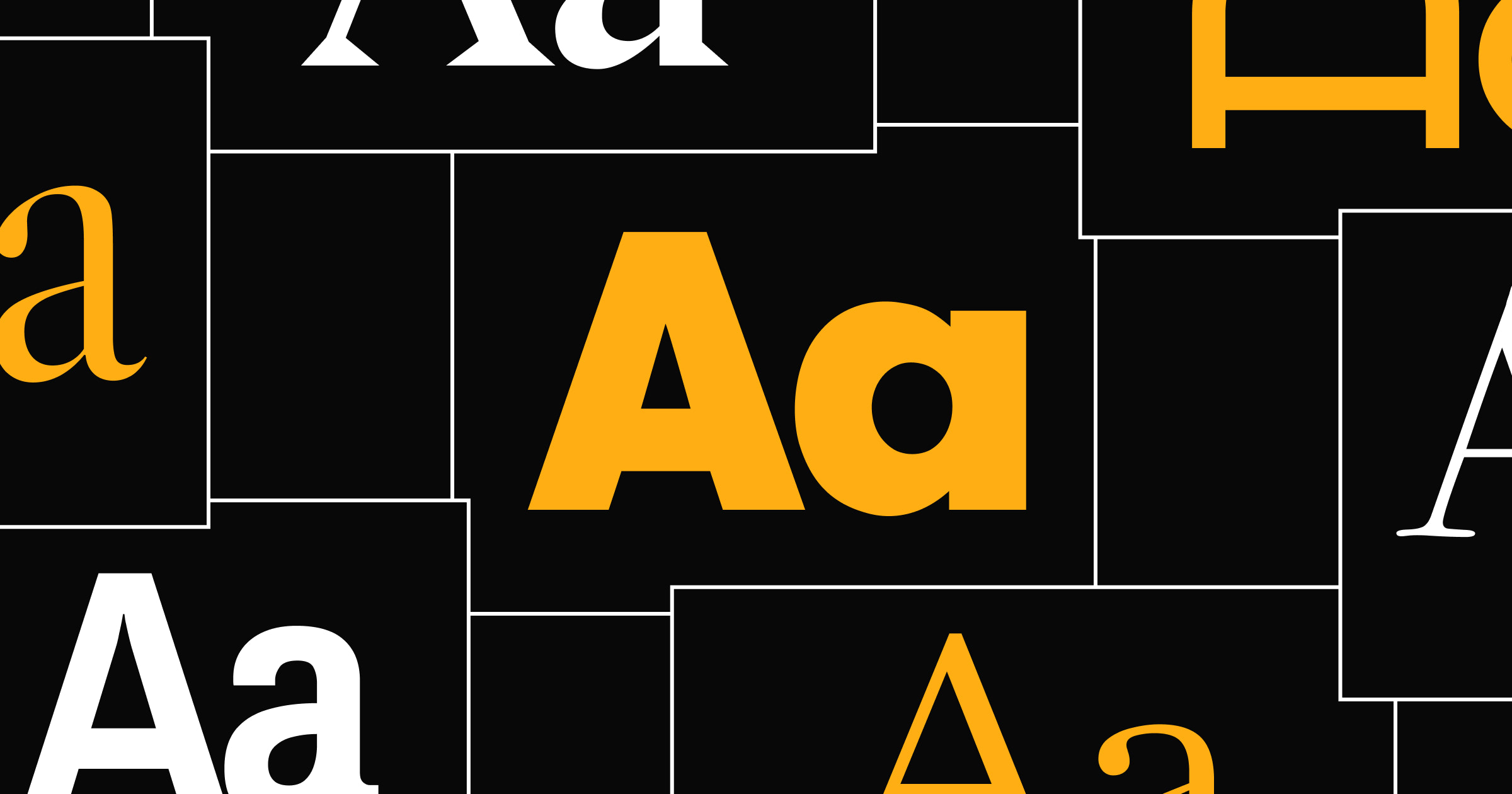


Professionalism isn’t just about what you say, it’s also about how you say it. On your website, that means picking the right font.
Different fonts can make the same text convey distinct tones through design elements like spacing and weights. So if you want your website to come across as credible, you’ll need a good professional font. The right typeface will match your brand’s style, be highly readable, and create a first impression visitors don’t forget.
In this article, you’ll learn what distinguishes business fonts like Helvetica and Arial from more stylized choices. You’ll also find a list of the best professional fonts for conveying authority and trustworthiness.
What makes a font professional
There are plenty of serif and sans serif typefaces that work well on business and brand websites. When you’re considering those options, look for fonts that meet these criteria:
- Readability. Every letterform is perfectly readable on any screen at the default font size and zoom levels.
- Consistency. The font has consistent spacing and sizing, so text takes up a predictable amount of space on the page.
- Color and texture. The colors in your palette provide enough contrast with the background for the font to stand out.
- Versatility. Improve performance with web-safe fonts (typefaces that come installed by default on most devices/browsers) or typefaces hosted by a reliable provider, like Google Fonts or Monotype.
5 modern professional fonts for digital-first brands
Many professional typefaces are sans serif, which means they avoid embellishments that add style but can impact readability. Here are five modern fonts that fall into that category.
1. Helvetica

Helvetica was Apple’s default font for iOS and macOS until it was replaced by San Francisco in 2015. This font is still preinstalled on Apple devices, which makes it a solid choice if your audience uses that OS. If you’re designing a website for an Apple-only app, for example, mirroring a font visitors are accustomed to is a smart way to build credibility.
2. Arial

Arial is a fallback font in most browsers: When the browser doesn’t have the right typeface installed and can’t download it, that font is replaced by Arial. That’s because Arial is a highly readable typeface with thick stroke weights and consistent letterform sizes. This font’s familiarity and versatility means it can play many roles on professional websites, and it’s a good choice when you want to focus on the message rather than its style.
3. Futura

Futura’s delicate linework and modern styling set it apart from most professional fonts. This is a great choice for businesses that want to convey elegance and class as well as credibility. The tight spacing does impact Futura’s readability, however, so this font is better for titles and headings (not body text).
4. Gill Sans

Gill Sans is a stylish web-safe font with sharp corners and unique letterforms. This typeface is clear and simple, but still unusual enough to make an impression on a professional website. Just avoid bolding this one, as the kerning and tight spacing can make some letters run together.
5. Univers

Univers has generous spacing, consistent stroke weights, and evenly-sized letterforms, making it useful for long-form text where readability is a top priority. Univers isn’t any more embellished than Arial, but it can fill the same role while being just different enough to get noticed.

The modern web design process
Discover the processes and tools behind high-performing websites in this free ebook.
5 traditional fonts for formal contexts
Serifs have extra lines and less regular forms that can make these fonts more elegant. Here are five serif typefaces that add a more traditional feel without being too formal.
1. Garamond

Garamond’s variable stroke weights and clipped serifs create a distinct style that’s more modern than most serif fonts, while still using traditional letterforms that lack kerning. The spacing between certain letters is tight, such as the ‘z’ and ‘y,’ but overall this font is clear enough to keep long-form text readable.
2. Times New Roman

Times New Roman is a classic for good reason: It’s readable, decorative, and well-spaced. Although this font has variable stroke weights, they're never thin enough to reduce legibility. The capital letters are especially stylish, with print-like serifs that look good in titles and headers.
3. Baskerville

Baskerville has a distinctive style with rounded edges and smaller letterforms. Heavier stroke weights give each character plenty of readability, even on smartphone screens. While Baskerville could work for body text, it’s best used as a display font where its unique variations can stand out.
4. Lora

Lora’s subtle serifs add a touch of embellishment, but overall this option is pretty plain for a traditional font. That simplicity is both readable and neutral, helping this typeface convey professionalism. There’s also generous spacing between characters, little variation in stroke weights, and consistent sizing throughout.
5. Source Serif

Source Serif’s classic serifs resemble typewriter letterforms, adding a traditional appeal to text. The consistent spacing and stroke weight make Source Serif legible at just about any size. Together, these features make the font appropriate for text on professional documentation sites, blogs, and news resources.
Tips for choosing the right professional font
When picking fonts for your business website, you don’t just need a single typeface. You’ll want to pair a few fonts you can use for UI elements, headlines, and body text.
Keep these best practices in mind as you make your choices:
- Prioritize readability and scalability. To avoid redoing the work later, pick fonts that will scale well as your site grows and its layouts fill with more content.
- Match fonts to the brand’s personality. Text styling conveys your brand image, so pick fonts that suit your voice and imagery.
- Use strategic combinations. Pick separate fonts for headings and body text to distinguish those elements.
- Test across digital and print media. Check your font choices in both online and offline contexts. Keeping fonts consistent everywhere gives your audience a consistent experience.
- Aim for timelessness. Trendy fonts go in and out of style often. Choose a font that’s readable, versatile, and neutral enough to stand the test of time.
Test your fonts and other design choices with Webflow
A lot of decisions go into designing a professional site, but small foundational choices can set you up for success. Whether you want a modern sans serif font or a more traditional serif one, your typefaces should be an extension of your brand image and facilitate an approachable reading experience.
Webflow’s visual design environment helps you quickly experiment with different font choices and seamlessly apply your final decisions. The real-time editor offers all the spacing, size, and color tools you need, so you can fine-tune your font choices carefully. Add to that the speed and performance of Webflow hosting, and you have the makings of a polished, trustworthy website.
Build your website and take it live with Webflow.

Build your online portfolio
Build and visually design a full portfolio website in just 21 days — with our free online course.


