

.jpg)


Some briefs define the solution. Frontify's defined the ambition and left the rest to us.
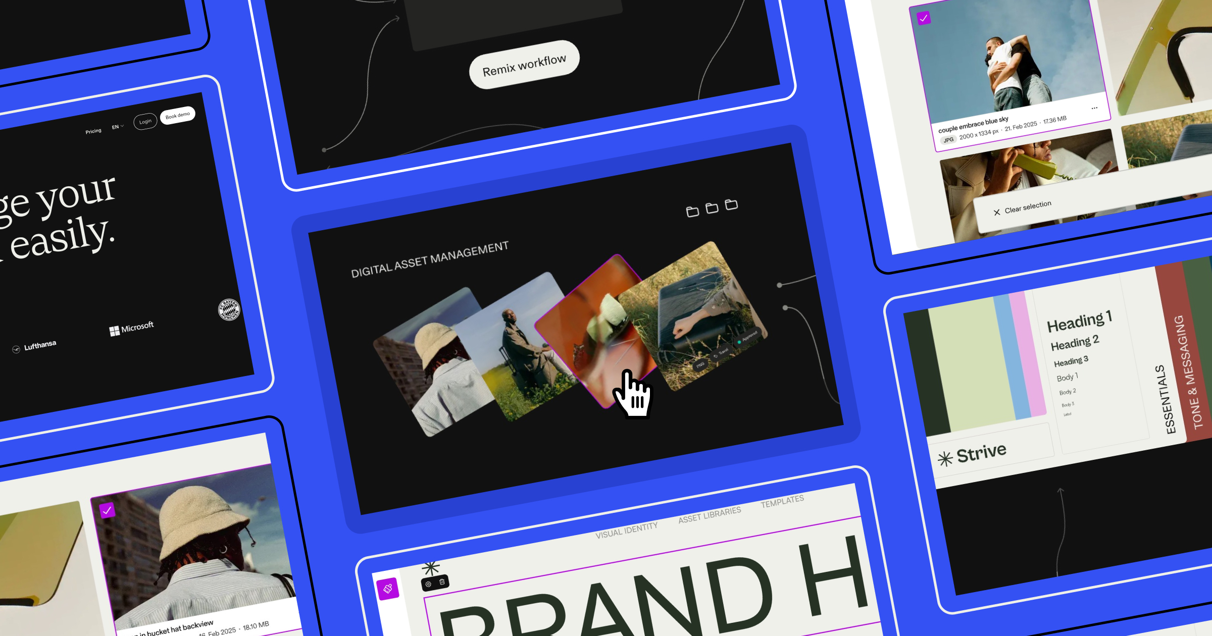
What that ambition became: Frontify, a brand management platform, wanted a scroll-driven product story where every element responds, reacts, and transitions with intention: layers of interactivity running in concert, held together by logic most users will never consciously notice. Building it meant pushing Rive well past its reputation as an animation tool, and drawing on nearly every technique we've developed across years of interactive work. This article is a detailed account of how our team at OFF+BRAND did it, and a practical guide to the Rive capabilities that made it possible.
Why Rive and why it fits this kind of work
Rive is widely known for UI animation. But for projects like this one — diagrammatic, interactive, and performance-sensitive — it earns its place for different reasons. Unlike video, Rive visuals are runtime-active: they respond to what users are doing, not just playing back a fixed sequence. That distinction matters enormously when the goal is to make something feel alive rather than produced.
We've used Rive across many projects requiring scroll syncing, cursor tracking, hover effects, and click interactivity. Frontify's brief brought all of those threads together in one place.
Building a scroll-driven timeline: data binding, joysticks, and blend states
Every scroll-driven Rive experience depends on the same foundational chain: a runtime variable that knows where the user is, a mechanism to translate that into motion, and a state machine to hold it all together. Here's how each piece works, and how we put them together for Frontify.
Data binding is the backbone of everything
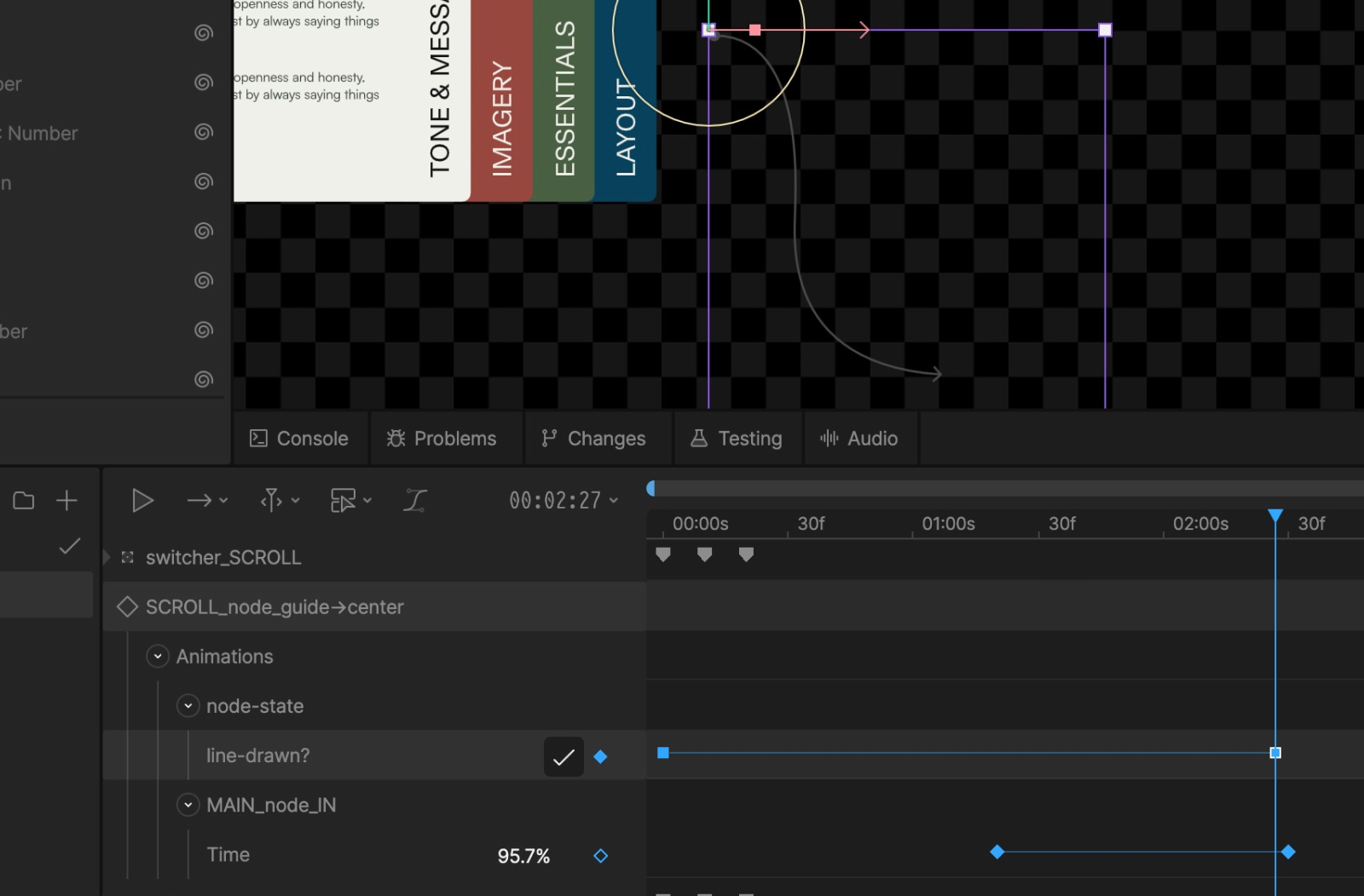
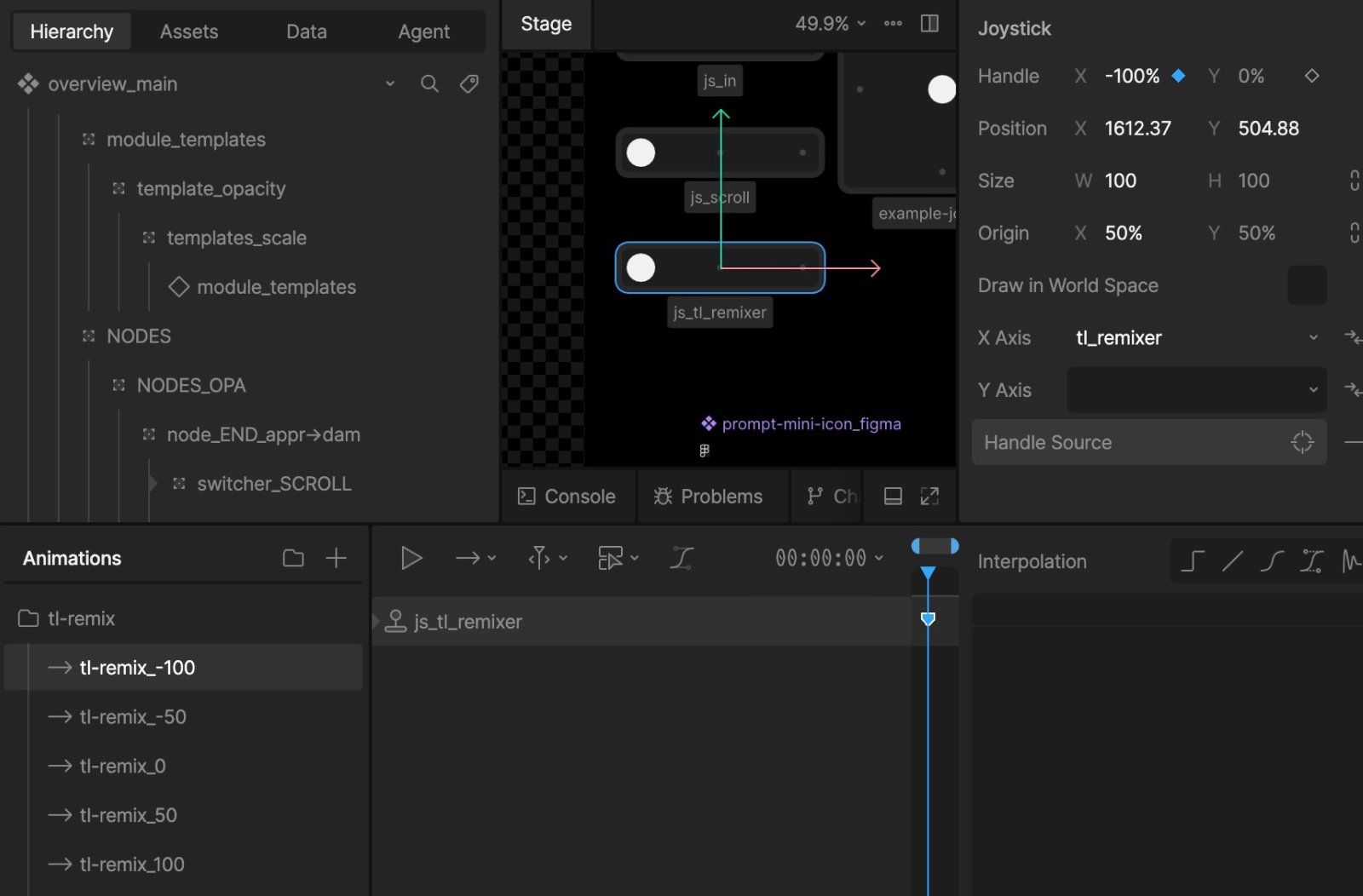
The foundation of any scroll-driven Rive experience is data binding, the mechanism that lets runtime variables influence what's happening inside the animation. For this project, we used a number type variable called scroll_y, controlled from JavaScript outside the Rive file. This single value becomes the backbone of the entire experience.
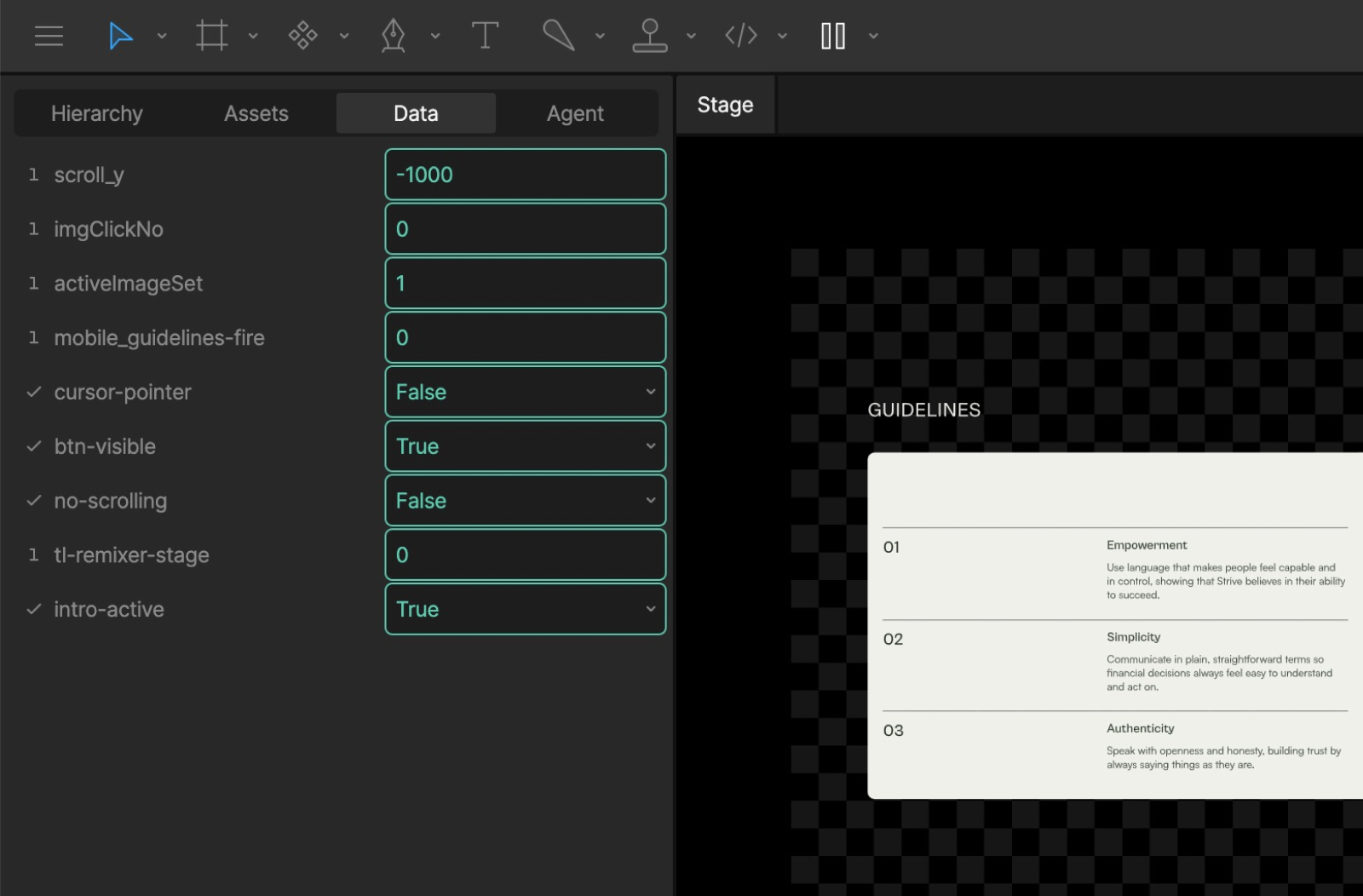
The image above shows the full set of data binding variables used in this piece. The key one is scroll_y. Controlled from JavaScript, it means the Rive module is being driven by events happening outside of it, in the website itself. That outside-in relationship is what makes the whole scroll experience possible.
Joysticks translate numbers into motion
A number on its own doesn't move a timeline. That's where joysticks come in. A joystick in Rive maps a value between -100% and 100% to a corresponding timeline, acting as the bridge between a data bind value and actual motion.
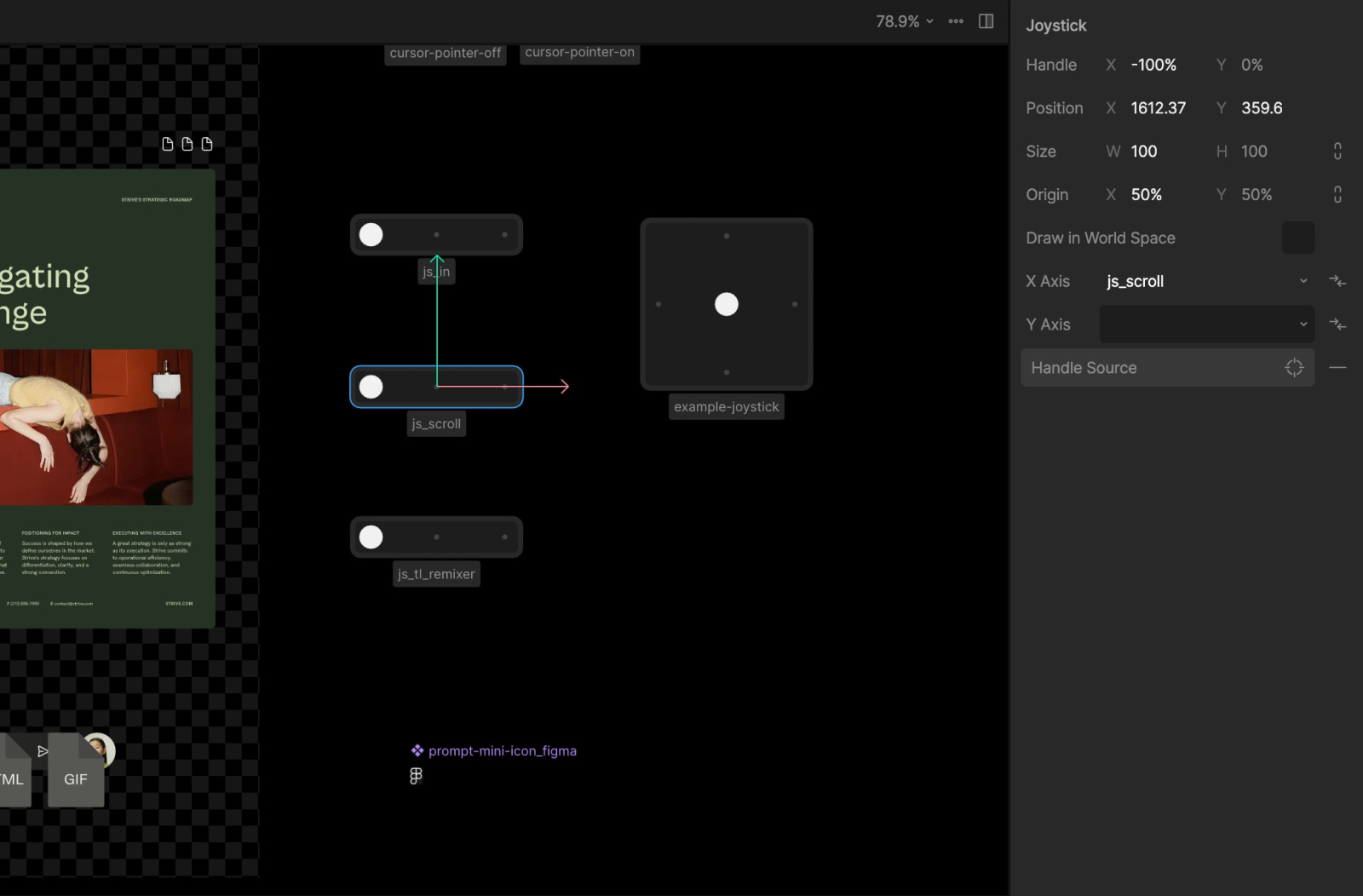
From here, we create two new timelines: scroll_0 with the joystick set to -100% (the start), and scroll_1000 with it set to 100% (the end). These then get linked into a blend state in the state machine.
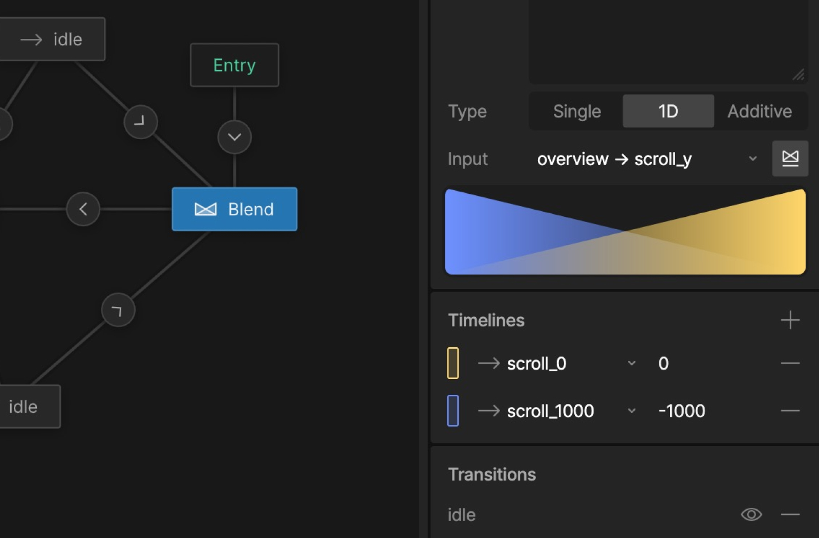
The result is a scrubbable timeline: fluid, bidirectional, and entirely controlled by the user's scroll position. The values 0 and -1000 aren't precious; what matters is the relationship between the two states, not the specific numbers.
Working with components: remap, nested timelines, and file hygiene
A complex Rive file can become unwieldy fast, especially when dozens of modules each carry their own animation logic. The way we manage that complexity comes down to three things: how we structure components, how we connect them to the parent timeline, and how we keep the file size honest as the project grows.
Components keep complexity from compounding
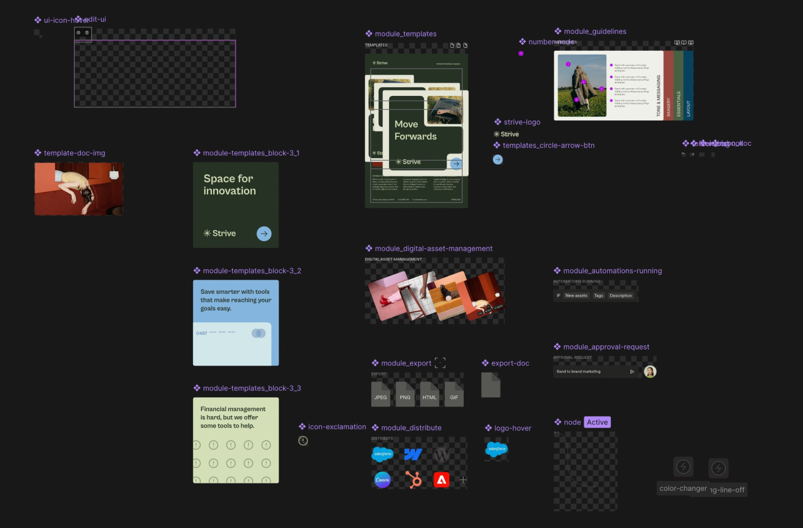
With many modules running their own internal logic, components were essential not just for reuse, but for legibility. Each module lives in its own component with its own timeline, which means the main scene stays clean and each piece remains independently workable.
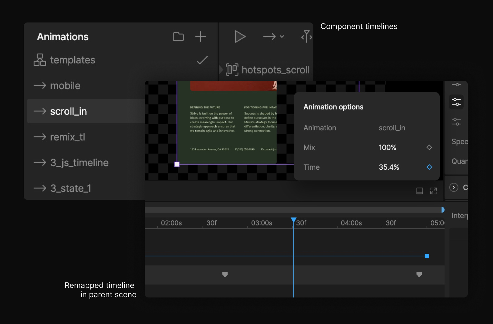
Remap is how the parent controls the parts
To control internal component timelines from the parent scroll, we use remap: a simple 0–100% mapping that dictates how far along a component's internal timeline plays based on the parent timeline's position. It's one of the tidier tools in Rive's kit, and it lets a single scroll value cascade down into every module simultaneously.
One component, many shapes: a smarter approach to arrow paths
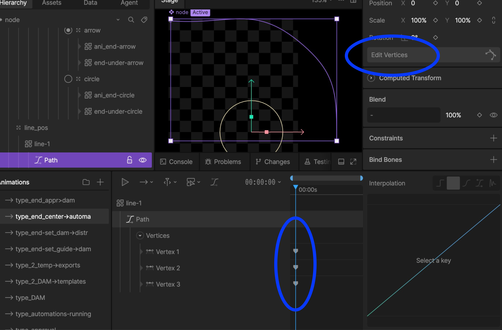
The animated arrow paths required something more than remap alone. Once a line had fully drawn in via scroll, we wanted it to transition into a looping idle state — a continuously flowing line that communicates activity without demanding the user's scroll input.
The challenge: each arrow has a different shape, start point, and curvature. Rather than build separate components for each variation, we used the “edit vertices” tool to create a separate timeline for each path shape inside a single "base" arrow component. Each timeline defines a start position, end position, an extra node along the line, and all the angle information needed to match the designs. The parent component selects the appropriate path timeline via remap, keeping the component count low and the file size lean.
This is one example, but the key element is how this approach scales. Apply it consistently across a complex file and the file size optimizations compound: fewer components, less redundancy, better performance where it counts.
Trim path is what makes the line feel alive
With the path architecture in place, the next question was how to make the looping animation itself feel like it has momentum rather than just cycling. Rive's trim path property is what makes this possible, and it's one we reach for constantly.
The mechanic: Trim End moves from 0% to 100% to draw the line in, then Trim Start follows from 0% to 100% to undraw it — but crucially, the start of Trim Start overlaps with the end of Trim End, with finessed easing on both. That overlap is what transforms a basic draw-undraw cycle into something that reads as continuous forward momentum.
The loop fires just before you'd expect it to
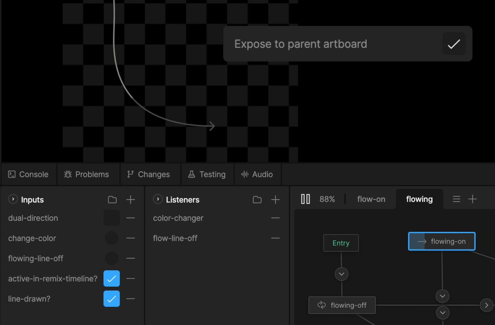
To trigger the looping animation at the right moment, we used nested inputs — booleans (true/false variables) with "expose to parent artboard" enabled, which allows the parent scroll timeline to set a component's internal state from outside it. (One practical note worth keeping: data binding should be used for all runtime-connected variables; we use inputs exclusively within the editor now.)
We set the trigger just before the line visually completes — not at the exact end point. That slight anticipation means the loop feels like it grows out of the draw-in rather than following it. It's an approach we apply consistently across scroll timelines: conditions set slightly early create overlaps; conditions set exactly on time create pauses.
There's a second layer, and you have to scroll to find it
Most interactive experiences are one system deep. Frontify needed two: a scroll-driven layer and, waiting at the end of it, a click-driven one that lets users remix the composition entirely. Getting both to coexist without interfering with each other was the most intricate part of the build.
Property groups give the button its own logic
When building scroll-driven experiences, not every element should be revealed via scroll. For key interactive elements like buttons, scrubbing in creates a problem: the button can end up caught in a half-state, visually present but not yet fully formed. That's a trust issue. A button should always feel like it's either there and clickable, or it isn't there at all.
So rather than tie the button's visibility to the scroll timeline directly, we used a property group boolean — btn-visible — that flips to true at the very end of the scroll timeline, triggering the button's appearance on its own independent state machine tree.
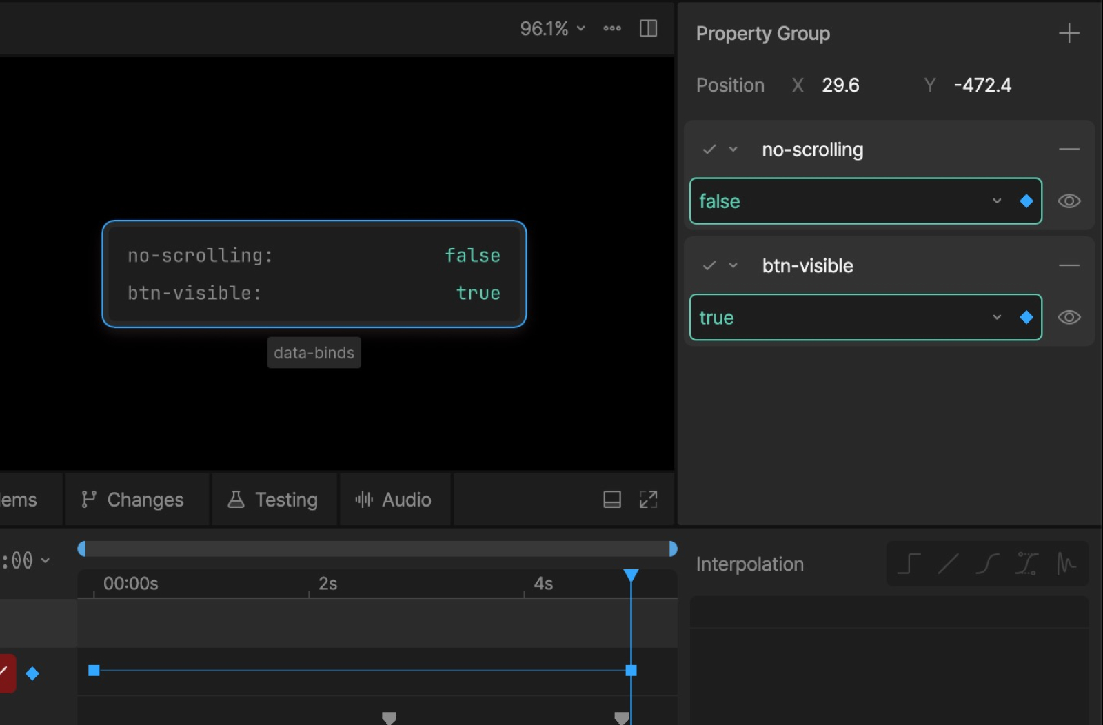
We've already seen how data bind values can be controlled by code. But what about controlling them from within Rive, or even from inside a timeline? This is where the "target to source" direction becomes important. Rather than having the property group follow the data bind value, we flip the relationship: the property group sets it.
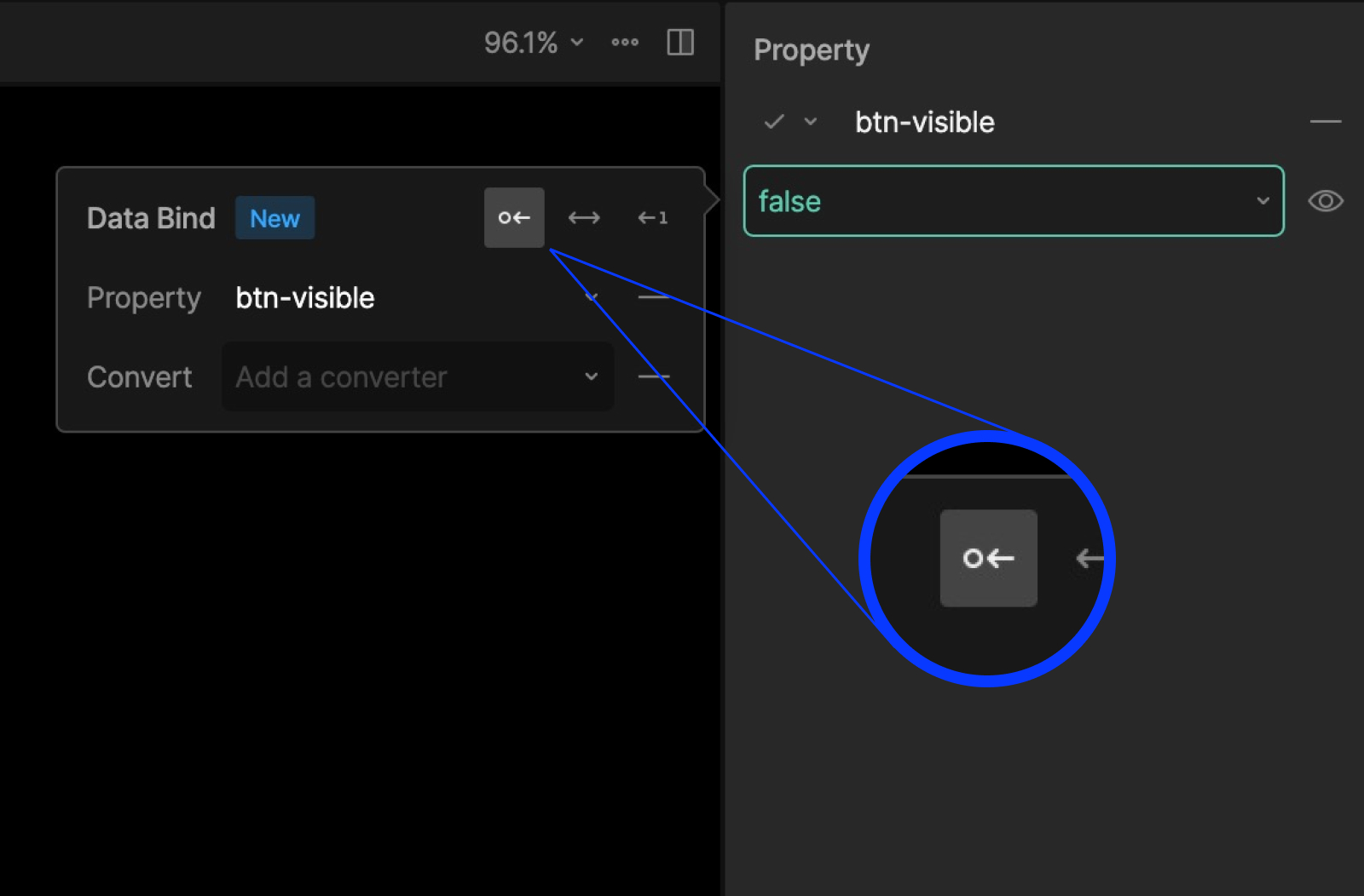
When btn-visible is set to true as the user reaches the end of the scroll, it sets the data bind value to true as well, which in turn drives the button's state machine.
From the outside, this looks like a lot of steps for a small detail. But details like this are where the experience either holds together or doesn't. When several of them compound across a single piece, the sum is a user experience that feels considered, even if no individual moment announces itself.
Click and scroll: one rule keeps them from clashing
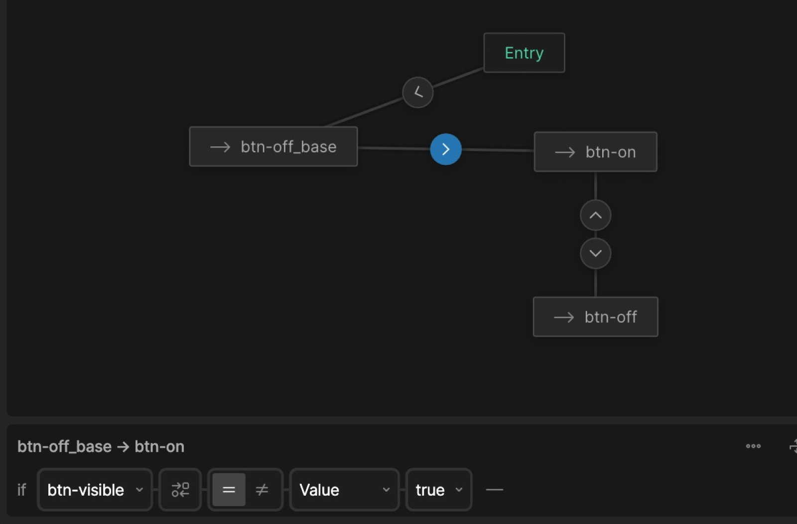
With the button ready, it needs to control an inner timeline running alongside the scrubbable, scroll-driven one. An important thing to keep in mind when working this way: the two timelines should never control the same property. Each one needs to own its properties exclusively. That's what allows them to interact without stepping on each other's toes.
The obvious approach to the remix timeline would be four separate timelines, one for each transition: 1→2, 2→3, 3→4, 4→1. That works, but it creates something detached and hard to maintain — in active projects, adjustments are inevitable, and four disconnected timelines means four places to make changes. The better approach was one central remix timeline controlled by a joystick, with five one-keyframe timelines setting the joystick to -100%, -50%, 0%, 50%, and 100% respectively, each representing a distinct state.
These five timelines wire into the state machine, transitioning between each other when the btn-clicked conditional is met. Each transition is set to 1.5 seconds — that duration is what controls the joystick as it moves through its range, say from 0% to 50%, over that time. We use linear easing on the transitions specifically because all the actual easing lives inside the remix timeline itself, keeping the motion consistent and adjustable from one place.
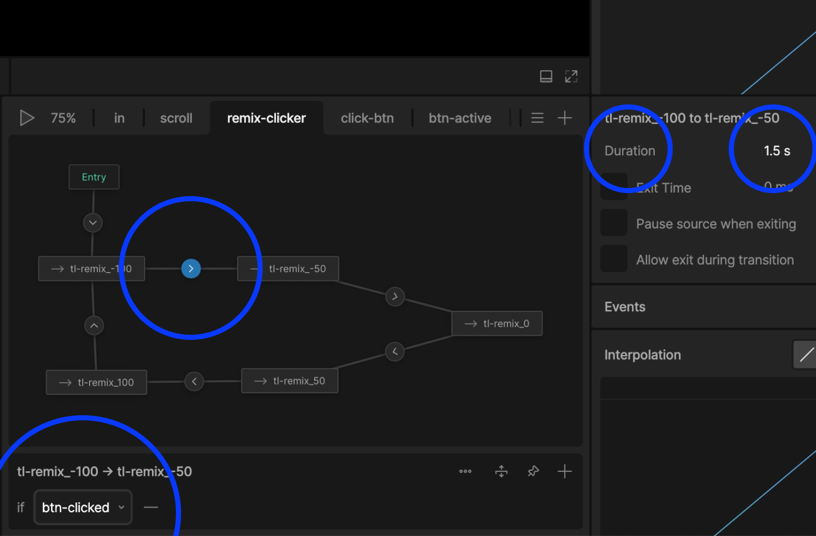
All of these elements placed together result in a two-layered interactive system: scroll-driven forward and backward from any point in the cycle, with click-driven state changes layered cleanly on top.
Three neat tricks worth keeping in your toolkit
Not everything in a Rive project is a major architectural decision, but the smaller details often have an outsized impact on how polished the final experience feels. Here are three techniques from this project worth keeping in your toolkit.
1. Use data binding to handle cursor styling at runtime
Rive doesn't have built-in control of cursor styling at runtime on the web, which matters most for clickable elements, where the cursor changing from an arrow to a hand gives users instant visual feedback that something can be clicked. It can still be done though, and it's something we applied throughout this piece.
Using data binding, we set a boolean value cursor-pointer from false to true when a specific hover is detected. A JavaScript handler picks that up and applies the relevant CSS cursor style, resulting in cursor: pointer (or any other) being shown to the user.
2. Use one shared component for all hover effects
The interactive diagram needed multiple areas to respond to hover — a subtle lightening effect that adds a layer of tactility, letting users feel the interface respond to their cursor. Rather than build that effect into each element separately, we created one shared component to handle it.
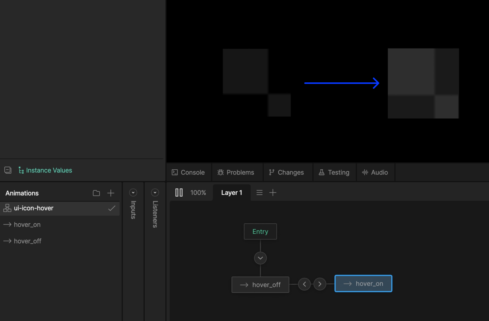
That one component, controlled by a simple state machine tree, can be placed into any parent scene, stretched to fit any element, and masked to respect rounded corners. The benefits compound: consistent behavior across the file, a smaller overall file size compared to the same effect applied in multiple places, and changes that only ever need to be made in one place.
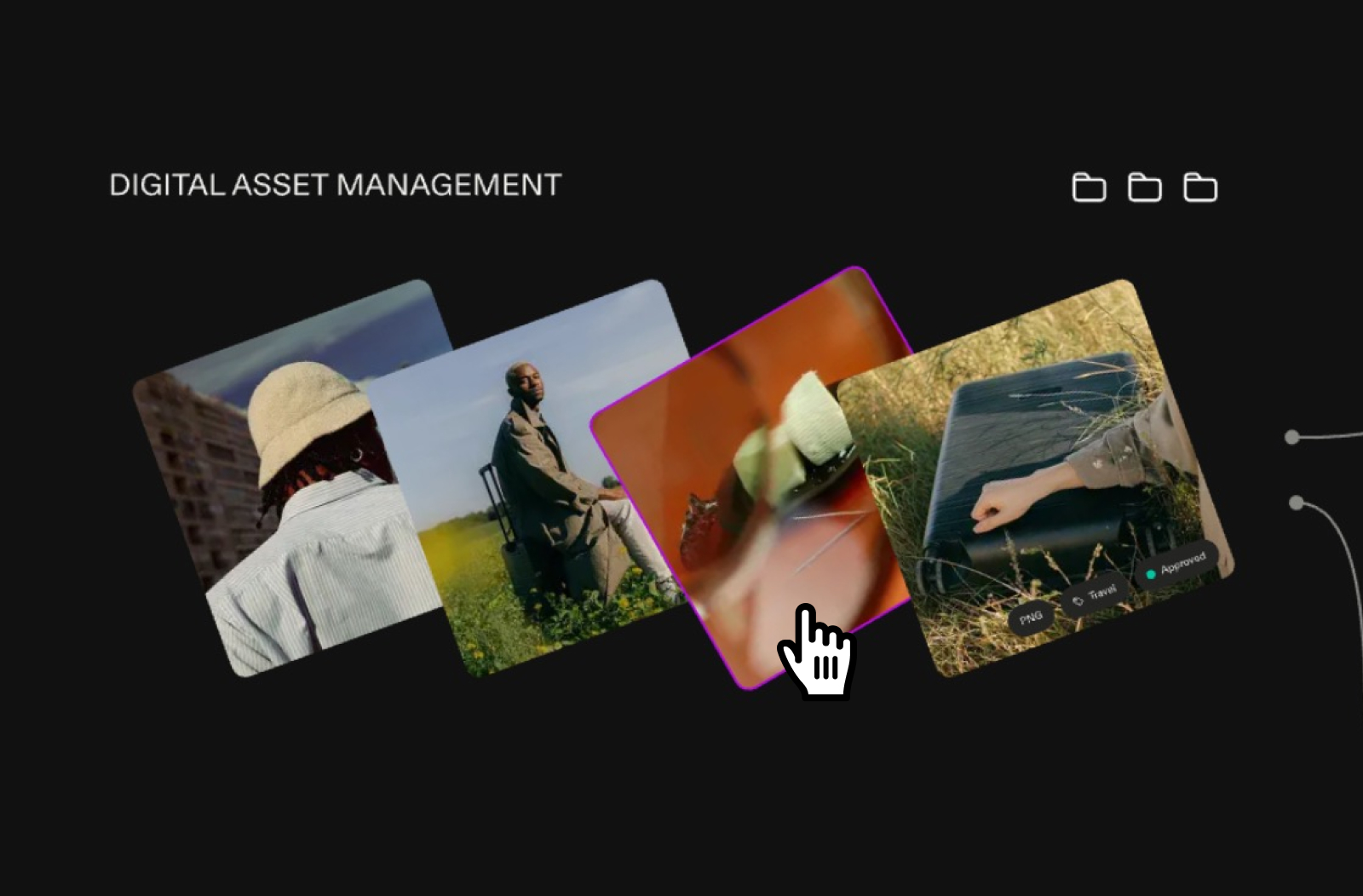
3. Contain raster images in their own components from the start
This one is simple, but it saves significant time in the later phases of a project when adjustments and amendments may be necessary. Our practice is to put all raster images into their own components from the get-go. When working with complex layer trees, image changes can become surprisingly tricky to handle. Containing them in dedicated components keeps everything easy to find and swap out without headache.
The best interactive experiences hide their complexity
Frontify came with an ambitious brief for its product overview page, a layered interactive story that needed to respond to users, reward exploration, and hold together technically at every level. That kind of ambition is what pushes Rive past its obvious use cases.
What this project shows is how far the tool can go when it's treated as a full interaction design environment: data binding connecting the outside world to what's inside the file, timeline separation letting two interactive systems coexist cleanly, components keeping complexity from compounding. The result is an experience that feels alive and effortless, and proof of what becomes possible when the structural work is done right.
That's the standard worth building toward in any Rive project. One that forces you to think in systems rather than sequences, structure for maintainability before complexity demands it and build experiences with a level of craft that matches the ambition behind them.


