


For freelancers, your website needs to sell your story as much as your skills.
Personal business sites for freelancers are part portfolio, part sales tool. By showing who you are, what you do, and why people should hire you, you can tell a cohesive narrative about your services that helps you stand out from agencies and big organizations.
In a competitive freelance landscape, it’s important to set this perspective quickly. The best portfolios build visitors’ trust in your ability to do the job while encouraging them to start sales conversations before they leave the homepage.
Read on to learn what makes a great freelancer site and explore seven of the best freelancer website examples to help you grow your client base.
What makes a freelancer website great?
As a freelancer, your website needs to highlight your strengths and encourage visitors to reach out with their project needs. Here are a few elements to include on your site so you can shape this path to action:
- Clear value proposition. When someone lands on your site, they shouldn’t waste time trying to understand what you do. A value proposition quickly lays out what they’ll gain if they stay and continue to scroll.
- Focused niche positioning. Niche positioning shows you understand a specific audience, industry, or type of problem. When your site reflects a niche, it filters visitors to attract better leads, which can then raise conversion rates. You’ll spend less time on dead-end inquiries and be more likely to build strong relationships with clients (which could translate into more work long term).
- Strong portfolio or case studies. A strong portfolio is proof that you can deliver on what you promise, and case studies show how you solve problems. When you present relevant, recent work with context, people can better connect your past work to their project needs. Plus, aesthetically-designed case studies add visual depth to your site and help you capture visitor attention faster.
- Social proof. When leads see that others had a positive experience working with you (via testimonials, reviews, awards, or media links), your claims feel more legitimate and you become a more attractive option for their next project.
- Conversion-focused calls to action (CTAs). Visually prominent CTAs with persuasive messaging give people a clear next step to take, removing hesitation before they eventually convert.
7 effective freelancer website design examples
Here are seven freelancer portfolio examples that combine strong visuals with functional examples to capture attention.
1. That One Couple
2. MAVE Design
3. Onboard Creative
4. Halbstark
5. Hey Karol
6. Right Hemisphere
7. Sam Hills
1. That One Couple

That One Couple shows how to make a freelancer site personality-rich yet commercially clear. The duo’s site features a warm color palette and retro aesthetics for approachable, casual branding. But it also quickly reinforces their credibility by laying out the specifics of their 35 years of combined experience with a list of past clients (including Sanrio and Marvel), featured projects, and testimonials.
All these elements sit on the homepage, so clients don’t have to dig for proof that That One Couple knows what they’re doing. The layout also guides potential clients through a simple narrative by telling them who That One Couple is and what they do, followed by a CTA to encourage inquiries. If your aesthetic is more casual, lean into social proof and a strong personal narrative to reinforce your credibility with potential clients.
2. MAVE Design
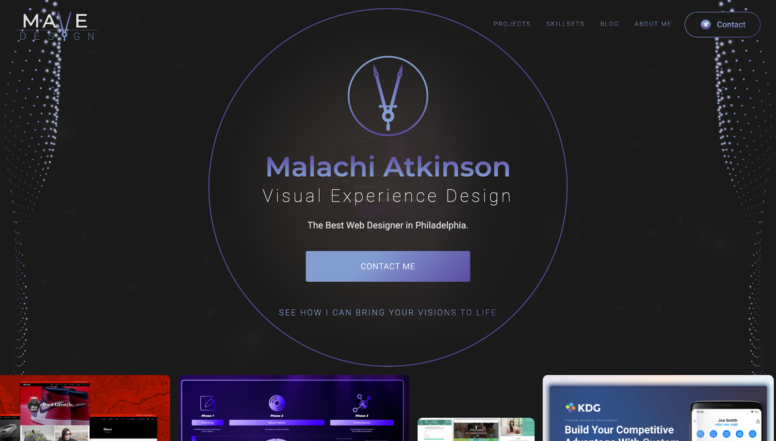
MAVE Design, short for Malachi Atkinson Visual Experience Design, presents one freelancer as his own agency. Malachi reinforces his claim that he’s “The Best Web Designer in Philadelphia” with two horizontal carousels of project screenshots toward the top of the homepage. Below, he includes a set of featured projects with screenshots and longer descriptions of what each accomplished, from SEO recovery to conversion-oriented redesigns.
This portfolio shows range and proof: You can quickly tell what Malachi does as a multidiscipline specialist, while his certifications, awards, and client logos further down the page add credibility. If you offer multiple services, organize your skillsets clearly before tying each one back to concrete outcomes, so potential clients can see how they can use your talents best.
3. Onboard Creative
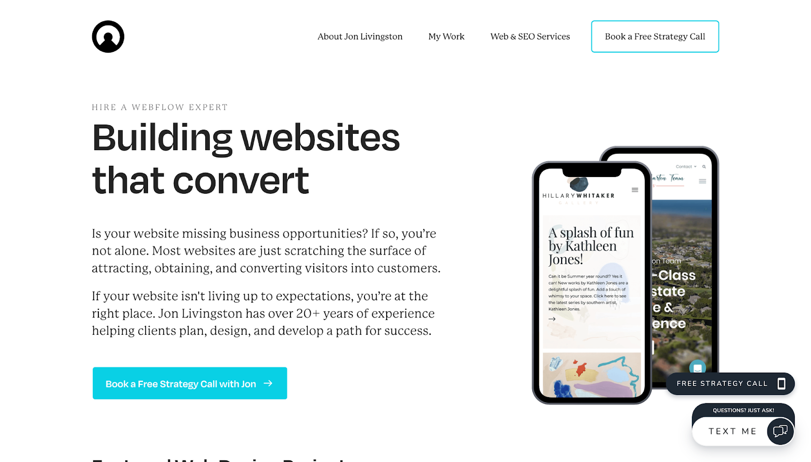
Unlike MAVE Design, the site for Jon Livingston’s freelance creative agency, Onboard Creative, makes it clear that Jon doesn’t offer a broad range of creative services. Instead, the homepage immediately positions his niche as a Webflow development expert. However, Jon doesn’t use Webflow-specific language on the site, instead opting for simple descriptions so potential clients who aren’t familiar with Webflow can still quickly understand how he’ll brainstorm and build a great site with strong SEO features.
The about page builds trust by connecting Jon’s 20+ years of experience with his values, like integrity, quality, and growth, which makes the business feel more dependable. Keeping things simple and relatable helps visitors understand the freelancer behind the site and brings clearer value to your work.
4. Halbstark
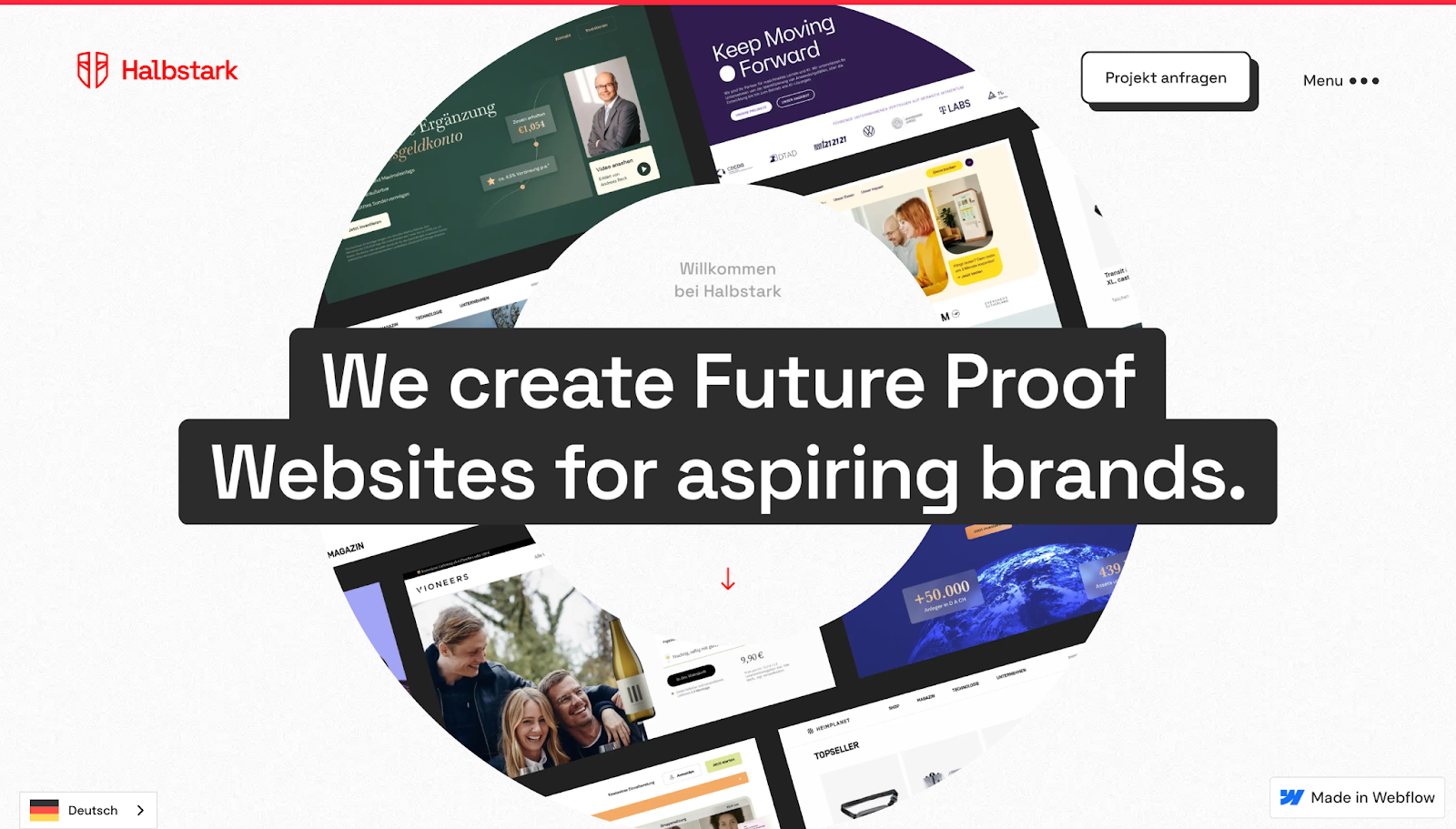
Halbstark offers language options for both English and German-speaking visitors, showing consideration for both markets the German freelance agency serves. The homepage design gives case studies plenty of visual weight through large thumbnails, so people can immediately appreciate the projects’ aesthetics while analyzing each one’s outcome to see if it aligns with their goals.
Dedicated sections for the agency’s story and client logos make their business easy to understand, especially with the help of a “Reviews” page featuring a grid of testimonials. A sticky menu in the top-right corner keeps navigation accessible while scrolling, so visitors can quickly go to any part of the site they need.
If your target audience is international, try leaning into visual proof and navigable layouts that mean you’ll spend less time translating (but keep the option to read in their preferred languages available).

Freelance web design boot camp
Explore what a successful, fulfilling web design career can look like with this free, comprehensive course.
5. Hey Karol
Hey Karol takes a more interactive approach than the standard strategy-first freelancer website, using motion to engage the audience without compromising on service details. For example, a hover-based animation reveals the header image, while on the services page, scrolling makes text and illustrations legible at the visitor’s reading pace.
The business’s site also saves screen space through horizontal carousels, so visuals have less weight on the page and support messaging rather than distracting from it. Strong conversion elements appear in the one-page site’s footer: a large contact form, a “Schedule Meeting” CTA, and an FAQ dropdown list that answers common questions.
If you’re keeping your freelancer website simple, make the most of your footer to capture inquiries from potential clients from any page.
6. Right Hemisphere
Right Hemisphere’s website has a modern, dark aesthetic, with a minimalist layout and generous blank space. It includes subtle scroll-based motion for visual interest, but gives the work ample room to breathe and visitors the chance to focus on the examples. At the same time, the geometry-based design language of circles and squares creates a strong visual identity across the page.
Like many sites on this list, it includes grid-based sections for awards, testimonials, and client logos, and the spacing here makes them easy to scan, too. Right Hemisphere shows how a strong design system with plenty of white space can make a portfolio memorable without losing impact.
7. Sam Hills
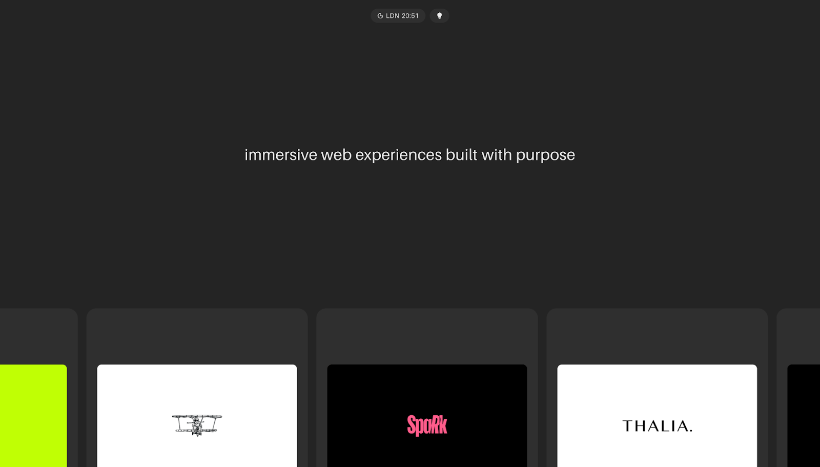
Sam Hills has a stripped-back homepage with a rotating typography animation in the header describing “immersive web experiences built with purpose” and “memorable web experiences built with strategy.” The message is short and to the point: Every decision in Sam’s work is made consciously, and the little details matter.
Rounded bubbles with a curated client list, descriptions of Sam’s two major services, and a contact form finish out the sparse page. There’s enough information in the FAQ for clients to decide if Sam could be a good fit for their needs, but not so much they have to spend a lot of time parsing through their options.
If you’re looking to design a lean portfolio, clearly define your offer, show real client work, and answer the questions that usually block inquiry to help you increase conversion rates.
Common freelancer website mistakes to avoid
Converting potential freelance clients is tough enough in a competitive market. To keep your site from accidentally blocking visitors from taking the next step, here are a few things to avoid:
- Vague positioning. Just saying “we build digital experiences” doesn’t help potential clients understand whether you’re the right fit for their needs. Explicitly lay out what your services are, the audience you cater to, and the results you’ll deliver.
- Too many services. A long menu of loosely-related services can confuse people and might suggest a lack of focus (and potentially quality). Prioritize a few services you’re most capable of delivering instead of listing everything you could possibly do. A tighter service list helps visitors understand your unique value faster and positions you as a specialized business, which can help you capture more leads.
- No testimonials. Without testimonials, your website depends heavily on your own claims, so add quotes from past clients that highlight what it’s like to work with you. Social proof reassures potential clients that other people trust you and have received value from your work.
- No clear CTA. If visitors have to guess what to do next, they’ll likely leave. Make the next step obvious, whether that’s submitting a form or booking a call, with a primary CTA. A clear CTA provides guidance and turns interest into conversion.
- Overdesigned animations. Use motion to complement the user experience. Animations should guide attention, reveal content gradually and smoothly, and add visual polish without slowing the page down or making information harder to access.
- Weak portfolio examples. Show recent work that reflects the types of projects you want more of, and add enough context for people to understand what they’re looking at. Case studies in your portfolio turn your claims into proof, especially when they’re paired with testimonials.
- No pricing clarity (when relevant). You don’t always have to publish your rates, but give some insight into your project scope or how pricing works up-front. When there’s zero pricing context, visitors may hesitate to reach out because they don’t want to waste time and be surprised by out-of-budget rates later.
Build a freelancer website that grows with you using Webflow
With the right design elements and messaging, you can make your value as a freelancer easy to understand and trust. Clients who are looking for services you offer will recognize you as a fit more readily, which helps you build your portfolio over time. Add in more opportunities for testimonials and social proof, and you’ll deepen your site’s credibility as you scale your business, too.
With Webflow, you can build your own website or update your existing site using a composable CMS (no coding required). Create responsive mobile-first layouts, add engaging animations, and tailor your site as you upskill.
Turn the right heads and build your freelance business with Webflow.

The missing guide to the freelance designer's life is here
Learn everything you need to know about making the leap to freelancing, from how to find clients to how to price your services.


