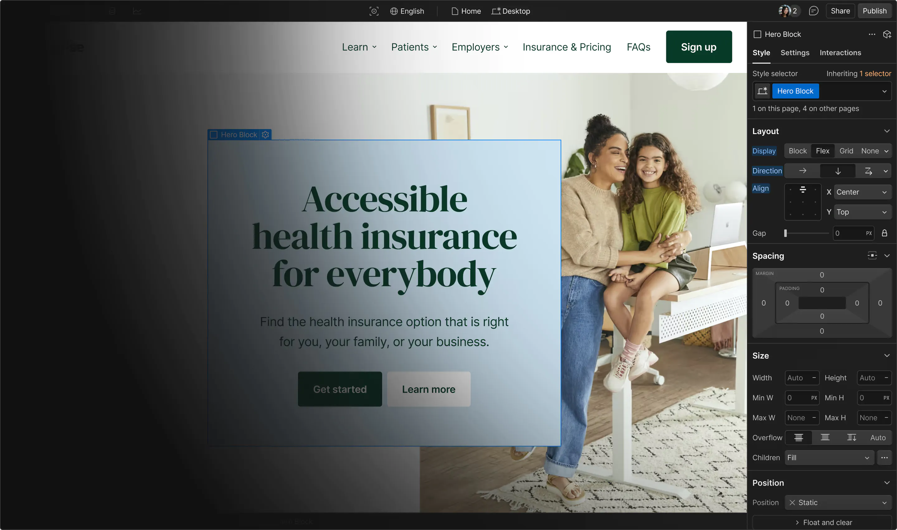
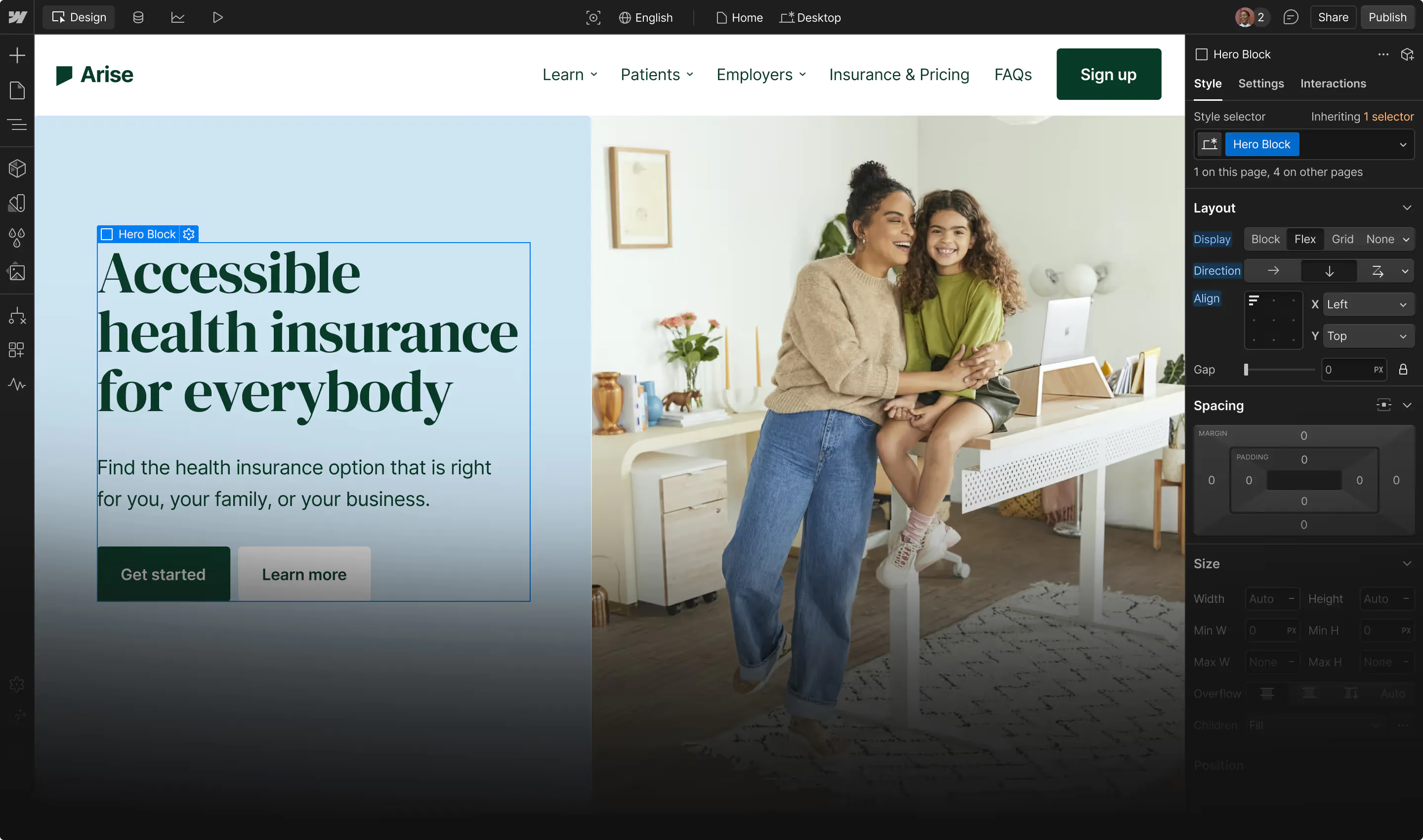









The best mobile websites adjust smoothly to offer every visitor a great experience.
Website design used to focus on the desktop experience, with mobile browsing as an afterthought. That approach is still common, but it’s not sustainable. Between 2015 and 2026, the global share of web traffic originating from mobile devices rose from about 31% to an all-time high of nearly 63% (Q2 2025).
In practical terms, this means more than half of visitors to your website are likely using small screens. The mobile experience is now just as important as the desktop experience, if not more so. That’s why savvy creators and businesses often opt for mobile-first design approaches, where the top priority is optimizing for phones and tablets. This way, you make sure all visitors can browse comfortably and focus on your site’s message.
In this guide, you’ll learn how mobile-first web design works and see a few successful examples. Plus, you’ll learn key factors and steps for building a mobile website that people enjoy using.
What does designing for mobile look like?
Designing for mobile means creating a user experience that matches how people browse on smartphones and tablets. Mobile screens have less space than laptops and desktops, so every design choice should help visitors navigate without extra effort.
The most common way to make that happen is to take a mobile-first approach to web design. Instead of creating a complete site that works well on desktops, then simply shrinking it for smaller screens, you start by planning how the most important content and actions will work on mobile. From there, you can expand the layout for larger screens that offer more room for supporting details and visual elements.
Effective mobile website design also accounts for touchscreen controls. Instead of using a cursor or touchpad, people tap, swipe, scroll, and pinch. So all your site’s interactive elements should be comfortable to use through those actions.
Responsive vs. Adaptive design: What’s the difference?
There are several mobile-first approaches, with the two most common being responsive and adaptive design. Here’s how each method works.
Responsive design
Responsive design uses one flexible layout that automatically adjusts based on each user’s screen size. Instead of creating separate versions of each page, you build one system that rearranges itself as the available space changes.
For example:
- On desktop: A responsive layout might show a headline, image, and call to action (CTA) side by side.
- On mobile devices: Those same elements stack vertically, so people can scroll and tap through the page without having to zoom.
This approach works well for many websites because it keeps the user experience consistent across devices.
Adaptive design
Adaptive design uses different layouts for specific screen sizes and/or device types. When a visitor reaches your site, their browser loads the version that best matches their device.
For example:
- On laptop: An ecommerce site displays a full product collection.
- On mobile: The site switches to a simplified search-first layout.
- On tablet: Visitors see a middle-ground layout, with an abbreviated catalog and more simplified search features.
This mobile web design approach is valuable when different devices need distinct experiences. But since you have to maintain multiple layouts, it requires more maintenance than a responsive site.
Factors to consider when designing a mobile site
Regardless of the strategy you prefer, follow these tips to make your mobile website more accessible and enjoyable from the first tap.
Keep navigation mobile-friendly and functional
Navigation affects how quickly visitors can move through your mobile website. On smaller screens, crowded visuals and hard-to-tap buttons require extra effort from users.
To provide a better navigation experience:
- Simplify the menu bar. Keep the menu focused on the most important pages.
- Highlight search functionality. If search helps visitors explore faster, make it highly visible and accessible in the site’s header.
- Use tap-friendly spacing. Give buttons and menu items enough room so visitors can select them without tapping the wrong elements.
- Keep important sections within reach. Place high-priority actions, like contact links and signup CTAs, where visitors can find and tap them quickly.
Create consistent content
A mobile website should offer as similar an experience as possible to the desktop version, so small-screen users don’t miss out on important information and actions.
To do that:
- Keep essential content in place across devices. Don’t remove important elements, like CTAs, from the mobile version of your site just to save space. Instead, stack or collapse sections, and eliminate optional content that doesn’t change the page’s overall message and value.
- Use a consistent visual language. Fonts, colors, and imagery should remain the same, so your mobile layout feels connected to the desktop version and other branding.
- Test how each page flows. Make sure each section sequence or user journey flows logically on mobile.
Optimize for mobile visibility
Designing for mobile also requires understanding how search engines find and crawl websites. Google relies on mobile-first indexing, which means it primarily uses the small-screen version of your site to determine search rankings.
Attend to important mobile search engine optimization (SEO) tasks by:
- Finalizing the mobile version. Include the same links, multimedia, and metadata as your desktop version to give search engines a complete picture of your site for better indexing.
- Testing mobile interactions. Check to see how elements like forms and buttons behave when you tap, scroll, or rotate through the site.
- Optimizing page speed. Compress large images and avoid content-heavy design choices that slow down your pages.
How to determine if your website is mobile-friendly
Testing your site before launch will help you catch issues that could negatively affect your UX and SEO. Here are a few ways to check whether your site is mobile-friendly.
Use built-in testing tools
Depending on your website builder or content management system, you might have access to built-in testing tools. If you use Webflow, you can move between responsive breakpoints to see how each page adapts across different screen sizes.
As you review each breakpoint, look for issues that might disrupt the user experience on a smaller screen. Make sure:
- Text wraps cleanly, with enough negative space to avoid overcrowding.
- Images scale without cropping or cutting out important details.
- Sections stack in a logical order.
Preview your site on real devices
A preview panel can show how a layout changes from desktop to mobile, but using a real smartphone tells you how the site actually feels to use. So open your staging environment or published site on as many physical devices as possible, and move through the user journey like a typical visitor would.
When doing this, look for elements of the experience that seemed fine in theory, but present possible roadblocks in practice. You might find sections that look great on desktop but feel long and overwhelming on mobile, or a button that’s prominent in previews but harder to notice while scrolling.
Evaluate mobile performance
Mobile performance isn’t limited to a website’s appearance and usability. While testing, check to see how quickly pages load, how interactions behave when triggered, and whether elements shift unexpectedly as users scroll.
All of these can improve your site’s Core Web Vitals, which are speed and visual stability metrics Google uses to prioritize sites in search results. Stronger performance supports search visibility while helping humans understand your site faster.

Get started for free
Create custom, scalable websites — without writing code. Start building in Webflow.
3 examples of great mobile web design
Before we wrap up, let's look at three examples of effective mobile experiences and why they work.
1. Akeo

Akeo’s desktop site uses large-scale visuals and a grid-style portfolio section to fit a lot of content on one page. On mobile, those same elements stack vertically, carrying over the core experience without feeling compressed. At the top of the site, the desktop sticky menu becomes collapsible, with a “Get a quote” CTA placed next to it.
Why this works: These design choices keep navigation close at all times, and they organize thorough information without taking up much space on the page.
2. Aether1.ai

Aether 1.ai’s mobile site carries over the immersive, animation-driven product story of its desktop version. The fixed navigation becomes a sticky hamburger menu, keeping links like Sound, Craft, and Specs within reach without crowding the screen. The full-bleed scroll sections stack into a vertical flow, and the detailed spec sheet collapses into a tappable accordion so dense product data stays scannable on a small screen. And the "Ask Aether" chat and Preorder button both stay anchored on-screen throughout.
Why this works: The mobile layout keeps the high-end feel of the desktop version while restructuring the heavier interactions and dense specs into a format that’s easy to act on from a phone.
3. Chosen Youth

The Chosen Youth Foundation’s website shares an emotion-led story with imagery, program details, and front-and-center donation options. On mobile, the navbar at the top of the page becomes a collapsible drop-down menu, while all other sections stack vertically. The mobile site also omits the parallax imagery from the desktop version, replacing those effects with static images for simplicity and better performance.
Why this works: The vertical design supports steady scrolling, while removing animated elements increases page loading speeds.
Build better mobile websites with Webflow
A strong mobile website will offer the same core content and functionality as the full desktop site. But it will adapt every aspect of the user experience to feel more natural and navigable on smaller screens.
With Webflow, you can build responsive layouts visually and preview each breakpoint to see how pages behave before publishing. You can also quickly create touch-friendly interactions, and have images adjust automatically for maximum performance. Plus, Webflow handles key performance optimizations like clean code, global CDN caching, and lazy loading, keeping your site’s Core Web Vitals strong on all devices.
Design an engaging, search-engine-optimized mobile website with Webflow.

The modern web design process
Discover the processes and tools behind high-performing websites in this free ebook.