

Dark mode websites make it easier to see all your hard work, no matter the device.
More and more designers are exploring the benefits of dark mode websites. Not only does a dark background reduce eye strain for a more welcoming user experience (UX), it also broadens the color palette potential so your design elements and text stand out. And over 60% of web users expect sites to have a dark mode when they visit.
A dark mode website design can offer the style and ease of access that visitors want, whether you’re designing your own site or updating your client’s pages. Before you start experimenting with dark mode on your own, review the best practices and five dark mode website examples in this article. That way, you can start with a better understanding of what defines this striking web design style.
Dark mode websites explained
A dark mode website design reverses the typical black-text-on-white-background color scheme of print media and traditional website design. Instead, it features a dark background and bright text on web pages and accompanying design elements, such as calls to action (CTAs) and navigation menus. Those darker screens, and high color contrast between backgrounds and text, can reduce eye strain as readers scroll.
Dark mode vs. Dark themed websites
The distinction between a dark mode website and a dark themed website is preference control.
- In a dark mode website, the visitor has the option to toggle between dark and light modes, which shift the site’s color palette but not the overall design.
- A dark themed website is deliberately designed with a black background, and the visitor can’t change it.
As a designer, creating a dark mode website means styling two versions of the site when you're picking your color palette, layout, and visuals.
Why should you incorporate dark mode on your website?
Dark mode is intended to reduce eye strain and improve readability for long reading sessions. That makes it an obvious choice if the site hosts long-form content with a lot of text to scroll through.
A black background also contrasts a wider range of colors better than white or gray backgrounds. The pastels and earthy tones of elegant color palettes can get lost on a bright background, diminishing some of their impact. Those same tones shine against a dark background, leading to crisper visuals and a better UX. If you’re hoping to capture a broad general audience and keep them on your pages, a dark mode website might be just what you’re looking for.
Dark mode website best practices
Developing a dark mode website requires adding a few more steps to your design process to make sure the site looks great both ways. Here are a few best practices to keep in mind while you’re working on a dark mode site:
- Start with a template. Pick up a template like the Light/Dark Mode Toggle (from Adrian Raath) that comes with the ability to adjust your whole site at once. You can toggle variable modes in Webflow’s visual design platform to add the dark colors you want without having to set it all up from scratch.
- Add an animation. That same toggling template also includes a seamless transition animation that changes the page from light to dark mode when you click a switch. This subtle animation makes the switch less jarring and adds extra polish, and it gives you a way to add a little more personality to the site with features like sun and moon graphics to indicate which mode is active.
- Check color contrast. Use a color contrast checker to ensure your color choices are accessible in both light and dark modes. Website visitors shouldn’t have to use one mode or the other just to keep the page readable.
- Test on different devices. Dark mode is popular on mobile devices, so use a mobile-first design process to build your dark mode website. This way, you can rest assured that all the fine details appear crisp on smaller screens.
5 dark mode websites for modern design inspiration
Switch between dark and light modes on each of these five dark mode website examples to see just how much of an impact dark mode can make.
1. The Moody Doula
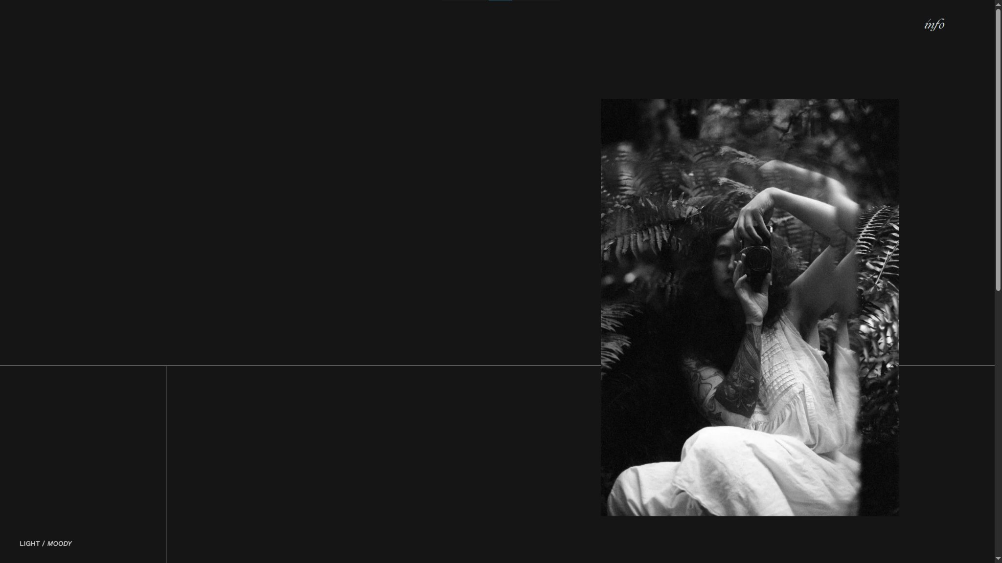
The Moody Doula’s website is an excellent example of minimalist web design that benefits from dark mode. The site has a lot of negative space, resulting in a very bright screen in light mode that overshadows the thin black line segmenting every layout. In dark mode, the colors flip, and the white line and text appear crisp throughout.
When you’re using very small, delicate design elements and decorative fonts like The Moody Doula, dark mode is a great way to ensure fine details stay visible.
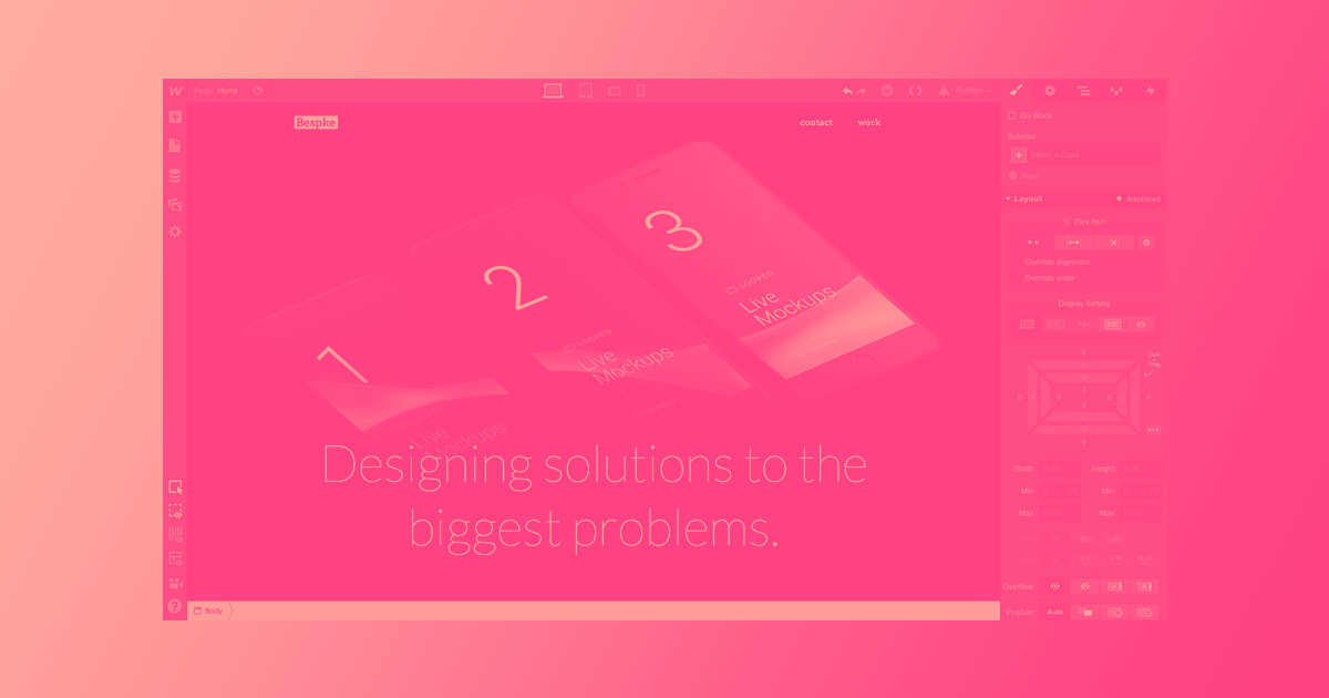
2. Webflow University
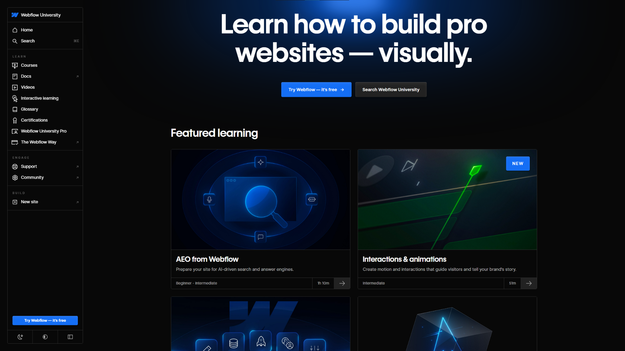
Webflow University offers a dark mode to reduce eye strain for readers scrolling through its long-form guides. This UX choice makes the visuals’ glowing blues and greens pop with a distinctive style that’s reminiscent of other tech platforms. Dark mode keeps all the major elements in high contrast for readability, and sharp lines stand out clearly. There’s a reason this has become Webflow’s default color scheme: it’s inventive, clear, and easy on the eyes.

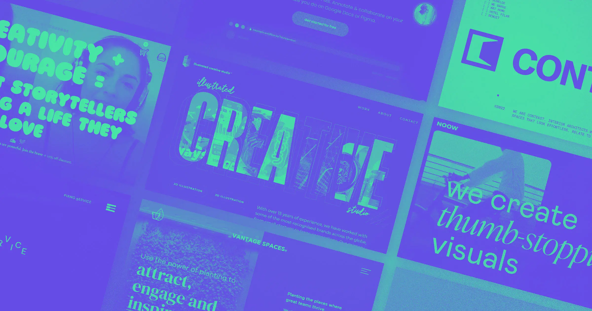
UX design websites from the Webflow community
Find inspiration from the Webflow community for your UX design website.
3. Coffee Collective Club
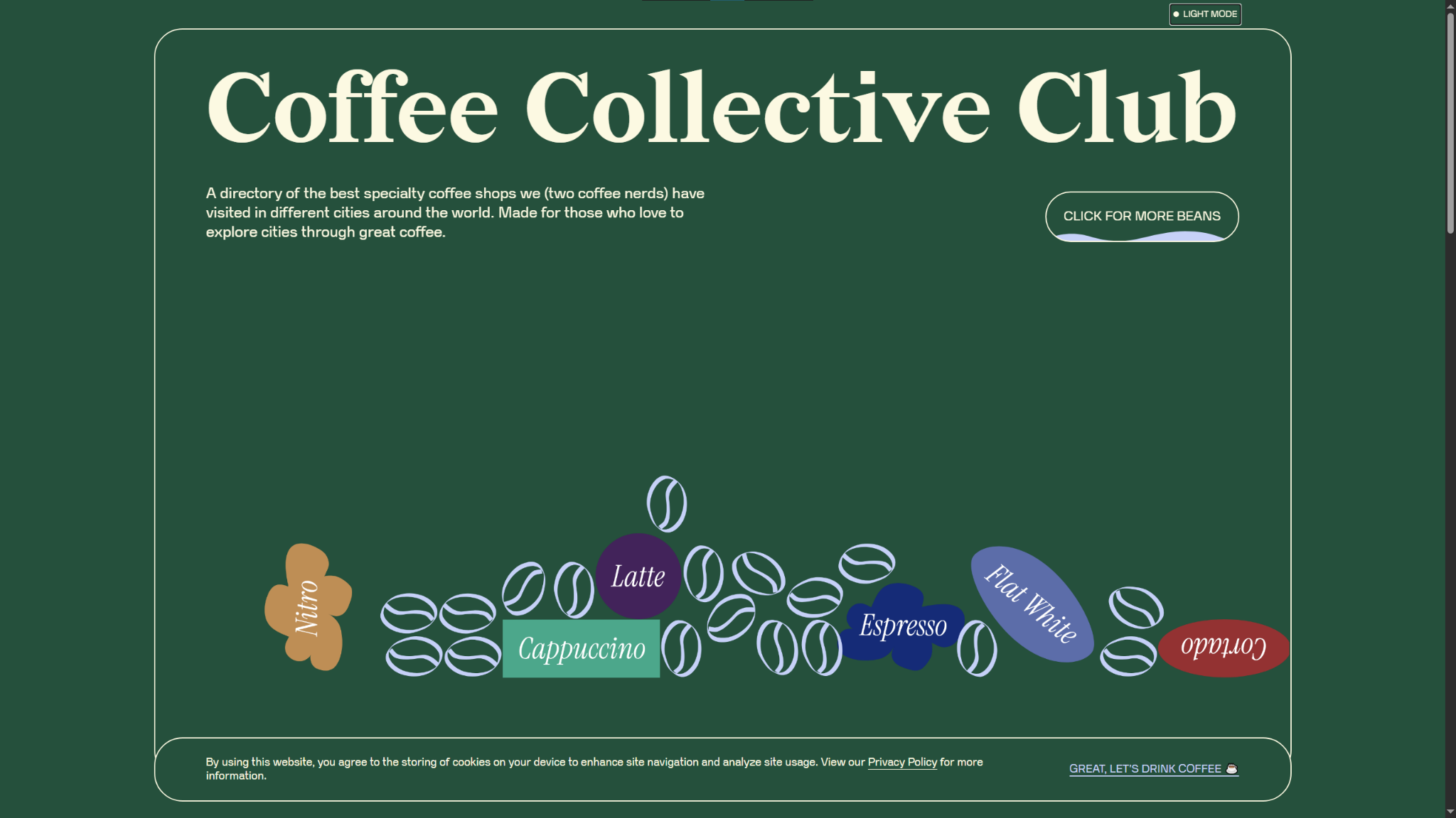
The Coffee Collective Club website by Ace Studio gets creative with its dark mode color scheme. Instead of the traditional black or dark gray background, it opts for a dark green instead. It’s a dark enough shade to still offer high contrast against the text for reduced eye strain, but it reflects the organization’s playful and unique brand identity better.
Notice how the line art and decorations use a pastel blue and light cream text, contrasting the saturated background to make the design elements stand out. In your dark mode website designs, experiment with lighter, less-saturated colors for page elements you want to call attention to. They stand out better against dark backgrounds.
4. Xavier Cédric
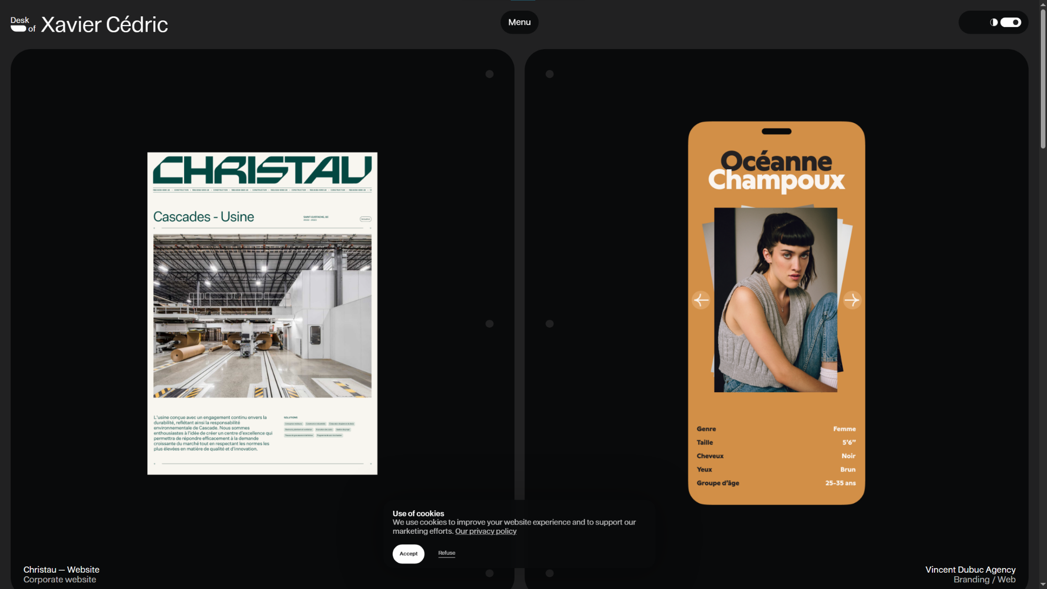
Xavier Cédric’s personal portfolio website uses dark mode to make his colorful work samples stand out. You can see from the examples that creative color palettes, like the bright orange and pink of the OutThere site, are Xavier’s specialty. This expert use of bold (but carefully calibrated) color schemes draws the viewer’s eye directly to these samples.
Make sure you have a solid grasp of color theory before committing to a colorful dark mode design style. It takes practice and a keen eye to make striking choices while maintaining accessibility and readability.
5. Kevin Hilgendorf
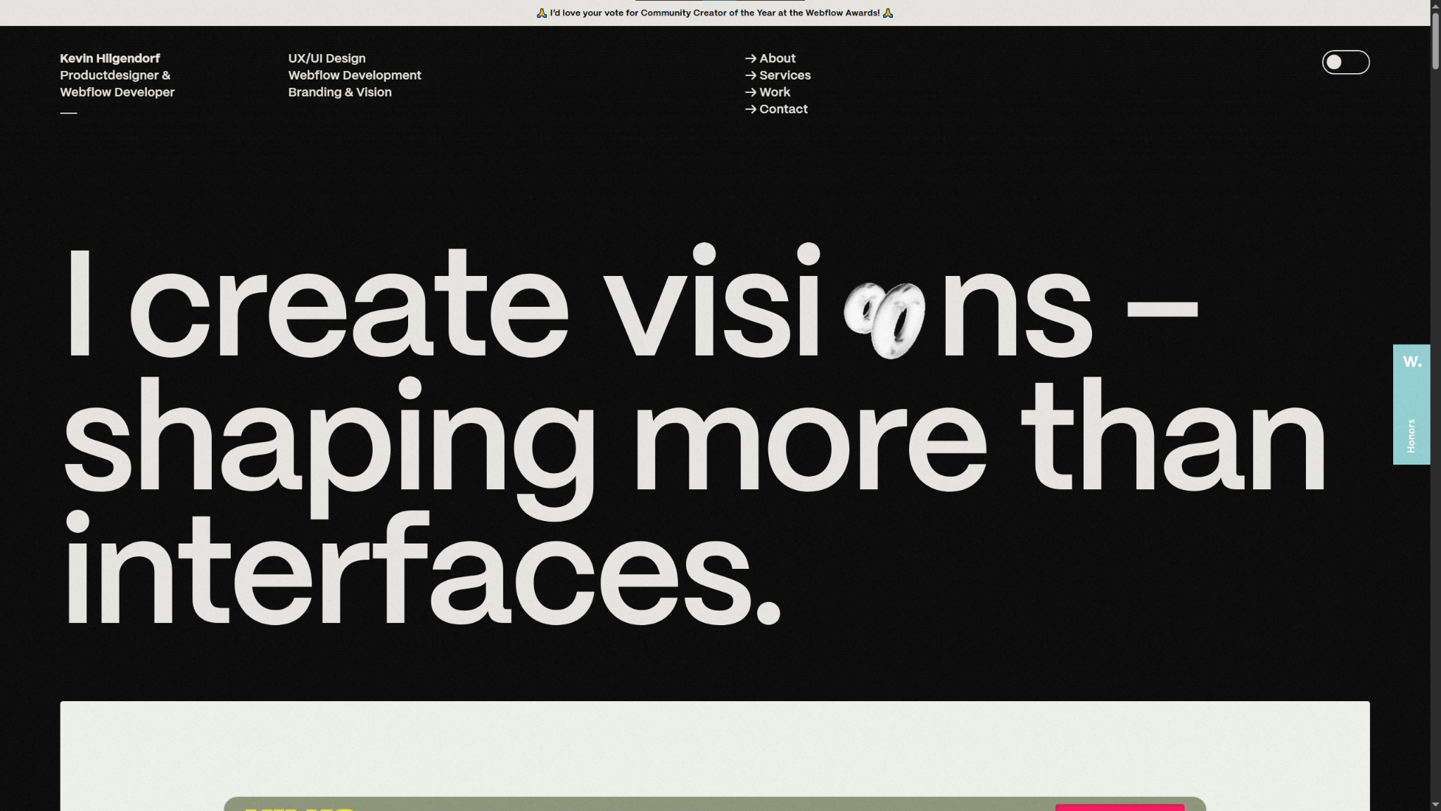
Webflow developer Kevin Hilgendorf's portfolio website features many scrolling animations and parallax effects, making for a deeply interactive and immersive UX. All the motion gets a bit blurry and washed out against a white background, but the cleaner lines afforded by the dark mode version keep every frame crisp.
Kevin adds glossy, reflective, and metallic surfaces to images and animations throughout his website, all of which flip from black to white in dark mode, and the light color shows off those stylistic highlights better. If you’re experimenting with different textures and sheens, try using dark mode to bring out the best in every design element.
Create your own dark websites with Webflow
Building out a dark themed or dark mode website means making careful design choices. You’ll need to pick your color palette precisely to balance readability and visual appeal in all your graphics, text, and UI/UX elements. The best way to set yourself up for success is to choose a visual-first website builder like Webflow.
Webflow’s visual canvas shows you every adjustment in real time, so you can fine-tune shades, tones, and hex codes to match your creative vision without constraints. And with our fast, reliable hosting, you can rest assured that any animations or scrolling effects you add will stay smooth and engaging for your visitors.
Design your next site in dark mode with Webflow.

The modern web design process
Discover the processes and tools behind high-performing websites in this free ebook.