


A great business website design makes visitors feel like they’re missing out if they don’t choose you.
With the right web design, you can establish an ambitious online presence that walks readers to your product and convinces them to purchase along the way. It seems like a big task, but it just takes time, creativity, and the right website builder.
Before you get started, check out these 10 small business website examples to shape your ideas into a cohesive vision for your site.
The elements of effective business website design
An effective web design for a company website grabs viewers’ attention, builds credibility for your brand, and converts first-time visitors into customers. There are several ways to achieve this, and they all rely on some foundational web design principles:
- Clear branding and proposal. Carefully coordinated colors, graphics, and fonts combine to create a consistent, memorable brand identity. It’s clear what your business does and what viewers can expect from the site.
- User-friendly navigation. Smart menu designs reduce friction in the user experience (UX), while guiding calls to action (CTAs) steadily move visitors toward conversion.
- High-quality visual components. Professional-quality visuals, from static images to interactive animations, conveys a sense of legitimacy and enhances the UX.
- User-centric content. Addressing visitors directly (speaking to their pain points, sharing use cases, etc.) establishes that your brand was built with them in mind.
- SEO/AEO. Fine-tuned SEO and AEO strategies organically drive traffic from search and answer engines for more views from new and existing audiences.
10 best business website designs that stand out
Gather some inspiration from others as you’re mulling over business website ideas. While you explore these business website design examples, consider how you might incorporate their strengths when you’re building your site.
- Hungry Tiger
- AYVAN
- Jax Snacks
- Yama
- Diana’s Seafood
- Spot
- Mama Joyce Peppa Sauce
- Koffiracha
- Palmer
- Closet World
1. Hungry Tiger
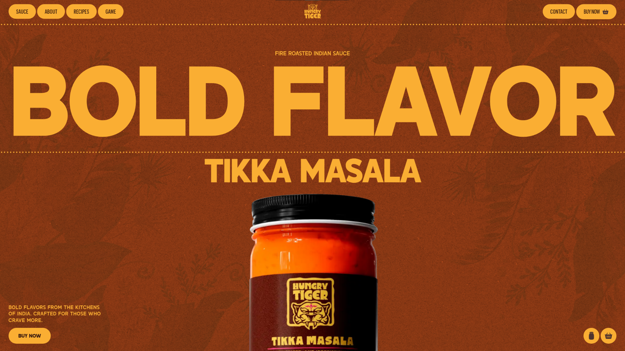
Why this design stands out:
- An orange and yellow-heavy color palette matches the colors of Hungry Tiger’s product, subtly introducing visitors before an image of the jar appears on screen.
- High-quality graphics and other visuals showcase the product and add polish to the overall UX.
- Carefully selected animations, like a rotating jar that spills open at the bottom of the homepage, enhance the site without slowing page load times.
Hungry Tiger has one product — a jarred tikka masala sauce — and every visual, interaction, and animation showcases it. Each section focuses on a different aspect of the sauce, from its ingredients to recipes visitors can use it in. Exploring the product or service you sell from multiple angles helps you tell a story that builds interest and customer loyalty over time.
2. AYVAN
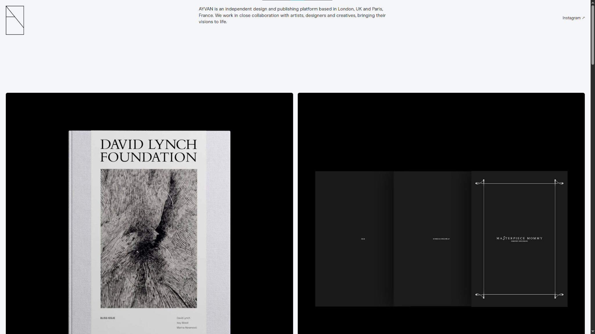
Source: AYVAN
Why this design stands out:
- A commitment to minimalism lets the visuals do the talking, with small amounts of text and plenty of white space to minimize distractions.
- The site focuses almost exclusively on the storefront, avoiding any potential navigation problems or information overload.
- A limited selection of books in the store increases urgency by subtly suggesting the products could run out at any time.
The AYVAN company website leans into this brand’s small inventory by blowing up the product images and arranging them in a Z pattern that takes up the full width of the screen. Every book has its time to shine, while the limited inventory gives an air of exclusivity and pushes purchasing urgency.
3. Jax Snacks
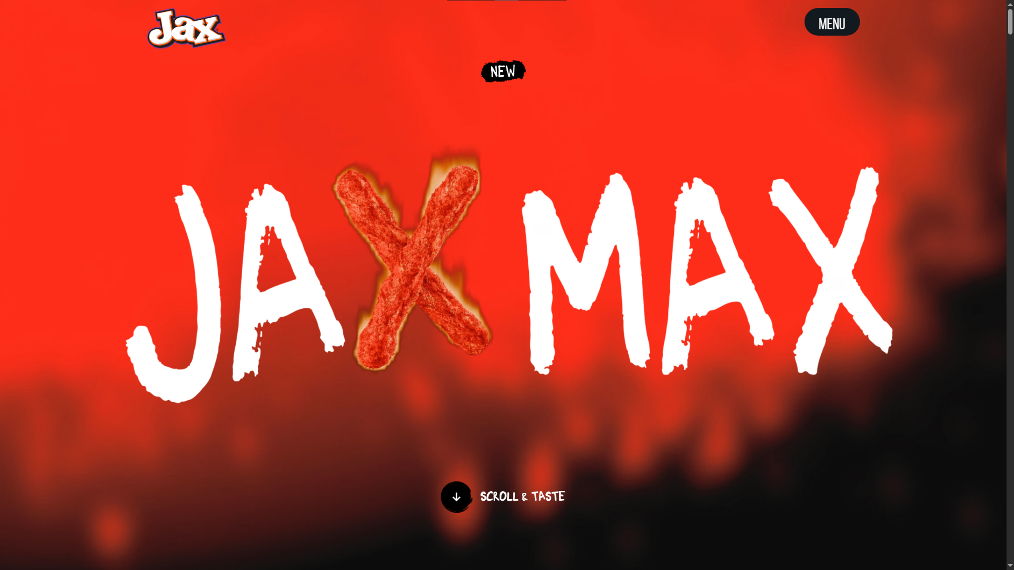
Why this design stands out:
- An animated full-screen hero graphic catches visitors’ attention right away.
- More animations, videos, and interactions throughout the site showcase the product and encourage visitors to scroll to discover what’s next.
- Several CTAs give visitors clear next steps, from finding a store that sells their product to engaging with their social media presence.
The Jax Snacks website is an immersive experience that captures potential customers’ attention through bold visuals and interactive features, like prompts to keep scrolling and floating snacks above the bottom banner. You can clone similar elements from templates in the Made in Webflow marketplace, so you don’t have to develop everything yourself.
4. Yama
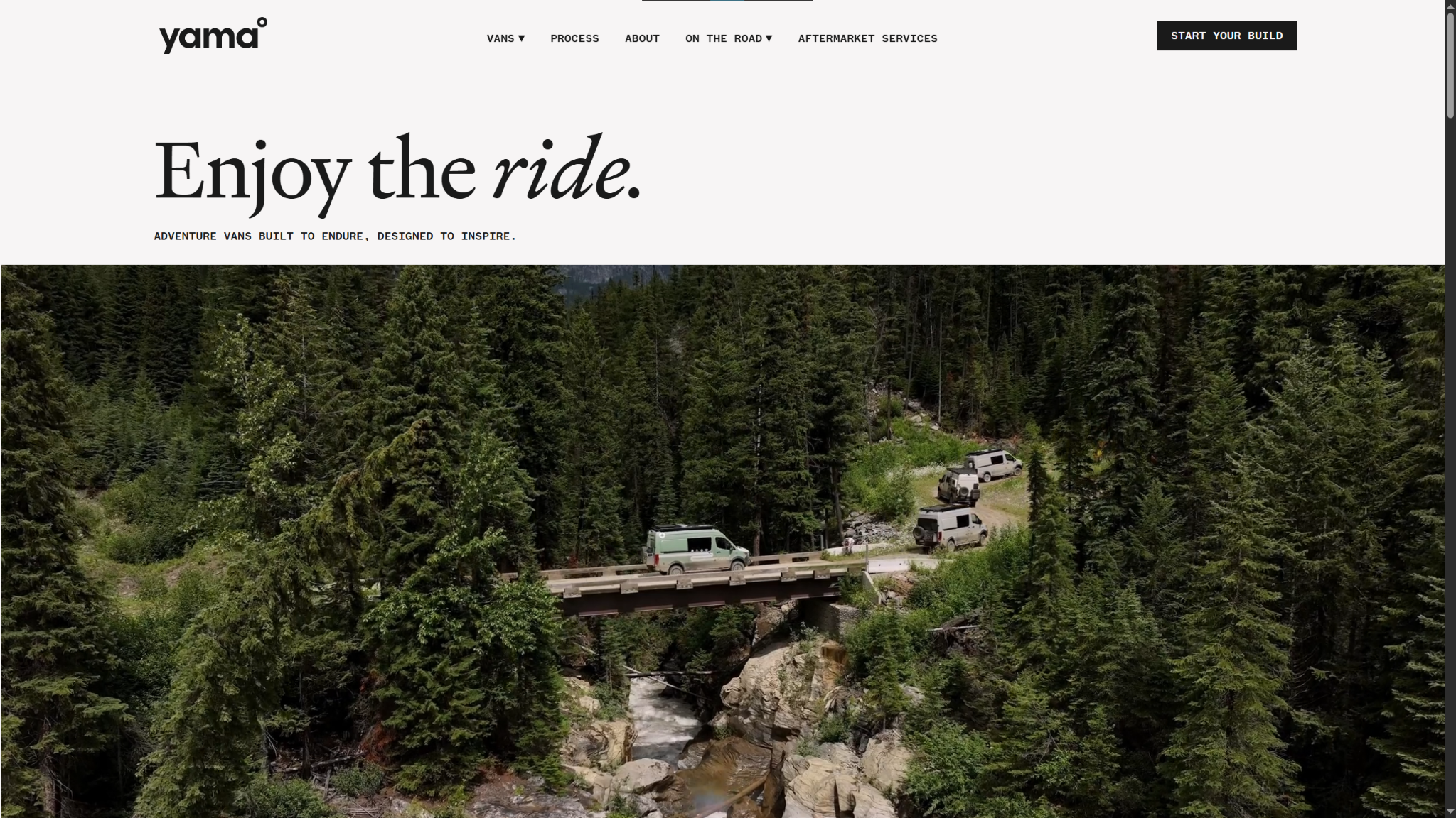
Why this design stands out:
- High-quality visuals immediately highlight the product, leaving no room for confusion about what Yama sells.
- Interactive features like comparison charts, galleries, and a custom builder put everything a potential buyer needs in front of them to avoid navigation problems.
- Modern fonts and a clean layout limit distractions, keeping the focus on their vans.
Yama’s company website is purpose-built, just like how they describe their vans. Nothing exists on the site that doesn’t directly contribute to the intended UX: Every interaction creates a click funnel that leads visitors to a contact form where they can order a vehicle.
5. Diana’s seafood
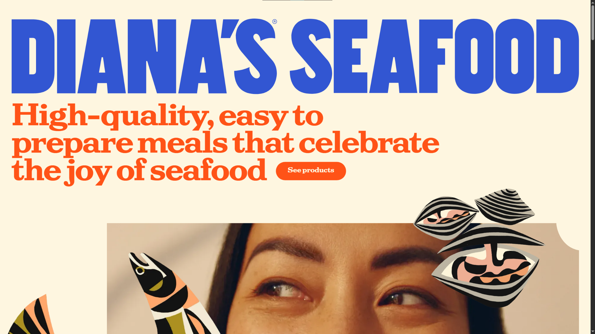
Why this design stands out:
- A saturated color palette makes bold headings, graphics, and text pop against the cream-colored background.
- Careful graphics and font choices (like pairing serif and sans serif fonts for different header levels) make text easy to differentiate and trips to the homepage memorable.
- Clear images of the products in their packaging establish credibility, as visitors see what the products will actually look like.
Diana’s Seafood uses a one-page web design, but it packs a lot into that one page. Notice how the model’s eyes appear just above the fold at the top, tempting visitors to scroll down to see the rest of their face (and learn more). Deliberate visual choices like these build interest and invite people to keep scrolling through your carefully curated homepage.

The modern web design process
Discover the processes and tools behind high-performing websites in this free ebook.
6. Spot
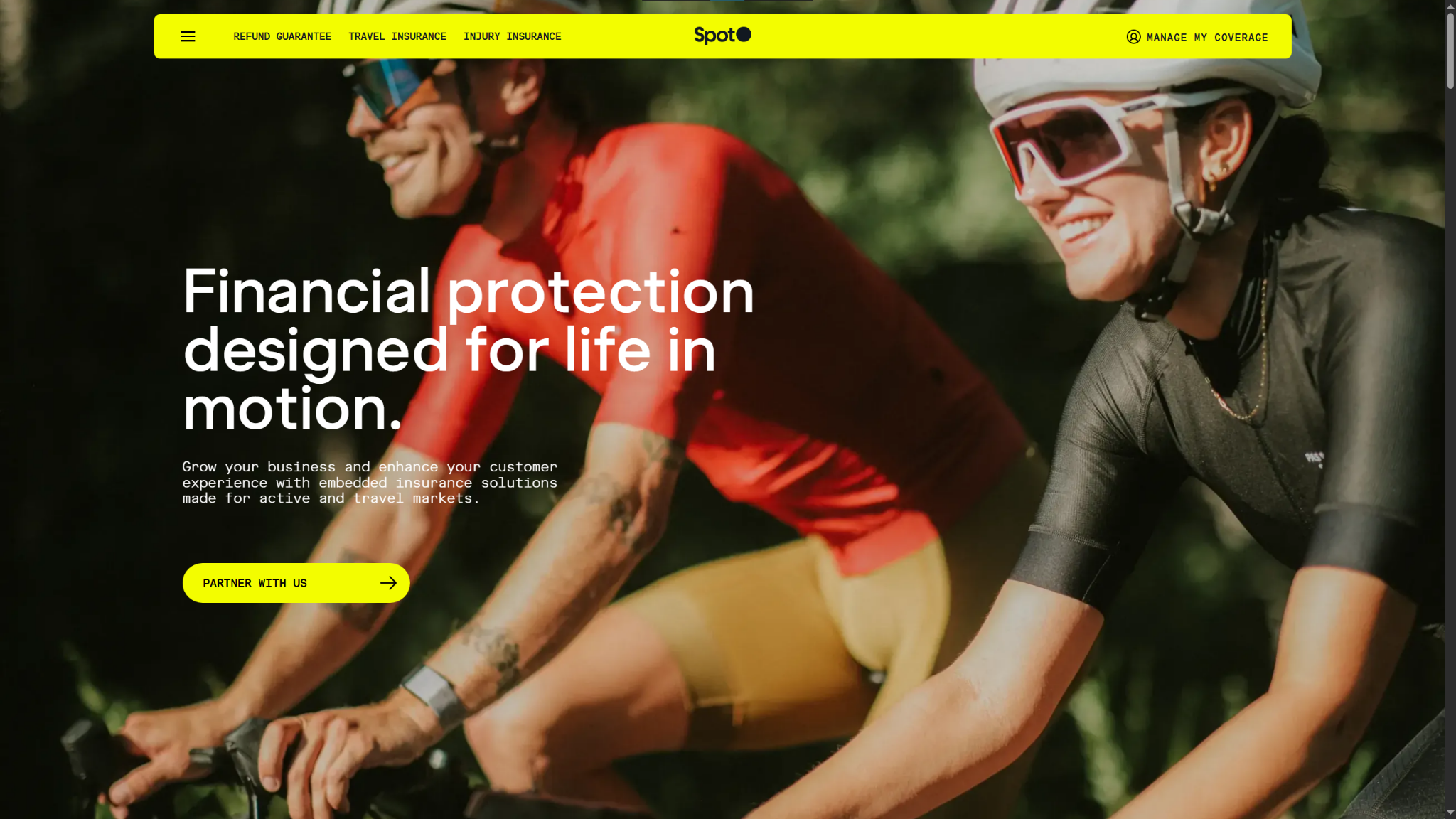
Why this design stands out:
- The opening headline quickly clarifies Spot’s brand identity as a B2B provider with a specific target audience (companies that want to offer niche insurance options to their customers).
- Mobile-friendly sticky navigation menus make it easy to move around the site.
- An integrated contact form keeps the next step in the customer journey close by so interested visitors can take the leap as soon as they’re convinced.
The B2B website that Muhammad Dilshad Khaliq built for Spot immediately establishes their credibility through pricing examples and a crystal-clear value proposition. The homepage answers common questions to directly address the target audience, making a strong first impression built on trust and transparency.
7. Mama Joyce Peppa Sauce
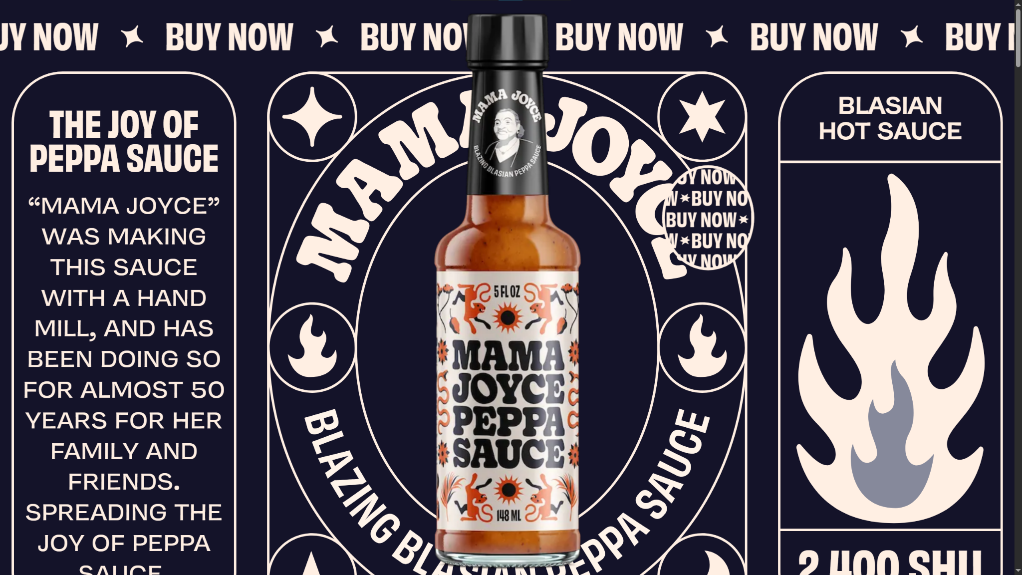
Why this design stands out:
- The unique top-level domain (TLD) choice of “.love” sets the site apart and keeps the domain costs down.
- A maximalist design uses the whole screen to deliver a bold, on-brand UX.
- Modern sans serif fonts make the abundance of large text easier to read and less overwhelming.
Much like their hot sauce, the web design for Mama Joyce Peppa Sauce is deliberately intense. It packs every square inch of the page with graphics and text, featuring a dark navy blue background that provides enough contrast to make everything pop. In your design, think about how you can organize text and graphics to emphasize your brand’s personality.
8. Koffiracha
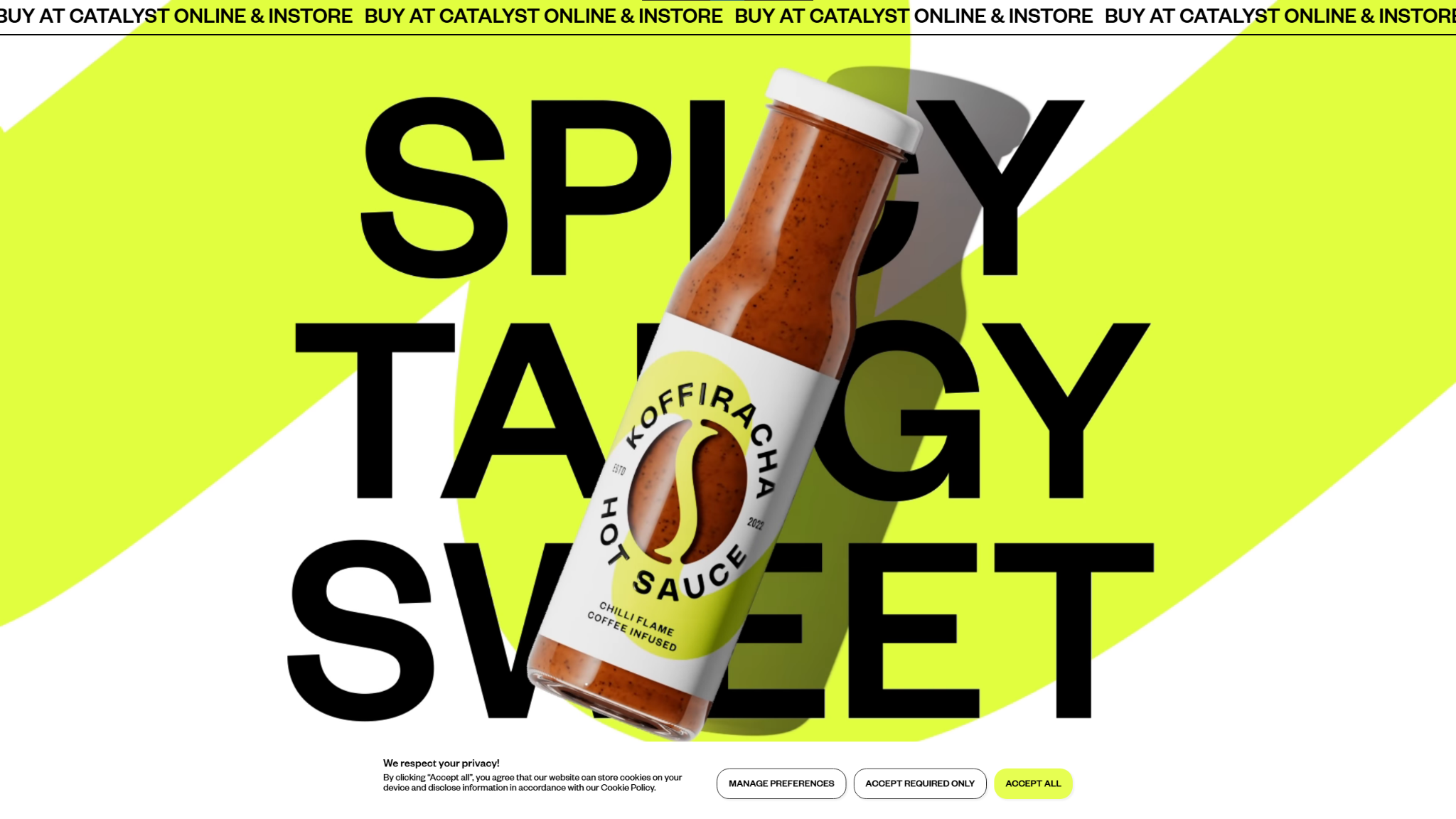
Source: Koffiracha
Why this design stands out:
- Evocative taglines and crisp graphics help visitors imagine the unique product (coffee-infused sriracha) in more detail so they can make faster conversion decisions.
- Several inviting CTAs direct visitors to an online store, where they can check prices and inventory.
- Numerous testimonials and ratings provide social proof that builds much-needed credibility for this unconventional product.
An unusual flavor combination like coffee and sriracha means an audience will need more convincing to try it, and Koffiracha’s web design is up for the challenge. It includes reviews from prominent names like Michelin star chefs underneath product images, followed by well-crafted descriptions for their main Koffiracha variants. This order puts social proof and sensory descriptions up front to help visitors overcome their doubts about Koffiracha’s taste.
9. Palmer
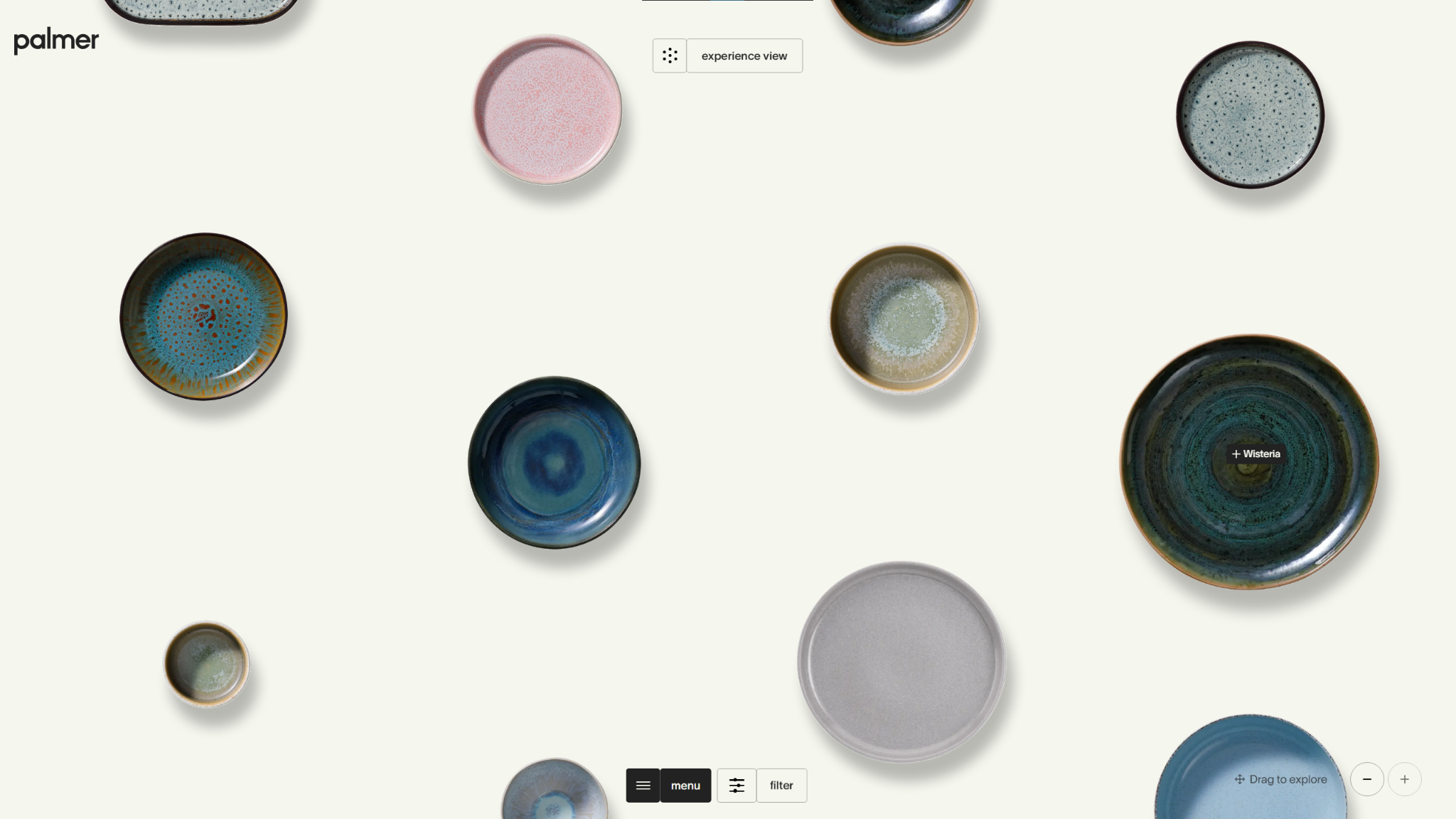
Why this design stands out:
- The homepage’s “experience view” provides a uniquely interactive way for visitors to view Palmer’s products before they see anything else.
- Customizable presentation options (like grid view rather than experience, or sorting by collection or item) involve visitors and give them the freedom to explore the site however they want.
- Professional flat lay photography and drop shadows make each product appear like a physical object on a flat surface.
UNCOMMON lived up to their name with the business website design they made for Palmer. Its unconventional layout is memorable and unique, while its customizability immediately engages visitors as they change the presentation and dynamically explore products. Intuitive pages don’t have to be static — interactive elements can quickly catch your viewers’ attention without making your site harder to navigate.
10. Closet World
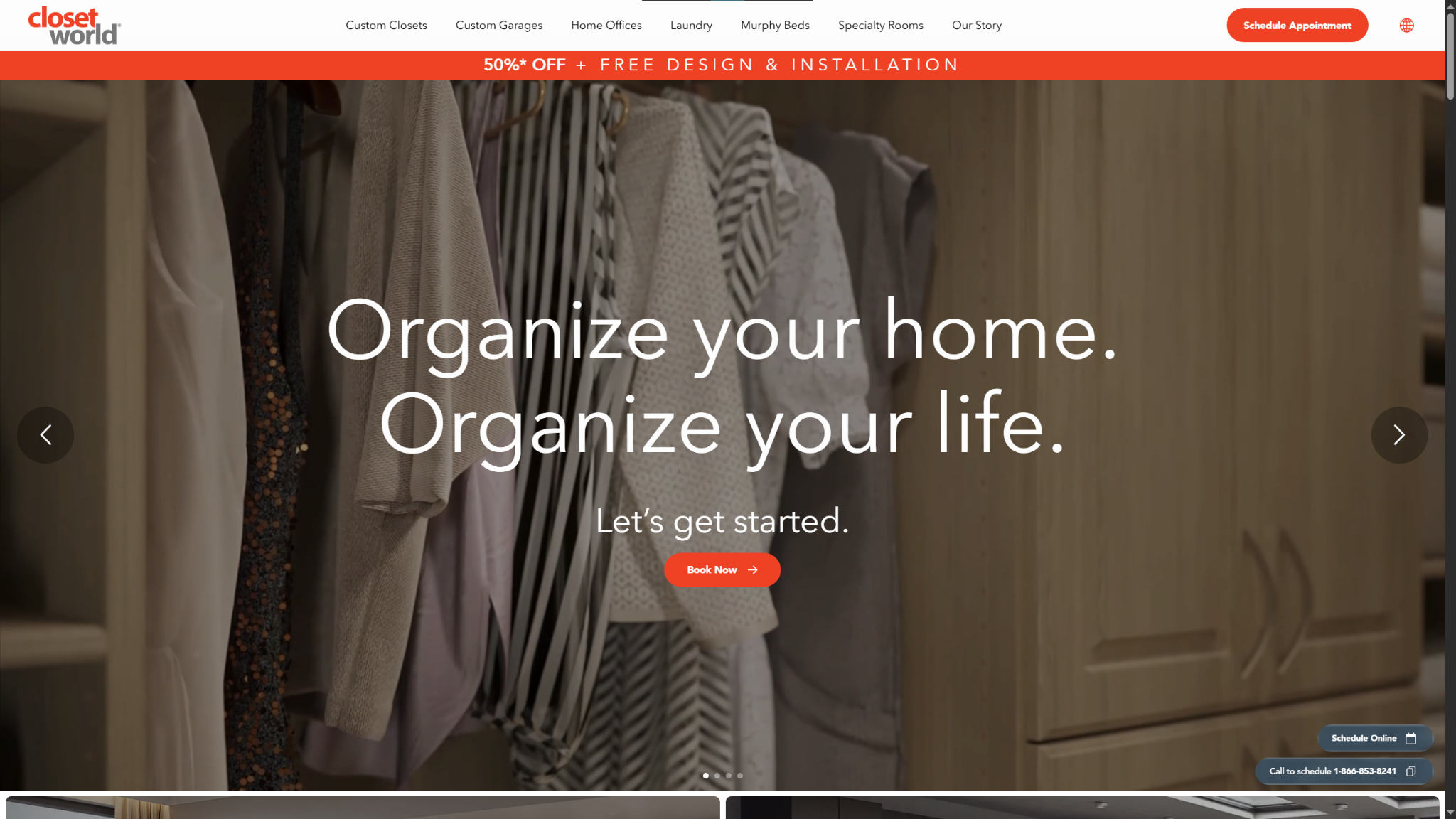
Why this design stands out:
- Subtle interactive elements on the homepage ready viewers for more in-depth interactions on the site, like the robust 3D Style Studio.
- High-quality photographs that consider things like lighting and composition showcase the brand’s work and present each space in a flattering, professional way.
- A sticky navigation menu at the top reminds visitors that there’s more to see, no matter what part of the homepage they’re on.
Closet World’s business website design is as neatly organized as their product. Everything has its place in this dynamic Z-pattern layout, which uses high-quality visuals to entice visitors with the promise of a tidier future. When you have large, important elements like animations or interactive features on part of the site, prepare your readers by introducing smaller versions of them on the homepage.
How to design a business website, step-by-step
The process that takes a business website from an idea to digital reality is well-documented, but you can put your own spin on the details to make your site truly reflect your business. Here’s a brief overview to help you get started:
- Plan strategically. Pick a target audience and style that align with your business goals, and assemble the assets (like animations and buttons) you’ll use to convey your brand image.
- Pick a platform. Choose a website builder like Wix, WordPress, or Webflow. For a striking first impression, choose Webflow, and get started with our visual canvas and thousands of templates.
- Design thoughtfully. Decide on a layout and arrange your branded assets to create a distinct visual hierarchy. Well-organized sites with clear hierarchy are easier to read and understand, so create a curated UX that guides visitors toward conversion opportunities.
- Test and launch. Test every element to ensure it works as intended. Once you’re feeling confident, launch your site, then test it again. Use different devices, browsers, and operating systems to find any inconsistencies, and have someone else review it from a different location just to confirm.
- Continuously improve. Monitor engagement metrics and experiment with conversion rate optimization (CRO) or A/B testing to find new ways to draw in more customers.
For more details, check out our dedicated guide on how to design a website.
Make your vision a reality with Webflow
Creating a web design for your business is a big step in your company’s journey. The process, best practices, and examples in this article will help, but you’ll also need the right platform to make it work. With a powerful website builder like Webflow, you’ll have everything you need to make your site look and feel exactly how you want, no plugins or add-ons required.
The Made in Webflow marketplace offers thousands of templates to start from. You can use the visual design environment to fine-tune your creation, then share it without touching a line of code.
Clone a template into a workspace and start building with Webflow.

Freelance web design boot camp
Explore what a successful, fulfilling web design career can look like with this free, comprehensive course.


