








The most effective B2B sites build confidence into every click, helping prospects understand your client’s value.
B2B audiences often arrive on a website with a specific problem to solve, and multiple stakeholders they need to satisfy before they’ll consider conversion. Once on your client’s site, these audiences dive straight into comparing options, weighing risks, and looking for proof that your client can provide the solution they want.
That’s why the most effective B2B sites present clear, immediate value propositions and convincing information. In this guide, we’ll look at 10 of the best B2B websites, and explore the design choices that make for conversion-generating user experiences.
- Anrok: Lead with your key promise
- UpGuard: Position around problems buyers recognize
- Sendlane: Use stats to measure value
- Dinergy: Provide process visibility
- Pocus: Empathize with buyer concerns
- RemotePass: Distinguish buyer paths
- Dropbox Dash: Demonstrate workflow compatibility
- Float: Mirror typical decision-making flows
- Codex: Show audiences what they can do with your solution
- Capchase: Tailor to each stakeholder
1. Anrok: Lead with your key promise
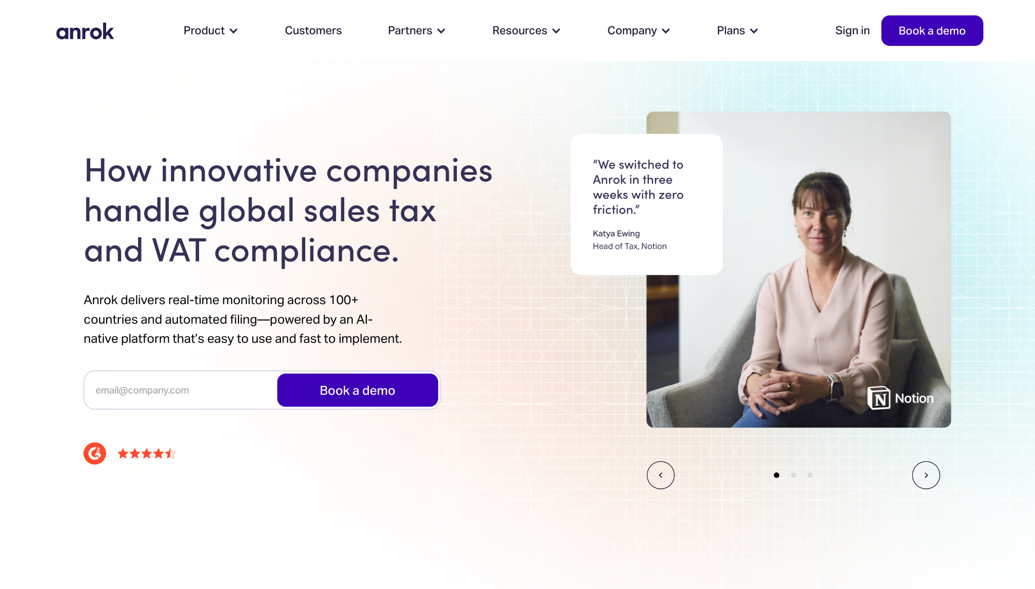
What it does. Anrok helps companies automate global sales tax and VAT compliance as they expand into new markets.
Why it works:
- The hero section turns a complex subject into a clear business outcome. Instead of opening with technical tax jargon, Anrok leads with the bigger picture: handling global compliance for modern companies. This helps visitors immediately understand the value Anrok provides.
- The page builds trust early with social proof. Customer logos, G2 ratings, and quotes from company executives appear at the top of the page, building trust with cautious buyers before they reach in-depth production details.
- The navigation reflects genuine buyer problems. Different services, such as integrations and tax resources, are separated into clear categories through the navigation bar, so visitors can choose paths based on their specific interests.
Key takeaway. If you’re building a service provider website, lead with the key promise and support that claim with plenty of proof.
2. UpGuard: Position around problems buyers recognize
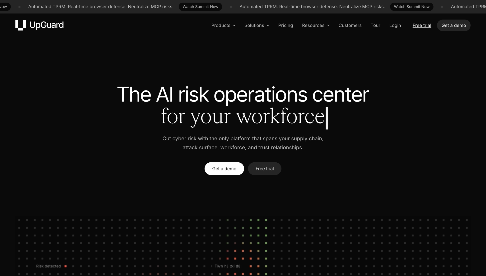
What it does. UpGuard helps companies monitor and reduce cybersecurity risks.
Why it works:
- The homepage makes multiple products feel accessible. Cybersecurity can be difficult to explain, so UpGuard breaks its offering into categories like “Vendor Risk” and “User Risk.” This lets visitors self-select based on the risks they care about most, instead of having to read through one long pitch.
- The messaging connects security to business workflows. Frequent language about vendors, attack surfaces, and workforce risks shows potential customers where UpGuard could fit into their day-to-day responsibilities.
Key takeaway. If your client has a technically complex offering, organize its website around problems the buyer will quickly recognize.
3. Sendlane: Use stats to measure value
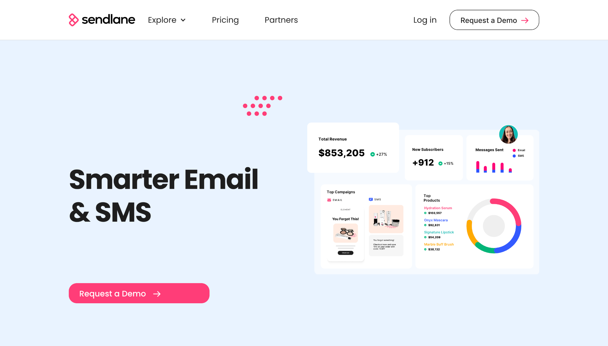
What it does. Sendlane helps companies manage email, SMS, and customer data in one platform.
Why it works:
- The social proof is tied to revenue. In addition to past customer logos, the site highlights metrics like click-through rates and ROI increases. This gives buyers evidence they can take back to key decision-makers.
- The support story reduces migration anxiety. Migration and platform changes can feel risky, so Sendlane highlights its knowledgeable human support.
Key takeaway. Show how your client’s product or service simplifies a painful workflow, and use stats to make the value proposition feel measurable.
4. Dinergy: Provide process visibility
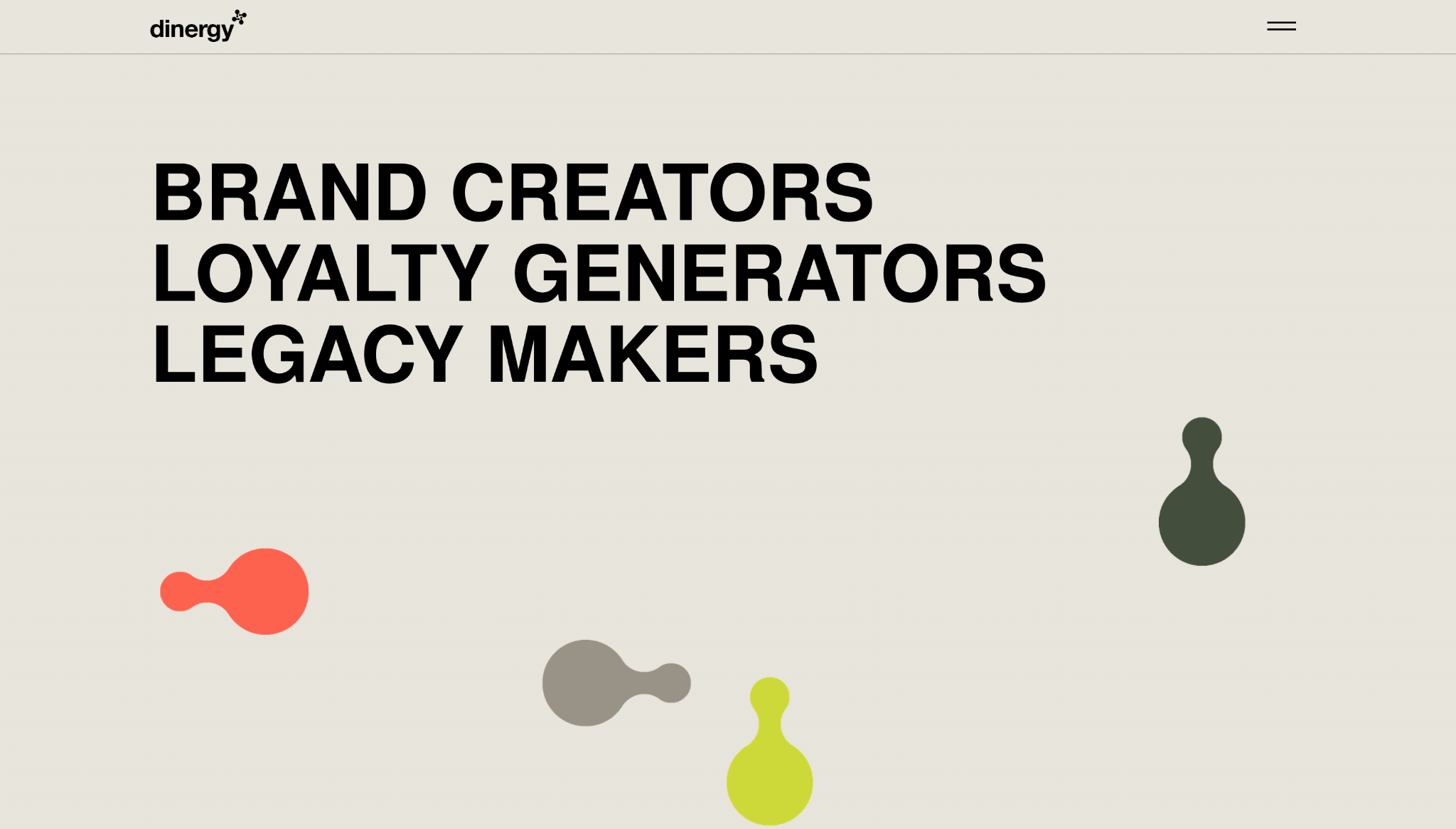
What it does. Dinergy is a creative agency that helps B2B businesses build stronger brands.
Why it works:
- The portfolio shows range. Featured work across various services, like branding and product development, helps visitors understand the agency’s versatile capabilities.
- The “how we work” messaging explains the agency’s approach. Dinergy frames itself as an experienced, hands-on partner that can help stretch client budgets and avoid the need to manage multiple consultants, giving prospects a clear reason to convert.
- The awards are proof of creative credibility. Creative services are hard to judge from a short visual pitch, so Dinergy’s site displays 30+ global awards to demonstrate its quality.
Key takeaway. Give your client’s process visibility, so prospective customers know they’re choosing a partner that matches their goals.
5. Pocus: Empathize with buyer concerns
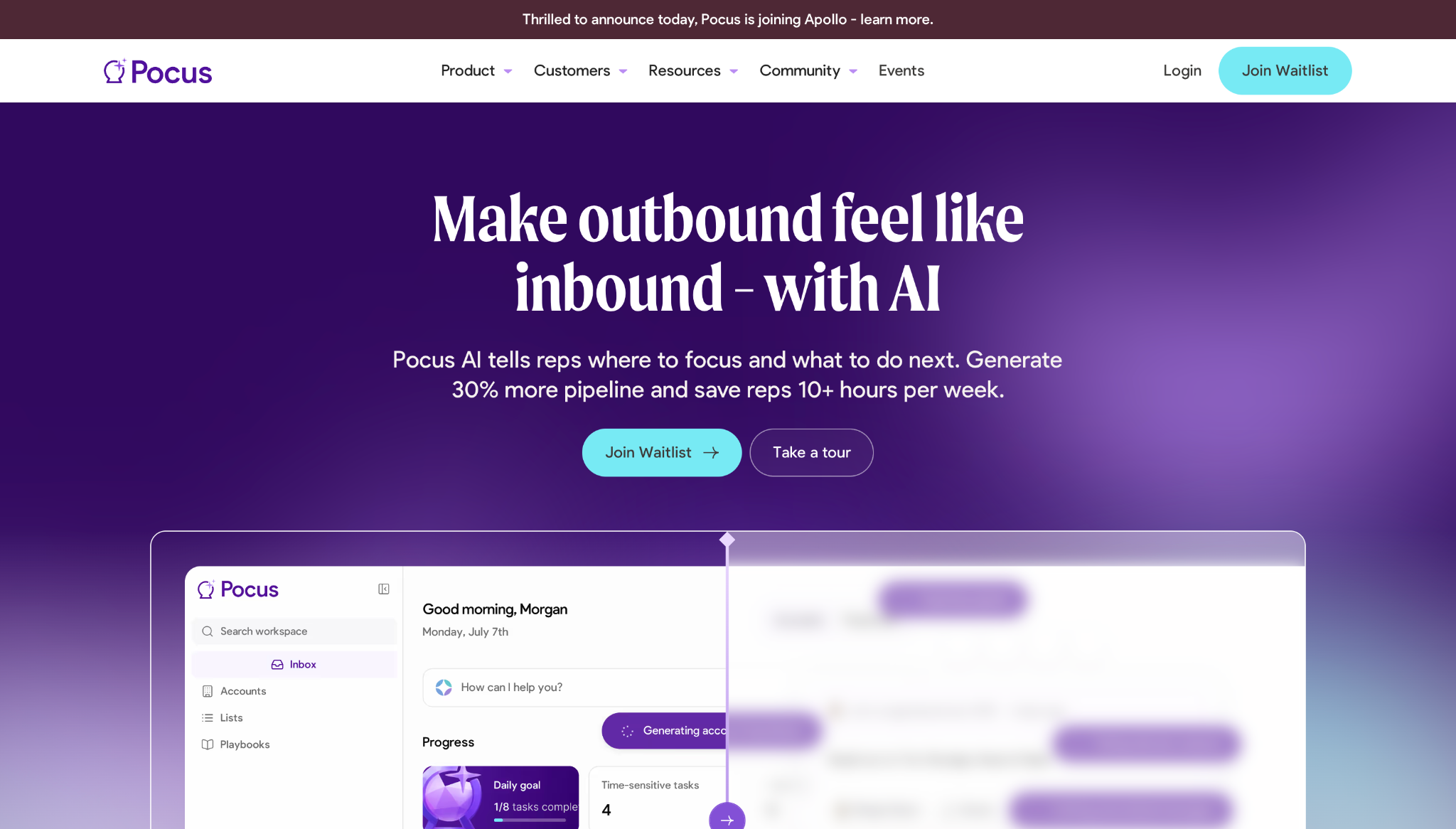
What it does. Pocus helps go-to-market teams use AI to prioritize accounts and guide sales representatives.
Why it works:
- The page reinforces familiar pain points early. Sections on decision paralysis and tool overload show that Pocus understands how sales teams typically lose momentum.
- The social proof matches the buyer’s priorities. This site highlights metrics revenue leaders care about, such as pipeline generated, rep time saved, and outbound contribution.
Key takeaway. Meet buyers where they’re at by empathizing with their concerns, then showing data-driven proof of results instead of vague marketing claims.

Turning traffic into revenue
In this webinar, hear from experts from HubSpot, Clay, Zapier, and Webflow on the future of customer acquisition and marketing automation.
6. RemotePass: Distinguish buyer paths
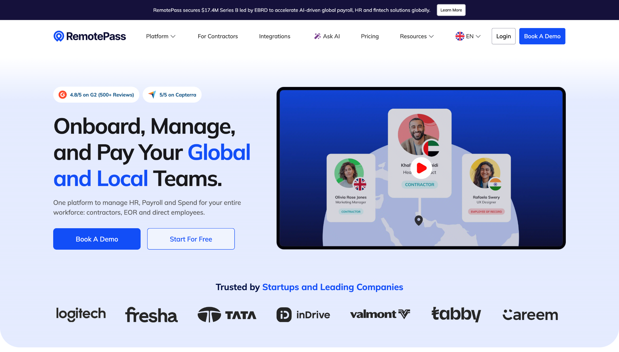
What it does. RemotePass is an HR platform that helps companies hire and manage global talent.
Why it works:
- The menu separates similar features clearly. Global hiring platforms combine several complex services that can blur together. RemotePass gives its target audience individual paths, such as “Contractors” and “For Employees,” so each persona can quickly find the most relevant solution.
- The site builds trust around risk-sensitive decisions. Compliance, security, and customer reviews are all part of the main product story, reassuring visitor concerns.
- The resources support buyers mid-consideration. Country guides, payroll resources, and reports capture demand from prospects earlier in the decision-making process.
Key takeaway. If your client offers several related services, separate buyer paths clearly, then bring them back to support one larger promise.
7. Dropbox Dash: Demonstrate workflow compatibility
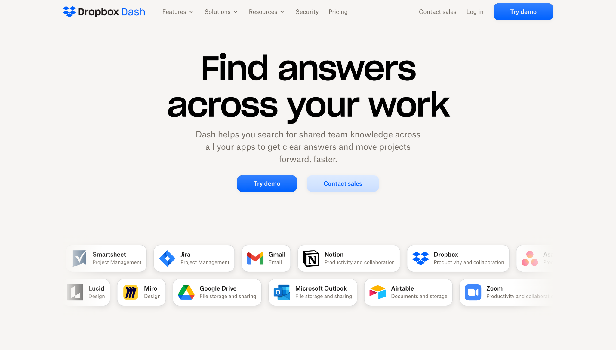
What it does. Dropbox Dash helps businesses find and organize company resources across the apps they already use.
Why it works:
- The visuals make integrations clear. Showcasing popular tools like Notion, Slack, and Google Drive prominently helps visitors picture how Dropbox Dash fits into their current tech stacks.
- The site walks through a typical workflow. The homepage is organized in a narrative fashion, moving through topics like “Find,” “Answer,” “Organize,” and “Share,” explaining how the AI-powered productivity features work in practice.
Key takeaway. To help a B2B website generate leads, demonstrate exactly how your client’s solution fits into the tools and routines its target audience already uses.
8. Float: Mirror typical decision-making flows
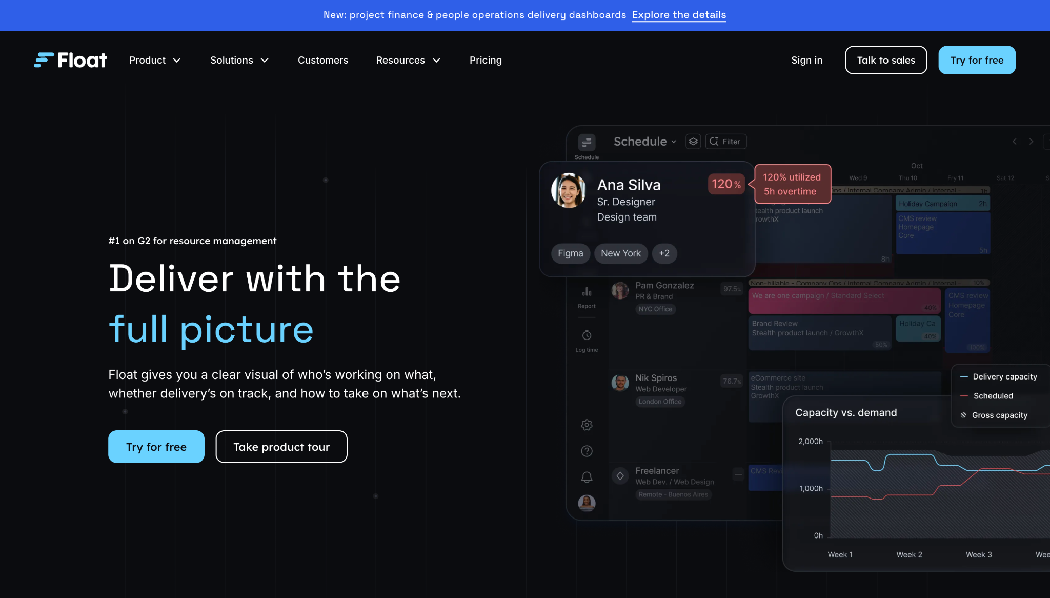
What it does. Float helps professional service companies manage logistics and understand delivery performance.
Why it works:
- The homepage addresses multiple issues. Float’s website doesn’t frame resource management as just a scheduling problem; it adds context by showing how availability, budget, and margins all affect each other.
- The product sections follow typical decision-making flows. The page’s design mirrors the order of questions a service business might have to answer during a project, from knowing who’s available to scoping work and tracking delivery performance.
Key takeaway. Make your client’s website persuasive by showing how each service connects to the bigger business picture, not just immediate tasks.
9. Codex: Show audiences what they can do with your solution
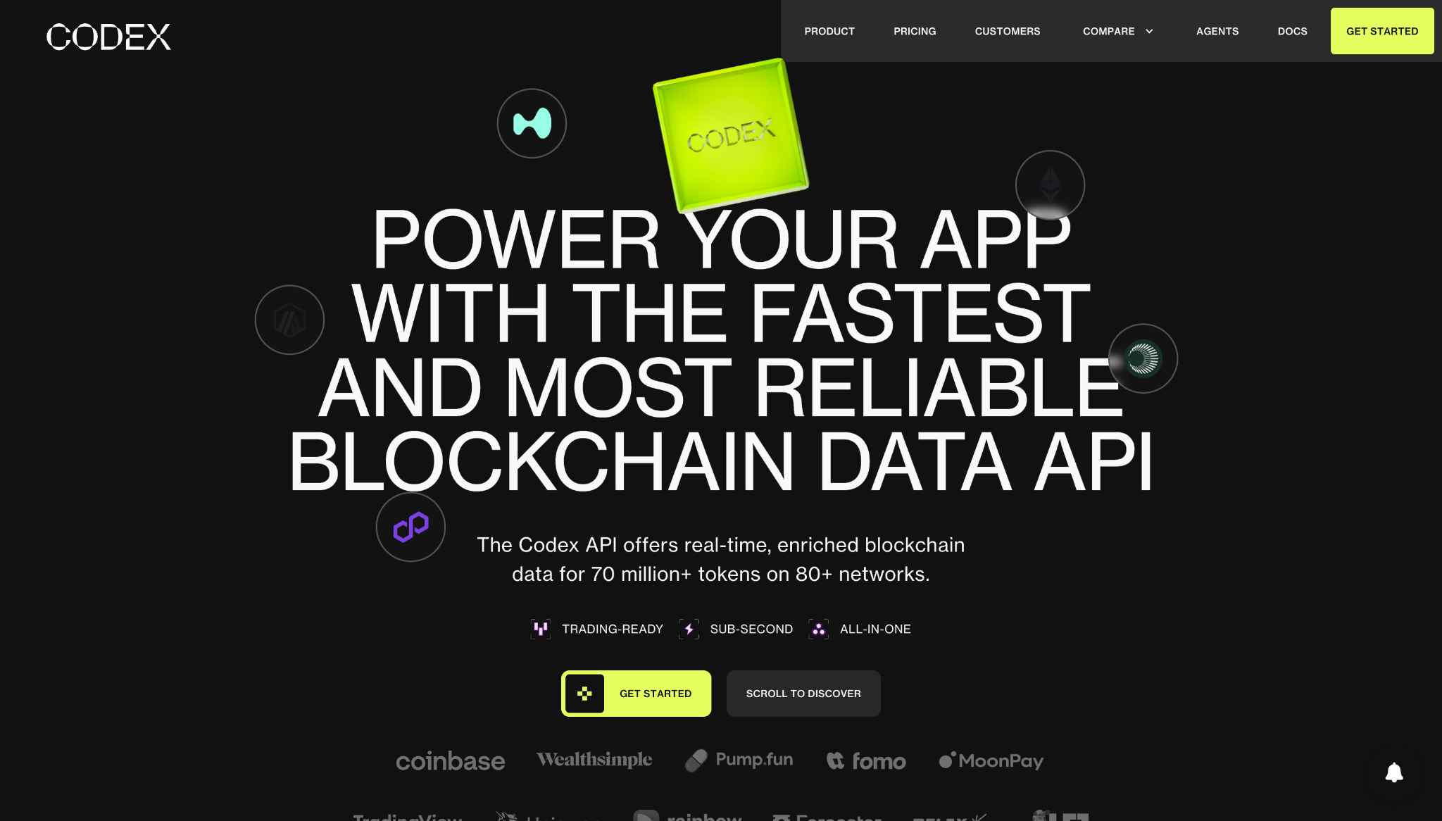
What it does. Codex provides real-time blockchain data APIs that help developers build crypto-related apps and products.
Why it works:
- The hero section speaks directly to developers. “Power your app” gives Codex’s website a defined audience from the first line.
- The feature sections talk about usable outputs. Dedicated sections on topics like token pricing and scam filtering clarify what developers can build with Codex.
Key takeaway. Show your client’s visitors the end products they can create, and the obstacles your client removes behind the scenes to make workflows smoother.
10. Capchase: Tailor to each stakeholder
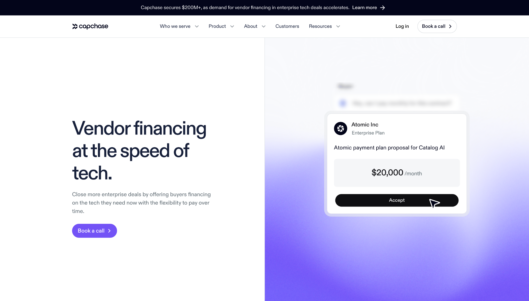
What it does. Capchase helps B2B tech vendors offer flexible financing solutions to buyers.
Why it works:
- The site connects financing to sales. Capchase’s website ties financing directly to closing enterprise deals, which helps revenue execs understand how the product's payment flexibility will impact their bottom lines.
- The product story turns speed into a competitive advantage. Spotlights on salesforce-embedded qualification, AI-assisted documentation, and flexible loan servicing tell visitors how Capchase helps them close deals faster.
Key takeaway. If your client’s service affects multiple stakeholders, design its B2B enterprise website around each persona’s decision criteria.
Best practices for B2B website design
To help you build a project like the B2B website examples above, here are some tips for effective B2B UX design:
- Include a clear value proposition. Tell visitors who your client caters to, which problems the product solves, and what outcomes they can expect.
- Segment audiences. Give different audiences clear paths that address their needs, using menus and page structures to help each person find the most relevant information.
- Display trust-building elements. Feature testimonials and certifications to reduce hesitation.
- Create conversion-focused CTAs. Make each next step specific to the buyer’s intent, using specific and relevant CTAs like “Book a consultation with an expert” or “See case studies for similar clients.”
- Use structured, user-centric navigation. Organize pages within the menu or navigation bar around how people search for information. For example, segment service pages, resource hubs, and pricing pages to help prospects find what they need faster.
- Design forms that reduce friction. Help interested visitors reach out with straightforward contact forms embedded in key pages. For the best effect, include multiple forms built for specific use cases, such as general inquiries and pricing estimates.
- Optimize site performance. B2B decision-makers are busy people, so make sure all pages load quickly and the site is mobile-friendly.
Build B2B websites that convert with Webflow
An effective B2B website gives your client’s best prospects fewer reasons to hesitate and more reasons to convert. Just like the B2B web design examples we’ve looked at here, your projects need to clearly guide people from first impression to confident purchase.
Webflow helps you build custom B2B experiences around that journey, whether your client needs service pages for different audiences or post-launch landing pages. And because Webflow is an agentic web marketing platform, you can use native Analytics and AI tools to learn what your client’s customers respond to and make continual improvements.
Build high-converting B2B websites with Webflow, and keep delivering long after the handoff.
Discover inspiring design work from the Webflow community
Made in Webflow is the place to browse, clone, and customize the latest websites built by the Webflow community.



.jpeg)