




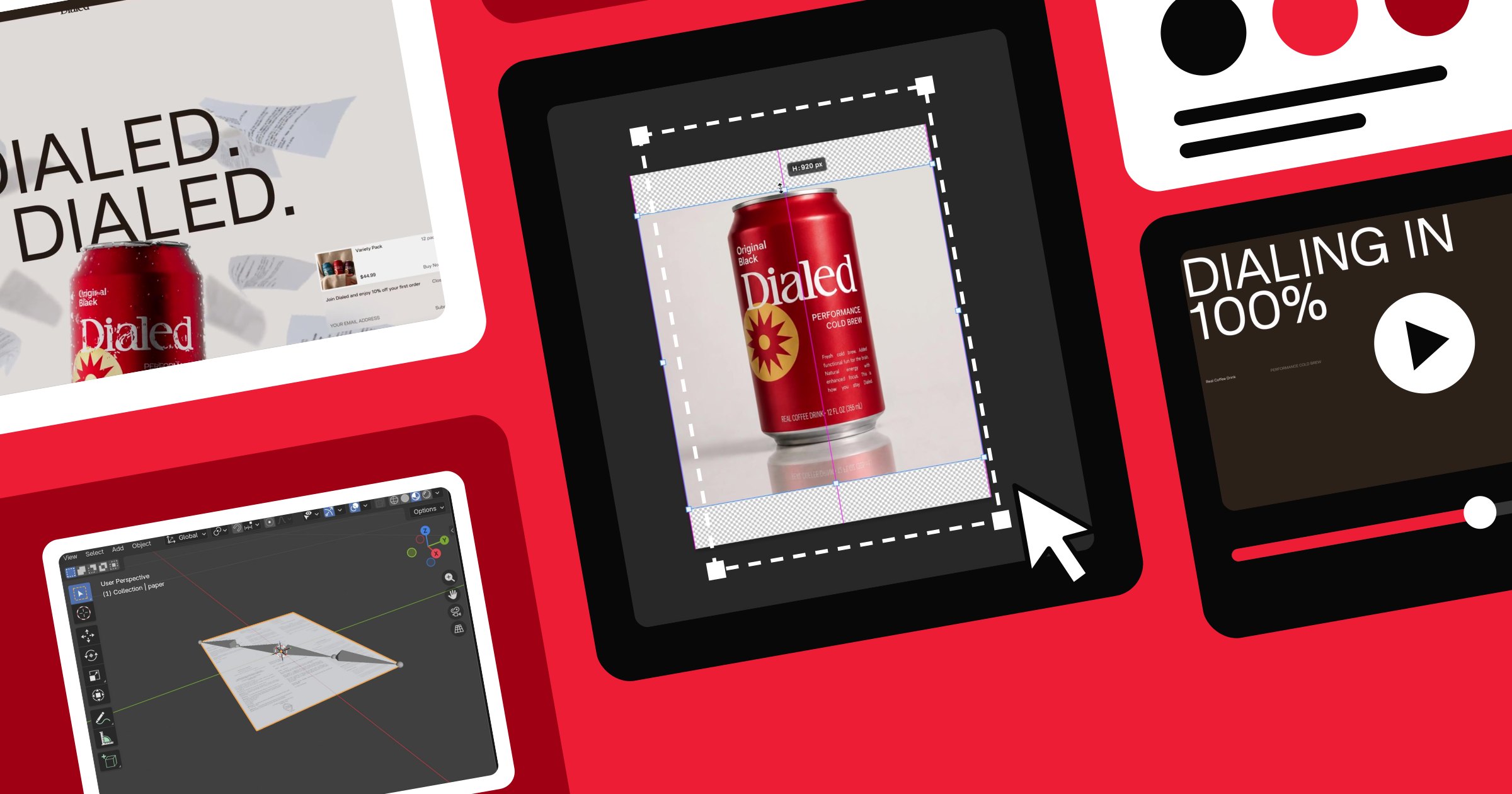



A look inside OFF+BRAND's design and development process for Dialed’s immersive website, from art direction, product photography, design and immersive development.
The idea was to feel elevated without losing the edge: bold typography, saturated colour, and a bit of irreverence. Translating that into a website meant building an interface that could shape-shift as fluidly as the product line itself, and figuring out how to make 3D cans, spilled coffee, and flying paper all behave believably in the browser on any device.
Here's how we got there.
A homepage that changes its outfit for each product
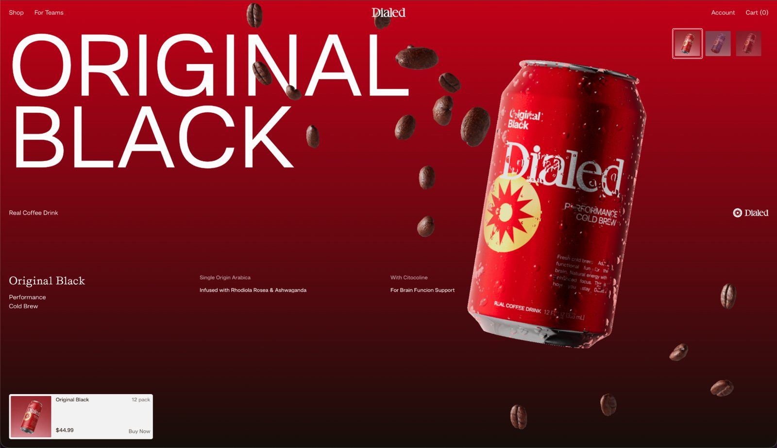
Keeping the carousel as the centrepiece of the page, we aimed to create an experience that lets the user step into different rooms for each can. Switch to a new flavour and the interface absorbs the colour palette, typography, and graphic language of the featured product, while the can floats dynamically on screen, surrounded by interactive 3D ingredients like coffee beans, vanilla pods, and chocolate chunks.
This dynamism helps drive conversion by keeping users interacting with the product grid rather than scrolling past it, especially when the core e-commerce goal is to get people pressing the buy button.
We also built a preloader for the homepage — but ended up optimising the WebGL scene so much that it loaded before the preloader had time to play. The fix was setting a minimum duration for it to run. Good problem to have.
While we focused on this, we kept pushing forward on other areas of the project too. Rather than waiting for everything to be finalised, we worked in phases as the brand and product continued to evolve. This built a malleable foundation for the carousel that could adapt to changes in the brand, product, and content as they developed — keeping the project moving without losing momentum.
The art direction here was bold and elevated. We focused on typography that stood out and imagery that spoke for itself — capturing both the business and the slump of the workplace, something Dialed aims to remedy.
Keeping the product in proportion
A unique challenge was generating a large suite of product imagery using AI while maintaining scale consistency across different renders; the exact same can would frequently shift in height and proportion. Beyond post-production colour grading, we experimented with several fixes, including Photoshop’s Content-Aware Scale and targeted prompt engineering. Both the tool and some unpredictable AI prompts produced a few hilarious side effects, alongside plenty of frustration when the AI simply wouldn't land on the precise result we needed.
What’s worth noting here is that the brand and product were still taking shape while this was being designed and built. Rather than waiting for everything to be finalised, the project was worked in phases, building a flexible foundation that could evolve as the branding, product range, and content developed. The focus stayed on keeping things moving, managing change without losing momentum, and making sure the creative and technical teams stayed aligned as things shifted underneath them
Beyond design into WebGL: The technical side of fluidity
Not long ago, we started experimenting with the Wiggle Bones library to animate pages of a book on our recent website for Trevor Noah. However, this time the challenge was to animate flying documents, making them feel light yet reactive. So we reached for the same system again.
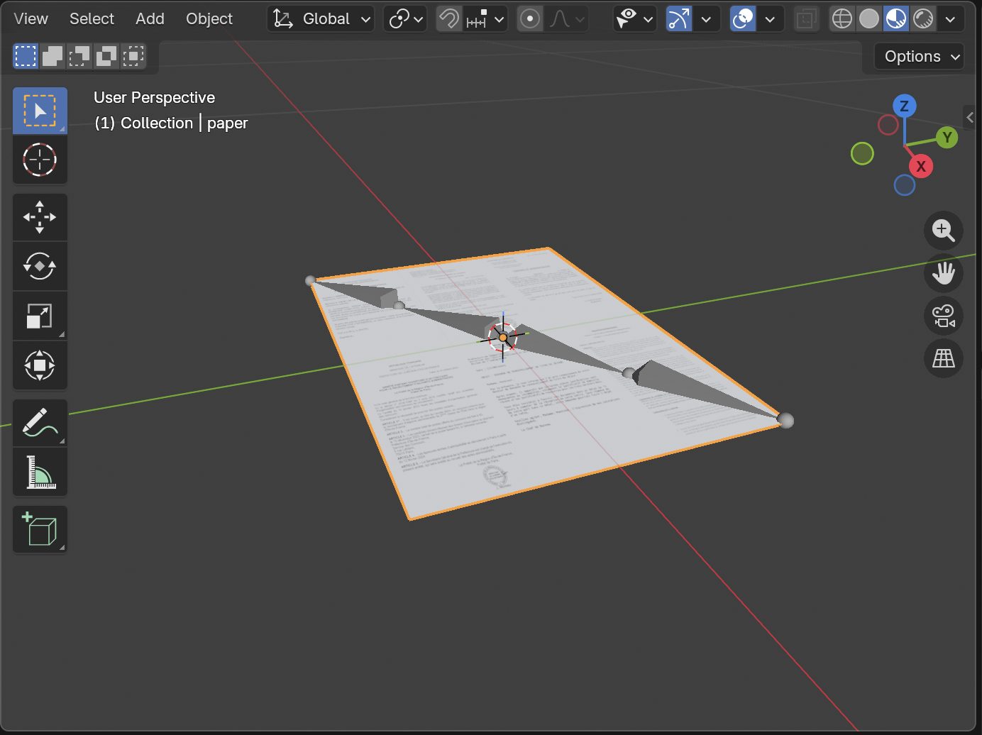
We animated the documents using a custom repulsion system and let the Wiggle Bones do its magic, while the documents were pushed in all directions.
We experimented with different bone compositions, but this very simple one felt closest to how a real sheet of paper would behave.
For depth of field, we separated the papers into three layers based on their depth and rendered the last two in separate dual Kawase blur passes. The dual Kawase blur pass, combined with a clamped render-target resolution, proved to be really fast with stronger blurs, which we needed on the last layer.
One of the core technical challenges was orchestrating the DOM so that regular page elements could sit both above and below the WebGL canvas. On the more complex hero transition, certain elements needed to appear between the paper scene and the 3D can — something that required more than one canvas to solve. Rather than running two separate renderers (which would mean loading some assets twice and adding unnecessary weight to the codebase), the team used a single renderer that draws twice, then used the drawImage() function to transfer the second rendered frame onto the second canvas.
Spilling the beans: How we made the liquid stream effect
Not all effects need a heavy shader pipeline to achieve the desired effect. A great example is a stream of liquid. If you look at a stream in slow motion, you’ll realise it looks almost like a static texture with a shimmering effect. We could easily achieve that with a simple noise texture, saving us a lot of resources while still getting the opportunity to add hover interaction.

For the hover interaction, we used another noise texture, which animated fast enough to create the desired disruption effect on the stream we saw in our reference video.
This approach not only saved us a lot of resources, but also allowed us to work with the photo reference from our design team without compromising on the realism of the composition.
For the footer, we decided to take the experiment into the wild (or rather, the kitchen) and capture some real-life references for how the spilled coffee drops could interact with the logo. We observed how espresso droplets fall and are absorbed into paper, while also experimenting with our fingers to study how the coffee spreads, expands, and naturally settles.
The idea that stuck was translated into generative SDFs inside a WebGL fragment shader, using refraction to create a convincing liquid effect directly over the logo.
What came out of it
Dialed’s website works because the design and build problems were solved together, not in sequence. The “elevated / bold” art direction only holds up because the transitions, physics, and shader work make it feel tactile rather than decorative — and a lot of that came down to solving small, unglamorous problems (a can that won't stay the same size, a canvas that needs to sit both above and below the DOM) with the same care as the big creative swings.
Build the kind of site other teams study
Webflow gives designers and developers full control over layout and motion, and the site you design is the site that ships.