







Just like an old-school newspaper, a blog’s ability to interest and engage readers relies heavily on its layout.
A blog is a great way to showcase your brand via informative articles that highlight your products and expertise. But for those articles to leave a positive impression, you also need a website layout that makes posts readable and helps people quickly find specific topics and new content.
In this article, you'll learn about four of the best blog layout styles. We'll also review examples that offer lessons you can apply when designing your website.
Why your blog's layout matters
Blogs are useful for driving website traffic, since optimized articles can reliably land near the top of search engine results pages and bring in new visitors. But once you attract readers, you need to quickly convince them your blog is worth their time.
A thoughtful layout with a clear visual hierarchy grabs visitor attention, directs it toward posts they might be interested in, and makes your content more readable. With a page design that follows blog UX best practices (such as organizing pages in line with scanning patterns and avoiding performance-draining plugins), you can keep people engaged with your brand and build rapport.
Common types of blog layouts
Here are the four most common layouts used in modern blog design.
Grid-based layouts
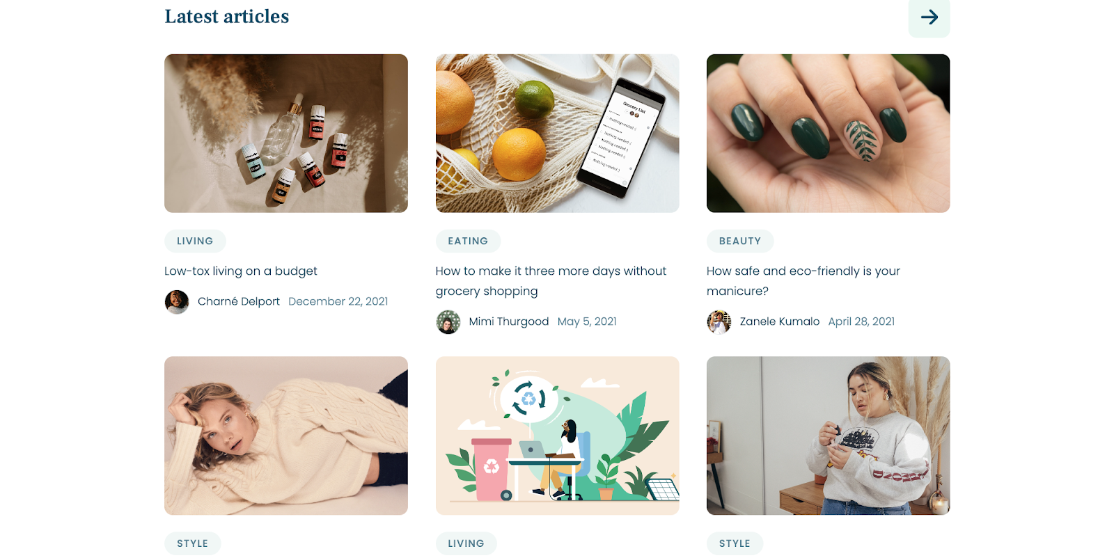
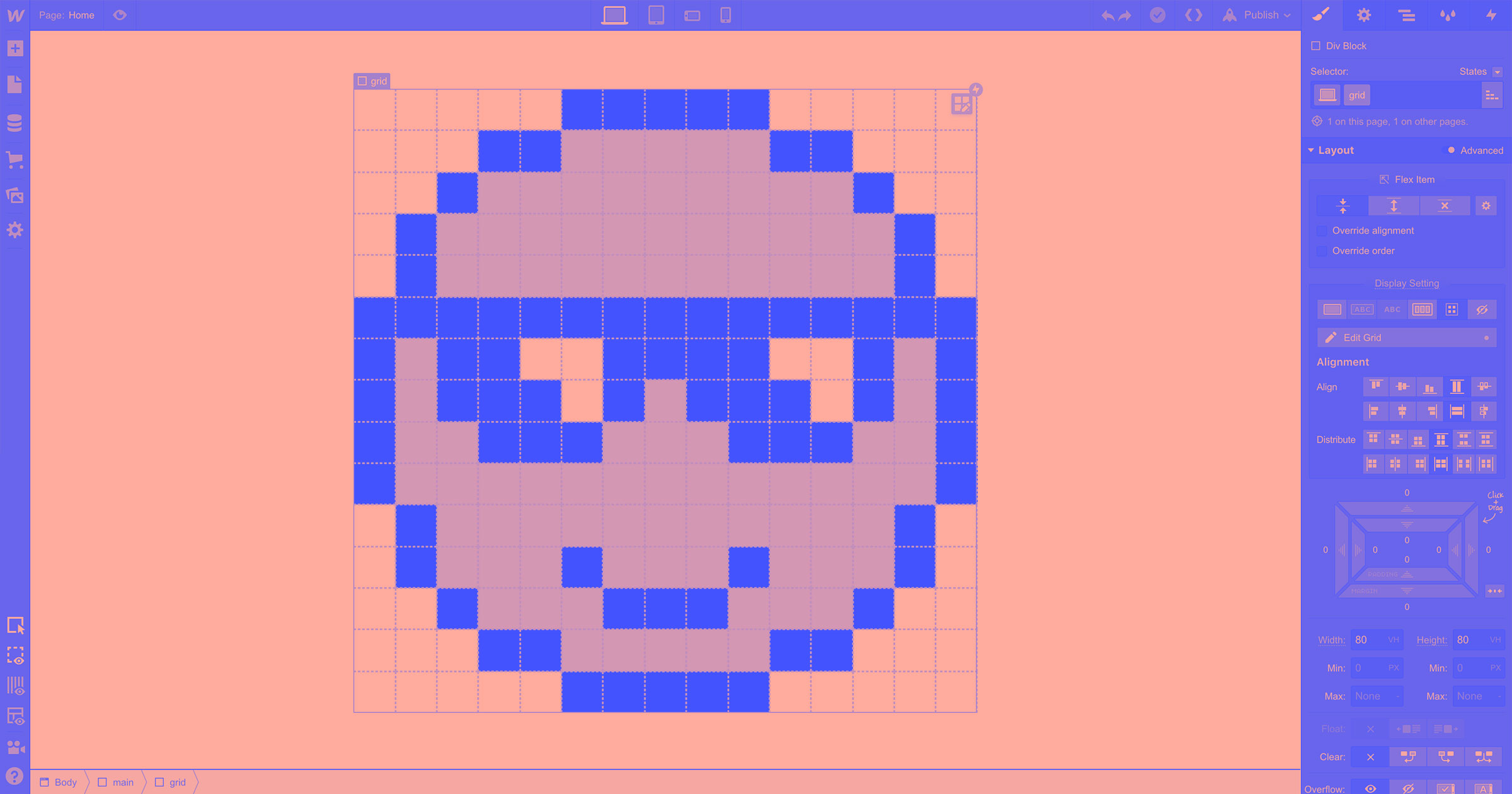
Blogs with grid designs make full use of page space, with columns and rows that organize similarly sized article cards. This style's main advantage is visibility, since you can show several articles on screen at the same time to give readers more choices.
Single-column layouts
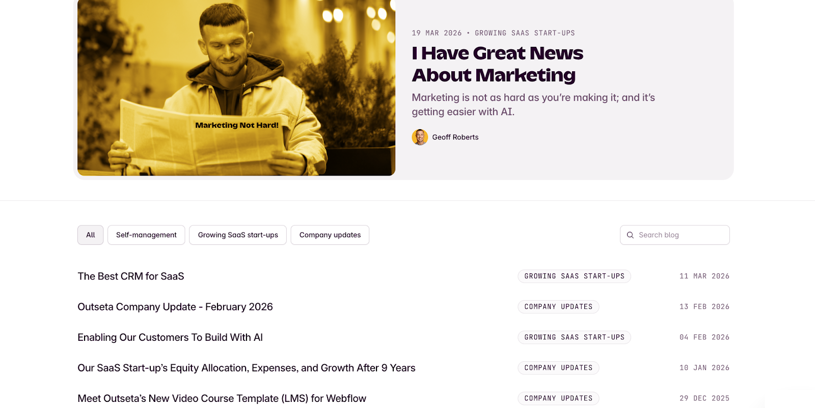
A single-column layout is typically a curated list of blog articles arranged in rows based on categories or authors. Those rows display in a single, long column that usually takes up the center two-thirds of the screen, resulting in a streamlined user experience. This style minimizes distractions and maximizes accessibility, so it's handy for encouraging people to browse archives and read posts.
Magazine-style layouts
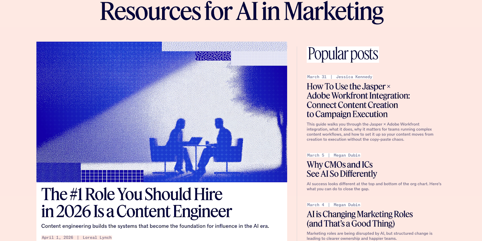
Magazine-style layouts can use grids or single-column designs, but they keep articles organized under top-level tabs like the sections of a magazine. This gives visitors the option to quickly filter by a primary category of interest, and it provides visual encouragement to explore the entire blog.
Minimal or monochrome layouts
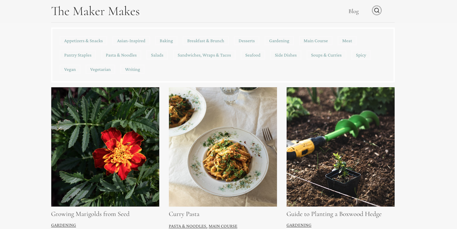
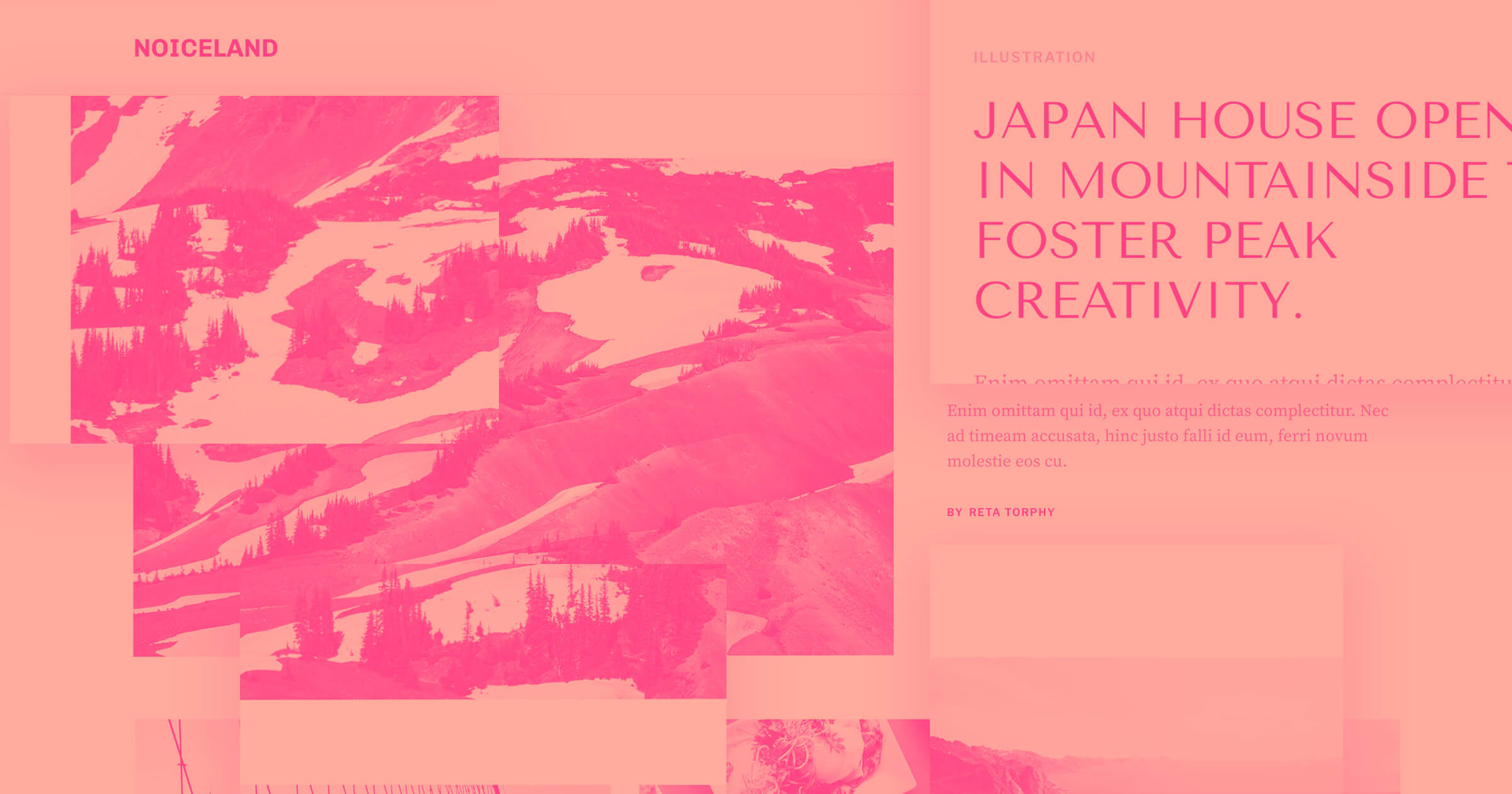
Minimalist and monochrome blog websites are deliberately straightforward, and they tend to let titles and featured images do most of the legwork. A minimalist blog will focus on removing all unnecessary elements to let articles shine, while monochrome sites use different shades of the same color to reduce visual noise so content stands out.
4 blog layout examples to inspire you
Here are four examples of effective layouts you can look to for blog design inspiration.
1. Strive Pharmacy
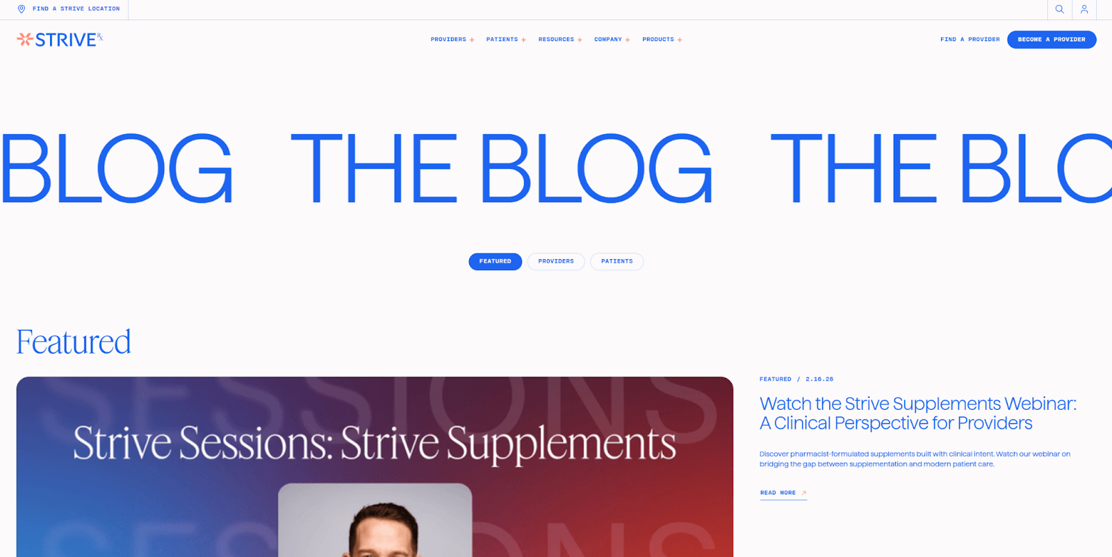
Strive Pharmacy, designed by Carter Ogunsola, uses a grid-based blog homepage layout. But first, there's a large featured article positioned at the top of the homepage to grab readers' attention. This scrolling hero section adds a bit of motion to make the design more engaging, and the three navigation options below let readers sort articles by category.
The primary grid spans the blog's entire homepage, so each article card has enough room for a large, eye-catching image. Clearly divided sections, plenty of whitespace, and contrasting background colors give every category and individual article space to shine in this layout.

UX design websites from the Webflow community
Find inspiration from the Webflow community for your UX design website.
2. Appcues
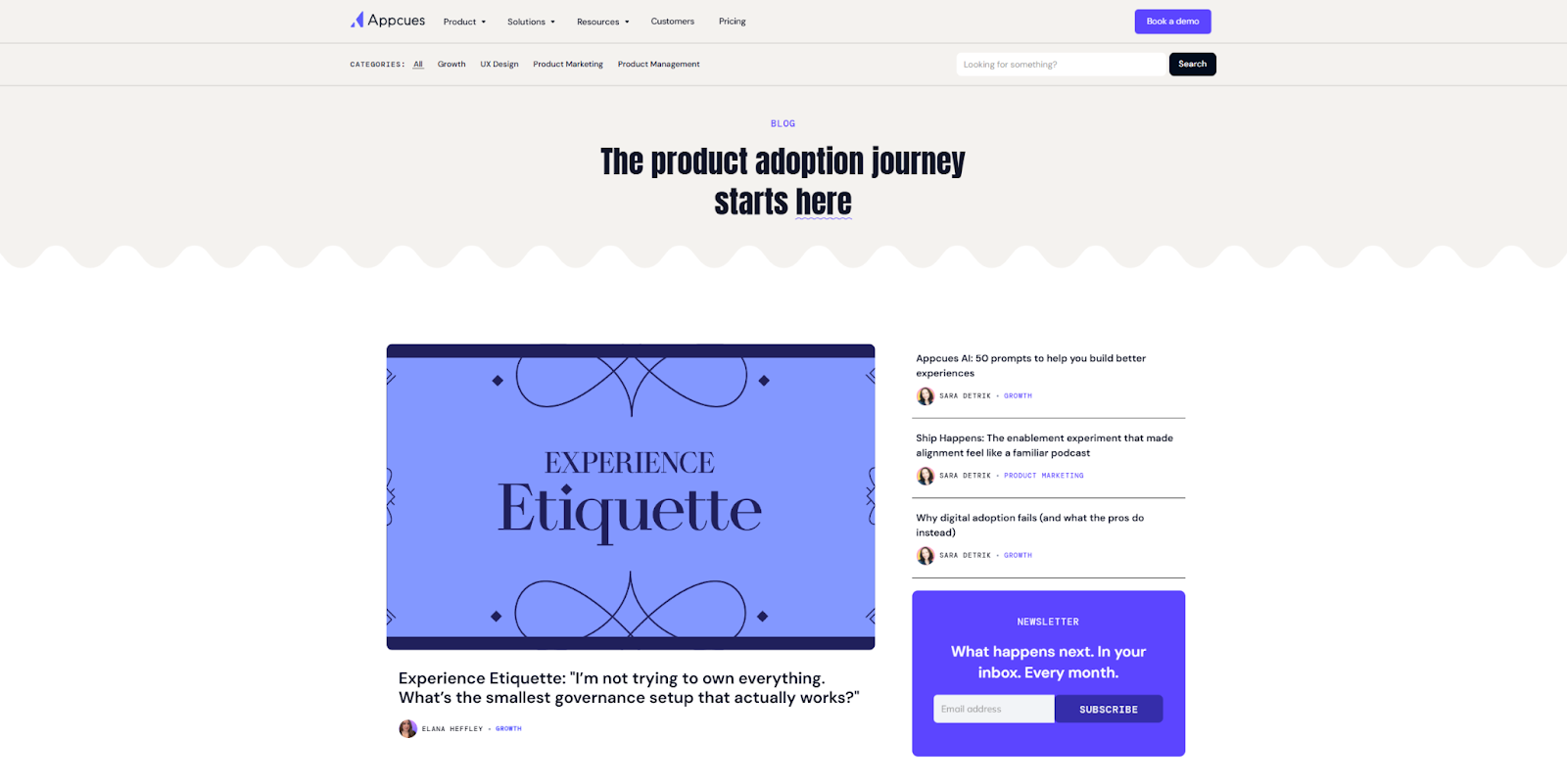
The Appcues business blog website uses a single-column layout broken into several curated rows. Readers looking for a specific category can scroll down to options like User Experience Design or Product Marketing and quickly find relevant articles. And along the way, they might discover another topic that interests them, keeping them around longer and giving Appcues more chances to build rapport.
To follow this layout example, you'll need to categorize your articles precisely and experiment to find out which content you should feature. Testing tools like Webflow Optimize and Webflow Analyze can show you what articles get the most attention and clicks.
3. Lattice
Source: Lattice
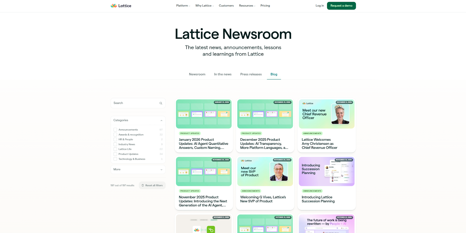
Lattice, designed by Chintan Savaliya, uses a magazine-style layout that's organized into four top-level sections, with a sticky menu on the left for filters. This setup is optimized to help readers find exactly what they're looking for in the fewest possible clicks. While that means there's less chance for discovery, it improves the odds that people looking to read about a specific topic will have a satisfying user experience.
This type of layout works best for large, diverse content libraries. If readers see that you have only one or two articles on their chosen topics, they'll likely go elsewhere for comprehensive coverage. But if you have robust archives that are clearly tagged and organized, a magazine-style layout is a great way to showcase breadth and depth.
4. Dropbox Sign
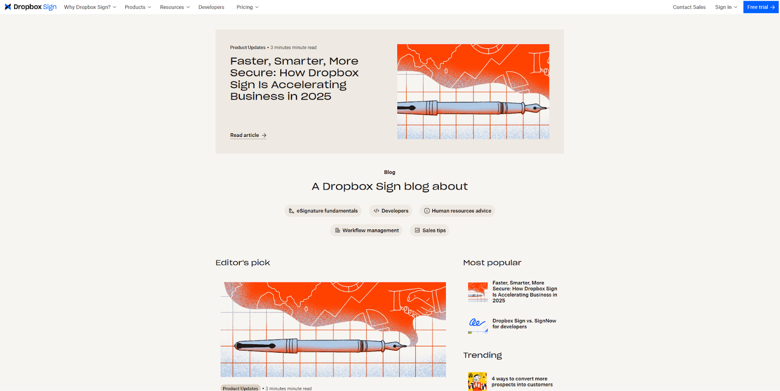
Dropbox Sign, designed by Justin Johnson, is a great example of a monochrome blog website, with a color palette made from various shades of cream. The neutral shades are reminiscent of paper, and they help the bright featured images pop. This blog's overall structure is a single-column layout, but its palette and minimalist design choices are what sets it apart.
If you want to achieve a similar effect in your layout, prioritize visuals. Every article needs a high-quality image that stands out from the background and other media on the page, while giving readers a peek into the post's topic.
How to choose the right blog website layout for your readers
As you assess all the options, consider these factors when choosing the best layout for your brand and content:
- Industry and content type. Some industries, such as software development and fashion, benefit from the discoverability single-column and grid-based layouts offer. If you're blogging in a niche where readers are more specialized, like for a healthcare or lifestyle blog, you might opt for a magazine-style approach with plenty of sorting options.
- Content volume. Consider your overall content strategy before committing to a blog layout. For example, you'll need significant archives to populate the long lists in most single-column and magazine-style layouts. Grid-based blog designs are more forgiving if you have fewer articles to show.
- Team resources. Each author brings a unique skillset to inform their articles, and a large team can result in a wide net of topics that should catch the attention of more readers. Prepare with a blog website style that can handle many categories and scale up quickly, such as a grid-based or magazine-style layout.
- Branding aesthetic. If squares and cubes feature prominently in your branding, a grid-based layout leans into that aesthetic. For brands associated with print media, a magazine style will feel familiar and welcoming to your target audience.
- Visual assets. Magazine-style and single-column layouts are useful when you lack distinctive images — space for media is already limited, so you can rely more on titles and tags to catch readers' attention. At the other end of the spectrum, a minimalist, monochrome layout is a great way to leverage high-quality visual assets.
Build a modern, unique blog website with Webflow
It's tempting to put all the focus on your content, but your blog website's structure is what positions that content for success. To inform the layout you choose, consider your niche, audience, topics, and branding, then choose a design that showcases what you offer while supporting readability.
Webflow is your trusted partner during the blog design process, giving you a full platform where you can experiment with layout styles. Ready-made CMS blog templates serve as design inspiration and quick-start resources, while the visual, drag-and-drop editor helps you turn your ideas into reality fast.
Build a blog that brings in and engages readers with Webflow.
More than a website builder
Webflow is a visual-first web development platform that empowers your teams to build, manage, and optimize in a visual canvas — backed by enterprise-grade hosting, scalability, and security.