








Sometimes, the most meaningful ways we can show up for customers are through the little fixes. We know your time is precious, and that deadlines come up fast, so we’re investing time in clearing away points of friction to keep your work moving.
Doing your job is already hard enough, you don’t need small frustrations getting in the way— like the formatting quirk you’ve learned to endure, the extra click you didn’t want to make, or the tedious workarounds that interrupt your stride.
These things might seem small on their own, but stack up enough of them and they can become a real pain in the…workflow.
It can be easy for these items to get stuck in the backlog. Not because we weren’t listening, but because when we had to choose where to put our time, bigger launches often won out.
So over the last several months, we’ve been transforming how our Product and Engineering organizations work so these things don’t keep falling to the bottom of the queue. We’ve incorporated AI-native workflows that empower more teammates to build and ship improvements to production so small fixes make it into the product faster.
This has freed up a block of time every week for a new ritual called Builder Wednesday, so our teams can focus on shipping enhancements that make Webflow easier for you to use.
Leading up to Webflow Conf this year, we asked ourselves, “What if we brought the spirit behind Builder Wednesday to life and let the community help prioritize what we fix?”
Introducing: The Papercuts Room
So, at Webflow Conf 2026, we opened the Papercuts Room, a space where our users could work with our team to tackle improvements in real time.
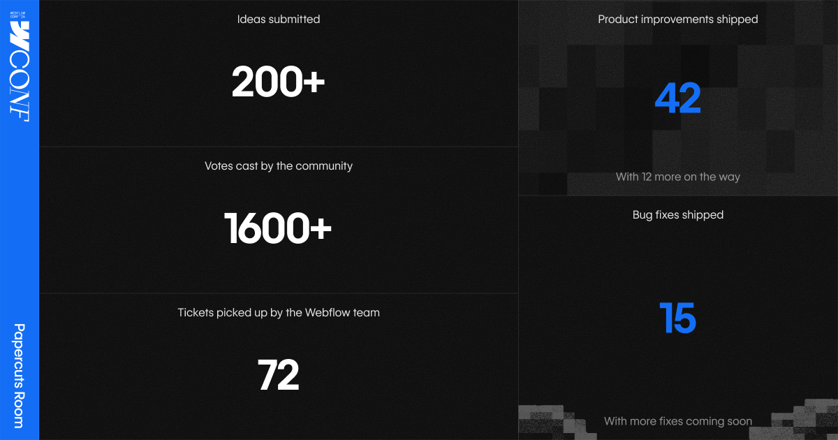
Attendees submitted their papercuts, voted on the ones they most wanted us to fix, and watched as our Product, Engineering, and Design teams triaged the top requests and started building solutions live.
Here’s a recap of what happened:
A handful of these were ones our own Marketing team had been asking for like:
- Hot keys for the Navigator, making it easier to jump across elements
- Long class names that truncate cleanly and show in full when you hover
- Build mode overrides, so overridden component properties and reset with an Option-click
- The ability for the CMS panel to remember your most recently selected collection, so you don’t have to hunt when switching between the canvas and another collection template
- A search field in the Pages panel that focuses automatically so you can start typing a page name without an extra click
- An “Open in new tab” option via Cmd/Ctrl-click or right-click to open site settings and the Dashboard in a new tab
- Drag and drop functionality to reorder custom attributes directly on an element
Every improvement we shipped:
From CMS workflows to components, and site management, the ideas shared in the Papercuts Room touched nearly every corner of our product. Here’s the rest of the improvements we shipped based on your feedback.
New CMS features you asked for
- CMS date and date-time bindings now offer zero-padded formats such as 04/01/2020, with matching output in the canvas and on published sites.
- You can show an additional CMS field and combine filters when manually choosing Collection List items, making similarly named entries easier to distinguish.
- Links outside CMS binding contexts can target a specific Collection item page by choosing its collection and item, with search and draft indicators in the picker.
- You can now resize columns in the CMS list view by dragging their edge, making collection data easier to scan. Widths reset when the CMS panel reloads.
- CMS archive and unarchive actions now explain that live-site changes take effect on the next publish, reducing confusion about whether an item changes immediately.
- CMS template branches now display the current item's publishing status in the top bar and provide direct access to edit it in Data Manager.
- CMS and Ecommerce image fields now show a checkmark when alt text is present, making accessibility coverage easier to spot at a glance.
- The CMS field deletion confirmation names the selected field, helping you verify you're deleting the intended content field.
- You can now search CMS Collections by name, making it easier to find what you need on sites with lots of Collections.
Navigate with fewer clicks
- You can now press Option/Alt + Shift + Z in the Navigator to expand or collapse the selected element and all its children, leaving everything else in the Navigator untouched.
- Exiting the canvas now returns you to the site's Dashboard folder when one exists, avoiding extra navigation from the workspace’s main page.
- Selecting an element inside a component automatically brings its linked property field into view, reducing manual scrolling through long Properties panels.
Retain context between sessions
- Style Panel Focus Mode now persists across reloads, so you don’t have to re-enable it each session.
- Component instances on other pages appear in alphabetical order, making it simpler to audit usage without the list reshuffling.
- Renamed sites retain their new name in the site-specific access menu, without reverting to their old name.
- The select-all checkbox in Forms now resets after a bulk deletion, so newly loaded submissions are not shown as selected.
Search and find what you’re looking for
- Quick Search preserves CMS item names as entered, so names with mid-word capitalization can be found and displayed correctly.
- Color variables can be found by full hex values, shortened hex values, or equivalent CSS color names across variable search surfaces, while previews and stored values remain unchanged.
- Class searches in Interactions now support partial, non-contiguous matches and rank the most relevant results first. Selected classes also remain visible immediately.
- Long industry and sub-industry options in Optimize audiences now use the available row width and show the full value in a tooltip when truncated, making similar categories easier to distinguish.
- Site names in CMS and Insights now remain visible for up to 80 characters, making longer names easier to identify before truncation.
Clearer labels in the user interface
- Manual site-search indexing now reminds you to publish recent changes first so those changes can appear in search results.
- Site Search settings now distinguish automatic reindexing after a full-site publish from how often manual reindexing is available, making each schedule clearer.
- Page creation returns clearer validation errors for invalid fields, missing folders, reserved slugs, or missing source-page content instead of reporting a generic server failure.
- The crash dialog explains recovery steps more clearly and offers a direct Support link when crashes repeatedly follow a specific action.
- Comment metadata such as browser, operating system, viewport, and breakpoint is now easier to discover from both comment bubbles and the Comments panel.
- Account creation timestamps now display (UTC) more clearly, making the time zone easier to recognize and compare.
- Analyze overview cards now provide direct actions to open page details or view an event's page in Analyze mode, including the correct CMS item when applicable.
- Partner Marketplace starting prices are labeled as USD, helping visitors distinguish them from other currencies that also use the $ symbol.
- Rich-text formatting toolbars remain visible and reachable while you edit and scroll in the modal
Updates that evade categorization, but still matter
- The Pages panel hides the User pages section on sites where the User Accounts feature was never activated, reducing unavailable options.
- You can now edit SEO, Open Graph, and Site Search settings while a page or parent folder is password-protected, so metadata can be prepared before protection is removed.
- You can now create and optionally name a manual backup directly from Site Settings > Backups, without opening the canvas.
- You can now set separate themes for the Dashboard and Canvas (System, Light, or Dark) so you’re no longer locked into one theme across both surfaces.
- Grid settings now include Auto-fill alongside Auto-fit, giving you more control over responsive layouts by preserving empty grid tracks when needed.
All the bugs we squashed
We also squashed a few bugs along the way, with more fixes and refinements already in the works:
- After all unused styles are revealed, Styles Manager now removes the redundant “Show all” link.
- The wildcard redirect help link in Site Settings now points directly to the current Help Center article and its examples, avoiding an outdated redirect.
- Branch conflict resolution now uses Webflow-styled dropdowns instead of browser-native menus, with more room for version choices.
- The Open Graph image selector for CMS template pages now has consistent spacing and hover states, and long field names truncate cleanly.
- The Dashboard top navigation now uses a simpler account-menu trigger. Desktop shows the avatar alone, while mobile and screen readers retain the Account label.
- The page-link selector in rich text fields now keeps a consistent height and better-aligned text when switching link types.
- The Webflow logo now aligns with the menu button at smaller Dashboard window sizes, making compact navigation clearer and more consistent.
- The Ratio menu in the Style panel now stays stable as you browse options, while preserving live previews and custom ratios.
- When using the MCP to create CMS items, newly created items default to the Draft status. You can set an item’s status to Draft or Ready to Publish, or preserve its current status.
- The Resend invite action now uses standard text styling, making it distinct from destructive member actions.
- Clear Formatting now remains visually neutral instead of appearing active when selected text has formatting, while continuing to clear styles when clicked.
- Insights and other mode icons now stay in place as you switch between them, and their tooltips continue to appear after changing modes.
- Right-clicking in the Navigator no longer causes the panel to keep panning as the pointer moves near an edge. Left-button drag scrolling continues to work as before.
- The File Upload element's upgrade tooltip now uses plan-neutral wording, so it no longer refers to the retired Business site plan.
- Adding form elements through Quick Find or the Add panel while a Form Wrapper is selected now intelligently places the element inside the inner Form, rather than throwing an error on the Form Wrapper.
What’s next?
The Papercuts Room may be closed for this year, but our commitment to make Webflow better to use isn’t going anywhere. We’re piloting Quality Week, which carves out an entire week for our Product team to smooth out rough edges, tackle quality-of-life improvements, and ship fixes for those little things.
Of course, there will always be more to improve, but we believe that a deliberate, continuous investment in fixing papercuts will result in a product experience that gives you back your time and helps you do your best work.
Got a papercut that’s been bugging you? We want to hear about it. Let us know what else you want in the Webflow Community.